Statistical programmers and analysts often use two kinds of rectangular data sets, popularly known as wide data and long data. Some analytical procedures require that the data be in wide form; others require long form. (The "long format" is sometimes called "narrow" or "tall" data.) Fortunately, the statistical graphics procedures in SAS (notably, PROC SGPLOT) can usually accommodate either format. You can use multiple statements to create graphs of wide data. You can use a single statement and the GROUP= option to create graphs of long data.
Example: Overlay line plots for multiple response variables
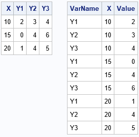
Suppose you have four variables (with N observations) and you want to overlay line plots of three of the variables graphed against the fourth. There are two natural ways to arrange the 4*N data values. The first (and most natural) is a data set that has N rows and 4 variables (call them X, Y1, Y2, and Y3). This is the "wide form" of the data. The "long form" data set has three variables and 3*N rows, as shown to the right. The first column (VarName) specifies the name of the three response variables. The second column (X) indicates the value of the independent variable and the third column (Y) represents the value of the dependent variable that is specified in the VarName column. Some people will additionally sort the long data by the VarName variable, but that is not usually necessary. In general, if you want to stack k variables, the long form data will contain k*N observations.
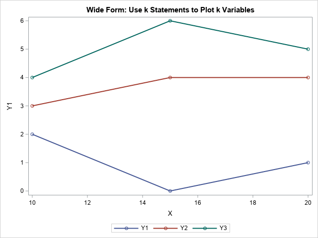
PROC SGPLOT enables you to plot either set of data. For the wide data, you can use three SERIES statements to plot X vs Y1, X vs Y2, and X vs Y3, as follows. Notice that you can independently set the attributes of each line, such as color, symbol, line style. In the following program, the line thickness is set to the same value for all lines, but you could make that attribute vary, if you prefer.
data Wide; input X Y1 Y2 Y3; datalines; 10 2 3 4 15 0 4 6 20 1 4 5 ; title "Wide Form: Use k Statements to Plot k Variables"; proc sgplot data=Wide; series x=X y=Y1 / markers lineattrs=(thickness=2); series x=X y=Y2 / markers lineattrs=(thickness=2); series x=X y=Y3 / markers lineattrs=(thickness=2); run; |
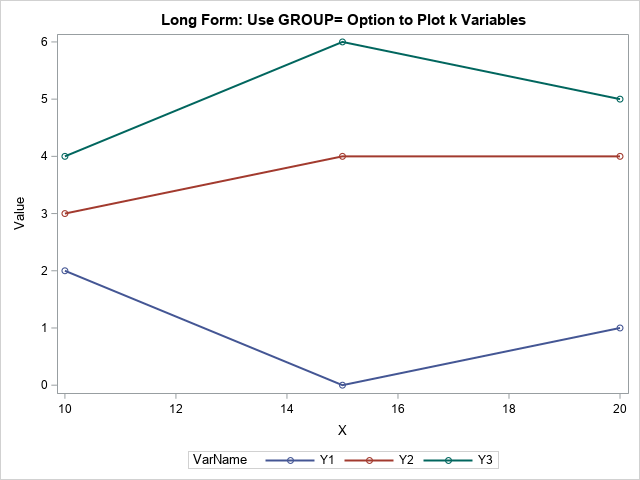
You can use PROC TRANSPOSE or the SAS DATA step to convert the data from wide form to long form. When the data are in the long format, you use a single SERIES statement and the GROUP=VarName option to plot the three groups of lines. In addition, you can set the attributes for all the lines by using a single statement.
/* convert data from Wide to Long form */ data Long; set Wide; VarName='Y1'; Value=Y1; output; VarName='Y2'; Value=Y2; output; VarName='Y3'; Value=Y3; output; drop Y1-Y3; run; title "Long Form: Use GROUP= Option to Plot k Variables"; proc sgplot data=Long; series x=X y=Value / group=VarName markers lineattrs=(thickness=2); run; |
Advantages and disadvantages of wide and long formats
The two formats contain the same information, but sometimes one form is more convenient than the other. Here are a few reasons to consider wide-form and long-form data:
Use the wide form when...
- You want to run a fixed-effect regression analysis. Many SAS procedures require data to be in wide form, including ANOVA, REG, GLM, LOGISTIC, and GENMOD.
- You want to run a multivariate analysis. Multivariate analyses include principal components (PRINCOMP), clustering (FASTCLUS), discriminant analysis (DISCRIM), and most matrix-based computations (PROC IML).
- You want to create a plot that overlays graphs of several distinct variables. With wide data, you can easily and independently control the attributes of each overlay.
Use the long form when...
- You want to run a mixed model regression analysis for repeated measurements. PROC MIXED and GLIMMIX require the long format. In general, the long format is useful for many kinds of longitudinal analysis, where the same subject is measured at multiple time points.
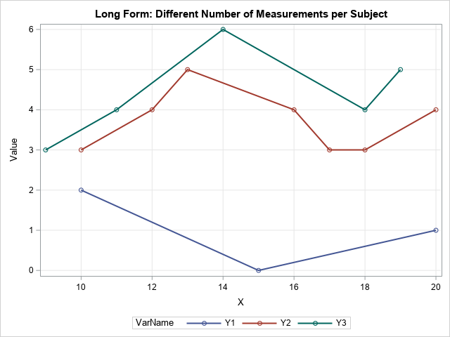
- The measurements were taken at different values of the X variable. For example, in the previous section, the wide format is applicable because Y1, Y2, and Y3 were all measured at the same three values of X. However, the long form enables Y1 to be measured at different values than Y2. In fact, Y1 could be measured at only three points whereas Y2 could be measured at more points.
The last bullet point is important. The long form is more flexible, so you can use it to plot quantities that are measured at different times or positions. Line plots of this type are sometimes called spaghetti plots. The following DATA step defines long-form data for which the response variables are measured at different values of X:
data Long2; infile datalines truncover; length VarName $2; input VarName X Value @; do until( Value=. ); output; input X Value @; end; datalines; Y1 10 2 15 0 20 1 Y2 10 3 12 4 13 5 16 4 17 3 18 3 20 4 Y3 9 3 11 4 14 6 18 4 19 5 ; title "Long Form: Different Number of Measurements per Subject"; proc sgplot data=Long2; series x=X y=Value / group=VarName markers lineattrs=(thickness=2); xaxis grid; yaxis grid; run; |
In summary, you can use PROC SGPLOT to create graphs regardless of whether the data are in wide form or long form. I've presented a few common situations in which you might want to use each kind of data representation. Can you think of other situations in which the long format is preferable to the wide format? Or vice versa? Let me know by leaving a comment.

4 Comments
For flexible reporting among multiple related data sources, long format is best. Several long tables with indexes/keys that tie them together for joining (normalized) are better than a single wide table with the same info. When I prep data for reporting on these blogs (WordPress data) or our communities data, I have build a collection of related tables that make it easier to slice/dice/visualize different aspects of the same system.
Pingback: Plot a family of curves in SAS - The DO Loop
Another point in favour of long form: it allows use of BY variables.
Both formats enable BY-group processing.