Knowing how to visualize a regression model is a valuable skill. A good visualization can help you to interpret a model and understand how its predictions depend on explanatory factors in the model. Visualization is especially important in understanding interactions between factors. Recently I read about work by Jacob A. Long who created a package in R for visualizing interaction effects in regression models. His graphs inspired me to discuss how to visualize interaction effects in regression models in SAS.
There are many ways to explore the interactions in a regression model, but this article describes how to use the EFFECTPLOT statement in SAS. The emphasis is on creating a plot that shows how the response depends on two regressors that might interact. Depending on the type of regressors (continuous or categorical), you can create the following plots:
- Both regressors are continuous: Use the CONTOUR option to create a contour plot or the SLICEFIT option to display curves that show the predicted response as a function of the first regressor while fixing the second regressor at a sequence of values (often low, medium, and high values).
- One regressor is categorical and the other is continuous: Use the SLICEFIT option to overlay a curve for the predicted response for each value of the categorical regressor.
- Both regressors are categorical: Use the INTERACTION option to create a plot that shows the group means for each joint level of the regressors. Alternatively, you can use the BOX option to draw box plots for each pair of levels.
For an introduction to the EFFECTPLOT statement, see my 2016 article "Use the EFFECTPLOT statement to visualize regression models in SAS." The EFFECTPLOT statement and the PLM procedure were both introduced in SAS 9.22 in 2010.
This article uses the Sashelp.Cars data to demonstrate the visualizations. The response variable is MPG_City, which is the average miles per gallon for each vehicle during city driving. The regressors are Weight (mass of the vehicle, in pounds), Horsepower, Origin (place of manufacture: 'Asia', 'Europe', or 'USA'), and Type of vehicle. For simplicity, the example uses only four values of the Type variable: 'SUV', 'Sedan', 'Sports', or 'Wagon'.
Although this article shows only two-regressor models, the EFFECTPLOT statement supports arbitrarily many regressors. By default, the additional continuous explanatory variables are set to their mean values; the additional categorical regressors are set to their reference level. You can change this default behavior by using the AT keyword.
Interaction between two continuous variables
Suppose you want to visualize the interaction between two continuous regressors. The following call to PROC GLM creates a contour plot automatically. It also creates an item store which saves information about the model.
proc glm data=Sashelp.Cars; model MPG_City = Horsepower | Weight / solution; ods select ParameterEstimates ContourFit; store GLMModel; run; |
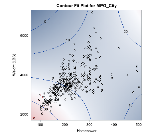
From the contour plot, you can see that the Horsepower and Weight variables interact. For low values of Weight, the predicted response has a negative slope with respect to Horsepower. In contrast, for high values of Weight, the predicted response has a positive slope with respect to Horsepower.
This fact is easier to see if you "slice" the contour plot at low, medium, and high values of the Weight variable. You can use PROC PLM to create a SLICEFIT plot. By default, the "slicing" variable is fixed at five values: its minimum value, first quartile value, median value, third quartile value, and maximum value.
/* Graph response vs X1. By default, X2 fixed at Min, Q1, Median, Q3, and Max values */ proc plm restore=GLMModel noinfo; effectplot slicefit(x=Horsepower sliceby=Weight) / clm; run; |
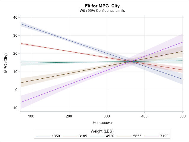
Because the slopes of the lines depend on the value of Weight, the graph indicates an interaction.
Changing the slicing levels for continuous variables
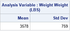
As shown in the previous section, the SLICEFIT statement uses quantiles to fix the value of the second continuous regressor. When I read Jacob Long's web page, I noticed that his functions slice the second regressor at its mean and one standard deviation away from the mean (in both directions). In SAS, you can specify arbitrary values by using the SLICEBY= option. The following statements use PROC MEANS to compute the mean and standard deviation of the Weight variable, then use those values to specify slicing values for the Weight variable:
proc means data=Sashelp.Cars Mean StdDev ndec=0; var Weight; run; proc plm restore=GLMModel noinfo; effectplot slicefit(x=Horsepower sliceby=Weight=2819 3578 4337) / clm; run; |
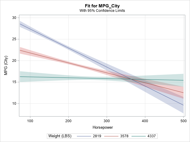
Again, the slope of the predicted response changes with values of Weight, which indicates an interaction effect. Notice that when Weight = 4337, which is one standard deviation above the mean, the slope of the predicted response is flat.
Of course, you can automate this process if you don't want to compute the slicing values in your head. You can use the DATA step or PROC SQL to compute the slicing values, then create macro variables for the sample mean and standard deviation. You can then use the macro variables to specify the slicing values:
proc sql; select mean(Weight) as mean, std(Weight) as std into :mean, :std /* put Mean and StdDev into macro variables */ from Sashelp.cars; quit; /* slice the Weight variable at mean - StdDev, mean, and mean + StdDev */ proc plm restore=GLMModel noinfo; effectplot slicefit(x=Horsepower sliceby=Weight=%sysevalf(&mean-&std) &mean %sysevalf(&mean+&std)) / clm; run; |
The graph is similar to the previous graph and is not shown.
Interactions between a continuous and a categorical regressor
If one of the regressors is categorical and the other is continuous, it is easy to visualize the interaction because you can plot the predicted response versus the continuous regressor for each level of the categorical regressor. In fact, this plot is created automatically by many SAS procedures, so often you don't need to use the EFFECTPLOT statement. For example, the following call to PROC GLM overlays three regression curves on a scatter plot of the data:
ods graphics on; proc glm data=Sashelp.Cars; class Origin(ref='Europe'); model mpg_city = Horsepower | Origin / solution; /* one continuous, one categorical */ store GLMModel2; run; |
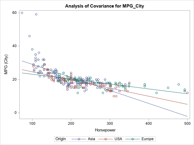
The slopes of the lines change with the levels of the Origin variable, so there appears to be an interaction effect between those two regressors.
The GLM procedure has access to the original data, so the lines are overlaid on a scatter plot. If you create the same plot in PROC PLM, you obtain the lines (and, optionally, confidence bands), but the plot does not include a scatter plot because the data are not part of the saved item store. For completeness, the following call to PROC PLM creates a similar visualization of the Horsepower-Origin interaction:
proc plm restore=GLMModel2 noinfo; effectplot slicefit(x=Horsepower sliceby=Origin) / clm; run; |
Interactions between two categorical regressors
I have previously written about how to create an "interaction plot" for two categorical predictors. Many SAS procedures produce this kind of plot automatically. You can use the EFFECTPLOT BOX or EFFECTPLOT INTERACTION statement inside many regression procedures. Alternatively, you can call PROC PLM and create an interaction plot from an item store. Again, the main difference is that the regression procedures can overlay observed data values, whereas PROC PLM visualizes only the model, not the data.
The following example creates a model that has two categorical variables. By default, PROC GLM creates an interaction plot and overlays the observed data values:
proc glm data=Sashelp.Cars(where=(Type in ('SUV' 'Sedan' 'Sports' 'Wagon'))); class Origin(ref='Europe') Type; model mpg_city = Origin | Type; store GLMModel3; run; |
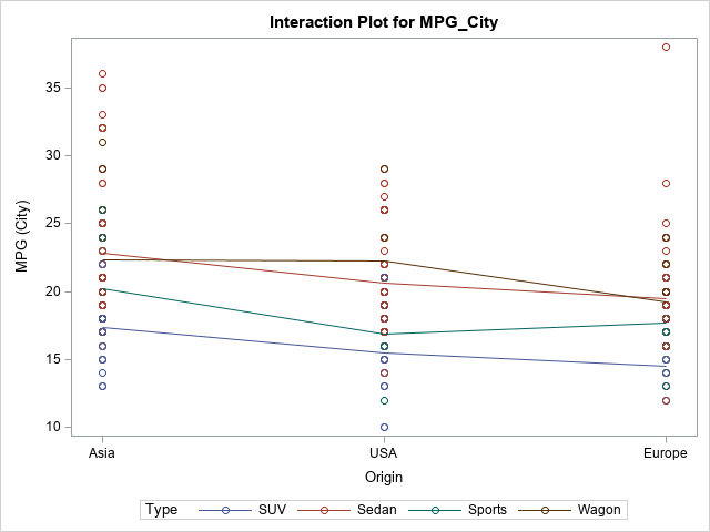
This model does not exhibit much (if any) interaction between the regressors. For a vehicle of a specific type (such as 'SUV'), Asian-built vehicles tend to have a higher MPG_City than UAS-built vehicles, which tend to have a higher MPG than European-built vehicles. These trend lines have similar slopes as you vary the Type variable. If you check the ParameterEstimates table, you will see that the interaction effects are not statistically significant (α = 0.05).
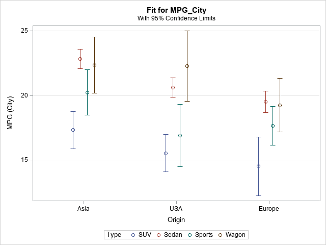
As mentioned, you can create the same plot (without the data markers) by using PROC PLM. If you request confidence intervals, you get a slightly different graph. You can choose whether or not to connect the means of the response for each level. The following statements create a plot for which the means are not connected:
proc plm restore=GLMModel3 noinfo; effectplot interaction(x=Origin sliceby=Type) / clm; /* effectplot interaction(x=Origin sliceby=Type) / clm connect; */ /* or connect the means */ run; |
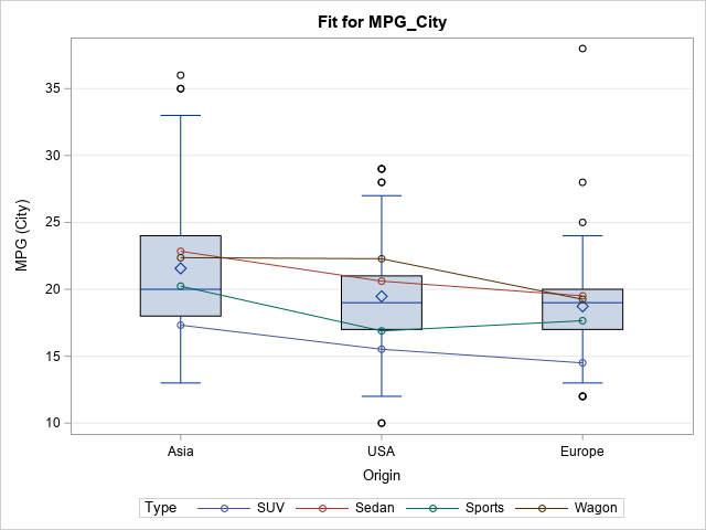
Lastly, you can use the EFFECTPLOT BOX statement in regression procedures. The information is the same as for the "interaction plot," but box plots are used to show the observed distribution of the response for each level of the first categorical regressor.
proc genmod data=Sashelp.Cars(where=(Type in ('SUV' 'Sedan' 'Sports' 'Wagon'))); class Origin(ref='Europe') Type; model mpg_city = Origin | Type; effectplot box(x=Origin sliceby=Type) / nolabeloutlier; run; |
Summary
In summary, you can use the EFFECTPLOT statement to visualize the interactions between regressors in a regression model. In general, when the slopes of the response curves depend on the values of a second regressor, that indicates an interaction effect. For a continuous-continuous interaction, you can choose the values at which you slice the second regressor. By default, the regressor is sliced at quantiles, but you can modify that to, for example, slice the variable at its mean and at (plus or minus) one standard deviation away from the mean. If you use the EFFECTPLOT statement inside a regression procedure, you can overlay the model on the observed responses. In PROC PLM, the EFFECTPLOT statement visualizes only the model.

10 Comments
thank you for this great post :)
Thanks for such a helpful post! I was wondering if it was at all possible to get the slopes of those different lines in the effect plot? This is for the graph that depicts the relationship between horse power and MPG by weight.
Thank you!
Sure. Just substitute the value of the WEIGHT variable into the model. For this example, the model is approximately
Y = 60.4 -0.12*Horsepower -0.01*Weight + 0.000028*Horsepower*Weight
So if you plug in, say, Weight=1850, you get the equation of the model at that fixed value of Weight.
The model becomes
Y = 41.9 - 0.0682*Horsepower.
Is there a way to download images from proc plm and adjust the dpi for publication quality?
The ODS system supports many destinations, formats, and resolutions. It is better to specify the correct style and destination rather than to save an image from the html output. Read about how to create publication-quality images in the doc. If you still have questions, post to the SAS Support Communities.
Amazing work! Thanks for sharing!
Very nice work.
I'm interested in using the first part (continuous by continuous predictors). In your example the outcome is continuous. If my outcome is categorical i.e. binary (1 vs 0), can I still use this method? The graph I obtain using PROC PLM has a Y axis that runs from -1 to +1.
Thank you for your help.
John
If you are modeling a binary response, see the examples in the article, "Use the EFFECTPLOT statement to visualize regression models in SAS," which uses a logistic regression model. A logistic model estimates the probability that Y=0, so the vertical axis should be a probability in the interval (0,1).
This is extremely helpful, thank you! I found the example of the predicted probability of having an underweight boy baby as a function of the mother's relative age particularly relevant to the research I'm currently doing.
I guess my 2 questions are - a) when we are evaluating an interaction as in the example (pasting code below), does it make sense to use an adjusted model? I guess since we are investigating the interaction then there is no need to adjust. b) I've been using PROC GENMOD / GEE for my model to account for clustering. To evaluate the interaction, can I use PROC LOGISTIC instead? Thank you so much! John
proc logistic data=babyWeight;
where Boy=1; /* restrict to baby boys */
model Underweight(event='1') = MomAge | CigsPerDay;
store logiModel;
run;
title "Probability of Underweight Boy Baby";
proc plm source=logiModel;
effectplot fit(x=MomAge plotby=CigsPerDay);
run;
Questions like this are best answered on the SAS Support Communities. Good luck on your research.