Last year I published a series of blogs posts about how to create a calibration plot in SAS. A calibration plot is a way to assess the goodness of fit for a logistic model. It is a diagnostic graph that enables you to qualitatively compare a model's predicted probability of an event to the empirical probability. I am happy to report that in SAS/STAT 15.1 (SAS 9.4M6), you can create a calibration plot automatically by using the PLOTS=CALIBRATION option on the PROC LOGISTIC statement.
Calibration plots for a model of a binary response
To demonstrate how to create a calibration plot by using PROC LOGISTIC, consider the simulated data that I analyzed in "Calibration plots in SAS." The data contain a binary response variable, Y, which depends quadratically on a uniformly distributed explanatory variable, X. The following call to PROC LOGISTIC fits a quadratic the model to the data. The new GOF option requests an extensive set of goodness-of-fit statistics and the PLOTS=CALIBRATION option requests a calibration plot:
/* NEW in SAS/STAT 15.1 (SAS 9.4M6): PLOTS=CALIBRATION option in PROC LOGISTIC */ title "Calibration Plot for a Quadratic Model"; title2 "Created by PROC LOGISTIC"; proc logistic data=LogiSim plots=calibration(CLM ShowObs); model y(Event='1') = x x*x / GOF; /* New in 15.1: More goodness-of-fit statistics */ run; |
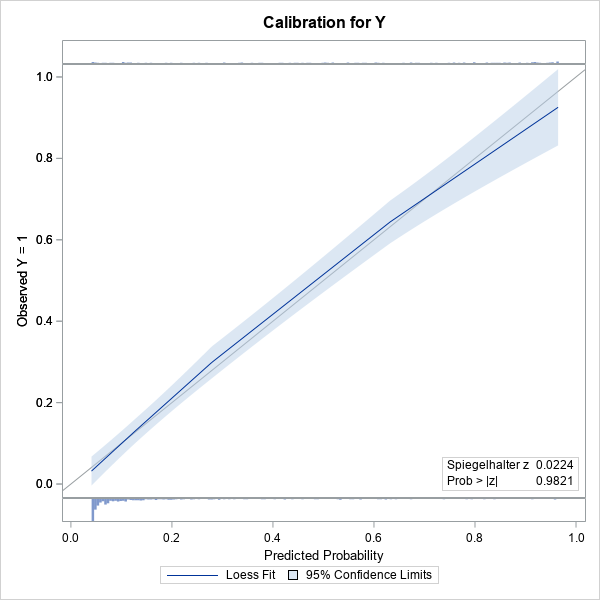
The calibration plot is shown. (Click to enlarge.) The plot contains a gray diagonal line, which represents perfect calibration. If most of the predicted responses agree with the observed responses, then the blue curve should be close to the diagonal line. That is the case in this example. The light blue band is a 95% confidence region for the loess fit and is created by using the CLM option.
Because I used the SHOWOBS option, the calibration plot displays tiny histograms along the top and bottom of the plot. The histograms indicate the distribution of the Y=0 and Y=1 responses. The article "Use a fringe plot to visualize binary data in logistic models" explains more about how fringe plots can add insight to graphs that involve a binary response variable.
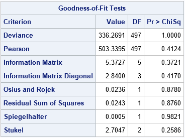
The lower right corner of the calibration plot contains one of the many goodness-of-fit statistics that are computed when you use the GOF option on the MODEL statement. A small p-value would indicate a lack of fit. In this case, there is no reason to suspect a lack of fit. The following table shows other goodness-of-fit tests. None of the p-values are small, so none of the tests indicate lack of fit.
Calibration plots for a polytomous response
An exciting feature of the calibration plots in PROC LOGISTIC is that you can use them for a polytomous response model. Derr (2013) fits a proportional odds model that predicts the probability of the severity of black-lung disease from the length of exposure to coal dust in 371 coal miners. The response variable, Severity, has the levels 'Severe', 'Moderate', and 'Normal'. The following statement create the data and model and request calibration plots for the model.
/* Data, from McCullagh and Nelder (1989, p. 179), used in Derr (2013, p. 8-10). The severity of pneumoconiosis (black lung disease) in coal miners and the number of years of exposure. */ data Coal; input Severity $ @@; do i=1 to 8; input Exposure freq @@; log10Exposure=log10(Exposure); output; end; datalines; Normal 5.8 98 15 51 21.5 34 27.5 35 33.5 32 39.5 23 46 12 51.5 4 Moderate 5.8 0 15 2 21.5 6 27.5 5 33.5 10 39.5 7 46 6 51.5 2 Severe 5.8 0 15 1 21.5 3 27.5 8 33.5 9 39.5 8 46 10 51.5 5 ; title 'Severity of Black Lung vs Log10(Years Exposure)'; proc logistic data=Coal rorder=data plots=Calibration(CLM); freq freq; model Severity(descending) = log10Exposure; effectplot / noobs individual; run; |
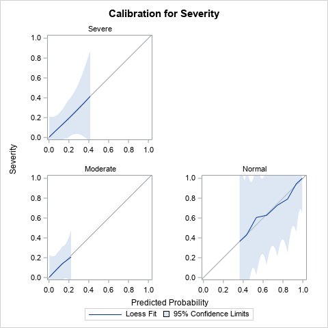
Derr (2013) discusses the results of the analysis, which are not shown here. I've displayed only the calibration plot for the model. Notice that PROC LOGISTIC creates a panel of three calibration plots, one for each response level. The calibration curves all lie close to the diagonal, so the diagnostic plots do not indicate a lack of calibration for any part of the model.
Summary
In summary, the PLOTS=CALIBRATION option in SAS/STAT 15.1 enables you to automatically create a calibration plot. The calibration plot is a diagnostic plot that qualitatively compares a model's predicted and empirical probabilities. You can use the PLOTS=CALIBRATION option on the PROC LOGISTIC statement to create a calibration plot. The CALIBRATION option supports several suboptions, which you can read about in the documentation for the PROC LOGISTIC statement.
You can download the SAS code used in this article, which includes SAS code that demonstrates how to create a calibration plot manually.

7 Comments
Rick,
What I care about is if PLOTS=CALIBRATION could handle a big table ,like one million obs.
Your last blog( proc loess ) looks like is not able to handle a big table .
1. The confidence limits for loess require forming an NxN matrix, so, yes, there is a limit.
2. For large data, the CLM will be tiny. You can use the PROC LOESS method to create the calibration plot without CLM. I suggest manually specifying SMOOTH=0.05 or some small number to prevent automatic smoothing selection.
3. I doubt you will see anything interesting. I ran a few simulations with correct and incorrect (misspecified) models, but the curves all tend to wiggle near the identity line.
Hope this helps.
Hello, what sort of calibration plot should be used in the setting of competing risk regression analysis ?
Thanks
I don't have any suggestions other than do an internet search. The paper by Gerds, Andersen, and Kattan (2014), "Calibration plots for risk prediction models in the presence of competing risks", Statistics in Medicine, looks relevant.
Hi Rick,
Thanks for this. Which optimal smoothing parameter does this use? And more generally, which is most appropriate? Local (like the PROC LOESS default), or global (like the PROC SGPLOT default)?
Thanks
Since it is a plot, it uses the same defaults as PROC SGPLOT. I think that plots use the AICC criterion with the PRESEARCH option.
Hi rick, I found this article very helpful.
Thanks for great work.
Is there any way I can plot this type of graph with my test data set?
ods graphics on;
proc logistic data=c.trainset plots(maxpoints=none)=calibration(CLM ShowObs );
score data=c.testset; /*I want to draw calibration plot of test set with predicted probability estimated by parameters of trainset */
model outcome(event='1')=score_total/GOF;
run;