Many data analysts use a quantile-quantile plot (Q-Q plot) to graphically assess whether data can be modeled by a probability distribution such as the normal, lognormal, or gamma distribution. You can use the QQPLOT statement in PROC UNIVARIATE to create a Q-Q plot for about a dozen common distributions. However, it can be useful to use a variant of the Q-Q plot called the probability plot, which enables you to graphically assess how well a model fits the tails of the data. A probability plot can also be created in PROC UNIVARIATE. It is essentially a Q-Q plot in which the X axis is labeled nonlinearly by using percentiles of the model distribution. This article describes how to create and interpret a probability plot in SAS.
Use a probability plot to compare empirical and theoretical percentiles
When fitting a distribution by using maximum likelihood estimation or some other method, you might notice that the model fits well in the center of the data but not in the tails. This may or may not be a problem. If you want the model your "typical" customers or patients, the model might be useful even if it does not fit perfectly in the tails.
Goodness-of-fit (GOF) tests indicate how well the model fits the data everywhere. Deviations in the tail can cause a GOF test to reject the hypothesis that the model fits well. You can use a probability plot to determine the percentiles at which the model begins to deviate from the data.
The following example is from the PROC UNIVARIATE documentation. The data are the thickness of the copper plating of 100 circuit boards. To illustrate that a model might fail to fit the tails of the data, I have artificially created four fake outliers and appended them to the end of the data. The example fits a normal distribution to the data and creates two Q-Q plots and a probability plot:
data Trans; input Thick @@; label Thick = 'Plating Thickness (mils)'; if _N_ <= 100 then Group="Real Data"; else Group = "Fake Data"; /* The last four observations are FAKE outliers */ datalines; 3.468 3.428 3.509 3.516 3.461 3.492 3.478 3.556 3.482 3.512 3.490 3.467 3.498 3.519 3.504 3.469 3.497 3.495 3.518 3.523 3.458 3.478 3.443 3.500 3.449 3.525 3.461 3.489 3.514 3.470 3.561 3.506 3.444 3.479 3.524 3.531 3.501 3.495 3.443 3.458 3.481 3.497 3.461 3.513 3.528 3.496 3.533 3.450 3.516 3.476 3.512 3.550 3.441 3.541 3.569 3.531 3.468 3.564 3.522 3.520 3.505 3.523 3.475 3.470 3.457 3.536 3.528 3.477 3.536 3.491 3.510 3.461 3.431 3.502 3.491 3.506 3.439 3.513 3.496 3.539 3.469 3.481 3.515 3.535 3.460 3.575 3.488 3.515 3.484 3.482 3.517 3.483 3.467 3.467 3.502 3.471 3.516 3.474 3.500 3.466 3.624 3.367 3.625 3.366 ; title 'Analysis of Plating Thickness'; proc univariate data=Trans noprint; qqplot Thick / normal grid odstitle="Q-Q Plot"; qqplot Thick / normal PCTLAXIS(grid) odstitle="Q-Q Plot with PCTLAXIS Option"; probplot Thick / normal grid odstitle="Probability Plot"; run; |
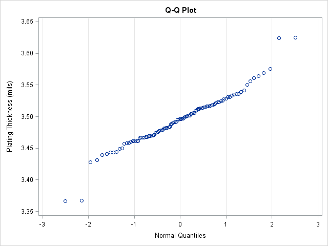
The first Q-Q plot indicates whether the model (in this case, the normal distribution) fits the data. If the bulk of the data falls along a straight line, then there is evidence that the model fits. In this case, the model fits most of the data but not the four (artificial) points that I added.
If these were all real data, you might wrestle with whether you should accept the normal model or choose an alternative model. The Q-Q plot indicates that the normal data seems to fit the central portion of the data.
It would be useful if the plot displayed the percentiles of the normal distribution. The next image shows the Q-Q plot with the PCTLAXES option (in the background) and a probability plot (in the foreground). Notice that the positions of the markers are the same as for the Q-Q plot; only the labels on the axes have changed. The PCTLAXES option for the second QQPLOT statement creates a graph that displays percentiles of the normal distribution at the top of the plot. The probability plot eliminates the quantiles altogether and displays only the normal percentiles
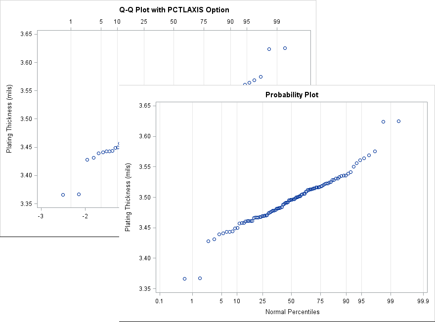
By using the probability plot, you can estimate that the model fits well for the central 95% of the data. Only the upper and lower 2.5th tails of the model do not fit the data. If your goal is to model only the central 95% of the data, it might be fine to ignore the extreme data.
Create a custom probability plot
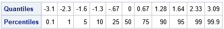
I have previously shown how to construct a Q-Q plot from first principles. If you want to create a probability plot, you first create a Q-Q plot but then use the QUANTILE function to find the quantiles that correspond to the probabilities that you want to display on the axis. For example, the following SAS/IML statements print the quantiles for a set of typical probabilities:
proc iml; p = {0.001 0.01 0.05 0.10 0.25 0.5 0.75 0.9 0.95 0.99 0.999}; qntl = quantile("Normal", p); /* compute tick locations */ print (qntl // 100*p)[r={"Quantiles" "Percentiles"} F=Best4.]; quit; |
You can use the VALUES= and VALUESDISPLAY= options on the XAXIS statement in PROC SGPLOT to display the probability values at the locations of the corresponding quantiles. The following DATA step creates the coordinates for a Q-Q plot but uses the previous table of quantile values to specify the values and labels on the X axis. This can be useful, for example, if you want to customize the probability plot. For example, the following call sets the colors and symbols of the markers, adds a legend, and sets the labels for the axes.
proc sort data=Trans; by Thick; run; data ProbPlot; set Trans nobs=nobs; y = Thick; /* for convenience, call variable Y */ v = (_N_ - 0.375) / (nobs + 0.25); /* Blom (1958) */ q = quantile("Normal", v); run; title "Custom Probability Plot"; proc sgplot data=ProbPlot; scatter x=q y=y; yaxis grid label="Plating Thickness (mils)"; xaxis values=(-3.1 -2.3 -1.6 -1.3 -.67 0.00 0.67 1.28 1.64 2.33 3.09) valuesdisplay=('0.1' '1' '5' '10' '25' '50' '75' '90' '95' '99' '99.9') grid label="Normal Percentiles" fitpolicy=none; run; |
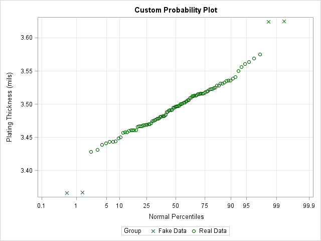
The VALUES= and VALUESDISPLAY= options are very useful. I use them regularly to customize the location of tick marks and the values that are displayed at each tick.
In summary, you can use the QQPLOT statement (with the PCTLAXIS option) or the PROBPLOT statement in PROC UNIVARIATE to create a probability plot. A probability plot is essentially the same as a Q-Q plot except that the X axis displays the percentiles of a model distribution instead of quantiles. If you want additional customization (or want to examine a model that is not supported by PROC UNIVARIATE), then you can create the Q-Q plot manually. You can use the VALUES= and VALUESDISPLAY= options on the XAXIS statement in PROC SGPLOT to display the percentiles of the model distribution. For more about how to interpret a probability plot (especially for a non-normal reference distribution), see the PROC UNIVARIATE documentation.
