A useful feature in PROC SGPLOT is the ability to easily visualize subgroups of data. Most statements in the SGPLOT procedure support a GROUP= option that enables you to overlay plots of subgroups. When you use the GROUP= option, observations are assigned attributes (colors, line patterns, symbols, ...) that indicate the value of the grouping variable. This article reviews the GROUP= option and shows how to trick PROC SGPLOT into performing a group analysis for statements that do not support the GROUP= option.
Three ways to plot data by groups
It is common to use colors or symbols to indicate which observations belong to each category of a grouping variable. Typical grouping variables include gender (male and female), political affiliation (democrats, republicans, and independents), race, education level, and so forth. When you use the SAS SG procedures to plot subsets of the data, there are three ways to arrange the plots. You can plot each group individually, you can create a panel of graphs, or you can overlay the groups on a single graph:
- If you use the BY statement in PROC SGPLOT, each subgroup is plotted independently in its own graph. The axes are scaled based only on the data in that subgroup.
- If you use the PANELBY statement in PROC SGPANEL, each subgroup is plotted in a cell of a lattice in which the axes are scaled to a common range.
- If you use the GROUP= option, the plots for each subgroup are overlaid in a single graph.
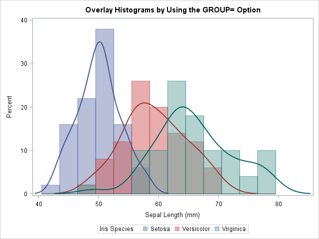
The following SAS statements demonstrate each approach. Only the GROUP= overlay is displayed because that is the topic of this article:
proc sgplot data=Sashelp.Iris; /* BY-group visualization. Three independent graphs. */ by Species; histogram SepalLength; density SepalLength / type=kernel; run; proc sgpanel data=Sashelp.Iris; /* Panel visualization. Shared common axis. */ panelby Species / columns=1 onepanel; histogram SepalLength; density SepalLength / type=kernel; run; proc sgplot data=Sashelp.Iris; /* Overlay three plots in one graph */ histogram SepalLength / GROUP=Species binstart=42 binwidth=3 transparency=0.5; density SepalLength / type=kernel GROUP=Species; run; |
How to emulate the GROUP= option
Many SGPLOT statements (such as the SERIES and SCATTER statements) have supported the GROUP= option since the early days of ODS graphics. For other statements, support for the GROUP= option was added more recently. For example, the GROUP= option was added to the HISTOGRAM and DENSITY statements in SAS 9.4M2.
Here is a trick (shown to me by my colleague, Paul) that you can use to emulate the GROUP= option. If a statement in the SGPLOT procedure does not support the GROUP= option, but the statement DOES support the FREQ= option, you can often use the FREQ= option to construct a graph that overlays the subgroups. You need to do two things. First, you need to create binary indicators variables (sometimes called dummy variables) for each level of the categorical variable. You then use multiple statements, each with a different frequency variable, to overlay the subgroups. These two steps are shown by the following DATA step and call to PROC SGPLOT, which uses the FREQ= trick to overlay three histograms:
/* emulate a GROUP= option for SGPLOT statements that do not support GROUP= */ data IrisFreq; set sashelp.Iris; Freq1 = (Species='Setosa'); /* Binary. Equals 1 if observation is in 'Setosa' group */ Freq2 = (Species='Versicolor'); /* Binary. Equals 1 if observation is in 'Versicolor' group */ Freq3 = (Species='Virginica'); /* Binary. Equals 1 if observation is in 'Verginica' group */ run; title "Overlay Histograms by Using the FREQ= Option"; %let binOpts = binstart=42 binWidth=3 transparency=0.5; /* ensure common bins */ proc sgplot data=IrisFreq; histogram SepalLength / freq=Freq1 &binOpts; /* only the 'Setosa' group */ histogram SepalLength / freq=Freq2 &binOpts; /* only the 'Versicolor' group */ histogram SepalLength / freq=Freq3 &binOpts; /* only the 'Virginica' group */ run; |
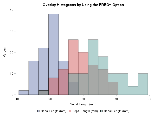
The graph overlays three histograms, one for each value of the Species variable. The result is similar to the earlier graph that used the GROUP= option. You can use the same trick on the DENSITY statement, although you will need to manually set the line attributes so that they match the attributes for the corresponding histograms.
You can use this technique in old versions of SAS to emulate the GROUP= option on the HISTOGRAM statement. You can also use it for statements that do not support the GROUP= option.
Although this example uses the DATA step to manually create the dummy variables that are used as frequencies, you can also create the dummy variables automatically by generating the "design matrix" for the Species variable. The GLMMOD procedure is the simplest way to create dummy variables in SAS, but other procedures provide additional features.
Generate prediction ellipses for groups
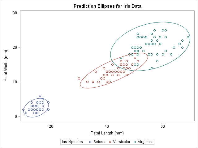
Several years ago I showed how you can overlay prediction ellipses for each group on a scatter plot. (Note that the ELLIPSE statement does not support a GROUP= option.) The technique requires that you transpose the data from long to wide form by creating new variables, one for each group of the categorical variable. Paul recognized that creating a dummy variable and using the FREQ= option is a simpler way to overlay prediction ellipses on a scatter plot:
title "Prediction Ellipses for Iris Data"; proc sgplot data=IrisFreq; scatter x=PetalLength y=PetalWidth / group=Species; ellipse x=PetalLength y=PetalWidth / freq=Freq1 legendlabel="Setosa"; ellipse x=PetalLength y=PetalWidth / freq=Freq2 legendlabel="Versicolor"; ellipse x=PetalLength y=PetalWidth / freq=Freq3 legendlabel="Virginica"; run; |
Advantages and disadvantages of the FREQ= trick
The main advantage of using the FREQ= option for group processing is that it enables you to overlay subgroups even when a statement does not support the GROUP= option. A secondary advantage is that this technique gives you complete control of the attributes of each subgroup. Although you can use the STYLEATTRS statement to control many group attributes, the STYLEATTTRS statement does not enable you to control marker sizes or line widths, to name two examples.
The FREQ= trick does have some disadvantages:
- You can't use the FREQ= trick for statements that produce graphs of categorical variables. The SGPLOT documentation states, “If your plot is overlaid with other categorization plots, then the first FREQ variable that you specified is used for all of the plots.” [My emphasis.]
- As mentioned earlier, if you are trying to produce multiple grouped plots, you might need to manually assign attributes to obtain consistency among the levels of the grouping variables. By default, most ODS styles use different attributes for each statement. If you want the attributes for the fourth statement to match the attributes for the first statement, you need to use an option such as LINEATTRS=GraphData1 on the fourth statement.
In conclusion, if a statement supports the GROUP= option, you should probably use that option to overlay plots of the groups. But if a statement does NOT support the GROUP= option (such as the ELLIPSE and HEATMAP statements), you can use the FREQ= trick to emulate the GROUP= behavior.
I thank my colleague, Paul, for showing me the ellipse example. I hope you agree that this trick is a real treat, not just on Halloween, but every day!

5 Comments
Nice Halloween tie-in! ;-)
Hello, where can i find irisdata to learn how to do these graphs?
The Iris data is distributed as part of SAS software. It is available to all SAS users as part of the SasHelp catalog of example data sets. Use DATA=Sashelp.Iris on the PROC SGPLOT statement.
Rick- Thank you so much for this blog! Your grouping trick facilitated an elegant figure for a paper I am working on. Also- I have profitably used your Simulation book and many of your SAS blogs and comments through the years- it is high time I said thank you. You have clever ways of drilling down to essential nuggets of information.
Again...thanks for your great work!- Erik
I always enjoy hearing when someone finds my efforts useful. Thanks for writing!