Programmers on a SAS discussion forum recently asked about the chi-square test for proportions as implemented in PROC FREQ in SAS. One person asked the basic question, "how do I test the null hypothesis that the observed proportions are equal to a set of known proportions?" Another person said that the null hypothesis was rejected for his data, and he wanted to know which categories were "responsible for the rejection." This article answers both questions and points out a potential pitfall when you specify the proportions for a chi-square goodness-of-fit test in PROC FREQ.
The basic idea: The proportion of party affiliations for a group of voters
To make these questions concrete, let's look at some example data. According to a 2016 Pew research study, the party affiliation of registered voters in the US in 2016 was as follows: 33% of voters registered as Democrats, 29% registered as Republicans, 34% were Independents, and 4% registered as some other party. If you have a sample of registered voters, you might want to ask whether the observed proportion of affiliations matches the national averages. The following SAS data step defines the observed frequencies for a hypothetical sample of 300 voters:
data Politics; length Party $5; input Party $ Count; datalines; Dem 125 Repub 79 Indep 86 Other 10 ; |
You can use the TESTP= option on the TABLES statement in PROC FREQ to compare the observed proportions with the national averages for US voters. You might assume that the following statements perform the test, but there is a potential pitfall. The following statements contain a subtle error:
proc freq data=Politics; /* National Pct: D=33%, R=29%, I=34%, Other=04% */ tables Party / TestP=(0.33 0.29 0.34 0.04) nocum; /* WARNING: Contains an error! */ weight Count; run; |
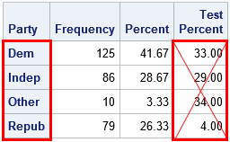
If you look carefully at the OneWayFreqs table that is produced, you will see that the test proportions that appear in the fourth column are not the proportions that we intended to specify! The problem is that order of the categories in the table is alphabetical whereas the proportions in the LISTP= option correspond to the order that the categories appear in the data. In an effort to prevent this mistake, the documentation for the TESTP= option warns you to "order the values to match the order in which the corresponding variable levels appear in the one-way frequency table." The order of categories is important in many SAS procedures, so always think about the order! (The ESTIMATE and CONTRAST statements in linear regression procedures are other statements where order is important.)
Specify the test proportions correctly
To specify the correct order, you have two options: (1) list the proportions for the TESTP= option according to the alphabetical order of the categories, or (2) use the ORDER=DATA option on the PROC FREQ statement to tell the procedure to use the order of the categories as they appear in the data. The following statement uses the ORDER=DATA option to specify the proportions:
proc freq data=Politics ORDER=DATA; /* list proportions in DATA order */ /* D=33%, R=29%, I=34%, Other=04% */ tables Party / TestP=(0.33 0.29 0.34 0.04); /* cellchi2 not available for one-way tables */ weight Count; ods output OneWayFreqs=FreqOut; output out=FreqStats N ChiSq; run; |
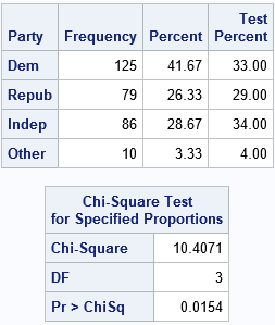
The analysis is now correctly specified. The chi-square table indicates that the observed proportions are significantly different from the national averages at the α = 0.05 significance level.
Which categories are "responsible" for rejecting the null hypothesis?
A SAS programmer posted a similar analysis on a discussion and asked whether it was possible to determine which categories were the most different from the specified proportions. The analysis shows that the chi-square test rejects the null hypothesis, but does not indicate whether only one category is different than expected or whether many categories are different.
Interestingly, PROC FREQ supports such an option for two-way tables when the null hypothesis is the independence of the two variables. Recall that the chi-square statistic is a sum of squares, where each cell in the table contributes one squared value to the sum. The CELLCHI2 option on the TABLES statement "displays each table cell’s contribution to the Pearson chi-square statistic.... The cell chi-square is computed as
(frequency – expected)2 / expected
where frequency is the table cell frequency (count) and expected is the expected cell frequency" under the null hypothesis.
Although the option is not supported for one-way tables, it is straightforward to use the DATA step to compute each cell's contribution. The previous call to PROC FREQ used the ODS OUTPUT statement to write the OneWayFreqs table to a SAS data set. It also wrote a data set that contains the sample size and the chi-square statistic. You can use these statistics as follows:
/* create macro variables for sample size and chi-square statistic */ data _NULL_; set FreqStats; call symputx("NumObs", N); call symputx("TotalChiSq", _PCHI_); run; /* compute the proportion of chi-square statistic that is contributed by each cell in the one-way table */ data Chi2; set FreqOut; ExpectedFreq = &NumObs * TestPercent / 100; Deviation = Frequency - ExpectedFreq; ChiSqContrib = Deviation**2 / ExpectedFreq; /* (O - E)^2 / E */ ChiSqPropor = ChiSqContrib / &TotalChiSq; /* proportion of chi-square contributed by this cell */ format ChiSqPropor 5.3; run; proc print data=Chi2; var Party Frequency TestPercent ExpectedFreq Deviation ChiSqContrib ChiSqPropor; run; |
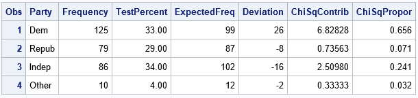
The table shows the numbers used to compute the chi-square statistic. For each category of the PARTY variable, the table shows the expected frequencies, the deviations from the expected frequencies, and the chi-square term for each category. The last column is the proportion of the total chi-square statistic for each category. You can see that the 'Dem' category contributes the greatest proportion. The interpretation is that the observed count of the 'Dem' group is much greater than expected and this is the primary reason why the null hypothesis is rejected.
You can also create a bar chart that shows the contributions to the chi-square statistic. You can create the "chi-square contribution plot" by using the following statements:
title "Proportion of Chi-Square Statistic for Each Category"; proc sgplot data=Chi2; vbar Party / response=ChiSqPropor datalabel=ChiSqPropor; xaxis discreteorder=data; yaxis label="Proportion of Chi-Square Statistic" grid; run; |
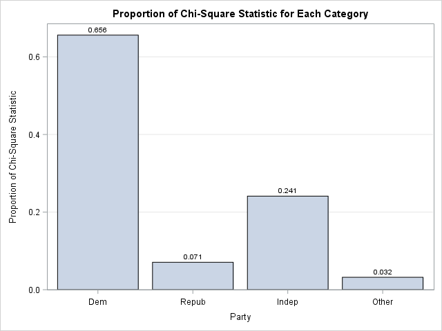
The bar chart makes it clear that the frequency of the 'Dem' group is the primary factor in the size of the chi-square statistic. The "chi-square contribution plot" is a visual companion to the Deviation Plot, which is produced automatically by PROC FREQ when you specify the PLOTS=DEVIATIONPLOT option. The Deviation Plot shows whether the counts for each category are more than expected or less than expected. When you combine the two plots, you can make pronouncements like Goldilocks:
- The 'Dem' group contributes the most to the chi-square statistic because the observed counts are "too big."
- The 'Indep' group contributes a moderate amount because the counts are "too small."
- The remaining groups do not contribute much because their counts are "just right."
Summary
In summary, this article addresses three topics related to testing the proportions of counts in a one-way frequency table. You can use the TESTP= option to specify the proportions for the null hypothesis. Be sure that you specify the proportions in the same order that they appear in the OneWayFreqs table. (The ORDER=DATA option is sometimes useful for this.) If the data proportions do not fit the null hypothesis, you might want to know why. One way to answer this question is to compute the contributions of each category to the total chi-square computation. This article shows how to display that information in a table or in a bar chart.

1 Comment
One suggestion -- the post says, “To specify the correct order, you have two options: ….” There’s another option, which might actually be the best option to reduce user error (in assigning test percents to levels) – provide the test percents in a data set (and then specify any display order). Like this,