My colleague, Robert Allison, recently published an interesting visualization of the relationship between chess ratings and age. His post was inspired by the article "Age vs Elo — Your battle against time," which was published on the chess.com website. ("Elo" is one of the rating systems in chess.) Robert Allison's article indicates how to download the 2014 Elo ratings for 70,963 active players into a SAS data set. You can use PROC SGPLOT to create a scatter plot of the rating and age of each player. Because the graph displays so many observations, I followed Robert's advice and used semi-transparency to bring out hidden features in the data. I also colored each marker according to whether the player is male (blue) or female (light red). The results are shown below:
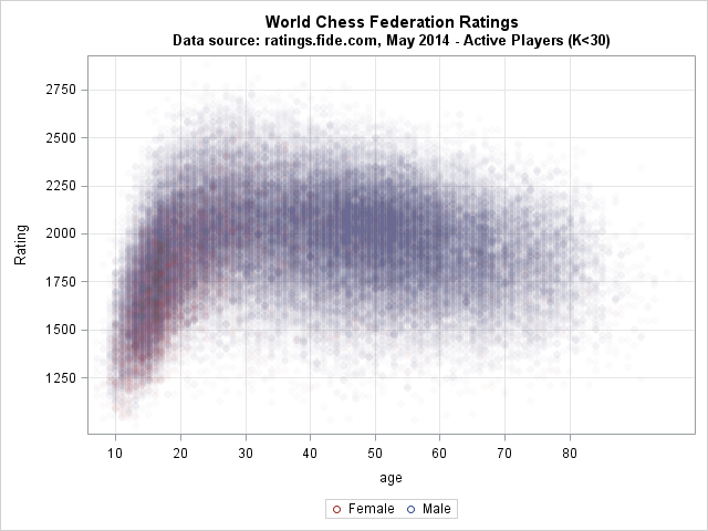
As pointed out in the previous articles, ratings depend on age in a nonlinear fashion. The ratings for young players tend to be less than for young adults. Ratings tend to be highest for players in their mid to late twenties. After age 30, ratings tend to decrease with age. The purpose of this article is to use statistical regression to predict ratings from age.
Predict percentiles of Elo rating as a function of age
The chess.com article shows a line plot that is formed by binning the players' ages into five-year age ranges, computing the average rating in each bin, and then connecting the means in each age group. This bin-and-connect-the-means method is less powerful than regression, but approximates the nonlinear relationship between age and the average rating for that age. A more powerful statistical technique is quantile regression. In quantile regression, you model the percentiles of the response variable, such as the 25th, 50th, or 90th percentile of the distribution of ratings for a given age. In other words, quantile regression enables you to compute separate predictions for the ratings of poor players, for good players, and for great players. A previous article compares quantile regression with the simpler binning technique.
I used the QUANTREG procedure in SAS to performs quantile regression to model the 10th, 25th, 50th, 75th, and 90th percentiles of rating as a function of age. (Quantiles are numbers between 0 and 1, whereas percentiles are between 0 and 100, but otherwise the terms are interchangeable.) I ignored the gender of the players. The following graph is the default plot that is created by PROC QUANTREG. The lowest curve shows the predicted rating for the 10th percentile of players (the weak players) as a function of age. The middle curve shows the predicted rating for the 50th percentile of players (the average players). The highest curve shows the predicted rating for the 90th percentile, who are excellent chess players.
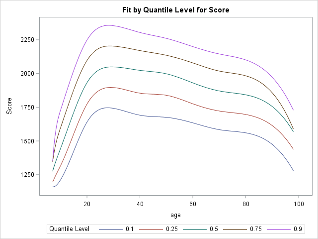
For the shown percentiles, the predicted chess ratings increase quickly for young players, then peak for players in their mid-twenties. This happens for all percentiles, from the 10th to the 90th. For example, the median player (50th percentile) at age 29 has a rating of about 2050. In contrast, the 90th percentile for a 29-year-old is about 2356.
This plot should remind you of a children's weight and height charts in a doctor's office. Just as the mother of a young child might use the doctor's chart to estimate her child's percentile for weight and height, so too can a chess player use this chart to estimate his percentile for rating. If you are a chess player, find your age on the horizontal axis. Then trace a line straight up until you reach your personal Elo rating. Use the relative position of the surrounding curves to estimate your rating percentile. For example, a 40-year-old with a 1900 rating could conclude from the graph that he is between the 25th and 50th percentile, but closer to the 50th.
As I said, this graph is created by default, but we can do better. In the following section, I add separate curves for women and men. I also add grid lines to make it easier to estimate coordinates in the graph.
Adding gender to the predict percentiles
Chess is enjoyed by both men and women. If you add gender to the quantile regression model, you obtain separate curves for men and women for each percentile. The following graph shows the predicted percentiles for the 10th, 50th, and 90th percentiles, for both men and women. Notice that the predicted male ratings are higher than the predicted female ratings at every age and for each quantile. Notice also that the predicted scores for females tend to peak later in life: about 30 years for females versus 25 for males. After peaking, the female curves drop off more quickly than their male counterparts.
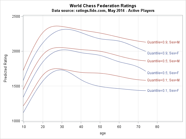
Percentiles for Elo chess ratings by gender
The previous section overlays the male and female percentile curves. This makes it easy to compare males and females, but even with only three quantiles, the graph is crowded. If you want to display five or more percentile curves, it makes sense to separate the graph into a panel that contains two graphs, one for males and one for females. Again, this is similar to the height-weight percentile charts in the pediatrician offices, which often have separate charts for boys and girls.
The following panel shows side-by-side predictions for quantiles of ratings as a function of age. If you are a chess player, you can use these charts to estimate your rating percentile. For your current age and gender, what is your percentile?
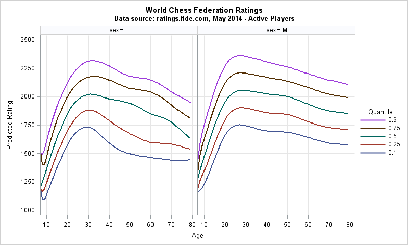
In summary, I used data for Elo ratings in chess to build a quantile regression model that predicts percentiles of ratings for a given age and gender. Using these graphs, you can see the predicted Elo ratings for poor, good, and great chess players for every combination of age and gender. If you are a chess player yourself, you can locate your age-score value in one of the plots and estimate your percentile among your age-gender peer group.
If you are a SAS user and are interested in the details, you can download the SAS program that creates the analysis and graphs. It uses PROC QUANTREG to predict the quantile curves, and uses tips and techniques from the articles "How to score and graph a quantile regression model in SAS" and "Plot curves for levels of two categorical variables in SAS."

6 Comments
Interesting analysis!
Looks like a few linka are broken.
Otherwise, awesome post!
Thanks, Paul. I fixed the links you reported.
Very cool, as usual. It's interesting that, for chess ratings, the lines are mostly parallel. I've done some QUANTREGs (e.g. for the birthweight data that SAS provides) that show non-parallel lines, which can be cool. I've presented them a couple times and am doing it again at MWSUG.
Hi Rick, I write a chess blog (www.danamackenzie.com/blog) and I would be interested in showing the age quantile plots for chess ratings. But I'd like to ask your permission first.
Also -- separate issue entirely -- I am also a freelance writer working on a book for the American Mathematical Society. I was looking online for a visual illustration of low-rank matrices and came across the beautiful pictures in your post from August 30, 2017. That's how I found your blog, in fact. (Math first, chess second!) To use those images I would need to get formal permission from you, as the AMS would not allow me use them otherwise.
If you're willing to give permission for either of these items, please e-mail me or indicate how I can get in touch with you. Thanks!
Dana Mackenzie / Freelance Mathematics and Science Writer
scribe (at) danamackenzie (dot) com
Yes. You may reproduce the graphs provided that you give proper attribution, including linking to the original article.
Yes, you may use the images (or the ideas behind them) in your AMS book; same attribution requirements. If AMS needs me to sign something, email me or connect on LinkedIn and we'll work it out.