A previous article showed how to use a calibration plot to visualize the goodness-of-fit for a logistic regression model. It is common to overlay a scatter plot of the binary response on a predicted probability plot (below, left) and on a calibration plot (below, right):
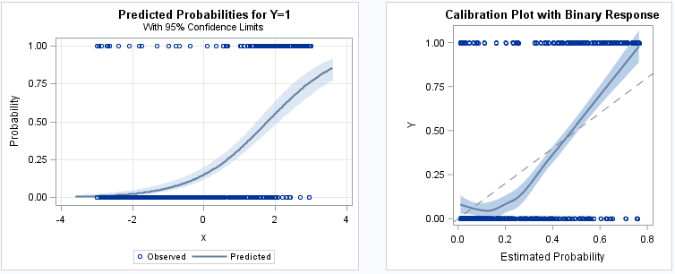
The SAS program that creates these plots is shown in the previous article. Notice that the markers at Y=0 and Y=1 are displayed by using a scatter plot. Although the sample size is only 500 observations, the scatter plot for the binary response suffers from overplotting. For larger data sets, the scatter plot might appear as two solid lines of markers, which does not provide any insight into the distribution of the horizontal variable. You can plot partially transparent markers, but that does not help the situation much. A better visualization is to eliminate the scatter plot and instead use a binary fringe plot (also called a butterfly fringe plot) to indicate the horizontal positions for each observed response.
A predicted probability plot with binary fringe
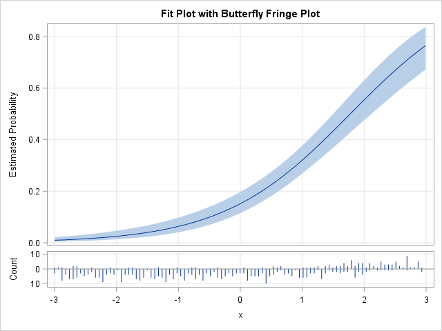
A predicted probability plot with a binary fringe plot is shown to the right. Rather than use the same graph area to display the predicted probabilities and the observed responses, a small "butterfly fringe plot" is shown in a panel below the predicted probabilities. The lower panel indicates the counts of the responses by using lines of various lengths. Lines that point down indicate the number of counts for Y=0 whereas lines that point up indicate the counts for Y=1. For these data, the X values less than 1 have many downward-pointing lines whereas the X values greater than 1 have many upward-pointing lines.
To create this plot in SAS, you can do the following:
- Use PROC LOGISTIC to output the predicted probabilities and confidence limits for a logistic regression of Y on a continuous explanatory variable X.
- Compute the min and max of the continuous explanatory variable.
- Use PROC UNIVARIATE to count the number of X values in each of 100 bins in the range [min, max] for Y=0 and Y=1.
- Merge the counts with the predicted probabilities.
- Define a GTL template to define a panel plot. The main panel shows the predicted probabilities and the lower panel shows the binary fringe plot.
- Use PROC SGRENDER to display the panel.
You can download the SAS program that defines the GTL template and creates the predicted probability plot.
A calibration plot with binary fringe
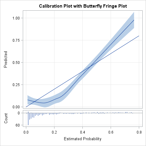
By using similar steps, you can create a calibration plot with a binary fringe plot as shown to the right. The main panel is used for the calibration plot and a small binary fringe plot is shown in a panel below it. The lower panel shows the counts of the responses at various positions. Note that the horizontal variable is the predicted probability from the model whereas the vertical variable is the empirical probability as estimated by the LOESS procedure. For these simulated data, the fringe plot shows that most of the predicted probabilities are less than 0.2 and these small values mostly correspond to Y=0. The observations for Y=1 mostly have predicted probabilities that are greater than 0.5. The fringe plot reveals that about 77% of the observed responses are Y=0, a fact that was not apparent in the original plots that used a scatter plot to visualize the response variable.
To create this plot in SAS, you can do the following:
- Use PROC LOGISTIC to output the predicted probabilities for any logistic regression.
- Use PROC LOESS to regress Y onto the predicted probability. This estimates the empirical probability for each value of the predicted probability.
- Use PROC UNIVARIATE to count the number of predicted probabilities for each of 100 bins in the range [0, 1] for Y=0 and Y=1.
- Merge the counts with the predicted probabilities.
- Define a GTL template to define a panel plot. The main panel shows the calibration plot and the lower panel shows the binary fringe plot.
- Use PROC SGRENDER to display the panel.
You can download the SAS program that defines the GTL template and creates the calibration plot.
For both plots, the frequencies of the responses are shown by using "needles," but you can make a small change to the GTL to make the fringe plot use thin bars so that it looks more like a butterfly plot of two histograms. See the program for details.
What do you think of this plot? Do you like the way that the binary fringe plot visualizes the response variable, or do you prefer the classic plot that uses a scatter plot to show the positions of Y=0 and Y=1? Leave a comment.

5 Comments
Sweet! Thank you.
I would like to create a plot the probability of an event using logistic regression in SAS. I try to follow sas code from SAS manual but it doesn't work properly. I have no idea what's going on. I use this code..
data Data1;
input disease n age;
datalines;
0 14 25
0 20 35
0 19 45
7 18 55
6 12 65
17 17 75
;
ods graphics on;
proc logistic data=Data1;
model disease/n=age / scale=none clparm=wald clodds=pl rsquare outroc=roc1;
units age=10;
run;
ods graphics off;
symbol1 i=join v=none c=black;
proc gplot data=roc1;
title ’ROC Curve’;
plot _sensit_*_1mspec_=1 / vaxis=0 to 1 by .1 cframe=white;
run;
ods graphics on;
proc logistic data=Data1;
model disease/n=age / scale=none clparm=wald clodds=pl rsquare outroc=roc1;
units age=10;
graphics estprob;
run;
ods graphics off;
May I have your help. Sir.
Thank you,
I have three suggestions:
1. On the PROC LOGISTIC statement, specify
proc logistic data=Data1 plots=(effectplot roc);
PROC LOGISTIC will automatically create the graphs you want.
2. To ask questions like this, post your code and question to the SAS Support Community for Statistical Procedures.
3. When creating graphs in SAS, consider using the newer SGPLOT procedure instead of the older GPLOT procedure.
Is there an easy way to use "a fringe plot" to plot log(odds) versus explanatory variables in order to check the linear assumption?
Regards, Sabina
Pingback: An easier way to create a calibration plot in SAS - The DO Loop