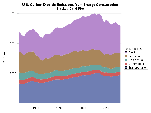
This article shows how to construct a "stacked band plot" in SAS, as shown to the right. (Click to enlarge.) You are probably familiar with a stacked bar chart in which the cumulative amount of some quantity is displayed by stacking the contributions of several groups. A canonical example is a bar chart of revenue for a company in which the revenues for several regions (North America, Europe, Asia, and so forth) are stacked to show the total revenue. If you plot the revenue for several years, you get a stacked bar chart that shows how the total revenue changes over time, as well as the changes in the regional revenues. A stacked band plot is similar, but it is used when the horizontal variable is continuous rather than discrete.
Create a stacked bar chart in SAS
A few years ago Sanjay and I each wrote about ways to create a stacked bar chart in SAS by using the SGPLOT procedure in SAS. Recently I created a stacked bar chart that spanned about 20 years of data. When I looked at it, I realized that as the number of categories (years) grows, the bars become a nuisance. The graph becomes cluttered with vertical bars that are not necessary to show the underlying trends in the data. At that point, it is better to switch to a continuous scale and use a stacked band plot.
This section shows how to create a stacked bar chart by using PROC SGPLOT. The next section shows how to create a stacked band chart.
For data, I decided to use the amount of carbon dioxide (CO2, in million metric tons) that is produced by several sources from 1973–2016. These data were plotted as a stacked bar chart by my friend Robert Allison. The data are originally in "wide form," with five variables that contain the data. For a stacked bar chart, you should convert the data to "long form," as follows. You can download the complete SAS program that creates the graphs in this article.
/* 1. Original data is in "wide form": CO2 emission for five sources for each year. */ data CO2; informat Transportation Commercial Residential Industrial Electric COMMA5.; input Year Transportation Commercial Residential Industrial Electric; datalines; 2016 1,879 235 308 928 1,821 2015 1,845 240 321 942 1,913 2014 1,821 233 347 955 2,050 2013 1,803 223 333 952 2,050 ... more lines ... ; /* 2. Convert from wide to long format */ proc sort data=CO2 out=Wide; by Year; /* sort X categories */ run; proc transpose data=Wide out=Long(rename=(Col1=Value))/* name of new column that contains values */ name=Source; /* name of new column that contains categories */ by Year; /* original X var */ var Transportation Commercial Residential Industrial Electric; /* original Y vars */ run; |
For data in the long form, you can use the VBAR statement and the GROUPDISPLAY=STACK option in PROC SGPLOT to create a stacked bar chart, as follows:
/* 3. create a stacked bar chart */ ods graphics / subpixel=on; title "U.S. Carbon Dioxide Emissions from Energy Consumption"; title2 "Stacked Bar Chart"; proc sgplot data=Long; vbar Year / response=Value group=Source groupdisplay=stack grouporder=data; xaxis type=linear thresholdmin=0; /* use TYPE=LINEAR so not every bar is labeled */ yaxis grid values=(0 to 6000 by 1000); label Source = "Source of CO2" Value = "CO2 (mmt)"; run; |
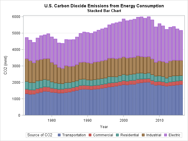
The graph is not terrible, but it can be improved. The vertical lines are a distraction. With 43 years of data, the horizontal axis begins to lose its discrete nature. All those bars and the gaps between bars are cluttering the display. The next section shows how to create two new variables and use those variables to create a stacked band plot.
Create a stacked band plot
To create a stacked band chart with PROC SGPLOT, you must create two new variables. The cumValue variable will contain the cumulative amount of CO2 per year as you accumulate the amount for each group (Transportation, Commercial, Residential, and so forth). This will serve as the upper boundary of each band. The Previous variable will contain the lower boundary of each band. You can use the LAG function in Base SAS to easily obtain the previous cumulative value: Previous = lag(cumValue). When you create these variables, you need to initialize the value for the first group (Transportation). Use the BY YEAR statement and the FIRST.YEAR indicator variable to detect the beginning of each new value of the Year variable, as follows:
/* 4. Accumulate the contributions of each group in the 'cumValue' variable. Add the lag(cumValue) variable and call it 'Previous'. Create a band plot for each group with LOWER=Previous and UPPER=cumValue. */ data Energy; set Long; by Year; if first.Year then cumValue=0; /* for each year, initialize cumulative amount to 0 */ cumValue + Value; Previous = lag(cumValue); if first.Year then Previous=0; /* for each year, initialize baseline value */ label Source = "Source of CO2" cumValue = "CO2 (mmt)"; run; title2 "Stacked Band Plot"; proc sgplot data=Energy; band x=Year lower=Previous upper=cumValue / group=Source; xaxis display=(nolabel) thresholdmin=0; yaxis grid; keylegend / position=right sortorder=reverseauto; /* SAS 9.4M5: reverse legend order */ run; |
The graph appears at the top of this article. The vertical lines are gone. The height of a band shows the amount of CO2 that is produced by the corresponding source. The top of the highest band (Electric) shows the cumulative amount of CO2 that is produced by all sources. This kind of display makes it easy to see the cumulative total. If you want to see the trends for each individual source, a time series plot would be a better choice.
The graph uses a new feature of SAS 9.4M5. The KEYLEGEND statement now supports the SORTORDER=REVERSEAUTO option, which reverses the order of the legend elements. This option makes the legend match the bottom-to-top progression of the stacked bar chart. I also used the POSTITION= option to move the legend to the right side so that the legend is next to the color bands.
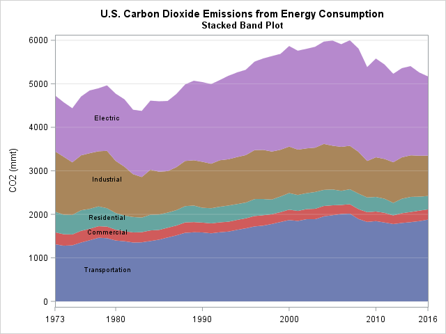
Label the stacked bands directly
If you have very thin bands, a legend is probably the best way to associate colors with groups. However, for these data the bands are wide enough that you might want to display the name of each group on the bands. I tried several label positions (left, center, and right) and decided to display the group name near the left side of the graph. Since many people scan a graph from left to right, this causes the reader to see the labels early in the scanning process.
The following DATA step computes the positions for the labels. I use 1979 as the horizontal position and use the midpoint of the band as the vertical position. After you compute the positions for the labels, you can concatenate the data and the labels and use the TEXT statement to overlay the labels on the band plot, as follows:
data Labels; set Energy; where Year = 1979; /* position labels at 1979 */ Label = Source; XPos = Year; YPos = (cumValue + Previous) / 2; keep Label XPos YPos; run; data EnergyLabels; set Energy Labels; run; title2 "Stacked Band Plot"; proc sgplot data=EnergyLabels noautolegend; band x=Year lower=Previous upper=cumValue / group=Source; refline 1000 to 6000 by 1000 / axis=y lineattrs=GraphGridLines transparency=0.75; text x=XPos y=Ypos text=Label; xaxis display=(nolabel) values=(1973, 1980 to 2010 by 10, 2016) offsetmin=0 offsetmax=0; yaxis grid values=(0 to 6000 by 1000) label="CO2 (mmt)"; run; |
Summary
In summary, you can use PROC SGPLOT to create a stacked band plot in SAS. A stacked band plot is similar to a stacked bar chart but presumes that the positions of the bars represent a continuous variable on a linear scale. For this example, the bars represented years. You can let PROC SGPLOT automatically place the legend along the bottom, but if you have SAS 9.4M5 you might want to move the legend to the right and use the SORTORDER=REVERSEAUTO option to reverse the legend order. Alternatively, you can display labels on the bands directly if there is sufficient room.

10 Comments
Great example of logical evolution from stacked bar charts to stacked band plots.
that is a lot of work for something that takes 5 minutes in excel. seems like stacked bands or series is just not a SAS thing.
About evolution without progress.
Unless you create the stacked band plot in a web-enabled manner, it suffers the same, in my opinion disqualifying, defect as the stacked bar chart. There is NO way to know reliably the PRECISE value of any band component's measure of interest. In a plot it is the measure at that point in time that you don't know precisely.
Running your eye from two points on plot lines over to the vertical axis, estimating the numbers by visually interpolating between tick mark values, and then mentally subtracting those two estimates is not the path to precise knowledge.
In a chart, plot, graph, infographic, or whatever, you need both image and precise numbers.
Image provides easy, quick inference.
Precise numbers provide reliable, accurate inference.
Web enablement makes precise numbers at least temporarily accessible via pop-up text. For a multi-line or multi-band plot, static annotation is not practical. A companion table is the only choice for non-web information packaging in this kind of visual.
I have my 17-inch laptop set at the recommended resolution, 1920 X 1080. IF I were to change the resolution to, say, 1280 X 720 (still respecting the 16 X 9 aspect ratio, I would get a magnified view. But any visual should by design, be readable for non-exotic viewer without having to take extraordinary measures. The explanatory text of this blog posting is eminently readable. The code font is smaller, but I can still read it. Now to the visuals.
In the plot at the upper right, I can easily read the title and the title of the legend. I CAN read the legend entries, the tick mark values with a bit of visual guessing, but what's in the parenthesis for the vertical axis label I just do not know for sure. If it is ppm for parts per million, whatever are the units could have been added to the chart title.
In the plot at the upper right, I can easily read the title and the title of the legend. I CAN read the legend entries, the tick mark values with a bit of visual guessing, but what's in the parenthesis for the vertical axis label I cannot read. Whatever are the units could have been added to the chart title, and axis label could have been omitted. We read horizontally, not vertically. If no ambiguity, axis labels should simply be omitted, as was the case for the horizontal axis in this case. Often axis identities are already evident from the title, and if still needed, are better placed in a subtitle.
The other problem with that plot is the size of the legend color samples. If the order of the legend entries was not the same as the order of the bands, it would be impossible to know which band is Electrical vs Industrial. Color to be reliably distinguishable must be big enough in area (legend samples or plot markers) or wide enough in thickness (lines and text).
In the plot at the lower left, the associability challenge for the legend was substituted with a readability challenge by putting the labels right into the areas. The resulting problems are text that is too small to easily read (squashed to fit into the narrow bands), and insufficient contrast between the color of the text and the color of the band background. White text would be more readable for some of the bands, especially the blue band, but the font size would still be insufficient. The only worse choice than black on blue is black on black.
I have been sharing advice about the communication-effective use of color with SAS users since 1995. For my latest sharing, see
http://nebsug.org/wp-content/uploads/2016/05/2016-Bessler-Paper-IASUG-NebSUG-2016-Paint-a-Better-Picture-of-Your-Information-with-Color.pdf
I have been advocating for “grouped” bar charts with a total bar in each group, instead of stacked bars, since 1992. See, for example,
http://www.sascommunity.org/sugi/SUGI92/Sugi-92-45%20Bessler.pdf
LeRoy Bessler PhD
Visual Data Insights™
Strong Smart Systems™
Thanks for taking the time to write this nice summary. Your issues are well stated and address best practices in data visualization. The purpose of my blog is to share ideas and programming tips, so thanks for sharing yours!
Several of your concerns can be addressed by using features of PROC SGPLOT:
Regarding displaying precise values, you can create graphs that display tool tips that appear when you hover the pointer over a marker. All you need to do is enable the option by using ODS GRAPHICS / IMAGEMAP;. Then you can use the TIP=(variable-list) option to specify the variables whose values you want to display in the tips.
Yes, the default sizes of the graphs in the blog are small. I do that because some people subscribe to my blog by email. On the web version, you can click on the graph and see it at the resolution that it was created. I usually create graphs to have 480 horizontal pixels, which fits well in a browser. Many SAS users know that they can use a statement such as ODS GRAPHICS / WIDTH=1280 HEIGHT=720; to generate the graph at a different resolution.
Yes, the default size of the legend items might be too small for some people. That's why PROC SGPLOT enables you to control the size of the "swatch" that is displayed in legends. In fact, there are many ways to configure the size and appearance of legends in the graph. I usually accept the default properties so that the code in the post does not become too complicated.
Best wishes and happy visualizations!
After my personal crusade, the developers provided control of the size of the color swatches.
Excel to this day still does not provide control of color swatches in any of its legends, or perhaps I have just not found it.
The benefit of less work and less time to create a chart or plot can come at the cost of needed or wanted capability.
I recognize that band plots are very, very popular. In most cases, perhaps people don't care about providing the precise numbers. They may just want to provide a rough visual comparison over time. Easy is always a natural solution, even if sub-optimal in consequences.
Data tips were mercifully available for HTML in ODS Graphics from the beginning. However, in the case of the band plot, the automatic data tips would be for the y values, not for the difference at each point between the current y value and the y value of the line below if. For SAS/GRAPH, I could provide such customized data tips. For ODS Graphics, I have no immediate idea how to do that.
Pingback: 10 posts from 2018 that deserve a second look - The DO Loop
Is there a way to select specific colors for the bands? I'm thinking shades of gray for print friendly purposes or to not have the green and red side by side for accessibility. I have tried to define a color style using proc template but this does not seem to work with the band statement.
The SAS/STAT documentation has an entire chapter about choosing styles and attributes. The easiest way to use the JOURNAL style. For example, if you are writing to the RTF destination, you can use
The advantage of using (or modifying) a style is that it applies to all graphs. If you only need to modify the attributes for a single graph, you can use the STYLEATTR statement to set the fill colors for one plot at a time. For the band plot, you can use the following:
The PALETTE function in SAS/IML enables you to choose a set of greyscale colors that is optimal for distinguishing classes.
I would like to create the last graph using 5 specific color in RGB.
I do not know how to change these colors.
Thanks
Jorge
Use the STYLEATTRS statement. as discussed in a previous comment. For example,
styleattrs DATACOLORS=(darkred darkgreen blue darkorange purple);