In a previous article, I discussed the lines plot for multiple comparisons of means. Another graph that is frequently used for multiple comparisons is the diffogram, which indicates whether the pairwise differences between means of groups are statistically significant. This article discusses how to interpret a diffogram. Two related plots are also discussed.
How to create a diffogram in SAS
The diffogram (also called a mean-mean scatter diagram) is automatically created when you use the PDIFF=ALL option on the LSMEANS statement in several SAS/STAT regression procedures such as PROC GLM and PROC GLMMIX, assuming that you have enabled ODS graphics. The documentation for PROC GLM contains an example that uses data about the chemical composition of shards of pottery from four archaeological sites in Great Britain. Researchers want to determine which sites have shards that are chemically similar. The data are contained in the pottery data set. The following call to PROC GLM performs an ANOVA of the calcium oxide in the pottery at the sites. The PDIFF=ALL option requests an analysis of all pairwise comparisons between the LS-means of calcium oxide for the different sites. The ADJUST=TUKEY option is one way to adjust the confidence intervals for multiple comparisons.
ods graphics on; proc glm data=pottery plots(only)=( diffplot(center) /* diffogram */ meanplot(cl ascending) ); /* plot of means and CIs */ label Ca = "Calcium Oxide (%)"; class Site; model Ca = Site; lsmeans Site / pdiff=all cl adjust=tukey; /* all pairwise comparisons of means w/ adjusted CL */ ods output LSMeanDiffCL=MeanDiff; /* optional: save mean differences and CIs */ quit; |
Two graphs are requested: the diffogram (or "diffplot") and a "mean plot" that shows the group means and 95% confidence intervals. The ODS OUTPUT statement creates a data set from a table that contains the mean differences between pairs of groups, along with 95% confidence intervals for the differences. You can use that information to construct a plot of the mean differences, as shown later in this article.
How to interpret a diffogram
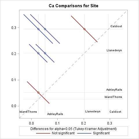
The diffogram, which is shown to the right (click to enlarge), is my favorite graph for multiple comparisons of means. Every diffogram displays a diagonal reference line that has unit slope. Horizontal and vertical reference lines are placed along the axes at the location of the means of the groups. For these data, there are four vertical and four horizontal reference lines. At the intersection of most reference lines there is a small colored line segment. These segments indicate which of the 4(4-1)/2 = 6 pairwise comparisons of means are significant.
Let's start at the top of the diffogram. The mean for the Caldecot site is about 0.3, as shown by a horizontal reference line near Y=0.3. On the reference line for Caldecot are three line segments that are centered at the mean values for the other groups, which are (from left to right) IslandThorns, AshleyRails, and Llanederyn. The first two line segments (in blue) do not intersect the dashed diagonal reference line, which indicates that the means for the (IslandThorns, Caldecot) and (AshleyRails, Caldecot) pairs are significantly different. The third line segment (in red) intersects the diagonal reference line, which indicates that the (Llanederyn, Caldecot) comparison is not significant.
Similarly, the mean for the Llanederyn site is about 0.2, as shown by a horizontal reference line near Y=0.2. On the reference line for Llanederyn are two line segments, which represent the (IslandThorns, Llanederyn) and (AshleyRails, Llanederyn) comparisons. Neither line segment intersects the diagonal reference line, which indicates that the means for those pairs are significantly different.
Lastly, the mean for the AshleyRails site is about 0.05, as shown by a horizontal reference line near Y=0.05. The line segment on that reference line represents the (IslandThorns, AshleyRails) comparison. It intersects the diagonal reference line, which indicates that those means are not significantly different.
The colors for the significant/insignificant pairs depends on the ODS style, but it is easy to remember the simple rule: if a line segment intersects the diagonal reference line, then the corresponding group means are not significantly different. A mnemonic is "Intersect? Insignificant!"
The mean plot with confidence interval: Use wisely!
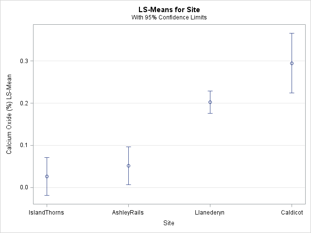
The previous section shows how to use the diffogram to visually determine which pairs of means are significantly different. This section reminds you that you should not try to use the mean plot (shown at the right) for making those inferences.
I have seen presentations in which the speaker erroneously claims that "the means of these groups are significantly different because their 95% confidence intervals do not overlap." That is not a correct inference. In general, the overlap (or lack thereof) between two (1 – α)100% confidence intervals does not give sufficient information about whether the difference between the means is significant at the α level. In particular, you can construct examples where
- Two confidence intervals overlap, but the difference of means is significant. (See Figure 2 in High (2014).)
- Two confidence intervals do not overlap, but the difference of means is not significant.
The reason is twofold. First, the confidence intervals in the plot are constructed by using the sample sizes and standard deviations for each group, whereas tests for the difference between the means are constructed by using pooled standard deviations and sample sizes. Second, if you are making multiple comparisons, you need to adjust the widths of the intervals to accommodate the multiple (simultaneous) inferences.
"But Rick," you might say, "in the mean plot for these data, the Llanederyn and Caldecot confidence intervals overlap. The intervals for IslandThorns and AshleyRails also overlap. And these are exactly the two pairs that are not significantly different, as shown by the diffogram!" Yes, that is true for these data, but it is not true in general. Use the diffogram, not the means plot, to visualize multiple comparisons of means.
Plot the pairwise difference of means and confidence intervals
In addition to the diffogram, you can visualize comparisons of means by plotting the confidence intervals for the pairwise mean differences. Those intervals that contain 0 represent insignificant differences. Recall that the call to PROC GLM included an ODS output statement that created a data set (MeanDiff) that contains the mean differences. The following DATA step constructs labels for each pair and computes whether each pairwise difference is significant:
data Intervals; length Pair $28.; length S $16.; set MeanDiff; /* The next line is data dependent. For class variable 'C', concatenate C and _C variables */ Pair = catx(' - ', Site, _Site); Significant = (0 < LowerCL | UpperCL < 0); /* is 0 in interior of interval? */ S = ifc(Significant, "Significant", "Not significant"); run; title "Pairwise Difference of LSMeans (Tukey Adjustment)"; title2 "95% Confidence Intervals of Mean Difference"; footnote J=L "Pairs Whose Intervals Contain 0 Are Not Significantly Different"; proc sgplot data=Intervals; scatter y=Pair x=Difference / group=S name="CIs" xerrorlower=LowerCL xerrorupper=UpperCL; refline 0 / axis=x; yaxis reverse colorbands=odd display=(nolabel) offsetmin=0.06 offsetmax=0.06; keylegend "CIs" / sortorder=ascending; run; |
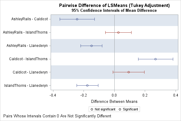
The resulting graph is shown to the right. For each pair of groups, the graph shows an estimate for the difference of means and the Tukey-adjusted 95% confidence intervals for the difference. Intervals that contain 0 indicate that the difference of means is not significant. Intervals that do not contain 0 indicate significant differences.
Although the diffogram and the difference-of-means plot provide the same information, I prefer the diffogram because it shows the values for the means rather than for the mean differences. Furthermore, the height of the difference-of-means plot needs to be increased as more groups are added (there are k(k-1)/2 rows for k groups), whereas the diffogram can accommodate a moderate number of groups without being rescaled. On the other hand, it can be difficult to read the reference lines in the diffogram when there are many groups, especially if some of the groups have similar means.
For more about multiple comparisons tests and how to visualize the differences between means, see the following references:
- High, R. (2014) "Plotting Differences among LSMEANS in Generalized Linear Models," Proceedings of the SAS Global Forum 2014 Conference.
- Hsu, J. (1996) Multiple Comparisons: Theory and Methods.
- Westfall, Tobias, and Wolfinger (2011) Multiple Comparisons and Multiple Tests Using SAS, Second Edition.

8 Comments
Great post, thanks. Agree, the diffogram is very cool. I was going to ask if there was an intuitive explanation for the length of the reference lines, but after reading a bit of Robin High's paper, I'm going to guess the answer is "no"? : )
"A third axis (implied on the graph but not printed by SAS ODS Graphics) exists from the top left to the lower right corners of the plotting area. This hidden axis represents the magnitude of the differences of the LSMEANS defined on the horizontal and vertical axes scaled in such a way [i.e., divided by SQRT(2)] that the confidence interval for the difference crosses the line of equality when the interval contains 0. It also provides values for the endpoints of the confidence intervals necessary for equivalence testing."
I think of it this way. If you look at the formulas for Tukey's pairwise comparison (Tukey-Kramer criterion), you see that is is a probability quantile divided by sqrt(2). Recall that sqrt(2) is the length of the diagonal of a square. The diffogram creates a scatter plot of the mean-mean pairs and equate the axes (to get a square plot), so that if you plot the confidence intervals diagonally, the geometry in the diffogram makes the sqrt(2) factor very natural. Other criteria may or may not have sqrt(2) in their formulas, but you can scale appropriately so that the geometry of the diffogram applies to those other tests as well. For a longer (and more rigorous) explanation, see Hsu and Peruggia (1991).
Thanks again Rick. I did notice that sqrt(2) and had some vague thoughts about Pythagoras. : )
Slightly OT but I live about 2 miles from Llanederyn and never knew SAS documentation contained a data set with data from there! It might easily replace SASHELP.CLASS as my go to table when I write example code!
Fun fact. Go for it!
Thanks for the difference-of-means plot. I also prefer to see the means in the diffogram but in practice this plot is almost always unusable for us for the reasons you give. The alternative here could be useful. It has the advantage over the letter plot or its graphical equivalent that it shows more about the degree of difference. For my colleagues who see significance as a black-or-white concept this is a useful antidote.
Hi, very helpful indeed. What if we want to compare the exponentiated differences between log10 transformed group means and present them as geometric mean ratios with associated 95% confidence intervals?
You can ask questions and post your code at the SAS Support Communities. Briefly, if you have two groups you can use the use PROC TTEST with DIST=LOGNORMAL as mentioned in the topic "Geometric Means" in the FASTats list. You can use LSMEANS / EXP to get the geometric mean estimates. If you want ratios, look at NLEstimate macro.