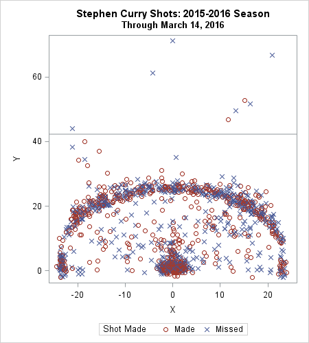
Last week Robert Allison showed how to download NBA data into SAS and create graphs such as the location where Stephen Curry took shots in the 2015-16 season to date. The graph at left shows the kind of graphs that Robert created. I've reversed the colors from Robert's version, so that red indicates "good" (a basket was scored) and blue indicates "bad" (a missed shot). The location of the NBA three-point line is evident by the many markers that form an arc in the scatter plot.
When I saw the scatter plot, I knew that I wanted to add some statistical analysis. In particular, I wanted to use SAS to construct a statistical model that estimates the probability that Curry scores from any position on the basketball court.
This article focuses on the results of the analysis. You can download the SAS program that generates the analyses and graphics. Although this article analyzes Stephen Curry, you can modify the SAS program to analyze Kevin Durant, Lebron James, or any other basketball player.
Probability as a function of distance
The first analysis estimates the probability that Curry makes a basket solely as a function of his distance from the basket. Curry is known for his consistent ability to make three-point shots. A three-point shot in the NBA requires that a player shoot from at least 22 feet away (when near the baseline) or 23.9 feet away (when further up the court).
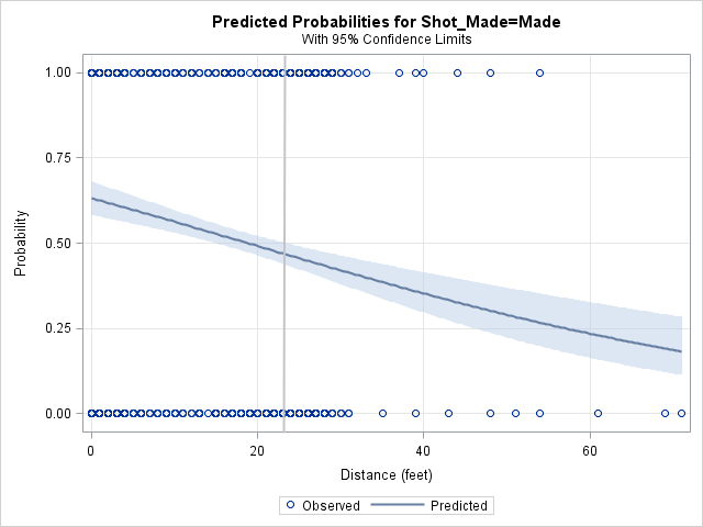
You can use logistic regression to model the probability of making a shot as a function of the distance to the basket. The adjacent plot shows the result of a logistic regression analysis in SAS. The model predicts a probability of 0.7 that Curry will make a shot from under the basket, a probability of 0.5 from 20 feet away, and a probability of 0.46 from the three-point arc, indicated by the vertical gray line at 23.9 feet. Recall that a probability of 0.46 is equivalent to predicting that Curry will sink 46% of shots from the three-point arc.
Almost all (98.3%) of Curry's shots were taken from 30 feet or closer, and the shots taken from beyond 30 feet were end-of-quarter "Hail Mary" heaves. Therefore, the remaining analyses restrict to shots that were from 30 feet or closer.
Probability as a function of angle and distance
The previous analysis only considers the distance from the basket. It ignores position of the shot relative to the basket. In general, the probability of scoring depends on the location from which the shot was launched.
For consistency, let's agree that "right" and "left" means the portion of the court as seen by a fan sitting behind the backboard. This is, of course, opposite of what Curry would see when coming down the court toward the basket. Our "right" is Curry's left.
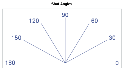
One way to model the positional dependence in the model is incorporate the angle relative to the backboard. The diagram shows one way to assign an angle to each position on the court. In the diagram, 90 degrees indicates a perpendicular shot to the basket, such as from the top of the key. An angle of 0 indicates a "baseline shot" from the right side of the court. Similarly, an angle of 180 degrees means a baseline shot from the left side of the court.
The following panel of graphs is the result of a logistic regression analysis that includes the interaction between angle and distance. The vertical lines in some plots indicate the distance to the sideline at particular angles. For 0 and 180 degress, the distance from the basket to the sideline is 25 feet.
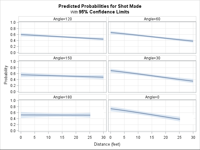
The panel of plots show that Curry is most accurate when he shoots from the left side of the court. (The left side corresponds to angles greater than 90 degrees, which are on the left side of the panel.) Remarkably, the model estimates that Curry's probability of making a shot from the left side barely depends on the distance from the basket! He is a solid shooter (probability 0.5, which is 50%) from the left baseline (Angle = 180) and from a slight angle (Angle = 150). The previous scatter plot shows that he shoots many shots from the 120 degree angle. This analysis shows that he is uncannily accurate from 20 and even 30 feet away, although the probability of scoring decreases as the distance increases.
Does Stephen Curry shoot better from his right? #Statistics can tell you! #NBA #Analytics Click To TweetOn the right side of the court (angles less than 90 degrees), Curry's probability of making a shot depends more strongly on the distance to the basket. Near the basket, the model predicts a scoring probability of 0.6 or more. However, the probability drops dramatically as the distance increases. On the right side of the court, Curry is less accurate from 20 or more feet than for the same distance on the other side. At three-point range, Curry's probability of making a shot on the right (his left) drops to "only" 0.4. The probability drops off most dramatically when Curry shoots from the baseline (Angle = 0).
Probability as a function of position
A logistic analysis is a parametric model, which means that the analyst must specify the explanatory variables in the model and also the way that those variables interact with each other. This often leads to simplistic models, such as a linear or quadratic model. A simple model is often not appropriate for modeling the scoring probability as a function of the Cartesian X and Y positions on the court because a simple model cannot capture local spatial variations in the data.
SAS provides several possibilities for nonparametric modeling of data, but let's stick with logistic regression for now. Many SAS regression procedures, including PROC LOGISTIC, support using an EFFECT statement to generate spline effects for a variable. A spline effect expands a variable into spline bases. Spline effects enable you to model complex nonlinear behavior without specifying an explicit form for the nonlinear effects. The following graph visualizes such a model.
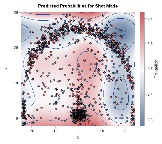
The image shows a scatter plot of the location of shots overlaid on a heat map that shows the predicted probability of Curry sinking a basket from various locations on the court. To better show the shot locations, the image has been stretched vertically. As mentioned previously, the location with the highest predicted probability is under the basket. From farther away, the predicted probability varies according to direction: to the left of the basket the probability is about 0.5, whereas a 15-foot jumper in front of the basket has probability 0.6. Notice the relative abundance of blue color (low probability) for shots on the right side. The lowest probability (about 0.3) occurs just beyond the three-point line at about a 60 degree angle, which agrees with the previous analysis. The same distance on the left side of the court is a much lighter shade of whitish-blue that corresponds almost 0.5 probability.
Statisticians will wonder about how well the model fits the data. The Pearson goodness-of-fit test indicates that the spline fit is not great, which is not surprising for a parametric fit to this kind of spatial data. In a follow-up post I use SAS to create nonparametric predictive models for the same data.
Conclusions
SAS programmers will appreciate the fact that "effect plots" in this article were generated automatically by PROC LOGISTIC. By using the EFFECT statement and the EFFECTPLOT statement, it is simple to create graphs that visualize the predictions for a logistic regression model.
These graphs show that in general Stephen Curry is a phenomenal shooter who has a high probability of scoring from even a long distance. Logistic regression was used to model the probability that Curry makes a shot from various angles and locations on the court. The analysis indicates that Curry shoots better from his right side, especially from three-point range.

22 Comments
Fun and interesting post! Thanks Rick :)
Rick,
Very Good.
Know how to use EFFECT statement to enhance the fit of logistic model.
" The analysis indicates that Curry shoots better from his right side, especially from three-point range."
Do you know why ? Maybe I guess most player are right-hand comfortable .
Interesting. Thanks. May I assume that this is about basketball? The name of the sport doesn't appear. We Brits do it too, going on about wickets and innings just to confuse you. ;-)
NBA = National Basketball Association
interesting but it's already been done for a contest last January for an interactive Microsoft PowerBI report.
See presentatiion & interactive report below:
https://m.youtube.com/watch?v=lT9tZqF9wrU
http://community.powerbi.com/t5/Best-Report-Contest/Stephen-Curry-A-look-at-the-intriguing-numbers-behind-the/m-p/17203#M7
Thanks for writing. In addition to your project, Robert Allison's original post there are additional links to analyses in R and Python. I had not seen your report, but it is very pretty. I like it and think you did a good job. You report historical averages over certain categories, such as ranges, time periods, and types of shots. However, there is a difference between reporting and analytics. My article builds predictive statistical models from explanatory variables. My models answer questions like "what is the probability that Curry will sink a 17.3-foot shot from 23.5 degrees to the basket on the right side?"
Hi, I think this is a really good example why people often think BI reporting is the same like analytic. @Rick mabe you should integrate a time variable into the predictive model to get the answer to the question "what is the probability that Curry will sink a 17.3-foot shot from 23.5 degrees to the basket on the right side in last 60 seconds of a match?"
Yes, I thought about including time, but the article is already too long. I provide a link to the data, so anyone is welcome to extend my analysis and add additional variables or build more complex models.
Pingback: Nonparametric regression for binary response data in SAS - The DO Loop
Although I found these two blogs very interesting, it did occur to me that these analyses do not take into consideration which direction the team is defending. Half the time Curry would be shooting for the basket at one end of the court and the other half of the time he would be shooting for the basket at the other end of the court. I don't follow pro basketball as I once did, but in following college bb, it often seems (no real data here) that the offense tends to be better when the team is shooting at the basket where their bench is on that side of the court. I'm also wondering if when putting all of the data points on one side of the court if the left/right designation is considered when moving the shots from the other side of the court so that all are depicted as being shot from the correct side.
The data are normalized so that left and right is consistent and means "as seen by a fan sitting behind the basket" that is Curry is shooting for. The data contains information about quarters, but that variable was insignificant to the model. Interesting theory about "offense better near the bench," but I do not have the data to test that hypothesis. I can imagine it might be important in elementary school when the coach is shouting directions to his players at full volume. :-)
Hi Rick,
This is a fascinating post. Really nice! I am following your blog since the beginning and I can say that your entries are more and more interesting. Please, devote more space in your blog to data science.
Hi Rick,
thanks for this brilliant bolg - I combined your analytical view with Robert Allisons visualizations into SAS Visual Analytics. Here you find the result: http://blogs.sas.com/content/sasdach/2016/04/13/das-neue-nerventonikum-fur-sportfans-predictive-analytics/#more-6650
It´s written in German but you will recognize your inputs ;-)
Cheers Thomas
hi rick,
It's an interesting post.After looking this discussing,I think the visualization graph is easy to understand the information.And have you ever thought about using another type graph to show the data ?
Hi Rick,
Your post provide a lot of statistical insights. I love it. As for the 2nd graph, it shows the predicated probability for the shots made versus distance. You generate it in "proc logistic" procedure. How to export the predicted probability values with its confidence limits into a sas data and it can be used for creating the separated "proc(S)Gplot" graph later on?
Thanks.
Ethan
The third paragraph contains a link to the SAS program that generates all the graphs. All statistical graphs are generated automatically by PROC LOGISTIC. The fourth graph is generated by using the EFFECTPLOT statement.
Hi Rick,
As for the 4th graph, it shows 6 predicated probability lines in a panel by angle=120, 60, 150,30,180 and 0 respectively. The variable "Angle" is numerical. I wonder if I can use replace with a categorical variable to show category='AB','AC','AD','BB','BC' and 'BD' respectively. I tried using the format statement in "proc logistic" procedure. But it doesn't work. Could you shed some lights to get it done?
Thank you so much!
Ethan.
Thanks.
Ethan
The EFFECTPLOT statement supports the FIT statement, which is used in this article. The AT option was used to specify values of the angles, like this
effectplot fit(x=Shot_Distance) / at(Angle=(120 60 150 30 180 0));
If your model has a CLASS variable called C with the values that you mention, you could use
effectplot fit(x=Shot_Distance) / at(C=all);
or if you only want a few levels, specify the levels like this:
effectplot fit(x=Shot_Distance) / at(C='AB' 'BC');
How is this data captured? Is someone manually entering the place where the shot is taken from or is the player wearing a GPS devise?
They use multiple cameras and advanced analytics to record and anaylze the players 25 times per second. For details, see the NBA Stats FAQ.
Pingback: The top 10 posts from The DO Loop in 2016 - The DO Loop
Pingback: Sports analytics: How impressive was Michael Jordan under pressure? - Hidden Insights