You can use histograms to visualize the distribution of data. A comparative histogram enables you to compare two or more distributions, which usually represent subpopulations in the data. Common subpopulations include males versus females or a control group versus an experimental group. There are two common ways to construct a comparative histogram: you can create a panel of histograms, or you can overlay histograms in a single graph. This article shows how to create comparative histograms in SAS.
Sanjay Matange and I have each written multiple previous articles on this topic. This article collects many of the ideas in one place. In the SAS 9.2 and SAS 9.3 releases, the graph template language (GTL) was required to construct some of these graphs. However, thanks to recent features added to PROC SGPLOT, PROC SGPANEL, and PROC UNIVARIATE, you can now create comparative histograms in SAS without writing any GTL.
Overlay and panel histograms in #SAS Click To TweetPanel of histograms
A panel of histograms enables you to compare the data distributions of different groups. You can create the histograms in a column (stacked vertically) or in a row. I usually prefer a column layout because it enables you to visualize the relative locations of modes and medians in the data.
In SAS, you can create a panel of histograms by using PROC UNIVARIATE or by using PROC SGPANEL. Both procedures require that the data be in "long form": one continuous variable that specifies the measurements and another categorical variable that indicates the group to which each measurement belongs. If your data are in "wide form," you can convert the data from wide form to long form.
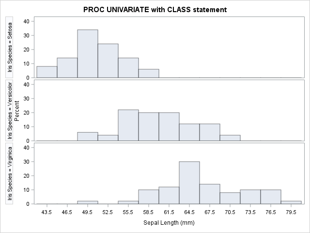
To use PROC UNIVARIATE, specify the categorical variable on the CLASS statement and the continuous variable on the HISTOGRAM statement. For example, the following example compares the distribution of the SepalLength variable for each of the three values of the Species variable in the Sashelp.Iris data:
proc univariate data=sashelp.iris; class Species; var SepalLength; /* computes descriptive statisitcs */ histogram SepalLength / nrows=3 odstitle="PROC UNIVARIATE with CLASS statement"; ods select histogram; /* display on the histograms */ run; |
The result is shown at the beginning of this section. The graph suggests that the median value of the SepalLength variable differs between levels of the Species variable. Furthermore the variance of the "Virginica" group is larger than for the other groups.
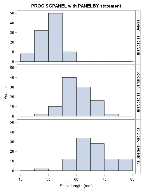
You can create similar graphs by using the SGPANEL procedure, which supports a wide range of options that control the layout. Specify the Species variable in the PANELBY statement and the SepalLength variable in the HISTOGRAM statement. The following call to PROC SGPANEL creates a comparative histogram:
title "PROC SGPANEL with PANELBY statement"; proc sgpanel data=sashelp.iris; panelby Species / rows=3 layout=rowlattice; histogram SepalLength; run; |
The graph produced by PROC SGPANEL is similar to the previous graph.
With the GTL you can create more complicated panel displays than are shown here. For example, Sanjay shows how to create mirrored histograms, which are sometimes used for population pyramids.
Overlay histograms
For comparing the distributions of three or more groups, I recommend a panel of histograms. However, for two groups you might want to overlay the histograms. You can use the TRANSPARENCY= option in PROC SGPLOT statements so that both histograms are visible, even when the bars overlap. The portion of bars that overlap are shown in a blended color.
In the HISTOGRAM statement of PROC SGPLOT, you can use the GROUP= option to specify the variable that indicates group membership. The GROUP= option overlays the histograms for each group, as the following example shows:
proc sgplot data=sashelp.iris; where Species in ("Setosa", "Versicolor"); /* restrict to two groups */ histogram SepalLength / group=Species transparency=0.5; /* SAS 9.4m2 */ density SepalLength / type=kernel group=Species; /* overlay density estimates */ run; |
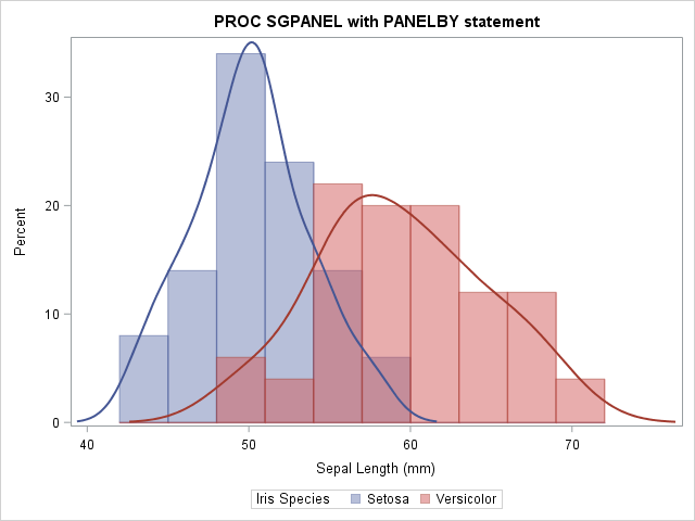
In this graph I added density estimates to help the eye visualize the basic shape of the two histograms. The purple region shows the overlap between the two distributions. For more than two categories, you might want to omit the histograms and just overlay the density estimates. The graph combines the first two rows of the panel in the previous section. The overlay enables you to compare the two subpopulations without your eye bouncing back and forth between rows of a panel.
The GROUP= option was added to the HISTOGRAM and DENSITY statements in SAS 9.4m2. You can create the same graph in PROC UNIVARIATE by using the OVERLAY option in the HISTOGRAM statement. The OVERLAY option requires SAS 9.4m3.
proc univariate data=sashelp.iris; class Species; var SepalLength; histogram SepalLength / kernel overlay; /* SAS 9.4m3 */ run; |
Overlay histograms of different variables
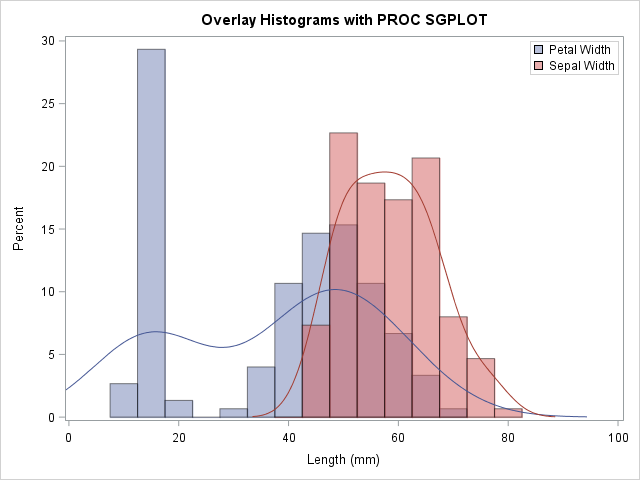
Because PROC SGPLOT enables you to use more than one HISTOGRAM statement, you can also overlay the histograms of different variables.
When comparing histograms it is best that both histograms use the same bin width and anchor locations. Prior to SAS 9.3, you could overlay histograms by using the graph template language (GTL). However, SAS 9.3 introduced support for the BINWIDTH= and BINSTART= options in the HISTOGRAM statement in PROC SGPLOT. Therefore you can force the histograms to have a common bin width, as shown in the following example:
title "Overlay Histograms with PROC SGPLOT"; proc sgplot data=Sashelp.Iris; histogram PetalLength / binwidth=5 transparency=0.5 name="petal" legendlabel="Petal Width"; histogram SepalLength / binwidth=5 transparency=0.5 name="sepal" legendlabel="Sepal Width"; density PetalLength / type=kernel lineattrs=GraphData1; /* optional */ density SepalLength / type=kernel lineattrs=GraphData2; /* optional */ xaxis label="Length (mm)" min=0; keylegend "petal" "sepal" / across=1 position=TopRight location=Inside; run; |
Summary
In summary, SAS provides multiple ways to use histograms to compare the distributions of data. To obtain a panel of histograms, the data must be in the "long" format. You can then:
- Use the CLASS statement in PROC UNIVARIATE to specify the grouping variable. This is a good choice if you also want to compute descriptive statistics or fit a distribution to the data.
- Use PROC SGPANEL, which provides you with complete control over the layout of the panel, axes, and other graphical options.
If you only have two groups and you want to overlay partially transparent histograms, you can do the following:
- Use the GROUP= option in the HISTOGRAM statement of PROC SGPLOT (requires SAS 9.4m2).
- Use the OVERLAY option in the HISTOGRAM statement of PROC UNIVARIATE (requires SAS 9.4m3).
Lastly, if you have two variable to compare, you can use two HISTOGRAM statements. Be sure to use the BINWIDTH= option (and optionally the BINSTART= option), which requires SAS 9.3.
The comparative histogram is not a perfect tool. You can also use spread plots and other techniques. However, for many situations a panel of histograms or an overlay of histograms provides an effect way to visually compare the distributions of data in several groups.
WANT MORE GREAT INSIGHTS MONTHLY? | SUBSCRIBE TO THE SAS TECH REPORT

17 Comments
The group= option for histogram statement is a huge benefit, thanks! Also for folks with SAS/QC, PROC CAPABILITY has a very nice COMPHIST statement for comparing histograms. Not sure if it can do overlaid histograms, but it does great paneled histograms, and can provide a wealth of other information.
Thanks for the reminder. PROC UNIVARIATE and CAPABILITY share many, um, capabilities! Because UNIVARIATE is in Base SAS, I chose to focus on it, but the latest release of PROC CAPABILITY also supports the OVERLAY option.
Pingback: Monte Carlo estimates of pi and an important statistical lesson - The DO Loop
Pingback: Head-tail versus head-head: A counterintuitive property of coin tosses - The DO Loop
Pingback: The top 10 posts from The DO Loop in 2016 - The DO Loop
Is it possible to overlay a scatter plot with a vline plot representing the mean and CI of a continuous variable at different time points when using sgpanel?
Any idea ?
Thanks.
Yes, although I'd use the SERIES statement instead of VLINE. I'd use a SCATTER statement with the YERRORLOWER= and YERRORUPPER= options for the mean and CIs. The basic idea is shown at http://support.sas.com/kb/42/542.html, but you need to merge in the original data to get the overlay. If any of that is not clear, post your question and data to the SAS Graphics Support Community.
Hi, is it possible to choose different colours for the classes in a proc univariate analysis ? For example, different sepal length as shown in your graph.
Run the PROC UNIVARIATE code in this post that uses the OVERLAY option. You will see that it uses different colors.
I often prefer to suppress the vertical cell headers in a ROWLATTICE (hard to read) and put in insets instead.
title "PROC SGPANEL with PANELBY statement";
proc sgpanel data=sashelp.iris;
panelby Species / rows=3 layout=rowlattice noheader spacing=10;
histogram SepalLength;
inset species / nolabel position=topright textattrs=(size=12 weight=bold);
rowaxis offsetmin=0;
run;
Hi, is it possible to get, using SGplot, or other proc, a graph of histogram overlay for comparing two sex sample, for example in SASuser.class, the variable height, before SAS V9.4m2 ?
Yes. You can use PROC TEMPLATE to define the GTL template and PROC SGRENDER to render the graph.
In "Overlay histograms of different variables", I can't get negative values to show in one of the variables. Both distributions start from zero.
In my example, I used the MIN=0 option on the XAXIS statement because my example data was positive. Remove that option.
How can I overlay 3 histogram in SAS?
Read this article. If your data are in "long form" and you use the GROUP= option, you'll get the three histograms automatically. If you are using "wide form" data, use a third HISTOGRAM statement.
Pingback: 10 tips for creating effective statistical graphics - The DO Loop