In my four years of blogging, the post that has generated the most comments is "How to handle negative values in log transformations." Many people have written to describe data that contain negative values and to ask for advice about how to log-transform the data.
Today I describe a transformation that is useful when a variable ranges over several orders of magnitude in both the positive and negative directions. This situation comes up when you measure the net change in some quantity over a period of time. Examples include the net profit at companies, net change in the price of stocks, net change in jobs, and net change in population. (Remember, however, that you do not have to transform variables in a linear regression! Linear regression does not require that the variables be normally distributed.)
A state-by-state look at net population change in California
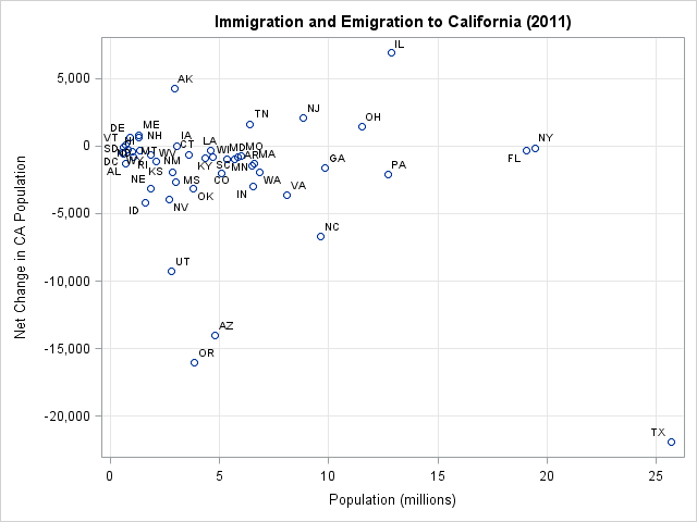
Here's a typical example. The US Census Bureau tracks state-to-state migration flows. (For a great interactive visualization of internal migration, see the Governing Data Web site.) The adjacent scatter plot shows the net number of people who moved to California from some other US state in 2011, plotted against the population of the state. (Click to enlarge.) For example, 35,650 people moved to California from Arizona, whereas 49,635 moved to Arizona from California, so Arizona was responsible for a net change of –13,985 to the California population. The population of Arizona is just under 5 million, so the marker for Arizona appears in the lower left portion of the graph.
Most states account for a net change in the range [–5000, 5000] and most states have populations less than 5 million. When plotted on the scale of the data, these markers are jammed into a tiny portion of the graph. Most of the graph is empty because of states such as Texas and Illinois that have large populations and are responsible for large changes to California's population.
As discussed in my blog post about using log-scale axes to visualize variables, when a variable ranges over several orders of magnitudes, it is often effective to use a log transformation to see large and small values on the same graph. The population variable is a classic example of a variable that can be log-transformed. However, 80% of the values for the net change in population are negative, which rules out the standard log transformation for that variable.
The log-modulus transformation
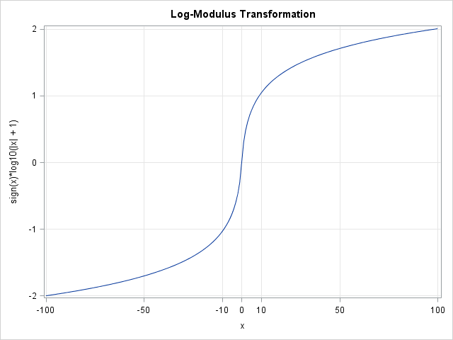
A modification of the log transformation can help spread out the magnitude of the data while preserving the sign of data. It is called the log-modulus transformation (John and Draper, 1980). The transformation takes the logarithm of the absolute value of the variable plus 1. If the original value was negative, "put back" the sign of the data by multiplying by –1. In symbols,
L(x) = sign(x) * log(|x| + 1)
The graph of the log-modulus transformation is shown to the left. The transformation preserves zero: a value that is 0 in the original scale is also 0 in the transformed scale. The function acts like the log (base 10) function when x > 0. Notice that L(10) ≈ 1, L(100) ≈ 2, and L(1000) ≈ 3. This property makes it easy to interpret values of the transformed data in terms of the scale of the original data. Negative values are transformed similarly.
Applying the log-modulus transformation
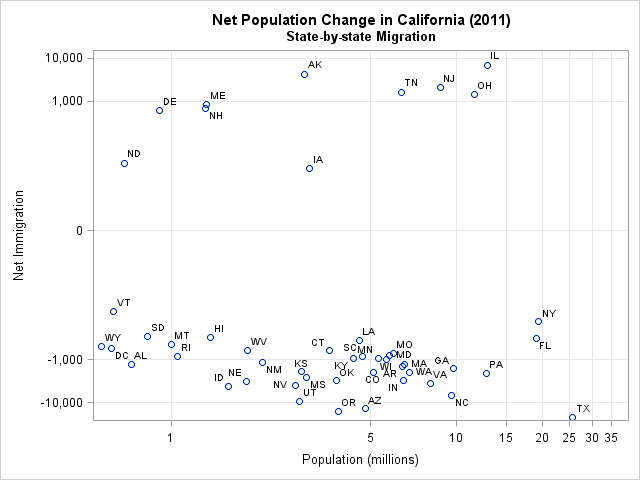
Let's see how the log-modulus transformation helps to visualize the state-by-state net change in California's population in 2011. You can download the data for this example and the SAS program that creates the graphs. A previous article showed how to use PROC SGPLOT to display a log axis on a scatter plot, and I have also discussed how to create custom tick marks for log axes.
The scatter plot to the left shows the data after using the log-modulus transformation on the net values. The state populations have been transformed by using a standard log (base 10) transformation. The log-modulus transformation divides the data into two groups: those states that contributed to a net influx of people to California, and those states that reduced the California population. It is now easy to determine which states are in which group: The states that fed California's population were states in New England, the Rust Belt, and Alaska. It is also evident that size matters: among states that lure Californians away, the bigger states tend to attract more.
The main effect of the log-modulus transformation is to spread apart markers that are near the origin and to pull in markers that are relatively far from the origin. By using the transformation, you can visualize variables that span several orders of magnitudes in both the positive and negative directions. The resulting graph is easy to interpret if you are familiar with logarithms and powers of 10.

18 Comments
Your log-scale plotting series are very helpful. Thank you very much for sharing your knowledge and experiences. I found just one typo within this posting. At the example of net population change, the state you used was not Alabama but Arizona.
Thanks for the careful reading. FIXED.
Good article. I also like that you found a good reference (and name) for the log-modulus transform. A lot of these techniques are part of the useful "folk theorems" that a lot of data scientists know, but finding a good writeup can be a problem. I'd like to share our take on this where we use arcsinh to derive a very similar function for the same goal (something continuous that approaches sign(x) log(|x|,10) for |x| large): "Modeling Trick: the Signed Pseudo Logarithm" http://www.win-vector.com/blog/2012/03/modeling-trick-the-signed-pseudo-logarithm/ . In our book ("Practical Data Science with R", page 75 ) author Nina Zumel decided it is better to map the entire interval [-1,1] to zero (giving up smoothness) to avoid inflicting excess math on audiences. All of these methods have the uneven stretching effect you note- which is needed away from the origin (a necessary centering or range compression step), but leaves some issues near the origin (unimodal data often appears bi-modal when density plotted).
Rick, thanks for the log-modulus transform, it is very useful for visualizing financial data where data range over several orders of magnitude. I had the pleasure of visualizing the distribution of such a balance variable via sgplot, but the histogram statement and axis statement did not play nice together (9.2) even though all values are positive. Had to resort to manually applying the transform and controlling the tick-marks:
Worked like a charm.
Very nice! It is a clever variation of the technique I described in the article "Create custom tick marks for axes on the log scale." I like the use of the user-defined format and the LOGVALUEFORMAT= option. I shortened the tick range and added some sample data to your example so that readers could try it out. (Daymond's original tick marks were for [-5e8, 5e8].)
The valueshint option is really handy. You can define the range to be really wide, sgplot will determine the appropriate min & max from the data and not use the full range indicated by values=(). Kudos to the sgplot developers who thought of this feature. It means I can be lazy and sgplot will do the "right thing".
Sir,
Both my dependent variable (change in market value) as the independent value (level of emission allowances) range over several orders of magnitude in both the positive and negative directions.
If I apply the log modulus transformation to both dependent and independent variable, could I still interpret the regression coefficients as elasticities?
Thanks in advance!
Roel
No. The log modulus transformation involves taking the absolute value, which changes things.
Thanks a lot sir! Any idea how to interpret the betas after applying the log modulus to both dependent and independent variable. It really racks my brains.
best, Roel
The purpose of this blog post was to visualize data. When you perform regression on transformed data, the interpretation becomes murky.
Thank You Rick for sharing. I found this helpful a lot
Hi Rick. Very interesting. I am interested in processing some torsion measurements and assess whether variable 1 versus variable 2 had any changes (over-time). My variables have both positive and negative values in the range (0.20, -0.20). When I test out different bases for logs across these values, I get complex values though. This means that I am losing some portion from my real numbers that I can't get back. Any ideas how to assess statistically changes between variables with this range?
Please accept my apologies, I did not do log(x+1) before but log(x)+1, which is very different! Thank you, that looks very into the points I was looking for.
Does this work for both right and left skewed data?
No, the LOG transformation is for right-skewed data. However, if X is a left-skewed distribution then Y= -X is a right-skewed distribution. So you can apply the linear transformation Y = -X + c and then use a LOG transformation for Y. You should choose c so that Y > 0.
Thank you. I've been attempting to normalize left skewed varibles with positive and negative orders of magnitude. I will apply the liner transformation and then apply the Log modulus transform.
Right, see also the article, "Sometimes you need to reverse the data before you fit a distribution."
Pingback: 10 tips for creating effective statistical graphics - The DO Loop