In my previous blog post, I showed how to use log axes on a scatter plot in SAS to better visualize data that range over several orders of magnitude. Because the data contained counts (some of which were zero), I used a custom transformation x → log10(x+1) to visualize the data. You can download the data and the SAS program.
I left one problem unresolved at the end of my last post: The tick marks on the axes were labeled on the log scale so that, for example, a marker positioned at the tick mark labeled '2' actually represents a value of 102 = 100. If the graph is intended for people who do not use logarithms on a regular basis, this log-scale axis might hinder them from properly interpreting the graph.
Fortunately, the SGPLOT procedure in SAS supports custom tick marks. In the XAXIS and YAXIS statements, you can use the VALUES= option to specify the location of tick marks and you can use the VALUESDISPLAY= option to specify the label for each tick mark.
Determine the tick locations
The goal is to place tick marks on the plot for the transformed data, but label those ticks by using the original untransformed counts. For example, suppose that you decide to display tick marks that correspond to the following counts: 0, 5, 10, 25, 50, 100, 250, and 500. The following DATA step computes the log-x-plus-one transformation for those values:
data TickMarks; input Count @@; LogCountP1 = log10(Count+1); datalines; 0 5 10 25 50 100 250 500 ; run; proc print noobs; run; |
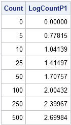
The numbers in the second column are the locations of the tick marks in the scatter plot of the transformed data. Put those numbers on the VALUES= option. The numbers in the first column are the corresponding labels that we want to display with those tick marks. Put those numbers (as text strings) on the VALUESDISPLAY= option, as follows:
ods graphics / width=750 height=1000; title "Custom Axes on Log Scale"; proc sgplot data=LogComments noautolegend; label logCommentP1="Number of Original Comments" logResponseP1="Number of Responses"; scatter x=logCommentP1 y=logResponseP1 / datalabel=NickName; lineparm x=0 y=0 slope=1; xaxis grid offsetmin=0.01 offsetmax=0.1 values=(0 0.78 1.04 1.41 1.71 2.00) /* tick locations */ valuesdisplay = ("0" "5" "10" "25" "50" "100"); /* labels displayed */ yaxis grid offsetmin=0.05 offsetmax=0.1 values=(0 0.78 1.04 1.41 1.71 2.00 2.40 2.70) valuesdisplay = ("0" "5" "10" "25" "50" "100" "250" "500"); run; |
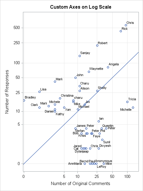
This plot shows the custom tick marks for the axes. The data are plotted on a log scale, but the labels on the tick marks show the original scale of the data. It is easy to estimate the number of comments and responses for each individual. For example, Robert has 25 original comments and less than 250 responses. John has less than 10 original comments and 50 responses.
Of course, you still have to careful reading graphs that have nonlinear axes. For one thing, you can't compare distances between points. On the plot, it looks like Tricia and Michelle are about the same distance apart as Rick and Chris, but that is not true. Tricia and Michelle differ by 25 comments, whereas Rick and Chris differ by more than 150.
Automating the tick locations and labels
I have one final remark. When creating the plot, I used the DATA step to compute the locations for a selected set of tick marks, but then I entered those values by hand on the VALUES= and VALUESDISPLAY= options in PROC SGPLOT. The fancier approach is to pack information about the tick marks into SAS macro variables and use the macro variables in PROC SGPLOT. You can use the SYMPUTX routine and string concatenation routines to carry out this task. The following SAS/IML program shows how to assign macro variables in PROC IML. I will leave the analogous DATA step program as an exercise for an ambitious SAS programmer:
proc iml;
Count = {0 5 10 25 50 100 250 500};
d = ' "' + char(Count,3) + '"';
v = " " + putn(log10(Count+1), "Best6.");
call symputx("D2", rowcat(d));
call symputx("V2", rowcat(v));
quit;

%put _user_; |
The values of the macro variables are displayed in the SAS Log. You can now use these macro variables in the PROC SGPLOT statements as follows:
proc sgplot data=LogComments noautolegend; ... yaxis grid offsetmin=0.05 offsetmax=0.1 values=(&V2) valuesdisplay=(&D2); run; |

11 Comments
Hi Dr.Wicklin, I got one question about assignment of two variables with known correlation in SAS. Specifically, I know the order and values of one vector variable. I also know the values of each element in the other vector variable. Then how can I reorder the second vector variable so that the correlation between the two variables will be around 0.5?
That is called the Iman-Conover method for generating correlated variables with specified marginal distributions. You can read about it and get the program in Chapter 9 of my book Simulating Data with SAS
Thank you very much for the reply!
Thanks for the follow up blog post and important point not to compare distances with nonlinear axes... a trap for those that may quickly glance at the plot.
Pingback: A log transformation of positive and negative values - The DO Loop
This is pretty close to what I routinely used to do in SAS/Graph when I wanted logarithmic axes. Specifically, I always ended up creating my own tick marks. But I have always found that using 1 2 5 and multiples of 10 of those numbers for the tick marks works well. In this graph, which has the odd offset and hence a zero, I would have tick marks at 0 1 2 5 10 20 50 100. The 1 is a little crowded and could be omitted but it's a very important value and therefore to me worth a tick mark. Specifically I would not have used 25 but rather 20.
I run the above codes using SAS 9.3, but got the following error:
369 valuesdisplay = ("0" "5" "10" "25" "50" "100"); /* labels displayed */
------------- ---
1 22
76
WARNING 1-322: Assuming the symbol VALUES was misspelled as valuesdisplay.
ERROR 22-322: Syntax error, expecting one of the following: a numeric constant,
a datetime constant, (.
ERROR 76-322: Syntax error, statement will be ignored.
Could you point me what's wrong?
A syntax error like that means that the statement is not available in your version of SAS. The ODS Graphics documentation states that the VALUESDISPLAY= option was intruduced in the first maintenance release of SAS 9.4.
Pingback: Discover power laws by log-transforming data - The DO Loop
Hello Rick!
What if I have BY statement in the PROC SGPLOT, can I still handle the value label in this way?
Best regard!
Yes.