If you are trying to visualize numerical data that range over several magnitudes, conventional wisdom says that a log transformation of the data can often result in a better visualization. This article shows several ways to create a scatter plot with logarithmic axes in SAS and discusses some of the advantages and disadvantages of using logarithmic transformations. It also discusses a common problem: How to transform data that range over several orders of magnitudes but that also contain zeros? (Recall that the logarithm of zero is undefined!)
Let's look at an example. My colleague, Chris Hemedinger, wrote a SAS program that collects data about comments on the blogs.sas.com Web site. For each comment, he recorded the name of the commenter and whether the comment was an original comment or a response to a previous comment. For example, "This is a great article. Thanks!" is classified as a comment, whereas "You're welcome. Glad you liked it!" is classified as a response. You can download the program that creates the data and the graphs in this article. I consider only commenters who have posted more than ten comments.
The following call to the SGPLOT procedure create a scatter plot of these data:
title "Comments and Responses on blogs.sas.com"; proc sgplot data=Comments noautolegend; scatter x=Comment y=Response / datalabel=TruncName; lineparm x=0 y=0 slope=1; yaxis grid offsetmin=0.05; xaxis grid; run; |
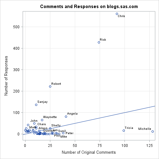
The scatter plot shows the number of comments and responses for 50 people. Those who have commented more than 30 times are labeled, and a line is drawn with unit slope. The line, which was drawn by using the LINEPARM statement, enables you to see who has initiated many comments and who has posted many responses. For example, Michelle and Tricia (lower right) often comment on blogs, but few of their comments are in response to others. In contrast, Sanjay and Robert are regular SAS bloggers and most of their remarks are responses to other people's comments. The big outlier is Chris, who has initiated almost 100 original comments while also posting more than 500 responses to comments on his popular blog.
The scatter plot is an excellent visualization of the data... provided that your goal is to highlight the people who post the most comments and classify them into "commenter" or "responder." The plot enables you to identify about a dozen of the 50 people in the data set. But what about the other nameless markers near the origin? You can see that there are many people who have posted between 10 and 30 comments, but the current plot makes it difficult to find out who they are. To visualize those observations (while not losing information about Chris and Michelle) requires some sort of transformation that distributes the data more uniformly within the plot.
Logarithmic transformations
The standard visualization technique to use in this situation is the logarithmic transformation of data. When you have data whose range spans several orders of magnitude, you should consider whether a log transform will enhance the visualization. A log transformation preserves the order of the observations while making outliers less extreme. (It also spreads out values that are in [0,1], but that doesn't apply for these data.) For these data, both the X and the X variables span two orders of magnitude, so let's try a log transform on both variables.
The XAXIS and YAXIS statements in the SGPLOT procedure support the TYPE=LOG option, which specifies that an axis should use a logarithmic scale. However, if you use that option on these data, the following message is printed to the SAS Log:
NOTE: Log axis cannot support zero or negative values in the data range.
The axis type will be changed to LINEAR. |
The note informs you that some people (for example, Mike) have never responded to a comment. Other people (Bradley, label not shown) have only posted responses, but have never initiated a comment. Because the logarithm of 0 is undefined, the plot refuses to use a logarithmic scale.
If you are willing to leave out these individuals, you can use a WHERE clause to subset the data:
title "Automatic Log Transformation"; title2 "Comment>0 and Response>0"; proc sgplot data=Comments; where Comment > 0 & Response > 0; scatter x=Comment y=Response / datalabel=NickName; xaxis grid type=log minor offsetmin=0.01; yaxis grid type=log minor offsetmin=0.05; run; title2; |
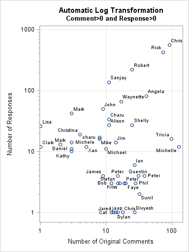
The graph shows all individuals who have initiated and responded at least once. The log transformation has spread out the data so that it is possible to label all markers by using first names. The tick marks on the axes show counts in the original scale of the data. It is easy to see who has about 10 or about 100 responses. With a little more effort, the minor tick marks enable you to discover who has 3 or 50 responses. I used the OFFSETMIN= option to add a little extra space for the data labels.
The SGPLOT procedure does not support using the LINEPARM statement with logarithmic axes, so there is not diagonal line. However, the grid lines enable you to see at a glance that Michael, Jim, and Shelly initiate comments as often as they respond. Individuals that appear in the lower right grid square are those who initiate more than they respond. (If you really want a diagonal line, use the VECTOR statement.)
Although the log transformation has successful spread out the data, this graph does not show the seven people who were dropped by the WHERE clause. It is undesirable to not show certain observations just because the log scale is restricted to positive counts.
The log-of-x-plus-one transformation
There is an alternative: Rather than using the automatic log scale that PROC SGPLOT provides, you can write your own data transformation. Within the DATA step, you have complete control over the transformation and you can handle zero counts in any mathematically consistent way. I have previously written about how to use a log transformation on data that contain zero or negative values. The idea is simple: instead of the standard log transformation, use the modified transformation x → log(x+1). In this transformation, the value 0 is transformed into 0. The transformed data will be spread out but will show all observations.
The drawback of the "log-of-x-plus-one" transformation is that it is harder to read the values of the observations from the tick marks on the axes. For example, under the standard log transformation, a transformed value of 1 represents an individual that has 10 comments, since log(10) = 1. Under the transformation x → log(x+1), a transformed value of 1 represents an individual that has 9 comments. You can use the IMAGEMAP option on the ODS GRAPHICS statement to add tooltips to the graph, but of course that won't help someone who is trying to read a printed (static) version of the graph. Nevertheless, let's carry out this nonstandard log transformation:
data LogComments; set Comments; label logCommentP1 = "log10(1 + Number of Original Comments)" logResponseP1 = "log10(1 + Number of Responses)"; logCommentP1 = log10(1 + Comment); logResponseP1 = log10(1 + Response); run; ods graphics / imagemap=ON; title "Custom Log Transformation"; proc sgplot data=LogComments noautolegend; scatter x=logCommentP1 y=logResponseP1 / datalabel=NickName tip=(Comment Response Total); lineparm x=0 y=0 slope=1; xaxis grid offsetmin=0.01; yaxis grid offsetmin=0.05 offsetmax=0.05; run; |
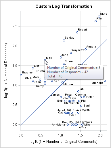
This graph is pretty good: the observations are spread out and all the data are displayed. You can easily show the diagonal reference line by using the LINEPARM statement. A disadvantage of this plot is that it is harder to determine the original counts for the individuals, in part because the tick marks on the axes are displayed on the log scale. Although many analytical professional will have no problem recalling that the value 2.0 corresponds to a count of 102 = 100, the label on the axes might confuse those who are less facile with logarithms. In my next blog post I will show how to customize the tick marks to show counts on the original scale of the data.
The point of this article is that the log transformation can help you to visualize data that span several orders of magnitudes. However, the log function is properly restricted to positive data, which means that it is more complicated to create and interpret a log transformation on non-positive data.
Do you have suggestions for how to visualize these data? Download the data and let me know what you come up with.

10 Comments
This isn't the first time I've been called an outlier, but I think this probably counts as the kindest application of that label to me. My 600 comments (total) might seem like a lot, but overall the blogs.sas.com site has collected over 13,000 comments so far -- a testament to our engaged readers!
Thanks for the interesting analyses! I look forward to seeing how others might approach a visualization of the comment data.
Indeed an interesting analyses! (Note I am "replying" to Chris to increase my count ;-) ) Great tip Rick about using the ODS imagemap option to get the figures due to the transformed axes. I look forward to seeing your next blog on customizing the tick marks to show the counts on the original scale.
Hope the post also encourages more engagement with users on blogs.sas.com :-)
If you have a count variable, the log(x+1) transformation is pretty natural.
But if you have a continuous variable that includes some 0's, then it seems that anything you add is fairly arbitrary. What are your thoughts on this? Add 0.0001? Don't do it at all? Something else?
I've written about this in my previous article about the log transformation. Personally, I prefer to add 1 because because adding 1 is easier to remember (and to interpret) than adding 0.0001.
Pingback: Create custom tick marks for axes on the log scale - The DO Loop
Pingback: A log transformation of positive and negative values - The DO Loop
This method would work on countinous as well as on negative data, just change the offset.
proc fcmp outlib=sasuser.funcs.trial; function minus_one(number); return (number-1); endsub; options cmplib=sasuser.funcs; proc format; value minus_one other=[minus_one()]; run; data _V/view=_V; set Comments; CommentP1 = 1 + Comment; ResponseP1 = 1 + Response; format CommentP1 ResponseP1 minus_one.; run; title "Comments and Responses on blogs.sas.com"; proc sgplot data=_V noautolegend; scatter x=CommentP1 y=ResponseP1 / datalabel=TruncName; lineparm x=0 y=0 slope=1; yaxis grid offsetmin=0.05; xaxis grid; run;Please withdraw, this is not working.
I didn't paste the log axes, the proc sgplot should be:
but I have fallen to the Problem Note 48653 raised in 9.2 and still unresolved in my version:
http://support.sas.com/kb/48/653.html
SG procedures are not quite there yet.
Boring old static formats always work:
even on negative data:
proc format; value NEG 0.1='-0.1' 1=' -1' 10=' -10' 100='-100'; data LOSSES; merge SASHELP.STOCKS(rename=(CLOSE=CI OPEN=OI) where=(STOCK='IBM')) SASHELP.STOCKS(rename=(CLOSE=CM OPEN=OM) where=(STOCK='Microsoft')); LOSSI=CI-OI; LOSSM=CM-OM; if .<LOSSI<=0 and .<LOSSM<0; LOSSI0=-LOSSI; LOSSM0=-LOSSM; label LOSSI0='Losses on IBM' LOSSM0='Losses on Microsoft'; format LOSSI0 LOSSM0 neg.; run; proc sgplot noautolegend; scatter x=LOSSI0 y=LOSSM0 ; xaxis grid type=log ; yaxis grid type=log ; run;Pingback: 10 tips for creating effective statistical graphics - The DO Loop