Mosaic plots (Hartigan and Kleiner, 1981; Friendly, 1994, JASA) are used for exploratory data analysis of categorical data. Mosaic plots have been available for decades in SAS products such as JMP, SAS/INSIGHT, and SAS/IML Studio. However, not all SAS customers have access to these specialized products, so I am pleased that mosaic plots have recently been added to two Base SAS procedures:
- The graph template language (GTL) added the MOSAICPARM statement, which produces mosaic plots from pre-summarized categorical data.
- The FREQ procedure added the PLOTS=MOSAICPLOT option in the TABLES statement.
Both of these features were added in SAS 9.3m2, which is the 12.1 release of the analytics products. This article describes how to create a mosaic plot by using PROC FREQ. My next blog post will describe how to create mosaic plots by using the GTL.
Use mosaic plots to visualize frequency tables
You can use mosaic plots to visualize the cells of a frequency table, also called a contingency table or a crosstabulation table. A mosaic plot consists of regions (called "tiles") whose areas are proportional to the frequencies of the table cells. The widths of the tiles are proportional to the frequencies of the column variable levels. The heights of tiles are proportional to the frequencies of the row levels within the column levels.
The FREQ procedure supports two-variable mosaic plots, which are the most important case. The GTL statement supports mosaic plots with up to three categorical variables. JMP and SAS/IML Studio enable you to create mosaic plots with even more variables.
As I showed in a previous blog post, you can use user-defined formats to specify the order of levels of a categorical variable. The Sashelp.Heart data set contains data for 5,209 patients in a medical study of heart disease. You can download the program that that specifies the order of levels for certain categorical variables. The following statements use the ordered categories to create a mosaic plot. The plot shows the relationship between categories of blood pressure and body weight for the patients:
ods graphics on; proc freq data=heart; tables BP_Cat*Weight_Cat / norow chisq plots=MOSAIC; /* alias for MOSAICPLOT */ run; |
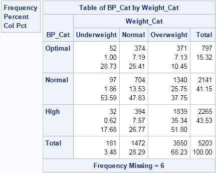
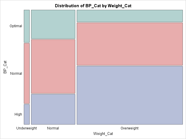
The mosaic plot is a graphical depiction of the frequency table. The mosaic plot shows the distribution of the weight categories by dividing the X axis into three intervals. The length of each interval is proportional to the percentage of patients who are underweight (3.5%), normal weight (28%), and overweight (68%), respectively. Within each weight category, the patients are further subdivided. The first column of tiles shows the proportion of patients who have optimal (29%), normal (54%), or high (18%) blood pressure, given that they are underweight. The middle column shows similar information for the patients of normal weight. The last column shows the conditional distribution of blood pressure categories, given that the patients are overweight.
The chi-square test (not shown) tests the hypothesis that there is no association between the weight of patients and their blood pressure. The chi-square test rejects that hypothesis, and the mosaic plot shows why. If there were no association between the variables, the green, red, and blue tiles would be essentially the same height regardless of the weight category of the patients. They are not. Rather, the height of the blue tiles increases from left to right. This shows that high blood pressure is more prevalent in overweight patients. Similarly, the height of the green tiles decreases from left to right. This shows that optimal blood pressure occurs more often in normal and underweight patents than in overweight patients.
The colors in this mosaic plot indicate the levels of the second variable. This enables you to quickly assess how categories of that variable depend on categories of the first variable. There are other ways to color the mosaic plot tiles, and you can use the GTL to specify an alternate set of colors. I describe that approach in my next blog post.

5 Comments
This is a great addition.
I think mosaic plots are under utilized.
Pingback: High school rankings of top NCAA wrestlers - The DO Loop
Pingback: Let PROC FREQ create graphs of your two-way tables - The DO Loop
Nice and easy-to-create graph! I try to think of differences between Mosiac plot and Proc Gareabar in SAS graph.
If possible, could you show how to annotate each percentage # on the Mosiac graph?
Pingback: How to add an annotation to a mosaic plot in SAS - The DO Loop