A common visualization is to compare characteristics of two groups. This article emphasizes two tips that will help make the comparison clear. First, consider graphing the differences between the groups. Second, in any plot that has a categorical axis, sort the categories by a meaningful quantity.
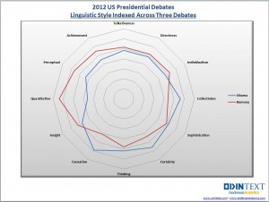
This article is motivated by a radar plot that compares the performance of Barak Obama and Mitt Romney in the 2012 US presidential debates. The radar plot (shown at left) displays 12 characteristics of the candidates' words during the debates. Characteristics included "directness", "talkativeness", and "sophistication." The radar chart accompanies an interesting article about using text analytics to investigate the candidates' styles and performance during the debates.
Unfortunately, I found it difficult to use the radar chart to compare the candidates. I wondered whether a simpler chart might be more effective. I couldn't find the exact numbers used to create the radar chart, but I could use the radar chart to estimate the values. The following DATA step defines the data. The numbers seem to be the relative percentages that each candidate displayed a given characteristic. (Possibly weighted by the amount of time that each candidate spoke?) Each row adds to 100%. For example, of the words and phrases that were classified as exhibiting "individualism," 47% of the phrases were uttered by Obama, and 53% by Romney.
data Debate2012; input Category $15. Obama Romney; datalines; Individualism 47 53 Directness 49 51 Talkativeness 49 51 Achievement 45 55 Perceptual 44 56 Quantitative 36 64 Insight 47 53 Causation 59 41 Thinking 52 48 Certainty 56 44 Sophistication 51 49 Collectivism 56 44 ; |
You can use the data in this form to display a series plot (line plot) of the percentages versus the categories, but the main visual impact of the line plot is that Obama's values are low when Romney's are high, and vice versa. Since that is just a consequence of the fact that the percentages add to 100%, I do not display the series plot.
To display a bar chart, you can create a grouping variable with the values "Obama" and "Romney." You can then use the GROUP= option on the HBAR statement in PROC SGPLOT to create the following stacked bar chart:
data Long; /* transpose the data from wide to long */ set Debate2012; Candidate = "Obama "; Value = Obama; output; Candidate = "Romney"; Value = Romney; output; drop Obama Romney; run; title "2012 US Presidential Debates"; title2 "Linguistic Style Indexed Across Three Debates"; footnote justify=left "Data from http://blog.odintext.com/?p=179"; proc sgplot data=Long; hbar Category / response=Value group=Candidate groupdisplay=stack; refline 50 / axis=x lineattrs=(color=black); yaxis discreteorder=data; xaxis label="Percentage" values=(0 to 100 by 10); run; |
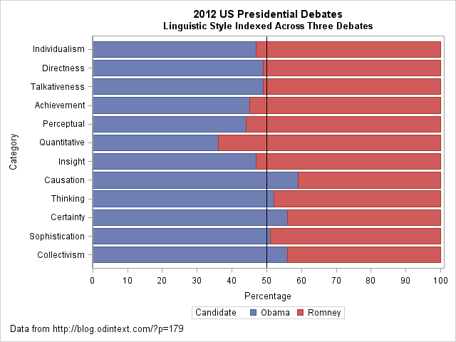
The stacked bar chart makes it easy to compare the styles of the two candidates. In some categories (directness, talkativeness, and sophistication), the candidates are similar. In others (quantitative, causation), the candidates differ more dramatically. A prominent reference line at 50% provides a useful dividing line for comparing the candidates' styles.
However, I see two problems with the stacked bar chart. First, the categories do not seem to be sorted in any useful order. (This order was used for the radar chart.) Second, I often find that if you want to contrast two groups, it often makes sense to plot the difference between the groups, rather than the absolute quantities. This results in the following changes:- The reference line becomes zero, which represents no difference.
- The chart can use a smaller scale, so that it is easier to see small differences.
- You can sort the categories by the difference, so that the order of the categories becomes useful.
- The difference is a single quantity, which is easier to visualize than two categories. (Although, since the percentages sum to 100%, there is only one independent quantity no matter how you visualize the data.)
The following DATA step uses the original data to compute the percentage difference between the candidates for each style category. Although it is not necessary to use two colors to visualize a single quantity, in US politics it is a convention to use red to represent Republicans (Romney) and blue to represent Democrats (Obama).
data DebateDiff; set Debate2012; label Difference = "Percentage Difference: Romney - Obama"; Difference = Romney - Obama; if Difference>0 then Advantage = "Romney"; else Advantage = "Obama "; run; proc sort data=DebateDiff; /* sort categories by difference */ by Difference; run; title2 "Linguistic Style Differences Indexed Across Three Debates"; proc sgplot data=DebateDiff; hbar Category / response=Difference group=Advantage; refline 0 / axis=x; yaxis discreteorder=data; xaxis grid; keylegend / position=topright location=inside title="Candidate" across=1; run; |
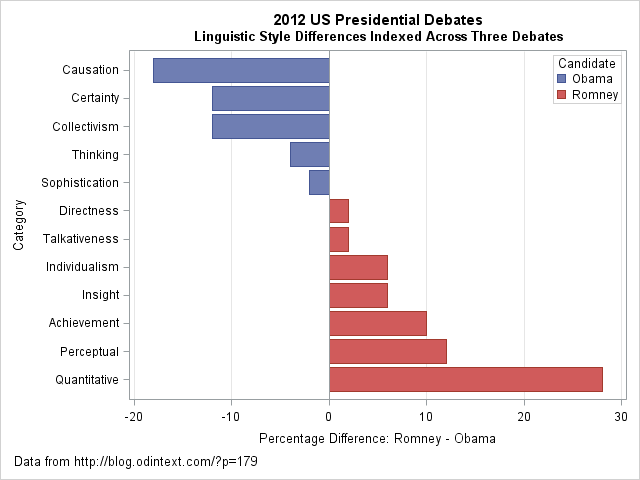
I think that the "difference plot" is superior to the original radar chart and to the stacked bar chart. It makes a clear contrast of the candidates' styles. You can clearly see that Obama's words evoked causation, certainty, and collectivism much more than Romney's did. In contrast, Romney's words were perceptual and quantitative more often than Obama's. In a statistical analysis that includes uncertainties, you could even include a margin of error on this chart. For example, it might be the case that the candidates' styles were not significantly different for the sophistication, directness, and talkativeness categories. If so, those bars might be colored white or grey.
Although radar charts are useful for plotting periodic categories such as months and wind directions, I think a simple bar chart is more effective for this analysis. The main idea that I want to convey is that if you want to contrast two groups, consider displaying the difference between the groups. Also, order categories in a meaningful way, rather than default to an arbitrary order such as alphabetical order. By using these two simple tips, you can create a graph that makes a clear comparison between two groups.
What do you think? For these data, which plot would you choose to display differences between the candidates?

8 Comments
Great post! I like the way you have recreated the data and improved on visualizations. Interestingly when I saw the stacked bar chart I was thinking how difficult it was to see the difference and charting the difference would be an improvement. :-) I like how you reordered it too, great idea. As usual great tips!
I'm also wondering whether a heat map on the differences might be another way to visualize the candidate's characteristic differences.
Excellent post, confirming the quote by Naomi Robbins that "One graph is more effective than another if its quantative information can be decoded more quickly or effectively by most of the obervers". Based on this definition, both your representations are more effective. I may also try the first bar chart sorted by either of the two values.
Now, if somehow one was able to compute the areas of the two figures in the radar chart, maybe that provides a measure. But, how do you decide the relative importance of each attribute?
I agree that your last graph is the best representation of these data.
It reminds me of William Cleveland's notes on the graph of imports vs. exports from England: Much better to plot the difference.
The only change I *might* make to your graph is to make the differences in absolute value rather than positive and negative numbers. Considering that this is a plot that would get a wide audience, I think some people might not be comfortable with negative numbers.
Great post. I recently took a snap shot on my phone of a radar plot like this for my "bad data visualizations" collage. It measured 10 different quality characteristics against goal for each. There was a line for the goal, and and a line for the actual, and then the area between them was colored green/red if they were over/under goal. And it just looked a mess. Since there was no logical ordering to the quality characteristics, I think the area was largely influenced by the ordering they used. Anyway, the happy part is I didn't know until now that there was a name for this sort of plot. I appreciate the introduction so I know how to label it if I ever do make that collage. : )
Thank you for improving on our work. I agree with you, whether a spider chart or bar chart is used, it’s helpful to sort on the difference and this is what we usually do. In this case the analysis was done very quickly (over night) so that it would be ready the next morning, so that may be part of the reason why this happened.
There is also some question as to whether or not certain attributes belong together here such as “individualism” and “collectivism” etc. But overall in this case I agree that a rank sort would be better.
Pingback: Claiming diversity? Compare with the population! - The DO Loop
Pingback: 10 tips for creating effective statistical graphics - The DO Loop
I'm late to reading this, but thank you! I've always found radar charts difficult to interpret and appreciate how much easier it is to gain the same information/insights from the bar charts. I'm keeping this in my back pocket for the next time I need it.