It seemed like an easy task. A SAS user asked me how to use the SGPLOT procedure to create a bar chart where the vertical axis shows percentages instead of counts.
I assumed that there was some simple option that would change the scale of the vertical axis from counts to percentages. After all, if you use the BARCHART statement in the GTL, you can use the STAT=PCT option to accomplish this. Unfortunately, PROC SGPLOT in SAS 9.3 does not support the STAT=PCT option. I checked the SAS 9.3 documentation for the VBAR statement several times, but, by golly, I didn't see any option that sets the scale!
At last I concluded that I would need to pre-compute the percentages and use the RESPONSE= option on the VBAR statement to specify the scale of the vertical axis.
One-way frequencies and bar charts
Assume that you want to display percentages instead of counts. If you are creating a bar chart for a one-way analysis of a categorical variable, the easiest way to visualize the categories is to use the ODS graphics in PROC FREQ. The TABLES statement supports creating a bar chart, and you can specify the scale of the vertical axis with the SCALE= option, as follows:
/* Frequency plot of percentages for one variable */ ods graphics on; proc freq data=sashelp.cars; tables Origin / plots=FreqPlot(scale=Percent) out=Freq1Out; /* save Percent variable */ run; |
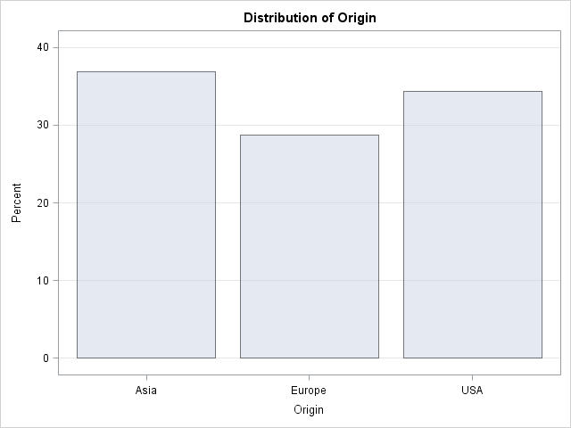
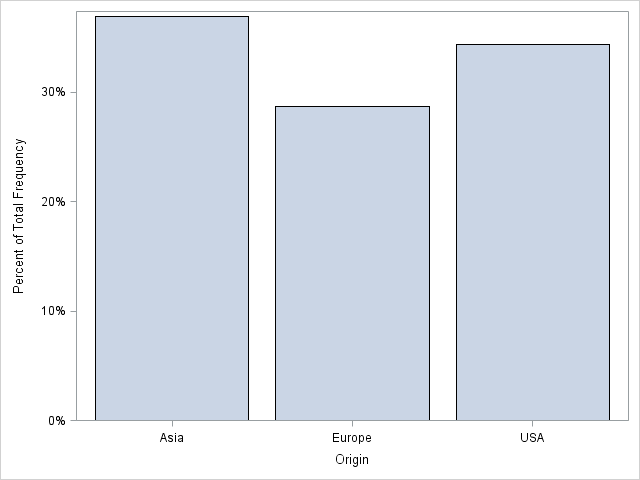
However, sometimes you might want to use the SGPLOT procedure, especially if you want to add titles or reference lines, or otherwise change the default properties of the bar chart. In that case, you can use the information in the Freq1Out data set that is created by the OUT= option on the TABLES statement. The Percent variable contains values in the range [0, 100]. I sometimes like to use values in the range [0,1]. The following DATA step divides by 100 and applies the PERCENTw.d format before plotting the summarized data:
/* use PROC SGPLOT to create a bar chart that shows percentages */ /* optional: divide by 100 and apply PERCENTw.d format */ data Freq1Out; set Freq1Out; Percent = Percent / 100; /* adjust range to [0, 1] */ format Percent PERCENT5.; run; proc sgplot data=Freq1Out; vbar Origin / response=Percent; /* axis shows percentages instead of counts */ run; |
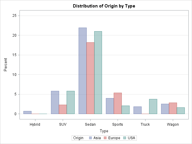
Two-way frequencies and grouped bar charts
The same trick works if you want to create a grouped bar chart. As before, you can create the bar chart directly by using the ODS graphics in PROC FREQ:
/* Frequency plot of percentages for two variables */ proc freq data=sashelp.cars; tables Origin*Type / plots=FreqPlot(twoway=cluster scale=Percent) out=Freq2Out; run; |
The bar chart looks very similar to the bar chart that is produced by using the SGPLOT procedure and the summarized data in the Freq2Out data set:
/* use PROC SGPLOT to create a grouped bar chart that shows percentages */ /* optional: divide by 100 and apply PERCENTw.d format */ data Freq2Out; set Freq2Out; Percent = Percent / 100; format Percent PERCENT5.; run; proc sgplot data=Freq2Out; vbar type /group=Origin groupdisplay=cluster response=Percent; run; |
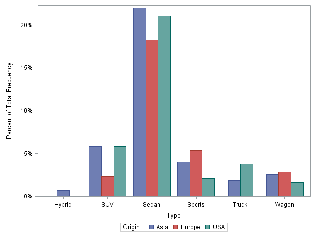
Notice an interesting difference in the two-way (grouped) bar chart: the FREQ procedure plots empty categories, such as the category of European trucks, whereas the SGPLOT procedure does not. Of course, the biggest difference between the PROC FREQ bar charts and the PROC SGPLOT bar charts are the washed-out colors in the PROC FREQ graphs. In order to show grid lines in the background, the template for the FREQ bar chart uses semi-transparent bars, which results in the washed-out colors.
In conclusion, yes, you can use PROC SGPLOT to create a bar chart that shows percentages, but you need to pre-compute the percentages. Can you think of a different way to accomplish this task?

9 Comments
Rick, thanks for sharing the trick. One of the other options that is missing in VBAR statement in SGPLOT is to specify Y or Y2 axis. I had to use GTL to create two Y axes. It would be much easier if user have that control in VBAR statement. Second but also important missing option on VBAR is to specify the numeric format of labels. If users use STAT options (MEAN) then in the current SGPLOT procedure there is no way to control the number of significant digits. Third and last missing component that is bothering me alot these days is to control the order of character categories on X-axis. I have to use DATASTEP procedure to control it.
Pingback: Create a bar chart with an “Others” category - The DO Loop
Could you please provide the code for SAS 9.2 to create the plot with percentage?
Thanks.
The process is the same for the basic VBAR at SAS 9.2. For the grouped case, you need to use a different process as described here: Percent VBAR.
Pingback: Percent VBar - Graphically Speaking
I have a related question, I would also like to add the Ns to the bottom of the bars - that way a person can get the percentages and also the total number per bar.
In sgplot I am able to add another vbar with the Ns, and place the values as well
I was able to overlay 2 vbars, with the pct one being the second one and that works because they are on the initial scale so the percentages show at the bottom and the bars are not visible (but there)
however, this is not what I wanted, I wanted percentages on top of bars and Ns at the bottom - anyone knows how to achieve this? reversing the vbar statements does not work as then the Ns in diffeent colors obscure the %s
I think you can use the VBARPARM statement instead of the VBAR statement. The VBARPARM statement has a DATALABEL= and a DATALABELPOS= option that you can use to display the labels (the N values).
If you run into trouble, post your question and example data to the SAS/GRAPH and ODS Graphics Support Community.
Thanks for the workaround in 9.3!
I just spent the morning trying to figure out why everything I saw for vbar had stat=pct available. Then I realized I was searching for: "sas 9.4 sgplot stat" and not SAS 9.3... (upgrading this week, so my head was already there...)
So it appears that stat=pct /is/ available in 9.4.
Pingback: Let PROC FREQ create graphs of your two-way tables - The DO Loop