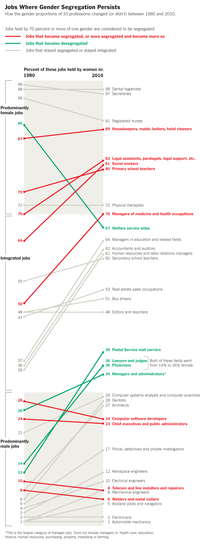
The New York Times has an excellent staff that produces visually interesting graphics for the general public. However, because their graphs need to be understood by all Times readers, the staff sometimes creates a complicated infographic when a simpler statistical graph would show the data in a clearer manner.
A recent graphic was discussed by Kaiser Fung in his article, "When Simple Is too Simple." Kaiser argued that the Times made a poor choice of colors in a graphic (shown at right) that depicts the proportion of women in certain jobs and how that proportion has changed between 1980 and 2010.
I agree with Kaiser that the colors should change, and I will discuss colors in a subsequent blog post. However, I think that the graph itself suffers from some design problems. First, it is difficult to see overall trends and relationships in the data. Second, in order to understand the points on the left side of the graph, you have to follow a line to the right side of the graph in order to find the label. Third, the graph is too tall. At a scale in which you can read the labels, only half the graph appears on my computer monitor. If printed on a standard piece of paper, the labels would be quite small.
You can overcome these problems by redesigning the graph as a scatter plot. I presume that the Times staff rejected the scatter plot design because they felt it would not be easily interpretable by a general Times reader. Another problem, as we will see, is that a scatter plot requires shorter labels that the ones that are used in the Times graphic.
A scatter plot of the same data is shown in the next figure. (Click to enlarge.) The graph shows the proportion of women in 35 job categories. The horizontal axis shows the proportion in 1980 and the vertical axis shows the proportion in 2010. Jobs such as secretary, hygienist, nurse, and housekeeper are primarily held by women (both in 1980 and today) and appear in the upper right. Jobs such as auto mechanic, electrician, pilot, and welder are primarily held by men (both in 1980 and today) and appear in the lower left. Jobs shown in the middle of the graph (bus driver, reporter, and real estate agents) are held equally by men and women.
The diagonal line shows the 1980 baseline. Points that are displayed above that line are jobs for which the proportion of women has increased between 1980 and 2010. This graph clearly shows that the proportion of women in most jobs has increased or stayed the same since 1980. (I classify a deviation of a few percentage points as "staying the same," because this is the margin of error for most surveys.) Only the job of "welfare aide worker" has seen a substantial decline in the proportion of women.
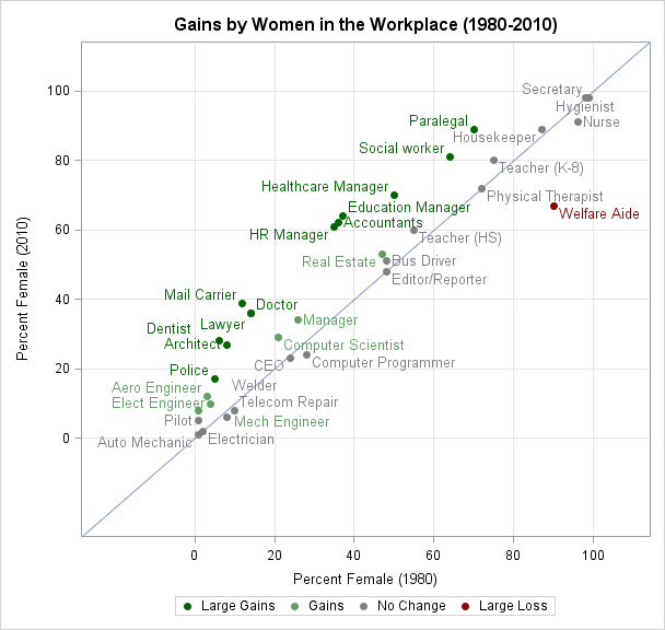
The markers are colored on a red-green scale according to the gains made by women. Large gains (more than 10%) are colored a dark green. Lesser gains (between 5% and 10% are a lighter green. Similarly, jobs for which the proportion of women declined are shown in red. Small changes are colored gray.
This graph shows the trend more clearly than the Times graphic. You can see at a glance that women have made strides in workplace equity across many fields. In many high-paying jobs such as doctor, lawyer, dentist, and various managerial positions, women have made double-digit gains.
The shortcomings of the graph include using shorter labels for the job categories, and losing some of the ability to know the exact percentages in each category. For example, what is the proportion of females that work as a welfare aide in 2010? Is it 68%, 67%, or 66%? This static graph does not give the answer, although if the graph is intended for an online display you can create tooltips for each point.
For those readers who are interested in the details, you can download the SAS program that creates this plot. The program uses three noteworthy techniques:- A user-defined SAS format is used to display the differences in proportions into a categorical variable with levels "Large Gains," "Gains," "No Change," and so on.
- An attribute map is used to map each category to a specified shade of red, gray, and green. This feature was introduced in SAS 9.3. My next blog post will discuss this step in more detail.
- The DATALABEL= option is used to specify a variable that should be used to label each point. The labels are arranged automatically. The SAS research and development staff spent a lot of time researching algorithms for the automatic placement of labels, and for this example the default algorithm does an excellent job of placing each label near its marker while avoiding overlap between labels.
What do you think? Which graphic would you prefer to use to examine the gains made by women in the workplace? Do you think that the New York Times readers are sophisticated enough to read a scatter plot, or should scatter plots be reserved for scientific communication?

4 Comments
Hi Rick
A few comments:
1) I think part of the job of a journalist is to educate people. People should know more when they finish reading an article than when they start. On substantive matters, probably few would disagree. But why shouldn't this include methodology? The scatter plot can be explained.
2) I think a fair proportion of the Times readers can read scatter plots.
3) What I think would be even better than the scatter plot you have is one where the x axis has "percent female 1980" and the y axis has the gain (or loss). Then "no change" is horizontal, and it's easier to compare distance from a horizontal line than distance from a diagonal one. This would be like a Tukey mean difference plot, but I think it is more intuitive (at least in this example) to let the x-axis be the starting value rather than the mean. This also lets us get away from categories like "large gain" and look at gain or loss more precisely.
These charts are not Sec 508 compliant (Americans w. Disablities act) because they use color only to distinguish lines/points. We at a federal agency e.g. CDC could not publish results this way.
Yes. Kaiser also mentions that the New York Times graphic uses red and green, which is a bad choice for color-blind readers, and proposes using red and blue instead.
Pingback: Specify the colors of groups in SAS statistical graphics - The DO Loop