Over at the SAS and R blog, Ken Kleinman discussed using polar coordinates to plot time series data for multiple years. The time series plot was reproduced in SAS by my colleague Robert Allison.
The idea of plotting periodic data on a circle is not new. In fact it goes back at least as far as Florence Nightingale who used polar charts to plot the seasonal occurrence of deaths of soldiers during the Crimean War. Her diagrams are today called "Nightingale Roses" or "Coxcombs."
The polar charts created by Kleinman and Allison enable you to see general characteristics of the data and could be useful for comparing the seasonal temperatures of different cities. A city such as Honolulu, Hawaii, that has a small variation in winter-summer temperatures will have a polar diagram for which the data cloud is nearly concentric. Cities with more extreme variation—such as the Albany, NY, data used by Kleinman and Allison—will have a data cloud that is off center. Comparing cities by using polar charts has many of the same advantages and disadvantages as using radar charts.
However, if you want to model the data and display a fitted curve that shows seasonality, then a rectangular coordinate system is better for displaying the data. For me, trying to follow a sinusoidal curve as it winds around a circle requires too much head-tilting!
Fitting periodic data: The quick-and-dirty way
You can visualize periodic time-series data by "folding" the data onto a scatter plot. The easiest way to do this is to plot the day of the year for each data point. (The day of the year is called the "Julian day" and is easily computed by applying the SAS JULDAYw format.) That produces a scatter plot for which the horizontal axis is in the interval [1, 365], or [1, 366] for leap years. An alternative approach is to transform each date into the interval (0,1] by dividing the Julian day by the number of days in the year (either 365 or 366). The following SAS code performs a "quick and dirty" fit to the temperature data for Albany, NY. The code does the following:
- A DATA step reads the temperatures for Albany, NY, from its Internet URL. This uses the FILENAME statement to access data directly from a URL.
- The Julian day is computed by using the JULDAY3. format.
- The proportion of the year is computed by dividing the Julian day by 365 or 366.
- The winter of 2011-2012 is appended to the data to make it easier to accent those dates while using transparency for the bulk of the data.
- The SGPLOT procedure is used to create a scatter plot of the data and to overlay a loess curve.
/* Read the data directly from the Internet. This DATA step adapted from Robert Allison's analysis: http://sww.sas.com/~realliso/democd55/albany_ny_circular.sas */ filename webfile url "http://academic.udayton.edu/kissock/http/Weather/gsod95-current/NYALBANY.txt" /* behind a corporate firewall? don't forget the PROXY= option here */ ; data TempData; infile webfile; input month day year Temperature; format date date9.; date=MDY(month, day, year); dayofyear=0; dayofyear=put(date,julday3.); /* incorporate leap years into calculations */ Proportion = dayofyear / put(mdy(12, 31, year), julday3.); label Proportion = "Day of Year (Normalized)"; CurrentWinter = (date >='01dec2011'd & date<='15mar2012'd); if Temperature^=-99 then output; run; /* Technique to overlay solid markers on transparent markers */ data TempData; set TempData /* full data (transparent markers) */ TempData(where=(CurrentWinter=1) /* special data (solid) */ rename=(Proportion=Prop Temperature=Temp)); run; proc sgplot data=TempData; scatter x=Proportion y=Temperature / transparency=0.8; scatter x=Prop y=Temp / markerattrs=(color='gray' symbol=CircleFilled) legendlabel="Winter 2011-12"; loess x=Proportion y=Temperature / smooth=0.167 nomarkers lineattrs=(thickness=4px) legendlabel="Loess smoother"; yaxis grid; title "Temperature in Albany, NY (1995-2012)"; run; |
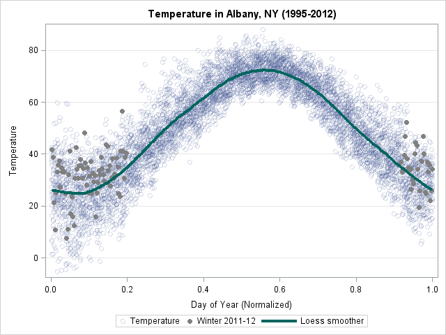
A few aspects of the plot are interesting:
- Only about 27% of this past winter's temperatures are below the average temperature, as determined by the loess smoother. This indicates that the Albany winter was warmer than usual—a result that was not apparent in the polar graph.
- The smoother enables you to read the average temperatures for each season.
The observant reader might wonder about the value of the smoothing parameter in the LOESS statement. The smoothing value is 61/365 = 0.167, which was chosen so that the mean temperature of a date in the center of the plot is predicted by using a weighted fit of temperatures for 30 days prior to the date and 30 days after the date. If you ask the LOESS procedure to compute the smoothing value for these data according to the AICC or GCV criterion, both criteria tend to oversmooth these data.
Creating a periodic smoother
The loess curve for these data is very close to being periodic....but it isn't quite. The value at Proportion=0 and Proportion=1 are almost the same, but the slopes are not. For other periodic data that I've examined, the fitted values have not been equal.
Why does this happen? Because of what are sometimes called "edge effects." The loess algorithm is different near the extremes of the data than it is in the middle. In the middle of that data, about k/2 points on either side of x are used to predict the value at x. However, for observations near Proportion=0, the algorithm uses about k points to the right of x, and for observations near Proportion=1, the loess algorithm uses about k points to the left of x. This asymmetry leads to the loess curve being aperiodic, even when the data are periodic.
In my next post I show how to create a really, truly, honestly periodic smoother for these data.

8 Comments
For a better LOESS fit (i.e., to eliminate the end effects), I would do as you have done, plotting data from January to December, using a smoothing value of 61 days (or maybe 31, if the winter and summer extremes were flattened too much). Then I would rearrange the data so it goes from July to June and repeat the LOESS. Smoothing values for the spring and summer should be the same, so I would combine April to September of the January-December smoothing with October to March of the July-June smoothing.
Then, since I'm interested in winter temperatures, I'd do my main chart from July to June.
Pingback: Creating a periodic smoother - The DO Loop
Pingback: A singular spectrum analysis of a temperature time series - The DO Loop
Rick -
I wonder if you have the source data for this chart?
The links in the first paragraph link to the data, which is apparently
http://academic.udayton.edu/kissock/http/Weather/gsod95-current/NYALBANY.txt
Never mind. I clicked Send, read the next article, and saw the link in the Periodic Smoother code sample.
Pingback: Create a strip plot in SAS - The DO Loop
Pingback: 10 tips for creating effective statistical graphics - The DO Loop