Over at the SAS Discussion Forums, someone asked how to use SAS to fit a Poisson distribution to data. The questioner asked how to fit the distribution but also how to overlay the fitted density on the data and to create a quantile-quantile (Q-Q) plot.
The questioner mentioned that the UNIVARIATE procedure does not fit the Poisson distribution. That is correct: the UNIVARIATE procedure fits continuous distributions, whereas the Poisson distribution is a discrete distribution. Nevertheless, you can fit Poisson data and visualize the results by combining several SAS procedures. This article shows one way to accomplish this. The method also works for other discrete distributions such as the negative binomial and the geometric distribution.
Do I receive emails at a constant rate?
For data I will use the number of emails that I received one day for each of 19 half-hour periods from 8:00 am to 5:30 pm. If I receive emails at a constant rate during the day, the number of emails in each 30-minute period follows a Poisson distribution. The following DATA step defines the data; PROC FREQ tabulates and plots the sample distribution:
/* number of emails received in each half-hour period 8:00am - 5:30pm on a weekday. */ data MyData; input N @@; /* 8a 9a 10a 11a 12p 1p 2p 3p 4p 5p */ datalines; 7 7 13 9 8 8 9 9 5 6 6 9 5 10 4 5 3 8 4 ; /* Tabulate counts and plot data */ proc freq data=MyData; tables N / out=FreqOut plots=FreqPlot(scale=percent); run; |
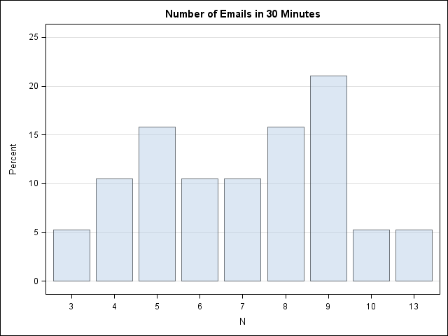
The mean of the data is about 7. A Poisson(7) distribution looks approximately normal—which these data do not. On the other hand, there are less than 20 observations in the data, so let's proceed with the fit. (I actually looked at several days of email before I found a day that I could model as Poisson, so these data are NOT a random sample!)
Fit the data
The first step is to fit the Poisson parameter to the data. You can do this in PROC GENMOD by by using the DIST= option to specify a Poisson distribution. Notice that I do not specify any explanatory variables, which means that I am fitting the mean of the data.
/* 1. Estimate the rate parameter with PROC GENMOD: http://support.sas.com/kb/24/166.html */ proc genmod data=MyData; model N = / dist=poisson; output out=PoissonFit p=lambda; run; |
At this point you should look at the goodness-of-fit and parameter estimates tables that PROC GENMOD creates to see how well the model fits the data. I will skip these steps.
Compute the fitted density
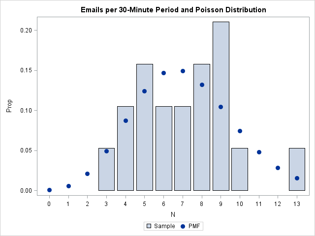
The P= option on the OUTPUT statement outputs the mean, which is also the parameter estimate for the fitted Poisson distribution. The mean is about 7.1. The following statements set a macro variable to that value and create a data set (PMF) that contains the Poisson(7.1) density for various x values. In a subsequent step, I'll overlay this fitted density on the empirical density.
/* 2. Compute Poisson density for estimated parameter value */ /* 2.1 Create macro variable with parameter estimate */ data _null_; set PoissonFit; call symputx("Lambda", Lambda); stop; run; /* 2.2 Use PDF function for range of x values */ data PMF; do t = 0 to 13; /* 0 to max(x) */ Y = pdf("Poisson", t, &Lambda); output; end; run; |
Overlay the empirical and fitted densities
I want to overlay the discrete density on a bar chart of the data. One way to visualize the discrete density is as a scatter plot of (x, pdf(x)) values that represent the fitted density at x=0, 1,...,13. Unfortunately, you cannot use the VBAR and the SCATTER statements in the same SGPLOT call to overlay a bar chart and a scatter plot. However, in SAS 9.3 you can use the VBARPARM statement together with the SCATTER statement. (Thanks to "PGStats" for this suggestion.) The VBARPARM statement requires that you compute the heights of the bars yourself, but the heights are easily constructed from the PROC FREQ output that was created earlier:
/* 3. Use bar chart to plot data. To overlay a bar chart and scatter plot, use the VBARPARM stmt instead of VBAR. */ data Discrete; merge FreqOut PMF; Prop = Percent / 100; /* convert to same scale as PDF */ run; /* 3.2 Overlay VBARPARM and scatter plot of (x, pdf(x)) */ proc sgplot data=Discrete; /* VBARPARM is SAS 9.3 stmt */ vbarparm category=N response=Prop / legendlabel='Sample'; scatter x=T y=Y / legendlabel='PMF' markerattrs=GraphDataDefault(symbol=CIRCLEFILLED size=10); title "Emails per 30-Minute Period and Poisson Distribution"; run; |
Create a discrete Q-Q plot
On the Discussion Forum, the questioner asked for a quantile-quantile plot. I don't know whether I've ever seen a Q-Q plot for a discrete distribution before; usually they are shown for continuous distributions. However, you can create a discrete Q-Q plot by following exactly the same steps that I described in my previous article on how to compute a Q-Q plot:
/* 4. Create a Q-Q plot */ /* 4.1 Compute theoretical quantiles */ proc sort data=MyData; by N; run; /* 1 */ data QQ; set MyData nobs=nobs; v = (_N_ - 0.375) / (nobs + 0.25); /* 2 */ q = quantile("Poisson", v, &Lambda); /* 3 */ run; proc sgplot data=QQ noautolegend; /* 4 */ scatter x=q y=N; lineparm x=0 y=0 slope=1; /* SAS 9.3 statement */ xaxis label="Poisson Quantiles" grid; yaxis label="Observed Data" grid; title "Poisson Q-Q Plot of Emails"; run; |
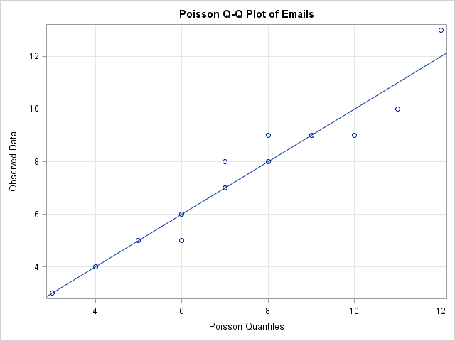
I've created a discrete Q-Q plot, but is it useful? A drawback appears to be that the discrete Q-Q plot suffers from overplotting, whereas a continuous Q-Q plot does not. A continuous CDF function is one-to-one so the quantiles of the ranks of the data are unique. In contrast, the CDF function for a discrete distribution is a step function, which leads to duplicated quantiles and overplotting.
For example, in the discrete Poisson Q-Q plot for my email, there are 19 observations, but only 13 points are visible in the Q-Q plot due to overplotting. If I analyze 10 days of my email traffic, I could get 190 observations, but the Q-Q plot might show only a fraction of those points. (In simulated data, there were only 25 unique values in 190 observations drawn from a Poisson(7) distribution.)
The fact that I don't often see discrete Q-Q plots bothered me, so I did a little research. I found a reference to discrete Q-Q plots on p. 126 of Computational Statistics Handbook with MATLAB where it says:
Quantile plots...are primarily used for continuous data. We would like to have a similar technique for graphically comparing the shapes of discrete distributions. Hoaglin and Tukey [1985] developed several plots to accomplish this [including]the Poissonness plot.
That sounds interesting! A future blog post will present an alternative way to visualize the fit of a Poisson model.

34 Comments
Interesting work. I had to do this myself a couple of weeks ago. To visualise I used a bar chart with two differently coloured bars for each value of N, one colour for theoretical value, another for real value.
To check if the data fit the theoretical distribution I calculated a Chi Square test. If you do that and use your data to estimate Lambda, you need to decrease your degrees of freedom by one.
Nice example! You never really answer your question Do I receive emails at a constant rate? Seems like the answer, not too surprisingly, is no (it dropped by about 3% every half hour during the day) :
/* number of emails received in each half-hour period
8:00am - 5:30pm on a weekday. */
data MyData;
input N @@;
t = intnx('MINUTE', '07:45:00't, _n_*30);
h = 7.75 + _n_ / 2; /* Better time units for COUNTREG */
format t hhmm5.;
datalines;
7 7 13 9 8 8 9 9 5 6 6 9 5 10 4 5 3 8 4
;
proc countreg data=myData;
model n = h / dist=Poisson;
output out=myPreds pred=pred;
ods output ParameterEstimates=myEsts;
run;
proc sql;
create table predGraph as
select t, n, pred,
quantile('Poisson',0.025, pred) as lower,
quantile('Poisson',0.975, pred) as upper
from myPreds
order by t;
proc sql noprint;
select EXP(Estimate*0.5) - 1 format=percentn6.1, Probt into :trend, :trendP
from myEsts where upcase(Parameter)="H";
proc sgplot data=predGraph noautolegend;
vbarparm category=t response=N;
band x=t lower=lower upper=upper / type=step transparency=0.8 fillattrs=(color=red);
series x=t y=pred / lineattrs=(color=darkred thickness=3);
inset "Trend = &trend. per half hour" "P = &trendP." / position=topright noborder;
xaxis offsetmin=0.05 offsetmax=0.05 fitpolicy=thin label="Time of day";
yaxis integer min=0 label="EMails / 30 minutes";
run;
PG
Thanks for the analysis! I always appreciate feedback and alternative ways to approach a problem. As I said, I had to search through my emails to find a day on which the data was at least approximately Poisson. This is not a random sample; I chose it thinking that the conclusion would be "Yes, there is no reason to think that I don't get emails at a constant rate." It looks like you are introducing time-of-day as an explanatory variable and analyzing it as a regression problem, whereas I was treating the collection of counts as a univariate sample.
Pingback: The Poissonness plot: A goodness-of-fit diagnostic - The DO Loop
i want to create a histogram for length of stay and fit the distribution into a poisson density function and also determine Lambda!!
I tried to use the above code but I get an error in the SGPLOT step while using the vbarparm statement(i copy the code as it is here and in the SAS window vbarparm appears "RED". Could you help me please
The code clearly states that VBARPARM is SAS 9.3 statement. Are you running SAS 9.3?
Thank you for the response. i am on 9.2. Could you please help me with this .I am scanning through the Documentation since morning. Thanks for the help.
As I show, you can use PROC GENMOD to fit the parameter, lambda. In SAS 9.2, you can use GTL and PROC SGRENDER to obtain the same plot as is in this article.
You can ask questions like this at the SAS statistical discussion forum: https://communities.sas.com/community/support-communities/sas_statistical_procedures There are many smart people there who can give you lots of advice on how to compute statistics in SAS.
Thank you so much for the valuable information. Thanks for your time too
Also I guess the proc freq step above needs to have ODS ON AND OFF. Otherwise there is an error.
Correct. In SAS 9.3, ODS GRAPHICS are ON by default.
Dear sir,
I posted on the site which you showed and no one seems to be interested with the Question. I read the documentation and came up with this.
proc template;
define statgraph histogram;
begingraph;
layout overlay;
histogram FreqOut;
endlayout;
endgraph;
end;
run;
ods graphics;
ods listing;
proc sgrender data=Discrete
template=histogram;
run;
Could you please suggest me if I am wrong
I thought you wanted a bar chart with an overlay? If all you want is the bar chart, use PROC FREQ (as shown) or
PROC SGPLOT data=Discrete;
vbar FreqOut;
run;
Dear Rick thanks for your response. I am looking for a histogram with poisson fit..
Thanks
In your GTL, overlay the HSTOGRAM and SERIESPLOT statements.
Thank you so much for this clear and concise example. I only have one problem/question. I am running SAS 9.3 but for some reason the vbarparm option is not working correctly. It is highlighted red in my code, however it does not generate an error in the log. The chart prints but the Poisson dots are all 0. Is this a calculation problem on my side or perhaps my version of 9.3 need an upgrade?
Thank you.
Pingback: 12 Tips for SAS Statistical Programmers - The DO Loop
My PhD advisor would like me to determine how to compare model fit for normal, negative binomial and Poisson distributions in GENMOD using diagnostic graphs, perhaps proc univariate on the residuals. Up to now, we have been using statistics like AIC and deviance/df to test a Poisson-distributed model against a negative binomial distributed model in PROC GENMOD, but my advisor is interested in using graphs to assess distributions of the model residuals instead.
To determine if model residuals are normally distributed, we have used histograms and Q-Q plots in PROC UNIVARIATE. While I doubt model residuals would fit a Poisson or negative binomial distribution, I have been reading your methods on how to graph bar plots of discrete data against a Poisson pdf (it worked) and how to create a Q-Q plot for Poisson-distributed data (haven't got it to work yet). I will also try constructing a Poissoness plot in SAS, then try to adjust the pdf graph and Q-Q plot to test negative-binomially distributed data.
Would you recommend any other graphical diagnostics in PROC GENMOD itself for comparing a model or the model's residuals under different distributions?
Do a literature review (forwards and backwards in time) starting from Ben and Yohai, 2004, JCGS. Also see Friendly's book on visualizing categorical data, and references therein.
Hi Rick,
I studied some of your post and I really appreciate that, They are Awesome. Many Thanks.
I am planning to fit some data with interval CENSORING in SAS. I did that with severity and it was amazing. Unfortunatly, I could not find Poisson distribution. Is there any way to fit my data to poisson distribution. My data are collected from cars and it is hard to judge if it is continious or discrete. Hence, I have to try famous distributions and the only one which is left is poisson. I appreciate that if you could kindly help me with that.
Best regards
Mohsen
I am not familiar with methods for fitting a Poisson distribution to interal-censored data. I suggest you do a literature search and post your question (with sample data, if you have it) to the SAS Statistical Support Community.
This was very nice - I just ran the code on a work data set. With the appropriate name changes, it worked perfectly!
Rick,
Thanks for this great stuff! However, now I want to see how a negative binomial distribution fits. I'm not sure what to enter into the pdf function.
Thanks,
Brian
Thank you for this Rick. :-) It has helped me to understand the Poisson Distribution more. Would I use a similar process for the Negative Binomial test?
Thank you.
Kriss
The same method should work for other discrete distributions that are supported by PROC GENMOD and other regression procedures.
I'm also interested in applying your example to a Negative Binomial and a Geometric distribution. However, I'm not sure how to transfer some of these steps (especially the early data steps on this page). Would you be willing to provide an example?
Thank you very much!
-Dylan
The process is exactly the same. Give it a try and ask questions at the SAS Support Communities.
I did some tinkering, and I think I got it to work. Thank you!
-Dylan
Pingback: Overlay a curve on a bar chart in SAS - The DO Loop
Pingback: Two ways to compute maximum likelihood estimates in SAS - The DO Loop
I know you mentioned that the negative binomial has the same process but after reviewing the pdf function in sas for negative binomial, it is a bit different, with m, p, and n needing to be specified. How would one find these values if you're just looking at count data and don't have a set of successes and failures specified?
The parameterization for GLMMOD uses (mu, k) where mu is the mean and k is a dispersion parameter. The density is given in the PROC GLMMOD documentation. Use that equation instead of the PDF function, which uses a different parameterization in terms of failures, success, and trials.
Thank you for this explanation. However I got this error message at the last step.
NOTE: Since no format is assigned, the numeric category variable will use the default of BEST6.
The fitted symbol does not overlay the bar plot.Instead I get an empty bar extra on 14 emails and this empty bar is the only one wit a filled circle.
How can I solve this problem?
Ismene
Thanks for writing. I can't tell what is wrong from your description. I suggest you plot your data, code, and output. code and a screenshot of your graph to the SAS Support Communities for Graphics. Link to this post and include what version of SAS you are using.