In our previous section of the series we discussed the impact of missingness and techniques to address this. In this final section of the series we look at how we can use drag-and-drop tools to accelerate our EDA.
As mentioned at the beginning of this series, SAS Viya offers multiple interfaces to perform the same actions. This allows users to build analyses with repeatable results as a team, regardless of which interface they use. A user may not want to write lines of code to perform an exploratory data analysis, and they can instead use a Visual Interface such as SAS Visual Analytics. We’re going to briefly cover how we could use Visual Analytics to perform an EDA for our HMEQ dataset. It is worth noting that the outputs of the dataSciencePilot actions were already stored in memory for use in this VA report.
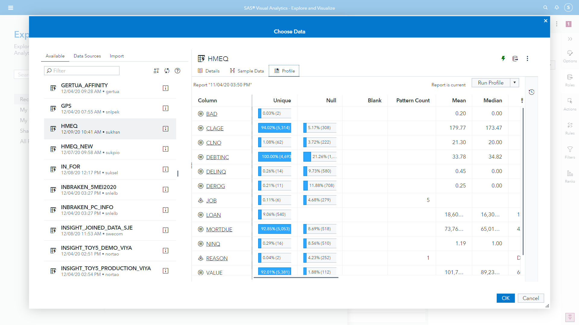
When starting a project in VA you can begin with some data profiling when selecting your source data using the data explorer.
The profile tab gives an overview of the cardinality and missingness in each column of your dataset, and for numeric attributes will display summary statistics. The uniqueness measure also displays the number of unique values which is useful for assessing the number of levels in a categorical attribute.
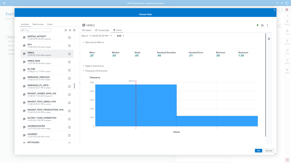
You can drill down into any of the attributes for further information. Numeric attributes will display a histogram for the values. In the case of our target category, shown in Figure 2, we can see an imbalance in our event levels. Note for model building we need to convert this from a numeric into a categorical attribute. We can do this from within the VA interface itself.
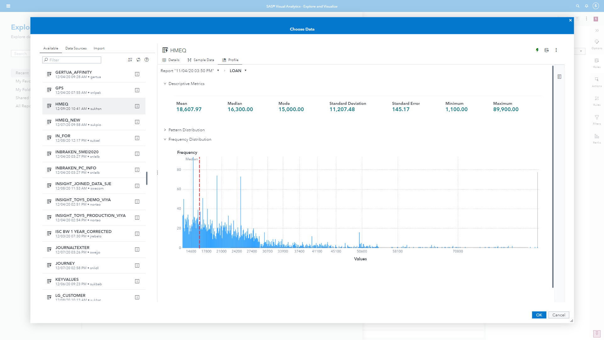
If we look at the Loan amounts, shown in Figure 3, we can see that the histogram is more useful. Clearly there are some outlier values at higher loan amounts and a wide range. The majority of loans tend to be between $10,000 and $20,000. This wide range with many outliers to the right might suggest to us that a log transformation would be beneficial for building a model. this visualization also shows us descriptive statistics to help us better understand out distribution. There is a deviation between the mean and median, though given the range of values it is not so terrible an imbalance.
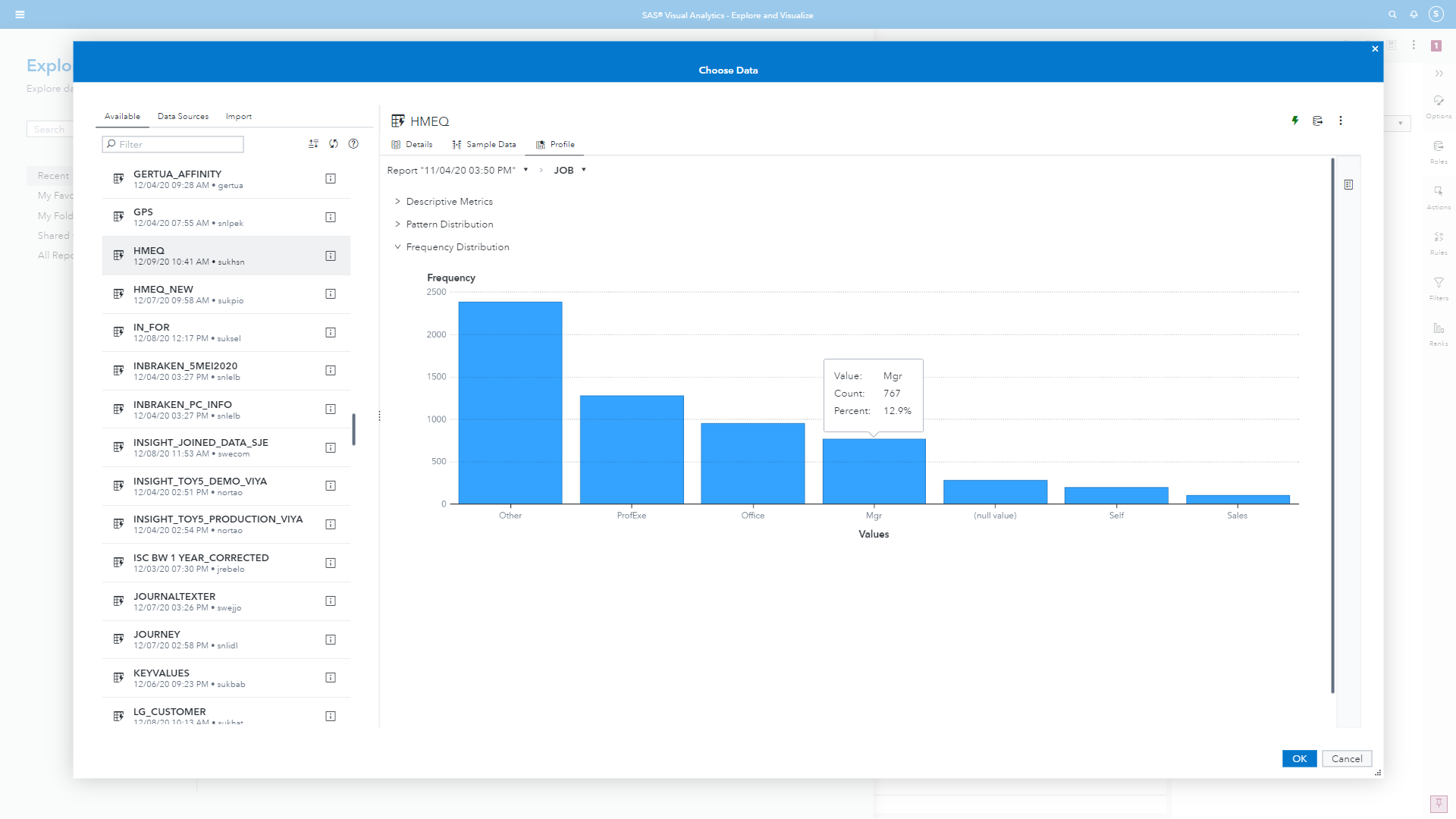
For categorical variables instead of a histogram we get a bar plot visualization showing us the category levels. We can see easily, looking at Figure 4, that there are many missing values and that the category ‘Other’ is a dominant level. The visualizations are all interactive and we can hover over to view the tooltip statistics.
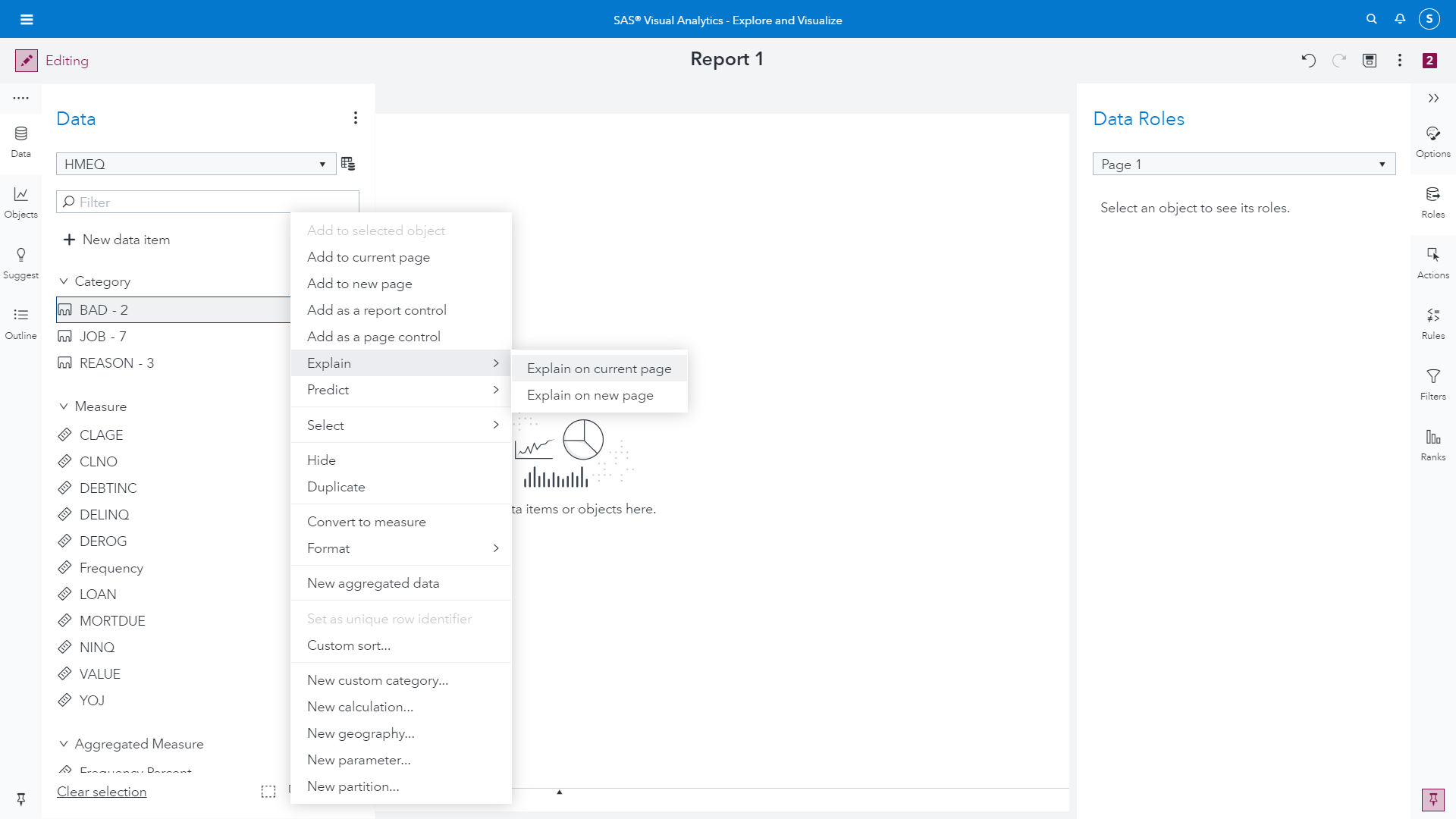
Once we load our dataset into our VA project we can begin building visualizations. Before we get started with building visualizations manually, we can begin by leveraging some of Viya’s autoML capabilities to explain our dataset to us. In Figure 5 we show that we can simply highlight the target column and select “explain”
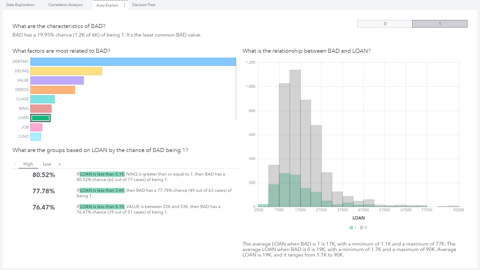
This creates an interactive visualization with a button prompt to let us explore event levels individually, shown in Figure 6. Here we can look at which attributes are most strongly related to our positive class. For example, if we select Loan amount in the visualization it will generate some probability rules in natural language to help us understand the data. Here we can see clearly that if someone applies for a loan that is less than $3,600 there is a substantially higher chance of defaulting on the loan. As analysts we can then think about why this might be. Is it that people with lower credit scores are only allowed to apply for small loan amounts? Or perhaps fraudsters think they are more likely to obtain funds if they only apply for a small amount.
Once we’ve looked at our automated explanations, we can then build visualizations directly with multiple datasets in a single canvas to answer more specific questions about our data. Since we’ve already gone through a lot of the analysis previously, we’ll just highlight some of the key uses of visualization for EDA.
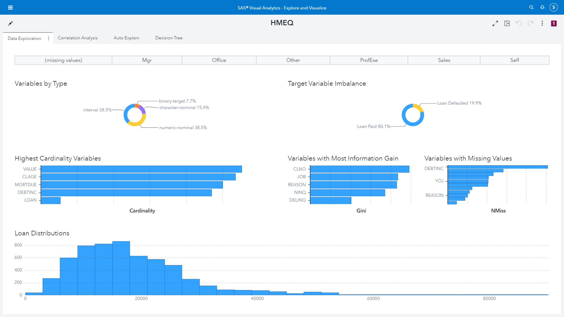
In Figure 7 we build an interactive visualization for the distribution of our data based on our data exploration output. We can easily see the data types in the dataset, the imbalance in our target class. All of this information we have seen previously either through coding or through the data profiling options.
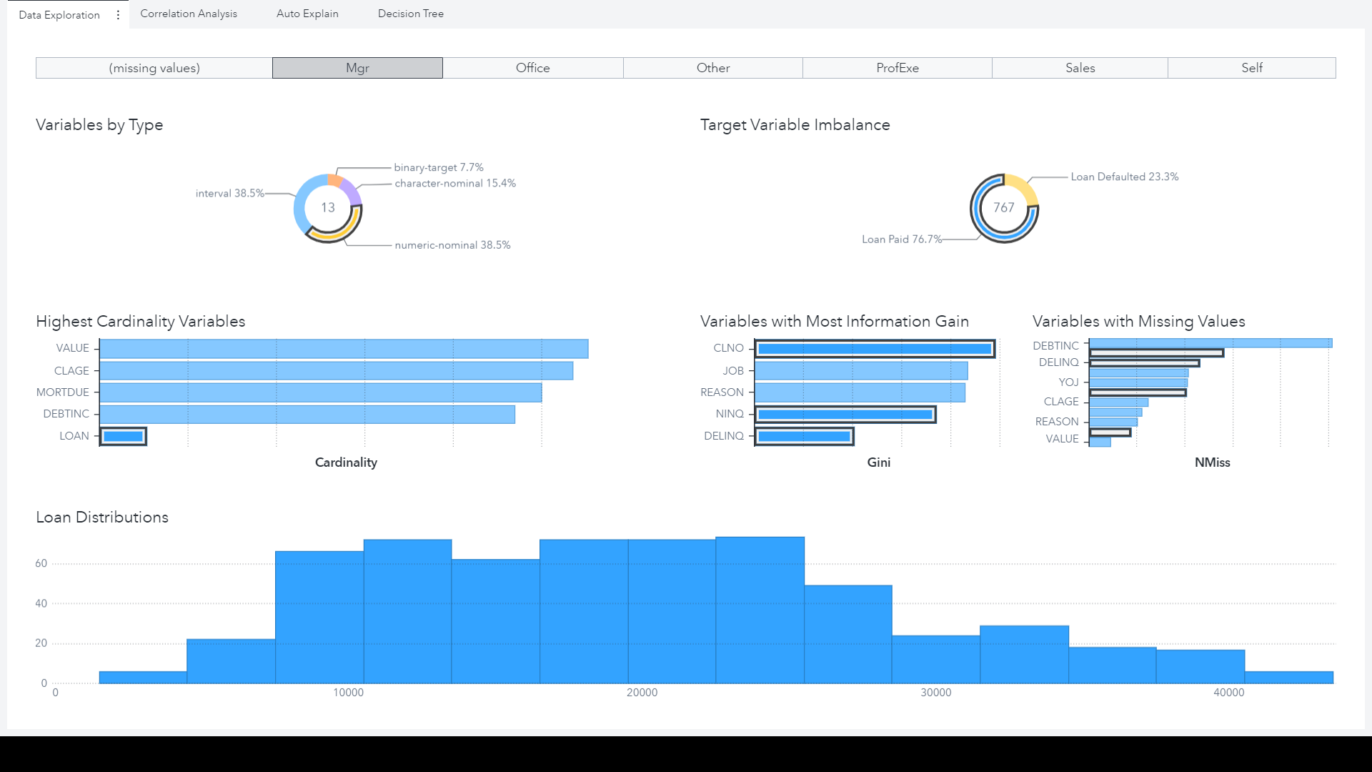
The benefit, however, of using a visual interface like this is the interactivity of the data exploration, highlighted in Figure 8. We are able to create an interactive filter for the job role, so we can assess how the distributions of loan amount change as the job type changes. There may be a relationship here between the job title of a loan applicant, and how much they are asking to borrow. Perhaps this could be related to the pattern we spotted in the ‘explain’ visualization around the frequency of loan default where the loan amount is small. Below we can see that when we filter the data for people who are ‘Managers’ whilst there are fewer loans with a small amount, the proportion of our positive class actually increases, suggesting that (on the face of it) proportionally managers are on average slightly more delinquent than other job types.
However, simply concluding that people in management are more likely to engage in fraud is strange and misleading, and this illustrates the importance of considering data and patterns in context. It is important to approach our data in such a way that we are open to discovering new patterns and insights, but equally that we are also blindly following our data.
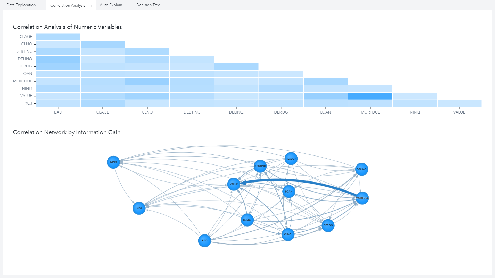
In Figure 9 we are simply putting the output of our ‘explore correlation’ CAS action into a visualization. However, having these as visualizations it is much easier to spot key relationships – for example the collinearity between the loan amount and an applicant’s outstanding mortgage amount.
Finally, as we did in the coding part, we may want to build a simple Decision Tree to assess patterns in the data both in terms of the partitioning and variable importance plots. Once again, looking at the output in Figure 10, these attribute importance results are similar to what we have seen previously – and this is a good thing! It illustrates the consistency of results as we move between interfaces in the Viya platform. In this case there is a slight difference, but if you look closely it is because we have already split the data via an analytic partition, whereas previously we fit the tree on all observations. We’ll discuss more about partitioning data and building models in Visual Analytics in the next blog series.

Whilst Visual Analytics is very suitable for performing EDA, it is not the only visual option for EDA in SAS Viya. One final example here is using the Model Studio interface. Model Studio is a visual pipeline interface to build predictive models with, however it comes with a vast set of functionality which allows you to do more than just building models.
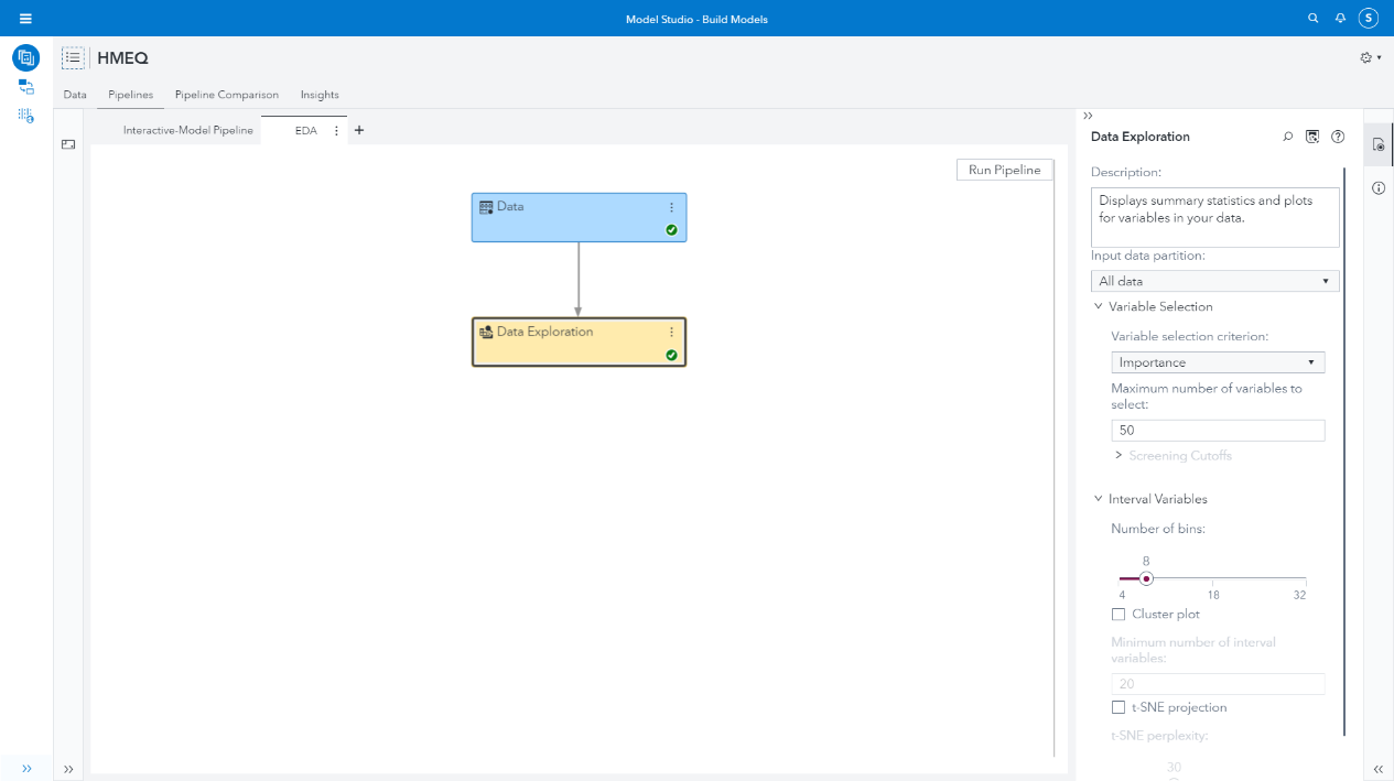
When we create a new project and in our pipeline we can add a Data Exploration node, shown in Figure 11. This will perform an EDA for us automatically, though we have a set of options we can tweak depending on what we want to do. In this case the default variable selection uses an Attribute Importance model, which is helpful to compare with our previous analysis.
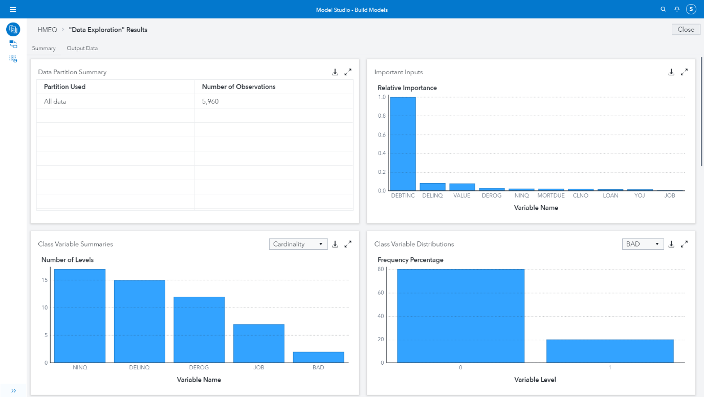
Once the node has ran you can explore the results, shown in Figure 12. The results will show you a set of visualizations describing the data. It shows the distributions of Class and Interval variables, highlights missingness, skewness, cardinality, and moments around the mean. We can see that the results of the Attribute Importance model are like what we produced manually using code previously.
Model Studio gives a really easy way to explore and understand your data. You can then make transformations to the dataset in the data tab (such as log scaling) and prior to building a model you can leverage other useful nodes such as Variable Selection, Filtering, Transformations and Imputation. This is all we’ll cover for now on Model Studio, in our next series we start looking at the foundations of predictive modelling using Model Studio and Visual Analytics.
Conclusion
This is the end of our series on the importance of Exploratory Data Analysis – I hope it has been an interesting read. This series was only a brief introduction to some of the considerations and techniques available to understand and prepare your datasets for predictive modelling. In the next series we’ll pickup where we left off, we’ll briefly consider some Feature Engineering and Sampling techniques and introduce the core concepts of Regression, Classification and Unsupervised Machine Learning algorithms.