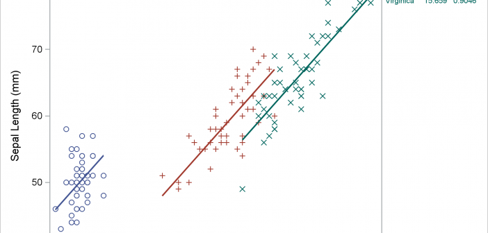
Usually, you use axis tables when there is a clear link between the rows of the axis table and the graph. I'll show how to use an axis table to create a table that is independent of the graph. This post also uses discrete attribute maps.

Usually, you use axis tables when there is a clear link between the rows of the axis table and the graph. I'll show how to use an axis table to create a table that is independent of the graph. This post also uses discrete attribute maps.
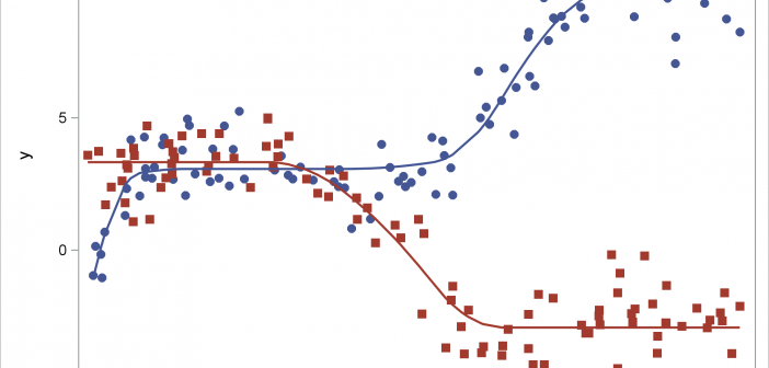
This post shows how to use PROC SGPLOT together with PROC TRANSREG to fit monotonically increasing or decreasing functions through a scatter plot.

This example shows how to create two coordinated range attribute maps and use them in creating an animated gif of the eclipse.
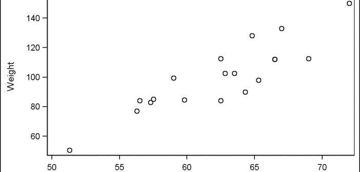
Last week I had the pleasure of presenting my paper "Graphs are Easy with SAS 9.4" at the Boston SAS Users Group meeting. The turn out was large and over 75% of the audience appeared to be using SAS 9.4 back home. This was good as my paper was focused on the cool new
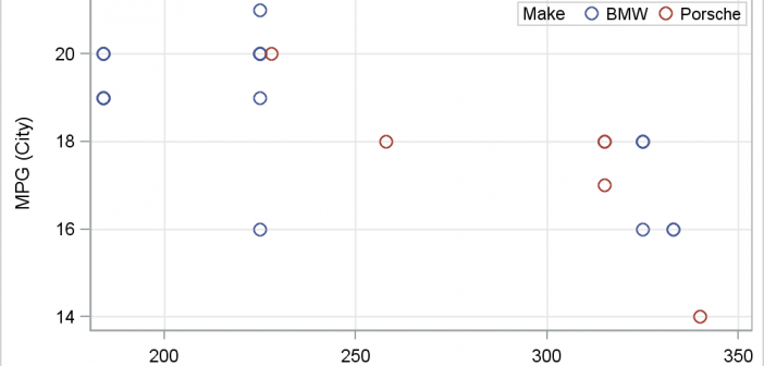
There has been much discussion on the SAS Communities page on usage of different symbols in a graph. The solutioin can vary based on the SAS release. New features have been added at SAS 9.4 releases to SG Procedures and GTL that make this very easy. With SAS 9.4M1, almost any combination is
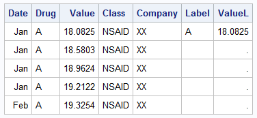
The series plot is a popular way to visualize response data over a continuous axis like date with a group variable like treatment. Here is some data I made up of a response value by date, treatment, classification and company that makes the drug. The data is simulated as shown in the attached program
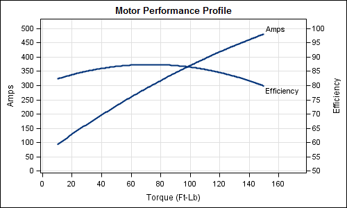
Often it is useful to view multiple responses by a common independent variable all in the same plot. SGPLOT procedure and GTL support the ability to view two responses, one each on the Y and Y2 axes by one independent variable (X) in one graph. Yes, you can also have X