If you're close to my age, you probably remember Joe Walsh's song Ordinary Average Guy. That song popped into my head when I was writing this example about moving averages, so I encourage you to listen to it while reading the blog post.
Many people are looking at graphs lately - graphs of things like the number of disease cases per day. And with real world data, the data points often have a bit of variability, and therefore an average line is often added to the graph, to make it easier to see the trend. Here's a recent example from the BBC website:
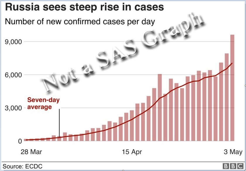
The line in the graph is labeled as the seven-day average ... but which seven days do they use? This is what they call a moving (or rolling) average, therefore at each point along the graph, seven days 'close' to that point are used to calculate the average for that point in time. In the graph above, I suspect that for each point in time, they are using the average of the current day and the previous 6 days (later, you'll see why I suspect this!)
How can you create such a graph in SAS? One way is to use Proc Expand (which is part of the SAS/ETS product). The code below calculates the moving average (movave) for some hypothetical data using a 7-day window. The 7 days used in the average consist of the current day, and the 6 days prior. I also use an option to trim the 6 days on the left side of the graph, since they wouldn't have 7 data points to include in the average.
proc expand data=my_data out=my_data;
convert cases=cases_left_smoothed / method=none transformout=(movave 7 trimleft 6);
run;
I then use the following code to plot the data points as 'needles' (basically, skinny bars), and overlay the moving average as a red line:
proc sgplot data=my_data noborder;
needle y=cases x=date /
lineattrs=(color=orange thickness=2px)
markers markerattrs=(color=gray77 symbol=circle);
series y=cases_left_smoothed x=date / lineattrs=(color=red);
yaxis display=(nolabel noline noticks)
grid gridattrs=(pattern=dot color=gray88)
valueattrs=(color=gray33 size=10pt);
xaxis display=(nolabel) type=time
valueattrs=(color=gray33 size=10pt);
run;
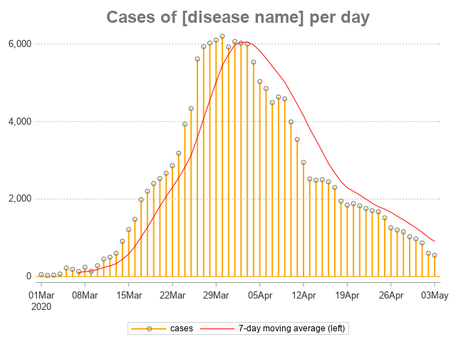
Nice graph, eh? ... Well, maybe if you squint your eyes a little when you look at it. But if you're a discerning user, you might notice that the red average line doesn't really represent the data points (at the top of the bars) very well. This is because we're using the left average. With the left average, when the data values are increasing, the average (red) line will tend to be below the data values. And when the data values are decreasing, the average (red) line will tend to be above the data values. (This is why I suspect the BBC used the left average.)
Rather than using the left average for this type of data, I prefer to use the center average. This uses the current day, and the 3 prior days, and the 3 following days, as the 7 days for the average. This makes the average line 'fit' the data points much better, for this type of data, imho. Here's the code to calculate the centered average (and trim the 3 days on the left of the graph, and 3 days on the right side of the graph):
proc expand data=my_data out=my_data;
convert cases=cases_center_smoothed / method=none transformout=(cmovave 7 trim 3);
run;
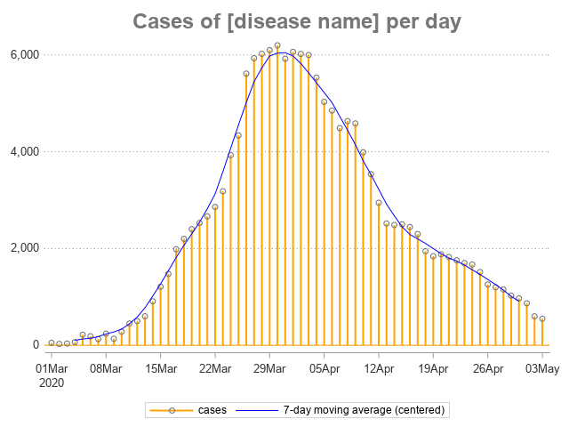
There! - Now doesn't that blue line follow the data points (the circles a the tops of the little bars) much better!? Hopefully you can put this tip to use, and improve your own graphs. Here's a link to my code & data, if you'd like to experiment with it.
Feel free to discuss in the comments, and for fun feel free to post a link to any "average line" graph you find in the news recently, that you think uses the "left" moving average rather than the "centered" moving average.


6 Comments
We don't have that module of SAS, and with the state budgets crashing from the loss of income, getting it will take an act of G*d.
How might one accomplish this with just the Base an Stat modules?
Good question! ... I've always had access to SAS/ETS, so I haven't given it much thought. Perhaps you could do something tricky with data steps and the lag() function, and sorting the data both ways(?)
Maybe someone else has some more elegant tips & techniques, that don't require the SAS/ETS product, and will share it in a comment! 🙂
There are many curve-smoothing algorithms, and I'm no expert, but here are my two cents. A person who does not have SAS/ETS might want to consider using a PBSPLINE statement to overlay a penalized- B-spline curve on top of the NEEDLE plot. This type of graph is included in ODS Graphics so it's included with Base SAS.
While I do have access to EXPAND and consider it a very useful procedure, this is how I would code the centered moving average by hand:
data movave73(keep=cases_center_smoothed midDate);
array sevenObs[7] _temporary_;
set my_data;
* Populate array;
do i=1 to 6;
sevenobs[i]=sevenObs[i+1]; * Move observations backwards to make room for current value;
end;
sevenObs[7]=cases; * Current obs at the end of array;
midDate=lag3(Date); * Date corresponding to array midpoint value;
format midDate date9.;
cases_center_smoothed = Mean(of sevenobs(*));
if _n_>=7 then output; * After 7 observations array is filled and can be used;
run;
Rob,
This a fantastic graph!
Inspired by YinLiang Wu's SAS blog titled "Implementing HMA, WMA & SMA with 27 lines of SAS code", I can create Hull moving average line to replace 7-day moving average line since I only have base SAS license. That's one of reasons I like SAS most is to solve a problem with different approaches.
Ethan
normal distribution one must have mean=median=mode all the data must be contained under the bell curve. I am not sure Just generate a sample from Gaussian distribution, and check its moment. They'll I'm generating 100 samples of 100 random numbers, then obtaining their means and medians.