Now that COVID-19 is spreading in the US, I thought it might be helpful to view the data at a more granular level. Follow along as I plot the county data on a map and discuss how the color-binning can influence people's perception of the data.
Maps like this can be helpful, as they can help you track where the virus has spread - and perhaps more importantly, where it hasn't spread.
County Data
First I needed a source for the US county-level coronavirus data. After a bit of web searching, I found that the usafacts.org had a page dedicated to this topic (see screen-capture below, with download link circled). And their terms and conditions page "encourages you to use this information for education, analysis and discussion regarding government activities" (which is always a welcome thing!)

Their download link goes to a csv file, which is a very convenient/flexible way to provide the data (thankfully it wasn't a table in a pdf file!) With SAS software, I can either download the csv and import it, or import the data directly from the URL, using the following code:
filename confdata url "https://static.usafacts.org/public/data/covid-19/covid_confirmed_usafacts.csv";
proc import datafile=confdata out=confirmed_data dbms=csv replace;
getnames=yes;
guessingrows=all;
run;
Preliminary Map
In this first visualization, I create a map with 5 color levels, and take the default color/legend binning strategy - that's quintile binning, with approximately 1/5 of the counties in each color.
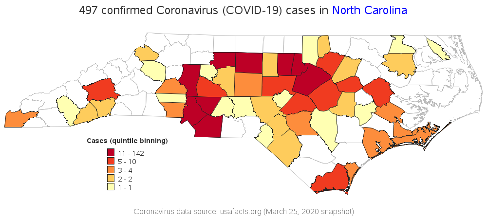
This map (above) looks somewhat dramatic, with lots of dark red. But if you look closely at the legend, you might notice that the dark red is assigned to counties with 11 to 142 confirmed cases. Wow, that's quite a large range! Does it make sense for a county with 11 cases to be dark red (the same as a county with 142 cases)??? Although quantile binning is a good choice in general and makes a good default, perhaps this particular data can be better represented by a different legend binning strategy.
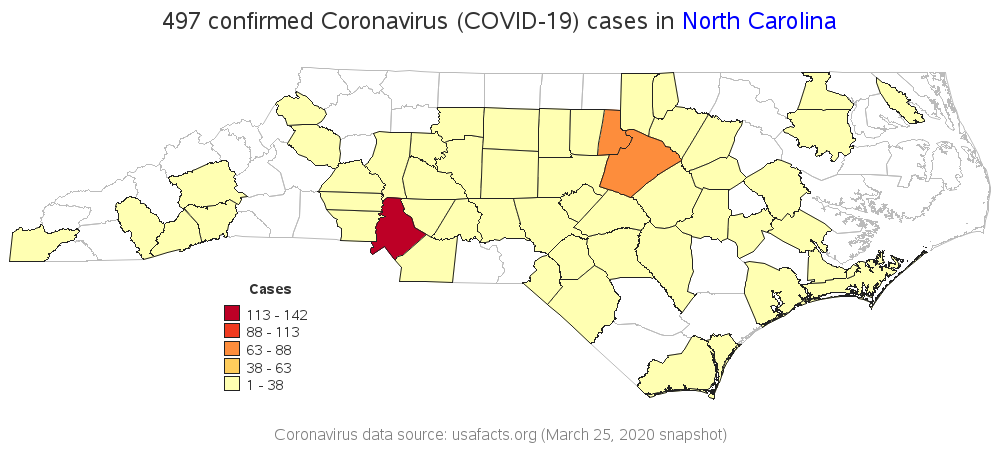
Nelder Legend Binning
For my next map, I have the color legend use the Nelder binning algorithm (Applied Statistics 25:94–7, 1976). Rather than placing 1/5 of the counties are in each bin, this algorithm creates 5 bins that span approximately equal ranges of values. Using this algorithm, Mecklenburg (Charlotte's county), Durham, and Wake (Raleigh's county) are the only counties darker than the lightest (yellow-ish) shade. Wow, you almost wouldn't think this is the exact same data as the previous map!
Cases per 100,000 Residents
Although the 2nd map above is probably a better representation of the data than the first map, it's still a bit biased - counties with larger populations will probably have more coronavirus cases, and show up in the darker colors. Therefore in my next map, I grabbed the county population data and calculate the number of coronavirus cases per 100,000 residents in each county. I think this is a much better number to compare.
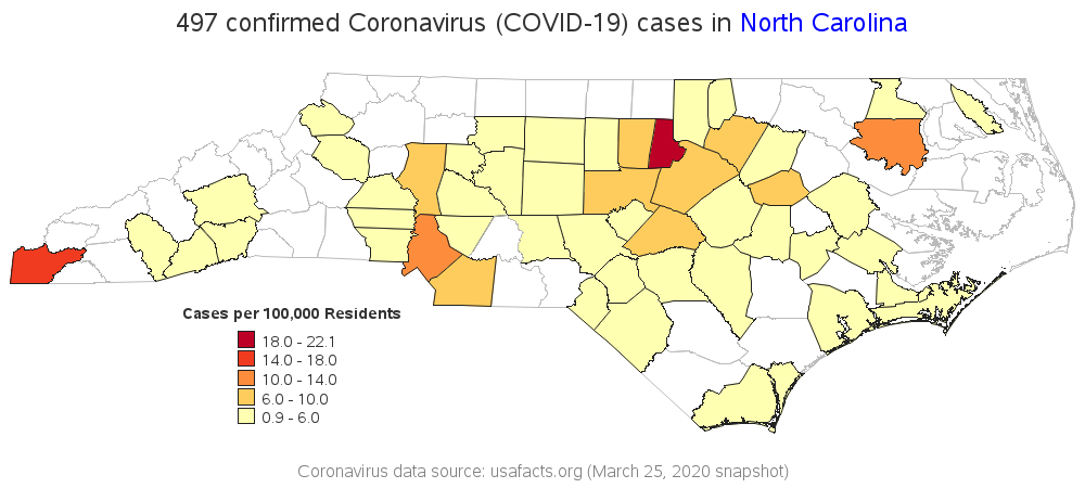
This new map shows that Durham county has the highest number of cases per 100,000 residents, and now Wake county is in the 2nd lowest (light orange) color range. And now Cherokee county (at the far western tip of the state) is in the 2nd highest color range (they don't have a high number of cases, but it's high for a county with such a small population).
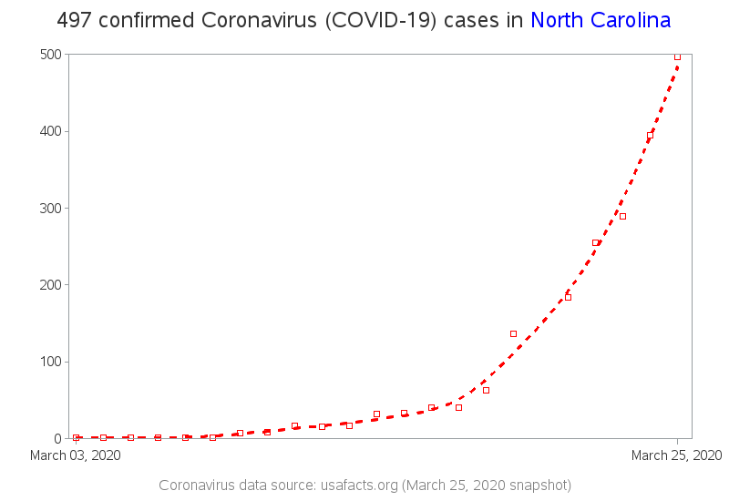
Trend Line
The maps above provide a nice snapshot of the March 25th data - but how has the data been changing over time? Has the number of cases leveled off, or is it still increasing? It would be nice to see a trend line of the data, eh? Here's a simple trend line graph:
Conclusions
Which of the above maps do you think is the most useful? How long do you think the trend line will continue to rise? I always suggest looking at the same data in several different ways - therefore rather than picking one favorite graph, I recommend looking at them all!
For these examples, I used North Carolina to demonstrate (because that's the state I live in), but you can easily modify my SAS code to create similar maps for any US state. Also, here is a link to my 'live' version of the graphs, which I will try to keep updated daily.
LEARN MORE | See all Coronavirus dashboard blog posts
Some of my colleagues at SAS have created a Novel Coronavirus Report using SAS Visual Analytics that depicts the status, locations, spread and trend analysis of the coronavirus. Data is updated nightly. The ability to visualize the COVID-19 outbreak can help raise awareness, understand its impact and can ultimately assist in prevention efforts. View the public SAS Coronavirus dashboard to see maps based in ESRI, coronavirus statistics, and an animated timeline of worldwide spread.


19 Comments
Question: the link to 'code' is the same as the link to "'live' version". Can you share the code?
Ahh - thanks for the heads-up! ... I've fixed the code link now (just changed the .htm to .sas)
Robert - I've created a simple site for people to self-report if they have symptoms, but are unable to get a Coronavirus test.
http://covidtest.me
So far, there's not a lot of data, but I'm hoping to create some visualizations once I get a critical mass of responses. My first snapshot is a map of the distribution here:
https://batchgeo.com/map/7b63f31d33762b5de7aa2312fc4cabb2
Thanks for your efforts. Perhaps we can collaborate?
Hmm ... I'm not sure if there will be a huge correlation between people who self-report having symptoms, and actually having the virus. When I looked at the North Carolina https://www.ncdhhs.gov/ webiste, they were reporting that only 5% of those tested in NC were positive for the virus. (Of course, ymmv!)
That's true, but my goal is more to examine the effect of the limited testing that's available most places in the US. How many people are looking for tests, but can't get one? Where is the disparity in supply and demand highest?
Should the objective of the chart to illustrate a flattened growth curve. If so, might it be more appropriate to use an log scale axis for the dependent variable?
Am I that flat in your graph I don’t believe it means the same thing as the public health flat?
If so, in this time in the crisis, where others might use your code, might it be helpful not to confuse flat?
It's an interesting idea, and another way to look at the data ... but I'm not a big fan of using a log axis scale for this type of data - I would rather see the actual values. (Also, I think a lot of people don't understand log axes, and I'm trying to create graphs that the general population can understand.)
Would I be correct in the interpretation of your chart, flattening the curve would be the inflection point of the line? What I mean should be charting the daily difference in the total, the number of new confirmed cases?
There are many different ways to plot the data, depending on what you want to find out from the data.
Where can I find code for the Nelder binning algorithm ?
Presumably they would show code, or pseudo-code, or the algorithm in Applied Statistics 25:94–7, 1976 (I haven't actually looked it up). The algorithm is compiled into the SAS code, and accessed through the Proc Gmap options - therefore as an end user I haven't seen the raw/underlying C code.
I came across this. I'm not sure if it does the Nelder binning algorithm.
https://github.com/friendly/SAS-macros/blob/master/axisspec.sas
The Nelder algorithm merely chooses "nice" numbers for axes, like multiples of 2, 5, 10, etc. It's not really a binning algorithm. In SAS, you can use the GSCALE function in SAS/IML software to obtain nice values for ticks for a given set of data.
I found something in R which may do Nelder binning.
https://rdrr.io/rforge/labeling/src/R/labeling.R
Would I be correct in the interpretation of your chart, flattening the curve would be the inflection point of your line?
I was suggesting the chart should show the number of new confirmed cases. However, patients are being denied testing and lab response time is not consistent, maybe running average of new cases might be more appropriate.
"Flattening the curve" has is not a precise term. As I understand, the general meaning is slow the acceleration of the infection rate (vs what it would be without interventions such as social distancing). Thus even if two states have not reached an inflection point, it might be reasonable to say that one has "flattened the curve" if it shows smaller growth in the number of new cases each day.
You might be interested in Rick Wicklin's post on cumulative frequency graphs. He has some nice panel graphs where he shows both the cumulative cases and the number of new cases.
Thanks Quentin!
"Flattening the curve" generally refers to decreasing the slope of the cumulative frequency curve of confirmed cases. When the cumulative curve is steep, there are many new cases every day. When the curve is less steep, there are fewer cases. When the curve is completely flat, there are no new cases.
Thanks Rick!