Everyone's thinking about the Coronavirus Disease 2019 (COVID-19), and wondering if there are any cases near where they live. I recently used SAS Software to create a dashboard with a world map showing which countries had reported cases. And now that the virus has spread around the world, a world/country-level dashboard doesn't really show the level of detail needed. Therefore, I have created an interactive map for the United States to show the data at a finer level of detail.
Here is my top-level choropleth map of the US. The states are colored with gradient shades of red and orange to indicate the number of cases in each state. I used quantile binning with five levels, therefore each shade of red represents about 1/5 of the states (the 20% of the states with the highest number of cases are the darkest red, and so on). If a state is colored light mint green (not a shade of red) that means it has no reported cases. Click the image below to see the interactive version (with drill-downs and mouse-over text):
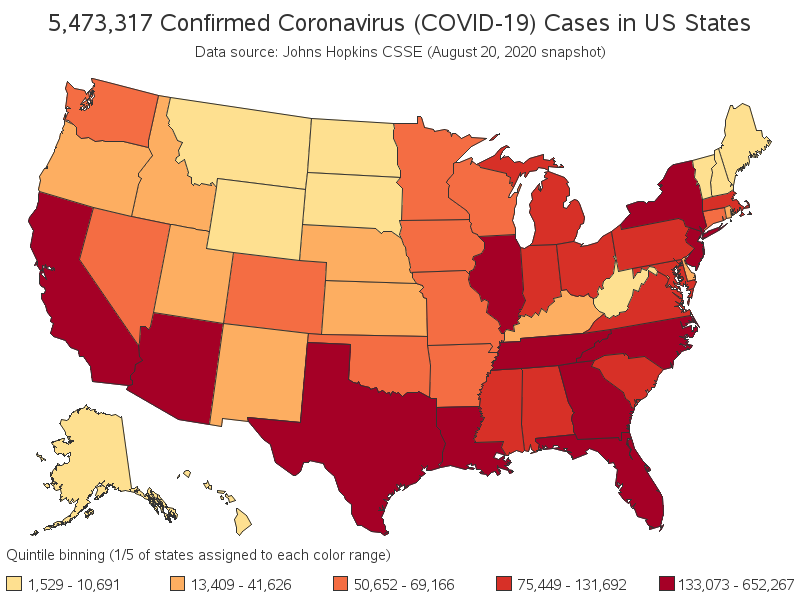
For the drill-downs to show the state-level data, I created all the individual maps, and used HTML anchors to jump to those maps when you click them in the US map. I chose this technique because the data source I'm using is only updated daily, and when I import the data, I can easily create the US-level and 50 state maps in a reasonable amount of time, and using a reasonable amount of disk space. This is a very simple way to share the results with thousands of people (perhaps millions?), with just a simple web server.
If you have a data source that is updated more frequently, or if there were so many drill-downs that it would be impractical to create them all ahead of time (perhaps county, city, or zip code level), there are ways to set up SAS to create the maps on-the-fly, so a new map is created when you click the link (it would go to the server, get the latest data, and create only the specific map you need). To use this technique, you would need various SAS processes running on a server in addition to the web server.
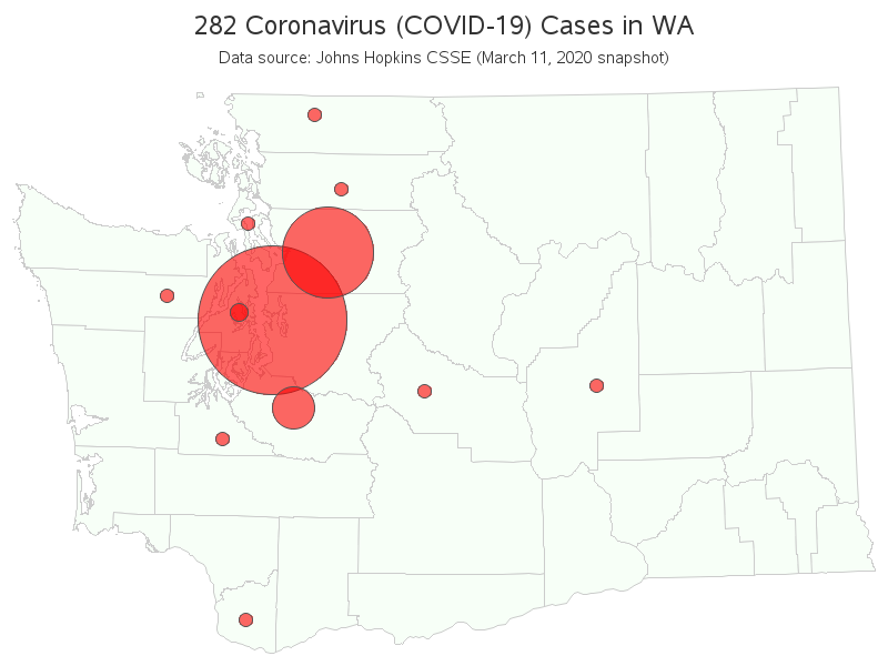
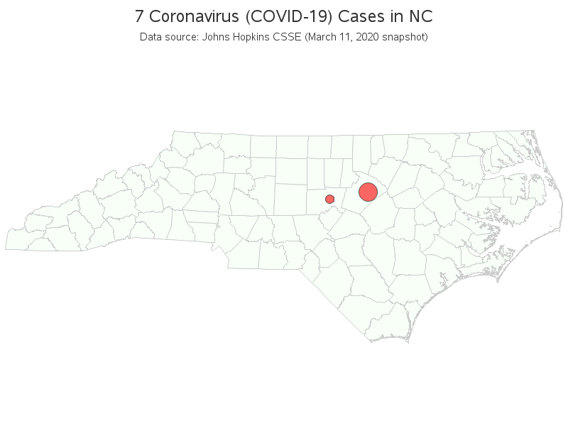
Here are a couple examples of individual state maps that the US map drills-down to. (Click the US map above to see the interactive version). The first example below is Washington state - the state that has the most cases as of the writing of this blog post. And second is North Carolina - the state where I live.
Data Validation
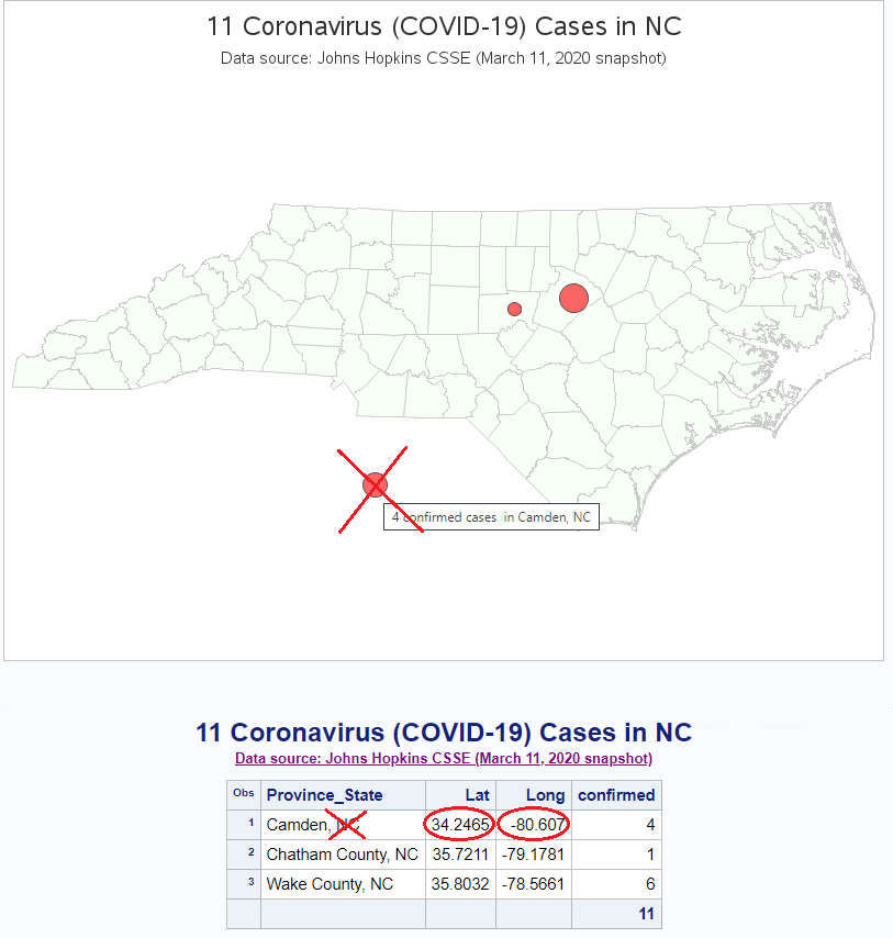
When I first plotted the data for North Carolina, I noticed that one of the bubbles was plotting outside the borders of the map. Upon further investigation, I found that although the data said "Camden, NC" the lat/long coordinate was for Camden, SC. This is one of the benefits of graphing your data - it helps you find errors! (I have corrected the problem in my copy of the data, and I'll try to contact the owners of the data to let them know there's a problem, and hopefully they'll fix it in their master copy.)
What are the advantages and disadvantages of the choropleth US map, and bubble state maps? What other variations of maps (and other graphs) might be useful, to answer specific questions? Feel free to discuss in the comments below. And if you'd like to see all the programming details, here is the SAS code I used.
I was planning to keep these maps updated on a regular basis, but on March 12 Johns Hopkins changed their data such that it only contains state summaries (no more city/county level of detail), so I can no longer create the detailed bubble maps. If they start providing the city/county data again, I plan to update these maps on a regular basis.
LEARN MORE | See all Coronavirus dashboard blog postsSome of my colleagues at SAS have created a Novel Coronavirus Report using SAS Visual Analytics that depicts the status, locations, spread and trend analysis of the coronavirus. Data is updated nightly. The ability to visualize the COVID-19 outbreak can help raise awareness, understand its impact and can ultimately assist in prevention efforts. View the public SAS Coronavirus dashboard to see maps based in ESRI, coronavirus statistics, and an animated timeline of worldwide spread.


6 Comments
Thanks very much. Do you have a deaths per week from virus compared to flu in past years?
Once we have a few weeks of coronavirus deaths data, I'll probably create such a graph (right now, there are just too few weeks & deaths to make a meaningful graph).
Why are you seeking more deaths! Map it now and pray.
How about graphing the number of recovered cases? Or a way to compare the recovered/mild/severe/deaths? I am hoping to find a glass half full graphic.
If you can find a good source of that data, let me know! 🙂
Roger DeAngellis posted SAS code to fetch the data on the topic "Schdedule-automatic-daily-downloads of the latest COV-19 daily timeseries"
Below is link.
https://github.com/rogerjdeangelis/utl-schdedule-automatic-daily-downloads-of-the-latest-COVID_19-daily-timeseries