I'm a bit of a boat paddling enthusiast, as you might have guessed from some of my previous paddling blog posts. The amount of exertion in race-paddling is similar to running - the longest race I've paddled in a race so far was 13 miles (half-marathon distance). But in the back of my mind, I've always been intrigued by the long paddling races ... and by long, I mean 100 miles.
Paddling 100 Miles
How long does it take to paddle 100 miles? A typical recreational kayak might go around 3mph, and would take around 33 hours. On a lake with no current or wind, I typically paddle my surfski (fast/racing kayak) around 6mph when I'm working it pretty hard ... which would take around 17 hours.
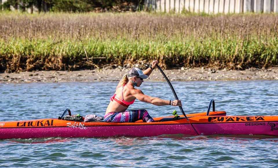
In the recent 100 mile California River Quest, April Zilg won the 100 mile race in her outrigger canoe (OC1). She paddled the 100 miles in 10 hours and 50 minutes. That's averaging 9.23 mph for the 100 miles! April is one of my paddling inspirations, and I'm especially proud of her win because she lived here in North Carolina before moving out west. I even had the privilege of paddling against her in a 13 mile race a few years ago - and yes, she beat me soundly! Here's a picture of April in that race (photo credit Brian Meyer):
Talking about paddling speeds is one thing, but of course I couldn't call myself a Graph Guy if I didn't plot some data. Therefore follow along as I create a map of the 100 mile race course, and a couple of graphs of the race results. If you don't want to wade through all the details, feel free to jump to the final graph at the end!
Mapping the Race Course
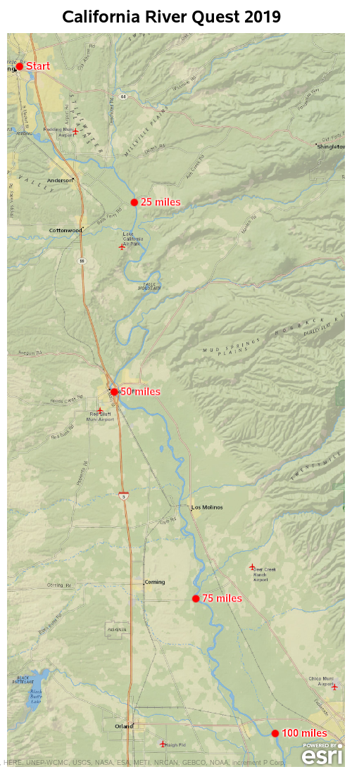
The race has a starting point, and a 'checkpoint' at each 25 miles. I estimated the latitude/longitude coordinates for each of these checkpoints, and put them in a dataset:
data checkpoints;
input lat long labeltext $ 25-50;
datalines;
40.5912103 -122.3875669 Start
40.4174706 -122.1947685 25 miles
40.1745591 -122.2285291 50 miles
39.9085391 -122.0914473 75 miles
39.7345816 -121.9580843 100 miles
;
run;
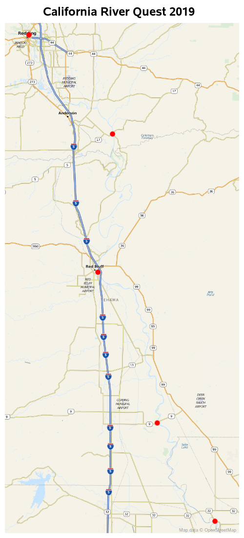
Plotting Checkpoints on Basic/Default Map
I then plotted these points as red markers on a map using the following minimal code:
proc sgmap plotdata=checkpoints noautolegend;
openstreetmap;
scatter x=long y=lat / markerattrs=(color=red size=12px symbol=circlefilled);
run;

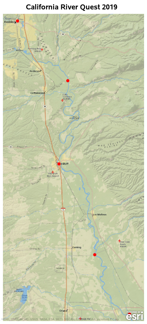
Changing Map Proportions/Size
Hmm ... sometimes simple code doesn't produce the best map. I would like to actually see the river on the map, wouldn't you?! If we change the size and proportion of the map, it will bring out more detail. So let's try that.
ods graphics / width=500px height=1100px;
proc sgmap plotdata=checkpoints noautolegend;
openstreetmap;
scatter x=long y=lat / markerattrs=(color=red size=12px symbol=circlefilled);
run;
Changing from Streetmap to NatGeo Map
That's a bit better. Now we can see the river ... but the river still isn't the main focus of the map. Since this is a street map (from OpenStreetmaps), its main focus is streets, not rivers. Therefore let's try a different map that might have more emphasis on the natural features, rather than the roads - Esri's NatGeo_World_Map ...
proc sgmap plotdata=checkpoints noautolegend;
esrimap url="http://services.arcgisonline.com/arcgis/rest/services/NatGeo_World_Map";
scatter x=long y=lat / markerattrs=(color=red size=12px symbol=circlefilled);
run;
Labeling Checkpoints
The river is much more prominent/visible in this map (and the roads are de-emphasized). Now let's add some text labels to the red markers. I add a statement to plot the text at the lat/long locations, and position it to the right of the coordinate. The text would overlap the red marker a little, therefore I prepend some non-blanking spaces (character 'a0'x) to the left of the text.
data checkpoints; set checkpoints;
labeltext='a0a0'x||trim(left(labeltext));
run;
proc sgmap plotdata=checkpoints noautolegend;
esrimap url="http://services.arcgisonline.com/arcgis/rest/services/NatGeo_World_Map";
scatter x=long y=lat / markerattrs=(color=red size=12px symbol=circlefilled);
text x=long y=lat text=labeltext / textattrs=(color=red size=11pt weight=bold) position=right;
run;
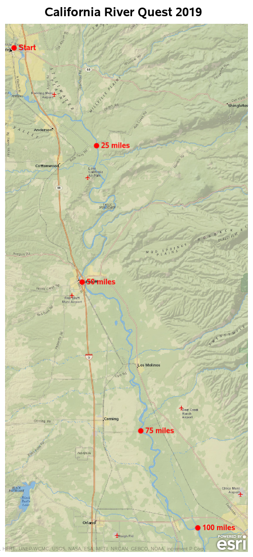
Adding Backlight Around Text
The map is looking pretty good, but the text label for the 50 miles marker is blending in a little with the black text in the Esri basemap behind it. Therefore let's use the new backlight= option to add some light contrast color behind/around the text. And while we're using new features, let's also use the new url= option to add a link to each marker, so you can click on it to see the Google map of that area. And the tip= option to add some custom text for the mouse-over. (These new features are are available in Viya 3.5.)
data checkpoints; set checkpoints;
label labeltext='Checkpoint';
labeltext='a0a0'x||trim(left(labeltext));
length drill_down $300;
drill_down='https://www.google.com/maps/@'||trim(left(lat))||','||trim(left(long))||',16z?hl=en';
run;
proc sgmap plotdata=checkpoints noautolegend;
esrimap url="http://services.arcgisonline.com/arcgis/rest/services/NatGeo_World_Map";
scatter x=long y=lat / markerattrs=(color=red size=12px symbol=circlefilled)
url=drill_down tip=(labeltext);
text x=long y=lat text=labeltext / textattrs=(color=red size=11pt weight=bold) position=right
url=drill_down tip=(labeltext) backlight=1;
run;
Here is the final map. If you want to try the mouse-over text, and drill-down links to the Google maps, click here to see the interactive version.
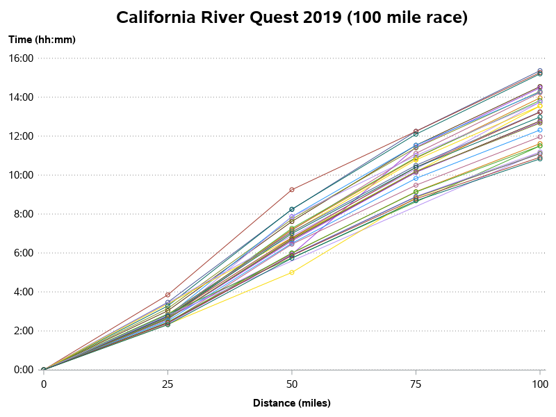
Race Results - Spaghetti Plot
Spaghetti plots have gotten a bad name ... but, even so, I think they are a decent way to get a quick first-look at your data. Here's a spaghetti plot of the 2019 race results. Yes, there are too many colors. And yes, the lines and markers overlap so that you can't follow any specific racer's data through the plot. But still, it let's you see what all the data is doing, in general.
proc sgplot data=plot_data noautolegend noborder;
by race_distance_numeric notsorted;
series x=distance y=time / group=racer_num lineattrs=(pattern=solid)
markers markerattrs=(symbol=circle size=7px)
tip=(full_name class category distance time avg_mph) url=name_search;
yaxis display=(noline noticks)
labelattrs=(size=11pt weight=bold) labelpos=top
grid gridattrs=(pattern=dot color=gray88)
valueattrs=(size=11pt) offsetmin=0 offsetmax=0;
xaxis labelattrs=(size=11pt weight=bold)
values=(0 to 100 by 25) valueattrs=(size=11pt);
run;
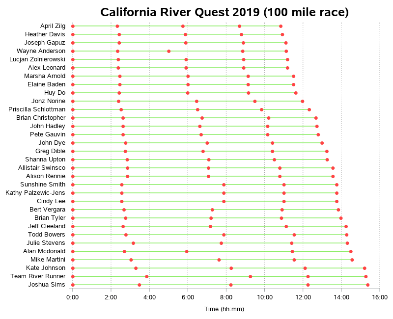
Race Results - A Better Plot
Even though the spaghetti plot (above) is useful, it's still not a great plot. Therefore I put on my Graph Guy thinking cap, and came up with a better way to graph the data. In this plot, it's much easier to see and compare the individual racers. And the graph just looks better, also! (If you'd like to see the interactive version, click here. If you'd like to see the SAS code used to create the map and graphs, click here.)
proc sgplot data=plot_data noautolegend noborder;
by race_distance_numeric notsorted;
series y=full_name x=time / group=full_name lineattrs=(pattern=solid color=cx49E20E)
markers markerattrs=(symbol=circlefilled color=cxff4444)
tip=(full_name class category distance time avg_mph) url=name_search;
xaxis grid gridattrs=(pattern=dot color=gray88) offsetmax=0 valueattrs=(size=10pt);
yaxis display=(nolabel noline noticks) valueattrs=(size=10pt);
run;
What's Next?
How does April plan to follow up her win of the 100 mile race? Well, of course, by competing in a 1000 mile race - the Yukon 1000, coming up in July 2020! I encourage you to follow along on her website, to see how she prepares, etc. And feel free to leave her a message of encouragement in the comments section below.


9 Comments
If your a scout (boy or girl) the 125 mile White River Race is what kids in Arkansas do to get off the gaming computer. It's an amazing race with a very unusual story line. As an older adult I've fell in love with the 135 mile "Tour du Teche" in the Lousiana bayou. The greatest effort of my life! Check out the pictures on my club web site. All three day of each stage are different and Sothern hospitality I've found is out of control there.
Nice! - Based on the pictures on your website, it looks like they have some very competitive canoes & paddlers! 🙂
For people wondering where the link is - click Steve's name above his comment, and that is the link!
I also found this link which shows some of the crazy stuff we've done so I know it's a legitimate link if you want to get crazy. Personally I like out midwest 10 to 15 mile races with one crazy effort at the end of the season. Kind of like runners do; lots of 10ks with a marathon at the end of their season!
Ooh! - I like that they have the approximate courses mapped out, and you can zoom-in to see the details! 🙂
Robert you omitted one very important detail from all your crazy maps and graphs; the river's current speed. Its easy to travel at almost 10mph if thr river is doing 6mph, but much harder with a 3mph river. Against the current on upstream sections of an up and back loop, paddlers will be brought to a near standstill in fast riffles. Across open lakes into the wind the effort also rises dramaticly.
Yep! - that would be good to add, but I couldn't find any data on current speed, though. I found some data on cfm (cubic feet of water per minute), but I don't know this river well enough to know what current speed is expected at various cfm's.
Thanks for a great post - I love showing the development of the river graph especially the final touch of the backlighting - each touch that makes the difference between a great professional graph and an an also ran.
A significant question arises from the results graph (a great visuallization by the way), what happened with Wayne Anderson in the 3rd leg? If he could have kept the pace of the 1st, 2nd, and 4th leg he would have won handily. And it looks likes a few others struggled with that 3rd leg - Alan McDonald could have finished in the top 5-ish but instead finished in {,2,3,...} well down low (suggestion for an improvement: add the rank number after their name, or before - maybe). And I like that the names are right justified - another touch to make it easier to read.
Thanks again - great work.
Thanks for the feedback!
I don't really know the details about what might have slowed people down in the 3rd leg (miles 50-75). Perhaps they got a cramp? Perhaps they stopped to take a break/eat/etc? Perhaps their boat didn't do well in that kind of water (maybe some swift/shallow rapids?) Maybe I can ask around and find out some more details. 🙂