The flu season has started here in the U.S., and according to the Centers for Disease Control and Prevention (CDC) data it has caused 214 deaths in the first week of 2020. Is this number higher, or lower, than usual? When does the flu season start, and how long does it last? Sounds like a fine excuse to create some graphs - follow along, and I'll show you how!
The Data
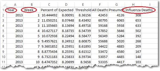
The CDC has a flu page, and towards the bottom there's a "Pneumonia and Influenza (P&I) Mortality Surveillance" graph (the black & red line graph). And under that graph, there's a link to "View Chart Data." This link points to the latest weekly data in a CSV file. Here's what the CSV file looks like, when viewed in Excel (I've circled the 3 variables I'm interested in):
I used the following code to import the CSV into SAS:
filename csv_file "NCHSData02.csv";
data my_data;
infile csv_file lrecl=200 dlm=',' pad firstobs=2;
label flu_deaths='Deaths';
format flu_deaths comma8.0;
input year week pct_deaths_due_to_pneu_and_flu expected
threshold all_deaths pneumonia_deaths flu_deaths;
if year>=2010 then output;
run;
Basic Graph
My first attempt at graphing the data actually produced a 'bad graph' - I'm sharing it with you, so you will be able to recognize the problem if it ever happens to you. And I'll also show you how to fix it! I vaguely knew I wanted to see the data as a time series, showing the number of deaths per week, therefore I naively started with the following code:
proc sgplot data=my_data;
spline x=week y=flu_deaths;
run;
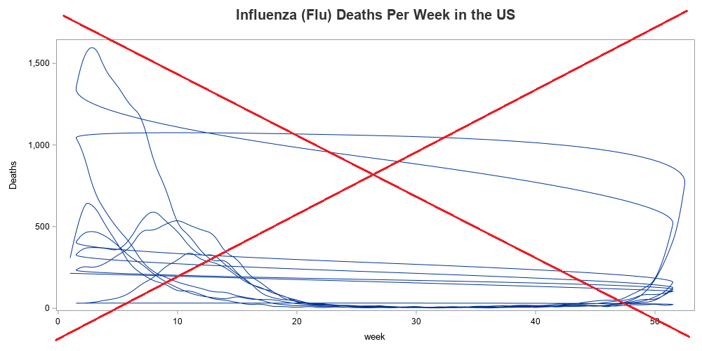
In the graph above, you'll notice that the end (week 52) of one year 'loops' back around and is connected to the beginning of the next year (week 1). This makes the graph pretty much unusable and worthless. How do I get it to draw a separate line for each year? ... One way is to add a group=year to the code - that draws a separate line for each year, and also gives each line a different color.
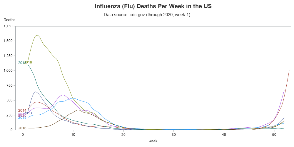
proc sgplot data=my_data;
spline x=week y=flu_deaths / group=year curvelabel curvelabelpos=start;
yaxis labelpos=top values=(0 to 1750 by 250) offsetmin=0 offsetmax=0;
run;
An Even Better Graph
The simple line graph was ~OK for viewing the data ... and it did provide an easy way of comparing the number of deaths during the same time periods each year. And I could see when the flu seasons generally started and stopped. But the graph just didn't click with my brain. Rather than seeing all the years overlaid, I wanted to see more of a continuous plot over time. But my data only has year and week variables ... it doesn't have a continuous 'date' variable. I guess I could estimate a date values for each year/week combination, but there's an easier way to get the graph I wanted.
I can create a separate plot for each year (showing the number of deaths per week), and then place all those graphs side-by-side using Proc SGpanel. Here's what I came up with.
proc sgpanel data=my_data noautolegend;
panelby year / onepanel columns=8 novarname
colheaderpos=bottom layout=columnlattice
headerattrs=(size=12pt color=gray33) noborder;
band x=week lower=0 upper=flu_deaths / fill fillattrs=(color=red);
rowaxis labelpos=top values=(0 to 1750 by 250)
offsetmax=0 offsetmin=0;
colaxis values=(1 to 52 by 1) display=(nolabel noticks novalues)
offsetmax=0 offsetmin=0;
refline 52 / axis=x lineattrs=(color=graycc thickness=1px);
refline 0 to 1750 by 250 / axis=y lineattrs=(color=graycc thickness=1px);
run;
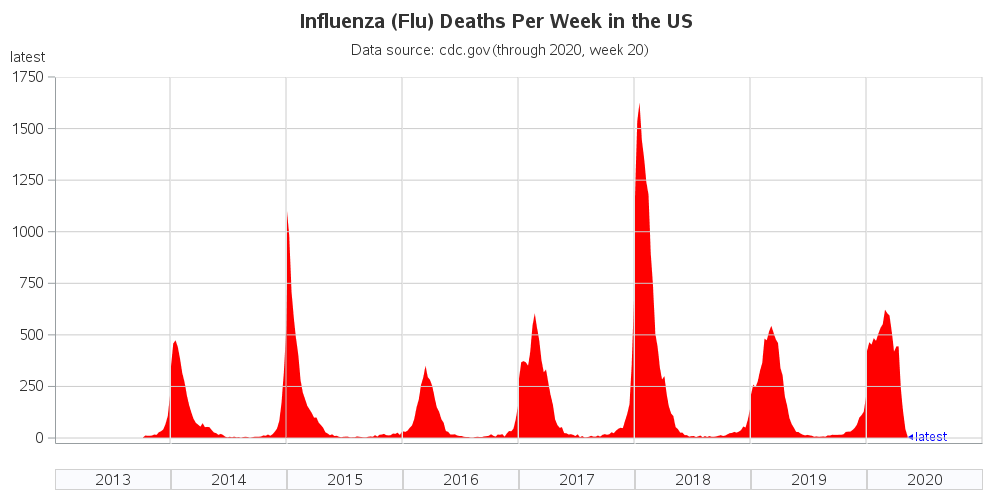
Now I've got my graph code ready for the 2020 flu season. All I have to do is occasionally download the latest data, and re-run my code, and it will add those 2020 values to the graph. And it's a might-fine graph, if I do say so myself! (If you'd like to experiment with the SAS code, here's the complete SAS program.)
Discussion
Here are a few questions I invite you to discuss in the comments section:
- Do you think the 2020 flu season will be better (fewer deaths), or worse (more deaths), than last year?
- What are some other ways we could visualize this data?
- And, just for fun, do you have any old family traditions for treating the flu?
A lot of my friends like treating the flu with chicken soup. While I'm not sure it can actually cure the flu, it probably doesn't make it any worse ... and it sure does taste good! Here's a picture of some chicken soup made by my friend Celia. She's the "godmother" of roller derby around Raleigh, and her chicken soup (or rather "chiggen soop") is rather prolific, according to her roller derby minions.


15 Comments
Curious about one aspect of this data - the CDC always reports tens of thousands of deaths from the flu. But that data definitely doesn't reflect that. Is there another set of death data that gets incorporated into the CDCs reports that's not reflected in this data?
Hmm ... I'm not sure. My guess would be that you're accustomed to seeing annual data, and this is weekly data(?)
I’ve also found that this exact source data table for influenza deaths is roughly about 20% of the total influenza deaths. I believe it is a subset of collected data & they extrapolate a total that is a multiple higher; I believe to be roughly 5X. If you do a comparison of under the curve total of weekly influenza deaths per season to the stated total per season, I believe it will be roughly 20% of the “totals.”
Your charts are wonderful. I’m sure a lot of people are finding them from google searches. For references for what I stated above...
This has total estimated deaths in chart form:
https://www.cdc.gov/flu/about/burden/index.html
Methods for Flu deaths (from basic to more detailed):
https://www.cdc.gov/flu/about/burden/how-cdc-estimates.htm
https://pubmed.ncbi.nlm.nih.gov/25738736/
https://onlinelibrary.wiley.com/doi/full/10.1111/irv.12486
I have some numbers. I’m still unsure why the source numbers say less influenza deaths per week than the total influenza deaths as both posted by the CDC.
Season
Added “weekly deaths” (under the curve from above)
“Total deaths” the CDC also posted
The multiple of total deaths of the sum of weekly deaths
2013-2014
4485
38,000
8.472686734
2014-2015
8197
51,000
6.221788459
2015-2016
3448
23,000
6.670533643
2016-2017
6954
38,000
5.464480874
2017-2018
15620
61,000
3.90524968
2018-2019
7171
34,157
4.763212941
Any math error is unintentional. But the gist is there; that the CDC posts the weekly influenza deaths one way & total influenza deaths a different way.
Ok, my interpretation from CDC’s methodology:
Weekly numbers appear to be confirmed deaths associated with influenza.
(The graphs from Mr. Allison. Thank you! And for those interested in COVID-19, he & his group have been making graphs;
https://blogs.sas.com/content/graphicallyspeaking/2020/03/13/tracking-the-coronavirus-disease-2019-covid-19-in-the-united-states/ )
Total number of Flu deaths appear to be from modeling; as reporting deaths associated with influenza are not mandated & are underreported.
Pediatric Mortality is closer to actual numbers as they are mandated to be reported at the state level, but they are still presumed underreported.
Thank you Mr. Allison
Did not add all weeks under 2017 -2018, but a thumbnail glance appears to be only about 20,000 deaths when CDC is reporting a medium range of 60K. Not sure how much value I can put in this. Trying to compare that range and weekly to covid 19 and this is really low.
I haven't seen the actual CDC reports tens of thousands of cases, my theory would be that the politicians and reporters that report "tens of thousands of deaths" and the "flu is worse then covid" stories we saw in spring; most likely uses this data and fail to recognize it's Pnemunia & Influenza Mortality...
F.i. seen a lot of news articles and clips quoting 80000 deaths of flu winter months 2019-2020.
And this CDC data (P&I) matches that with about 70000-100000 deaths (number depending on what you consider "winter months"). They are ignoring the fact that 90% of the mortality refers to Pnemunia of various kinds
I think the key is "stories we saw in the spring" - in the spring, when covid was just starting (and we thought it might only last a few weeks or months), the number of covid deaths was relatively low (compared to the number we have now, a year later).
This is really cool info. I'm not sure where you fall on this - some people seem to believe comparing flu stats to covid-19 is heresy punishable by death.I'm not advocating a comparison as much as providing perspective. Do you think you could update the last graph to include Covid-19 with Covis-19 in a different color. It would sure make people aware that flu is an ongoing concern
I second the request to see an updated graph to include Covid-19's with flu for this season.
It might not be a fair comparison because we have a 60-70% rate of flu vaccination in the U.S. and no Covid-19 vaccination yet. But it would still be interested to see when flu peaked this season, and how much.
As of today, there's no longer a link to "View Chart Data" at https://gis.cdc.gov/grasp/fluview/mortality.html
It's not clear if they're capturing the Covid-19 numbers in their current graph, which is based on "Pneumonia and Influenza (P&I)", as you said, but the numbers they're plotting are way above historical averages.
OK, while there is no link to "view chart data" below the graphs, there is a "Download" button above the graphs that allows for the data to be obtained in .csv format.
Thanks a lot for your graphs. Could you update the red one, with the latest numbers, as of today, January 7th, 2021? It would be very appreciated.
Right now (very early January) is very early in the flu season. I usually wait until the end of the flu season, when the data is complete, to update this graph.