As I get older, a few of my buddies are starting to retire. And this makes me think about my own retirement (not that I'm anywhere near old enough to retire, mind you!) Therefore when I saw a list of the "Best & Worst Cities for Retiring" it caught my attention. The list of almost 400 cities was a bit cumbersome to wade through, therefore as a Graph Guy I felt obliged to do something graphical to help analyze the data...
The Data
I found the data in an article on the Advanced Dental Care website. They had summary tables of the 50 best and worst cities, such as ...
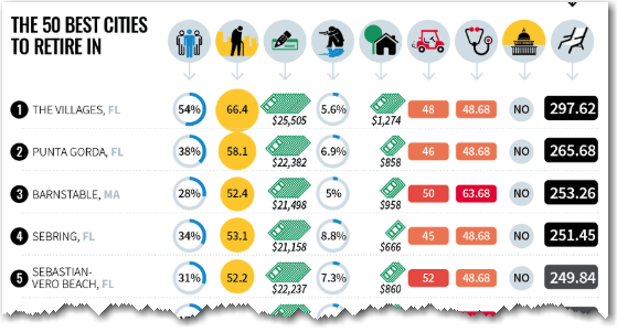
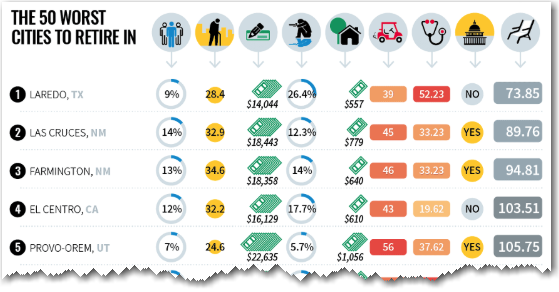
Their tables were loaded with color-coded graphical icons/glyphs, but these fancy tables didn't really help me get a handle on the data. Later in the article, they also had a simple text table of the data for all 381 cities in the study - I actually found this simple table easier to read.
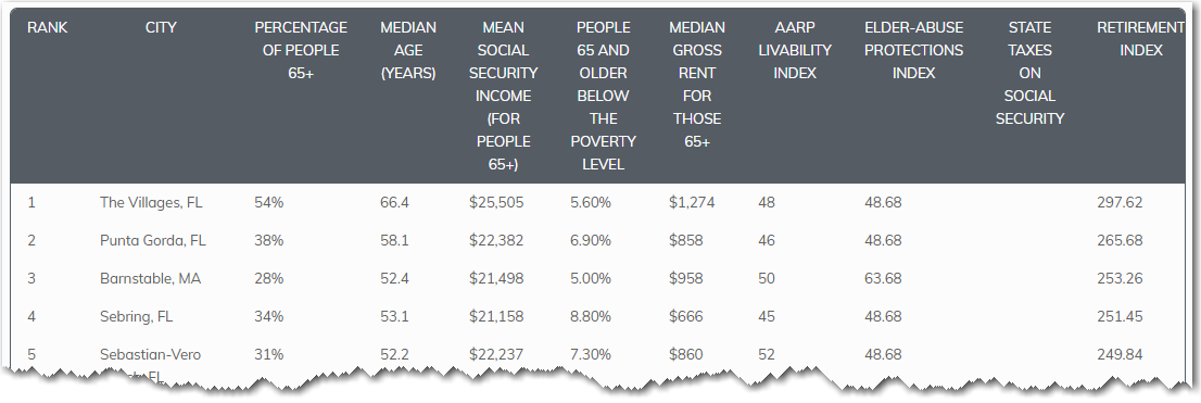
Also, a simple text table was much easier to import into SAS (I was able to copy-n-paste the values into a text file, and read the tab-delimited text using a data step).
Geocoding the Data
Now that I've got the table of data into a SAS table, what should I do with it? I think this data is begging to be plotted on a map!
The city & state values (such as "Raleigh, NC") are in the table, but how can I plot that on a map? There's a process called geocoding which takes city/state/address information, and estimates the latitude/longitude coordinate. In SAS, Proc Geocode can do that ... but we'll need to do a bit of "data cleaning" first.
Proc Geocode can estimate the lat/long of a city - but your data observation must be a single city. And some of the locations in the table are a combination of cities (and sometimes a combination of states), such as "Youngstown-Warren-Boardman, OH-PA". Therefore I parse out the first city and the first state ("Youngstown, OH" in this case) to use for the geocoding.
lookup_state=substr(trim(left(scan(city_state,2,','))),1,2);
lookup_city=trim(left(scan(city_state,1,',')));
After cleaning the data, I can easily run Proc Geocode, to estimate the lat/long of all the cities. For the cases where I just picked the first of multiple cities, the position will not be the exact centroid of the multiple cities ... but close enough when you're plotting the data on a map of the entire U.S.
proc geocode data=all_data out=all_data method=city
addresscityvar=lookup_city addressstatevar=lookup_state;
run;
Mapping the Data
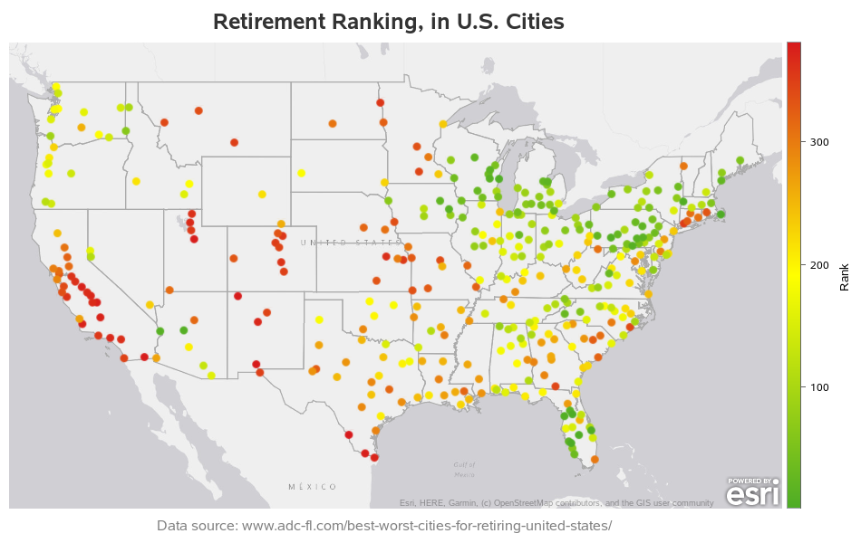
And now, I can use Proc SGmap to plot the data as colored markers on a map. (Here's a link to the complete SAS code, if you'd like to see all the details - the code utilizes features from the latest SAS release, Viya 3.5, so you'll need that to run it.)
proc sgmap plotdata=plot_data;
esrimap url="http://services.arcgisonline.com/arcgis/rest/services/Canvas/World_LIght_Gray_Base";
scatter x=long y=lat / colorresponse=rank
markerattrs=(symbol=circlefilled size=8pt)
colormodel=(cx4dac26 yellow cxd7191c);
gradlegend / position=right;
run;
According to this ranking, Florida, and the states along the Great Lakes, are the best places to retire.
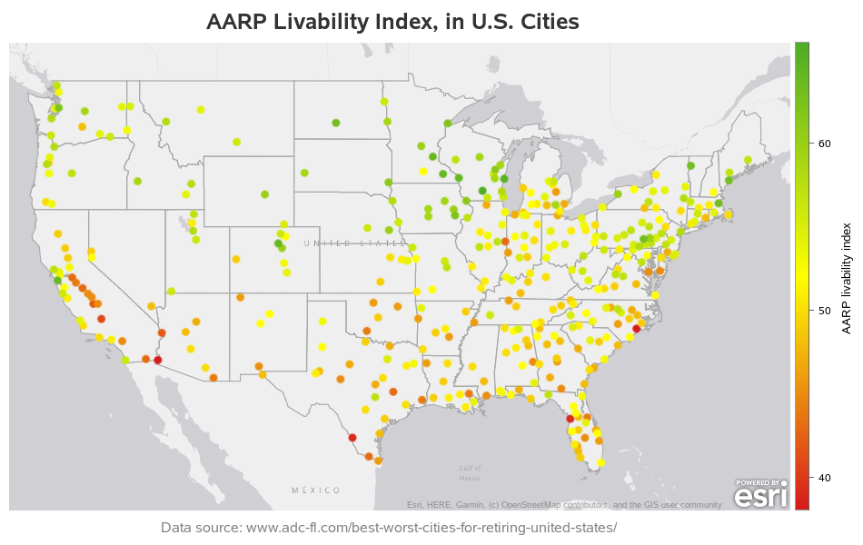
Hmm ... what about the other variables in the table? Let's plot some of them! Here's the AARP Livability Index. Looks like they favor Wisconsin, Minnesota, Iowa.
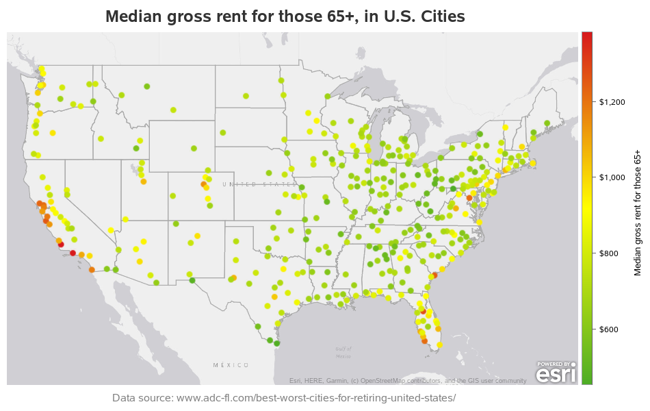
What if you're more budget-minded, and just care about the cost of rent for retired people? Looks like the closer you get to the coast, the higher your rent (this is especially evident in California).
And, perhaps the biggest question - where did retired people actually pick to live? Looks like Florida is the winner, by far! What's the big draw in Florida - perhaps the weather?

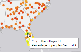
And where's the #1 spot with the highest % retired people? ... That would be The Villages, in Florida!
Discussion
Feel free to discuss these in the comments section:
- What factors in the maps do you agree/disagree with?
- What other factors could affect retirement decisions?
- Where do you plan to retire, and what are the major factors in your decision?
- If money were no object, where would you like to retire?
- Would you consider retiring in another country? (see my previous blog post on that topic)
Extras!
And if you made it this far, here's a little something extra for you... This is a picture of my buddy Ed, sitting outside his motor home, grilling dinner at White Lake. Ed retired about a year ago, and he was the developer who wrote Proc Geocode and Proc SGmap (the two tools I used to create these maps). Therefore I think that makes it especially fitting to include his picture in this blog post about retirement! 🙂


8 Comments
Robert,
I seem to have lost the link where you post the code to your wonderful maps. Could you refresh my memory?
Thanks,
Brian
I post many of them on robslink.com 🙂
Always interesting stuff Robert. Is there a reason you don't have a hover over to see city names on these maps?
I think that I can only put images (such as png or jpg) in the blog(?), and the mouse-over requires an HTML overlay. I could set up the maps with mouse-over as a page outside the blog, and link to it ... but I was wanting to keep it simple this time. 🙂
Too bad the data didnt include non-Social Security taxes on retirement income. That's a big deal for my retirement.
Good point!
Robert, as always, your analysis is great. But, in this particular case, I see flaws in the perspective of the collectors of the original data.
Several places in Florida get high marks because of a large percentage of 65+ residents and higher Social Security income. It's been the case for decades that many people with higher incomes who live in northern states move to Florida after they retire. They have higher Social Security income because they had higher incomes while working. They also want (and can afford) nicer places to live, so rents are higher.
Some cities score low marks for low Social Security income and high percentage of retirees living in poverty. I think it would be interesting to cross-reference that data with household median income data for working adults. Perhaps a large percentage of the households - working and retired - in those cities are living in or near poverty. It would also be interesting to know the percentage of households that are lifetime residents of the city vs. those who moved there after retirement. I doubt many well-off retirees would move to an economically depressed city simply because housing is cheaper.
It looks to me like the people who put together this survey assumed that retirees want to live in a town with a high percentage of retirees. I don't think that's a safe assumption.
The livability, elder-abuse, and retirement indexes are ambiguous because we don't know how they are calculated. Were you able to find any details?
Surveys like this should always consider things like taxes (state income, real estate, sales, etc.), affordability of housing, availability/affordability of health care, etc. Mild climate is usually a plus (though not for everyone).
All that being said - your "slice, dice, and graph" is, as always, very interesting!
Thanks for the great insight, Ted! (all the info I know about the data is via the links to the sources, which I embedded in the text above)