As we're getting into December, and the weather is getting colder, I thought it would be cool to plot some Antarctica data. You might remember I did this about 1.5 years ago, using good-old Proc Gmap, a special projection, and lots of tricky annotation. Well, this time let's use the "easy button" and do it with the new Proc SGmap!
The Data
A map isn't too exciting without some data on it, so let's use the locations where they might be doing research, such as ice core drilling.
data locations;
input lat long name $ 16-80;
type='Cores';
datalines;
-80.0 -119.500 Byrd
-81.7 -148.800 Simple Dome
-77.8 158.700 Taylor Dome
-66.7 112.800 Law Dome
-75.1 123.000 EPICA Dome C
-75.0 0.067 Dronning Maud Land (Kohnen)
-77.3 39.700 Fuji Dome
-79.0 107.000 Vostok Station
;
run;
Easy Map
And with just a few lines of code, we can plot these locations on a map of Antarctica!
proc sgmap plotdata=locations noautolegend;
openstreetmap;
scatter x=long y=lat / group=type
markerattrs=(color=red size=20px);
run;

Too Easy?
Hmm ... so, the above (easy) map doesn't really look like Antarctica, eh? It's got Antarctica spread out across the bottom of the map, like tile-based world maps tend to do. But there's a trick you can use to get a better looking Antarctica map - it's not really difficult, but you just need to know what the trick is! All you have to do is specify a special Polar Esri tile map server.
proc sgmap plotdata=locations noautolegend;
esrimap url='http://services.arcgisonline.com/arcgis/rest/services/Polar/Antarctic_Imagery/MapServer';
scatter x=long y=lat / group=type
markerattrs=(color=red size=20px);
run;

Less Easy, Mo' Betta!
One thing about plotting data on a tile map with Proc SGmap - it auto-zooms the map so that the data being plotted will be shown ... but sometimes you might want to 'zoom' the map out a little farther. SGmap is not interactive, and you can't interactively zoom the map in/out - therefore you have to use a 'trick'. You can add some fake data points that lie along the extents of the area you want to show, and then plot those as invisible markers.
Here I create a dataset with my extents along the edge of the desired map area (calling them slightly different lat/long names), and then combine it with my locations data.
data extents;
input lat_extent long_extent;
datalines;
-70 0
-70 90
-70 180
-70 270
;
run;
data locations; set locations extents;
run;
And then I generate my SGmap, and make the markers along the extent invisible by setting their transparency=1. This, in effect, zooms the map out to the desired level, so the entire border of Antarctica is visible.
proc sgmap plotdata=locations noautolegend;
esrimap url='http://services.arcgisonline.com/arcgis/rest/services/Polar/Antarctic_Imagery/MapServer';
scatter x=long y=lat / group=type
markerattrs=(color=red size=20px);
scatter x=long_extent y=lat_extent / transparency=1;
run;

We're done with the map!
Points to Ponder
I've got friends all over the world, and the ones south of the equator tell me it's actually warm there during Christmas. Which brings to mind a few questions:
- Do the Northern and Southern hemispheres have opposite seasons?
- Is the temperature difference because of the Earth's tilt?
- What about Earth's elliptical orbit?
- Maybe most of the land in the Southern hemisphere is closer to the equator?
- Or that there's more water (less land) in the Southern hemisphere?
Feel free to elaborate on these factors in the comments, and provide your theory as to why the Southern hemisphere has warmer weather for Christmas than the Northern hemisphere!
And a little bit of fun, to reward those of you who made it to the end of this blog post! ... Try to guess where 'in the South' these photos were taken, by my friends Linda (beach vacation last month), Andy (yes, the 'glowing orb' in the 2nd photo is a kiwi bird), and Michelle (sandals on the beach on Christmas day):


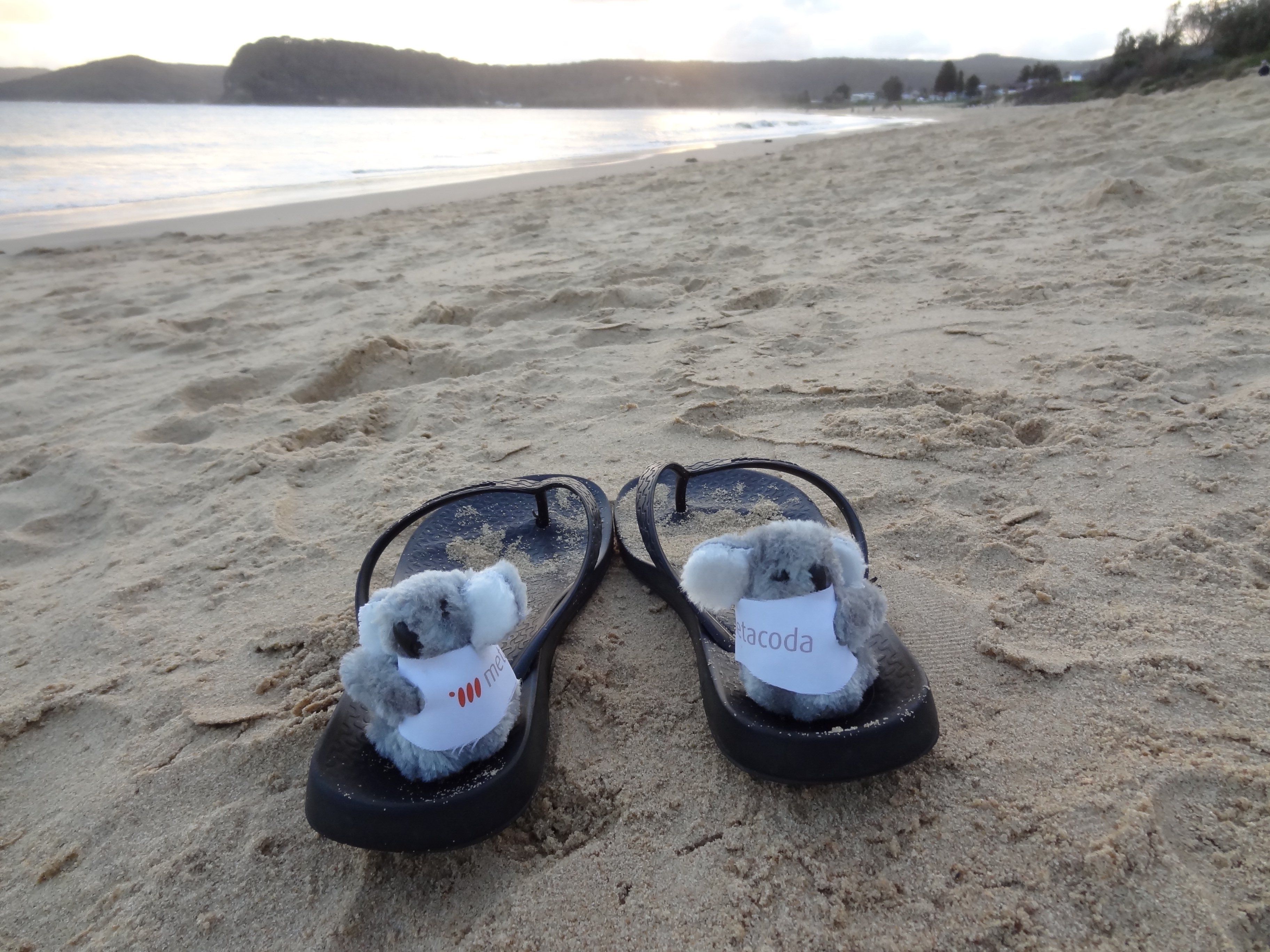
Answers: Topsail Beach North Carolina in November ('The South' in the US), New Zealand, and Australia!

2 Comments
I'm going with Carolina Beach.
Yep - that one of Santa on the beach has the unmistakable 'look' of a North Carolina beach! 🙂