The English language can be a bit tough to learn. One reason is that sometimes words can have more than one meaning. For example, the word shady can mean "of doubtful honesty or legality," or it can mean "giving shade from sunlight." Which of those meanings am I thinking about, when I say these mortgage rate graphs look shady? - Read along and find out ...
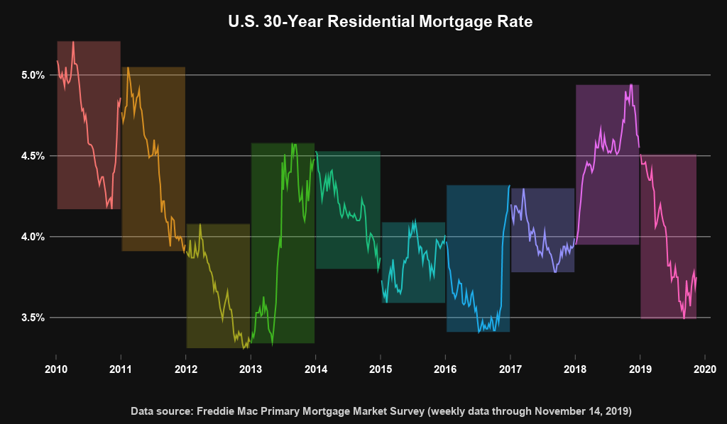
I recently saw the following graph on twitter. It was created by Len Kiefer - he creates wonderful mortgage-related graphs and shares them. This one especially caught my attention:
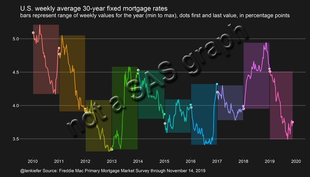
I usually discourage the use of black backgrounds in graphs ... but I actually *liked* this one! I liked it so much, that I decided to try to create my own version (imitation is the most sincere form of flattery, you know!)
Data
I had already created a few graphs using mortgage rate data in the past (paneled graphs, and overlaid graphs), so I already had some code to import the data into a form ready for plotting. All I had to do was download the latest spreadsheet from the Freddiemac page, and re-use that code.
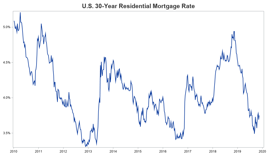
Basic Graph
I can plot the mortgage rate data as a line over time, with the following simple SAS code:
proc sgplot data=my_data (where=(year>=2010));
format rate percent7.1;
series x=date y=rate / lineattrs=(pattern=solid thickness=2px);
yaxis display=(nolabel);
xaxis display=(nolabel);
run;
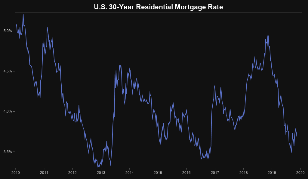
Black Background
We're off to a good start ... but how do I get a black background in my graph? There are a couple of ways to do that, but probably the easiest is to use the 'raven' ODS style. This will cause the background to be dark, and the text & lines to be light.
ods html style=raven;
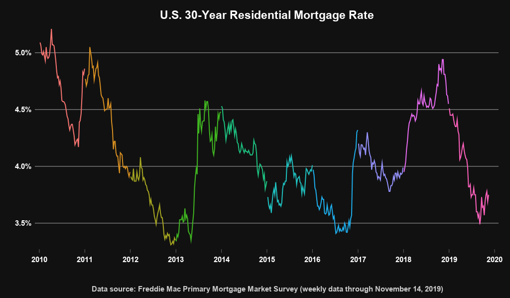
Color by Year
The black background was quick & easy ... but is there a similarly-easy way to make each year a different color? Certainly - you can use group=year. But I didn't want just any old 'random' colors - I wanted the same colors Len had used. Therefore I specify those using styleattrs datacontrastcolors. And while I'm at it, I add a few more options to make my graph look a bit more like Len's.
proc sgplot data=my_data (where=(year>=2010)) noautolegend noborder pad=(left=6pct right=3pct);
format rate percent7.1;
styleattrs datacontrastcolors=(cxf77470 cxd78f21 cxa5a521 cx3fb620 cx1cbf7e
cx1ec1c0 cx1dadeb cx9491fb cxe66aef cxfd60bc);
series x=date y=rate / group=year lineattrs=(pattern=solid thickness=2px);
yaxis display=(nolabel noline noticks)
offsetmin=.02 offsetmax=.02
valueattrs=(size=11pt color=white weight=bold)
grid gridattrs=(pattern=solid color=grayaa);
xaxis display=(nolabel noline)
offsetmin=.01 offsetmax=.01
valueattrs=(size=11pt color=white weight=bold);
run;
Shade
And now for the 'shady' part ... see what I did there! ... This is the 'shady' part of the graph! smh...
Len created a rectangle around the extents of each year's data, using a darker shade of the line color. To imitate that in my graph, I first used SQL to calculate the min & max x/y extents for each year, and then created a dataset containing 4 x/y corners of a polygon for the rectangle around each year. I plotted these coordinates as sgplot polygons with the fill colors coming from the styleattrs datacolors, and used transparency=.7 so the polygons are not nearly as bright as the lines.
proc sql noprint;
create table extents as
select unique year, min(date) as mindate, max(date) as maxdate,
min(rate) as minrate, max(rate) as maxrate
from my_data
group by year;
quit; run;
data extents (keep = xp yp year); set extents (where=(minrate^=.));
xp=mindate; yp=minrate; output;
xp=maxdate; yp=minrate; output;
xp=maxdate; yp=maxrate; output;
xp=mindate; yp=maxrate; output;
run;
data my_data; set my_data extents;
run;
proc sgplot data=my_data (where=(year>=2010)) noautolegend noborder
pad=(left=6pct right=3pct);
format rate percent7.1;
styleattrs
datacontrastcolors=(cxf77470 cxd78f21 cxa5a521 cx3fb620 cx1cbf7e cx1ec1c0
cx1dadeb cx9491fb cxe66aef cxfd60bc)
datacolors=(cxf77470 cxd78f21 cxa5a521 cx3fb620 cx1cbf7e cx1ec1c0 cx1dadeb
cx9491fb cxe66aef cxfd60bc);
series x=date y=rate / group=year lineattrs=(pattern=solid thickness=2px);
polygon x=xp y=yp id=year / fill outline tip=none
group=year transparency=.7 lineattrs=(color=gray11);
yaxis display=(nolabel noline noticks)
offsetmin=.02 offsetmax=.02
valueattrs=(size=11pt color=white weight=bold)
grid gridattrs=(pattern=solid color=grayaa);
xaxis display=(nolabel noline)
offsetmin=.01 offsetmax=.01
valueattrs=(size=11pt color=white weight=bold);
run;
Discussion
So, what do you think of using black backgrounds in graphs in general, and in this specific case? What are some other techniques you could use to create the 'shady' polygons? And, do you think the mortgage rates will go up, or down, before the end of the year? Feel free to discuss in the comments section!


6 Comments
I like the black background and shadiness 😉 Feel that it stands out more and the years can be more easily compared too. Are you now a shady person? 😉
I think I am, perhaps, becoming more "shady" as the years go by! 😉
This specific example reminds me of scratch art projects that we did in elementary school a long time ago. Cool!
Ahh! - I hadn't thought of that! But now that you mention it, I can't un-think of that, every time I see this graph! 🙂
Hi Robert,
I just found this shady post... and I have to admit that it really looks shady good!
Cheers,
Paul
Thanks!