We've had record high 90+ degree temperatures here in the southeast US this past week (September / October), and it has made me appreciate having an air conditioner. Indeed, air conditioners were pretty much invented here in North Carolina (see Eric Cramer). They are used in pretty much every building I frequent these days ... but it hasn't always been that way. In my 50+ years, I definitely remember living without - for example, we didn't use the air conditioner often when I was growing up, and didn't have it at all in my high school or my college dorm. Being a data guy, I thought it would be interesting to see how quickly air conditioners (and other technologies) were adopted in the US.
But before we jump into the data analysis, here's a picture to get you into the mood for looking at air conditioner data. This is my good buddy David, servicing the weather station on his roof, to make sure he doesn't miss capturing all this record weather data. Not bad climbing skills for an 'older guy' approaching his 70th birthday, eh!?! (And his roller skating skills are still very much on-point too!)

Existing Graphs
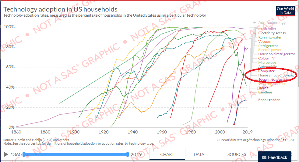
Before I did my own analysis, I looked around the Internet to see what was already out there. The first related graph I found was this one in the Reddit 'dataisbeautiful' group. It showed the adoption rate of various technologies (but unfortunately didn't include air conditioners). The biggest problem visual problem with this graph is probably the jumbled bottom axis. And the graph is a bit tall and scrunched for a time series plot.

But, the good thing about the graph above is that they cited the data source, and I was able to go to the ourworldindata.org website and find technology adoption data for a plethora of areas ... including air conditioners! Their graph was a bit better than the one on Reddit, and had a bit of interactivity such as mouse-over text (which was a big help). But it was still difficult to tell which line was which. Can you pick out the Home air conditioners line in the graph below?
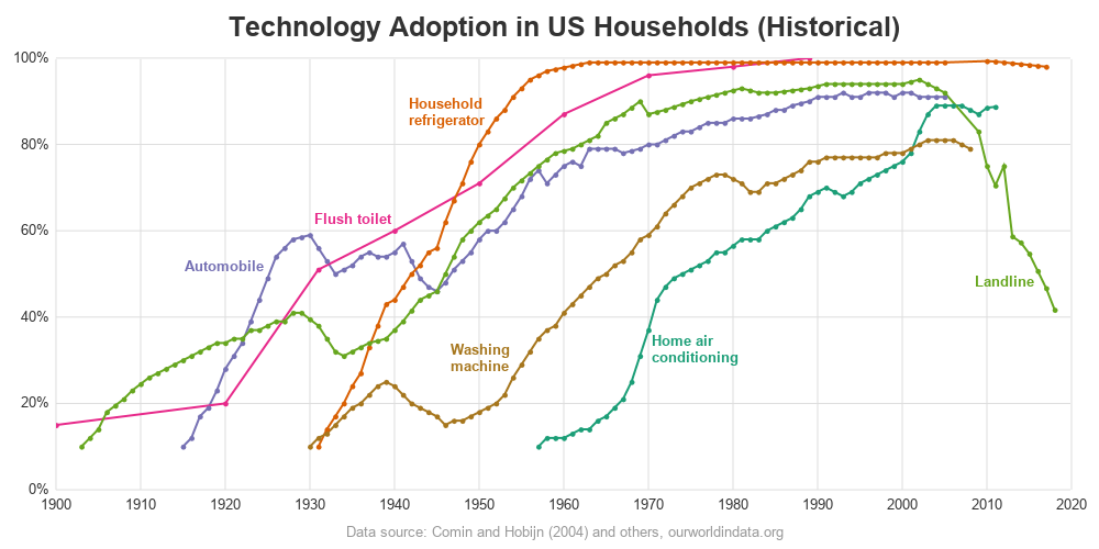
My Graph
So I downloaded their data csv file, imported it into SAS, and set about creating my own graph. Here are some of the choices I made in my re-design...
- Since it was a time series graph, I made my graph wider than it was tall (specifically, 1000 pixels wide and 500 pixels tall).
- Since the data in the 1800s was very sparse (only a few data points), I started my axis at 1900. This allows you to see more detail about the trends shown in most of the data points.
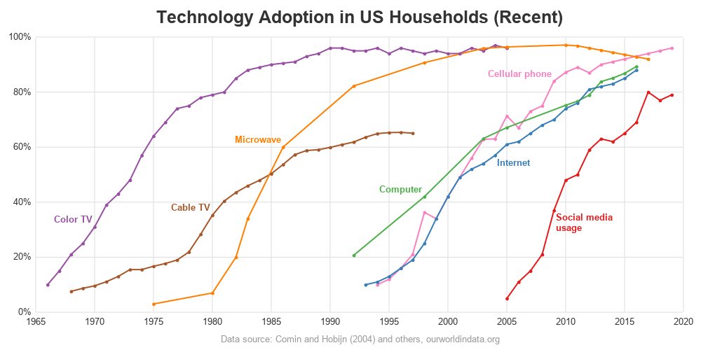
- In the original graphs, the 'recent' technologies were adopted very quickly, and their lines are very crowded in the right side of the graph (almost vertical lines), not showing much detail about the rate of adoption. In my version, I use two separate graphs - one for the older technologies, and one for the more recent technologies. This way you can see much more detail.
- Rather than labeling the lines along the right-hand axis (like the 2nd original graph), I place my labels alongside the actual lines (more like the 1st original graph).
- My horizontal axis is pleasantly spaced, and easy to read.
- I have reference lines in both the horizontal and vertical directions.
- I avoid using yellow as a line color, because yellow lines on a white background are difficult to see.
- I add markers along my lines, so it's easier to 'see' the rate of adoption. And you can also see if the data is more sparse for some technologies (for example, the flush toilet data appears to only have 1 data point every ~10 years).
And here is my new (hopefully) improved version!
Technical Details
Below is a summary of the coding techniques I used, for those of you who are SAS programmers. If you'd like to see all the details, here's the complete SAS job you can download and experiment with.
For the basic plot, I used a SGplot series to get a line with markers. And I assigned a group= so that each line would have a distinct color:
proc sgplot data=my_data;
series x=year y=Technology_Diffusion / group=Entity
markers markerattrs=(size=6px symbol=circlefilled)
lineattrs=(thickness=2px);
For the line labels, I had several options. I could have used the series plot's curvelabel option to place a label at the end of each line ... but due to the nature of the data, I didn't really like these automatic labels. I could have also modified my data= dataset to have text values at certain data points, and used a text statement to have them show up on the graph. But I chose to annotate the desired labels. It's a bit of extra work, but I think it was worth it to get the exact labels I wanted at the exact positions I wanted. A well-labeled graph is so much easier for the users to understand!
First, I decided where I wanted the labels, and created a dataset containing the data points closest to those locations (I determined which years the points were at, by looking at the mouse-over text for the plot markers).
data my_anno; set my_data;
if year=2016 and Entity='Landline' then output;
if year=1940 and Entity='Flush toilet' then output;
if year=1925 and Entity='Automobile' then output;
if year=1951 and Entity='Household refrigerator' then output;
if year=1954 and Entity='Washing machine' then output;
if year=1970 and Entity='Home air conditioning' then output;
if year=1970 and Entity='Color TV' then output;
if year=1980 and Entity='Cable TV' then output;
if year=1986 and Entity='Microwave' then output;
if year=1998 and Entity='Computer' then output;
if year=2009 and Entity='Cellular phone' then output;
if year=2004 and Entity='Internet' then output;
if year=2009 and Entity='Social media usage' then output;
run;
I then tweaked my annotate dataset to control the position of the text labels, in relation to the data point. You use the anchor variable to control that.
if entity in ('Flush toilet' 'Automobile' 'Household refrigerator' 'Washing machine'
'Color TV' 'Cable TV' 'Microwave' 'Computer' 'Cellular phone')
then anchor="bottomright";
if entity in ('Landline') then anchor="topright";
if entity in ('Home air conditioning' 'Internet' 'Social media usage')
then anchor="topleft";
I wanted the longer labels to be split into two lines, therefore I set the maximum width of the text labels to 11% of the available horizontal space. Any label longer than that is split into two lines.
width=11; widthunit='percent';
And since I wanted my text label colors to match the line colors, I assigned each of those manually. This is a bit more work than the curvelabel option or the text plot option, which would have automatically set the colors. But it's a price I was willing to pay.
if entity='Washing machine' then textcolor="&color1";
if entity='Landline' then textcolor="&color2";
if entity='Flush toilet' then textcolor="&color3";
if entity='Automobile' then textcolor="&color4";
if entity='Household refrigerator' then textcolor="&color5";
if entity='Home air conditioning' then textcolor="&color6";
if entity='Cellular phone' then textcolor="&color7";
if entity='Cable TV' then textcolor="&color8";
if entity='Microwave' then textcolor="&color9";
if entity='Color TV' then textcolor="&color10";
if entity='Computer' then textcolor="&color11";
if entity='Internet' then textcolor="&color12";
if entity='Social media usage' then textcolor="&color13";
Conclusions / Discussion
From the graph, it looks like household air conditioning started being adopted around the 1960s, and peaked at about 90% adoption rate in the 2000s (here in the US). Perhaps many of the remaining 10% of the households are up north, where it doesn't get as hot?
Do you see any interesting or surprising trends in the other technology adoption rates? Is there anything that jumps out at you in the graphs? Feel free to discuss in the comments!


14 Comments
I have heard that landlines are declining, but seeing it in a graph is more powerful for me.
What do you think are some of the reasons for the decline in landline phones? Do you have a landline, and why (or why not)? 🙂
Younger people who started with cellphones probably don't see the need for landlines. I have a landline, but that's because I'm old, and I've had one for a long time. I do have a cellphone too.
I guess I technically have a landline phone ... but only because the service was included for 'free' with my cable package. I got annoyed that I kept getting telemarketer/scammer calls on it (that was literally the only calls I got on it, because I hadn't given anyone that number), so I now leave it unplugged, unless for some reason I want to plug it in to make a call (such as calling my cellphone, so I can find where I left it in the house) 😉
I'M 58 and do not have a landline. Technically I have a fiber into my house and can use that for IP phone. But the main reason is that I moved 6 months ago and that give you the incentive to clean some of your not used unctions, that you still pay for out of negligence as you do not use it anymore. And Robert you should have a separate throw away phone for calling your cellphone when you mislaid the phone:-)
Yet another use for a 'burner' phone! 😉
We've maintained our landline, even though we each have a cell phone.
Why? Because we live in a kind of 'gulch' with lousy cell signals.
We can always tell when a neighbor has an important phone call, because they're on their front lawn or sidewalk... the side closer to the towers and outside any absorptive effects of the building.
IF 5G provides more reliable and stronger signals or if we, or a neighbor springs for a cell repeater in or on one of our homes, we'll dump the landline.
We also average 2-5 spam phone calls per day on the landline.... and NoMoRoBo nails nearly all of them.
The last place I lived that had no A/C was in -- perhaps surprisingly, to flatlanders -- Arizona! Specifically, Flagstaff, where I lived from 1999-2006. At 7000', it's about 20 degrees cooler than Phoenix on any given day, and tends to be very dry -- even in Monsoon season, which runs from roughly July 1 until early September. In Flag, 90 degrees is a hot day, and it pretty much always cools down into the 50s at night. Hence, not much need for air conditioning.
Nice! (and interesting!)
I might add that we haven't had a landline since around 2000 (not counting an ISDN line we only used for Internet, from 2003-6 -- Flagstaff was a technology backwater).
Actually, the "technology" that jumped out at me in the graph was... adoption of the flush toilet. That would seem much more important than... pretty much anything -- yet as late as 1960 or so, it was behind the fridge, and barely ahead of landlines and cars. It might help to have a better breakdown of what was counted as a "household" -- things like maybe rooming houses, or dorm-style housing, where they'd have a communal biffy used by everyone on the floor. Does that count as a household having a flush toilet, or not, and was it a significant number of housing units? Where I live now (downtown Lynn, MA), there's a set of affordable housing units going in across the street -- it's going to be 24 units, I think,which are dorm-style housing intended for young adults. They might not have a bathroom in each unit, from the description of it.
Ahh - good questions!
We have a landline to call family in Canada, when we last looked at plans it was free on the landline plan (which was also cheap) but we had to add a monthly international plan on our cells. That and some of our older family complained about not being able to hear when we called on a cell - that has improved with each iteration of cell phones but was a big issue even 5 years ago for my mother-in-law (hearing aids that she can use for phone calls through her smart phone fixed that right up!).
Rob,
the historical graph intrigues me. Automobile, Landline and Washing Machine trend up at the beginning and then dip down for a decade or so and resume their upward climb later. Refrigerator and Air Conditioner trend up and never dip like that. Flush Toilet may not have enough points to group with Ref and A/C but it resembles them. Why does this happen? Did the depression slow the purchase of cars and phones? Did World War II slow the purchase of washing machines? It looks like cars dipped again during the war, that's understandable. OR did builders of cars and washing machines have to come up with technical innovations (electric starters, automatic transmissions, more automated washers) to make these things easier to use in order to attract the potential buyers who are not early adopters? And then sales took off when these innovations were introduced? Or the costs of them came down?
Lots of great questions & points to ponder! (I bet someone could do a few years of research and write a dissertation on it!)