Yesterday we had a 'special election' here in NC, to elect new members to the House of Representatives for Congressional Districts 3 and 9. The election got a lot of national news coverage, therefore I thought people might like seeing the results plotted on a map.
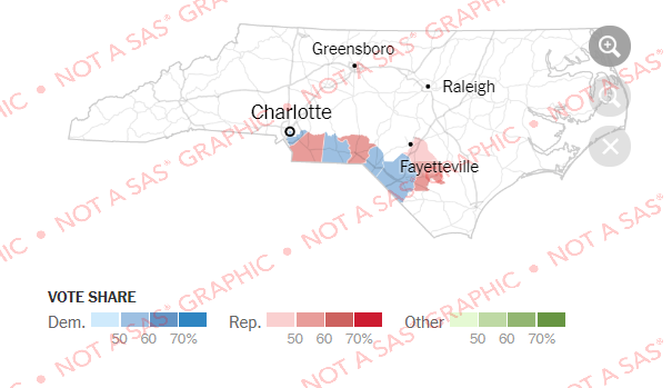
Before I decided to create my own map, I first looked around to see what maps already existed. I found several where the winning party was shown by color on each county (or portion of the county in the district). This type of map was ~OK if you just want to see where the Democrats or Republicans out-voted the other party in a county, but it didn't really tell me "how important" the votes in that county were. For example, a large county does not necessarily have a large number of voters, and vice versa. Here's an example of such a map from the New York Times:
My Custom SAS Map
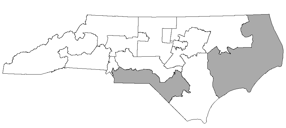
Follow along as I try to create a better map! First I downloaded the NC Congressional District shapefile, and imported it into SAS using Proc MapImport. Here's what the imported map looks like, with districts 9 and 3 colored dark gray.
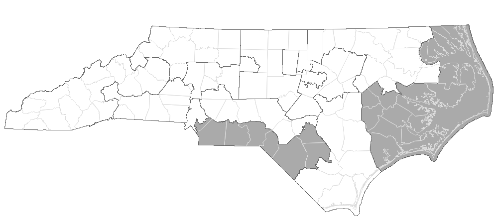
Not too many people are familiar with the Congressional District borders, therefore I wanted to also show the county borders (which people are more familiar with). I took the county borders from mapsgfk.us_counties, and turned them into a dataset of annotate poly/polycont functions that would draw the county borders, and overlaid that on top of the district map. Of course, annotating the county borders on top of the district map obscured some of the district borders, therefore I also created an annotate dataset to draw the district borders, and annotated them on top of the annotated county borders. The map is getting a few layers deep, but it shows the level of detail that I want!
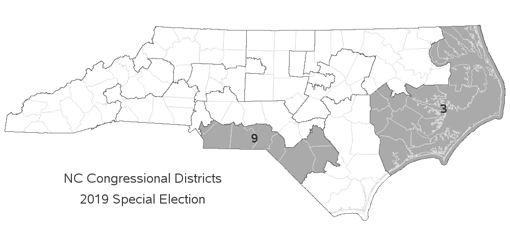
Next I annotated some text, so people would know what was being plotted on the map. I added some title text, and labeled the districts with a '3' and '9'.
Adding the Data
I got the election results from the official NC State Board of Elections website. I couldn't find an easy way to download all the data at once, therefore I manually viewed the report for each county, and copy-n-pasted the data into a spreadsheet for each county (there's bound to be a better/easier way somewhere?!?) I then imported the data into SAS, and merged in the X/Y coordinate county centroid, so that I could annotate a marker on each county to represent the votes.
Rather than just shading the counties by how Democrat or Republican they leaned, I wanted to also represent the number of votes cast in each county. My first thought was a 'bubble map' with the size of the bubble representing the total number of votes. But I also wanted to visually represent the number of votes that went to the Democrat and Republican candidates. Therefore I created custom combination bubble/pie markers. The area of the pies are proportional to the number of votes case in the county, and size of the pie slices represent the portion of the votes that went to each candidate in each county. I also arranged the pie slices such that the candidate with the most votes had their slice in the 'top' half of the pie.

For those who might want more information, I show the important details in mouse-over text. Click here to see the interactive version of the map, with the mouse-over text.
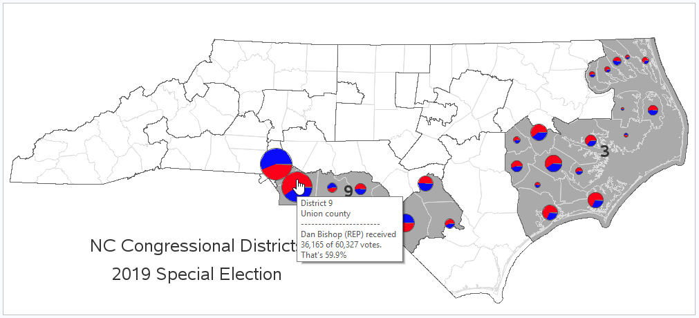
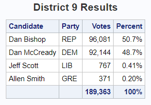
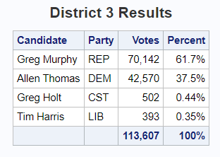
I think the bubble map is great for showing the election results at the county level ... but it isn't much use for showing the most important detail - who won the elections? A simple table is a much better way to show the total number of votes, and the winner in each district. I created these tables using simple Proc Print, with the numeric columns sum'd.
Did this map give you any more/different insight into the election results? What do you like, and dislike about the bubble/pie approach? What other suggestions do you have? (Feel free to discuss in the comments section.)


7 Comments
Great job, Robert!
I"m getting picky, but how about major cities? People not familiar with NC might want to see where Charlotte is located and Fayetville and probably some others that I'm overlooking.
For district 3, the water looks like a large county. If you're familiar with NC, you recognize the outer banks and know that there are large sounds there and not empty counties.
As for did this help present a different view of the results... sure! The immediate question I saw is how Union County and Mecklenberg County could basically cancel each other out though they are physically adjacent to each other.
Love what you do with data presentation!
I originally included the major cities in the map, but they were 'competing' with the pies (for real-estate, and for users' attention), so I decided to remove them.
Here's one of my other district maps with cities: http://robslink.com/SAS/democd101/nc_congressional_districts_2018.htm
Is county the smallest unit of data available? And have you thought about using shades of red and blue instead of pie charts?
The NC State Board of Elections page where I found the data would only let you query by the whole state, or county.
I'm sure that data is tracked at the voting precinct level, but I'm not sure how to get that data.
Hi Robert,
Is there a place where you save these Codes?
Thanks,
Prashant
I decided to just focus on just the results for this one, rather than the code.
good job. which codes have you shared? best regards