Flying drones was a new & exciting hobby, and very cool fad a few years ago. In recent years, the drone manufacturers have added some really nice features to make the drones easier to fly and more capable ... but the government also added some new rules that have curbed the enthusiasm a bit. One such rule is that drones over a certain size have to be registered - and in this blog post I'm showing one way to analyze that registration data!
But before we get started, here's a drone-related picture from my friend James (taken by his friend Todd). His drone got stuck in a tree (as sometimes happens), and this is how he recovered it. Must be nice, having access to equipment like this! 🙂

Preparing the data
Now, let's plot that data! The FAA released a snapshot of their drone registration data in 2016, based on FOIA requests. You can download the spreadsheet at the bottom of this faa.gov page. I used the following code to import the hobbyist registration data tab from the spreadsheet into SAS:
proc import out=my_data DATAFILE="Reg-by-City-State-Zip-12May2016.xlsx" dbms=xlsx replace;
range="Hobbyist$A3:E39462";
getnames=yes;
run;
I then used a data step to limit the data to just the North Carolina data. And while I was manipulating the dataset, I created a numeric version of the zip code variable, so it will match the numeric zip variable in the lookup table that Proc Geocode uses by default,
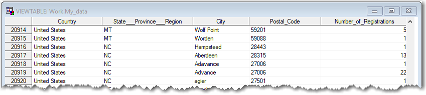
data my_data; set my_data (where=(country='United States' and State___Province___Region='NC'));
zip=.; zip=postal_code;
run;
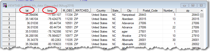
Next I ran Proc Geocode, to estimate the latitude/longitude coordinate for each zip code. This will allow me to plot the data on a map.
proc geocode data=my_data out=my_data (rename=(x=long y=lat))
method=ZIP addressstatevar=State___Province___Region;
run;
Error-checking the data
The lat/long values look reasonable at first glance ... but I decided to do a quick scatter plot as a sanity check. And, sure enough, there were several outliers that didn't seem correct. Presumably a few people had a typo when entering their zip code, while registering their drone. Never underestimate the power of a simple scatter plot!
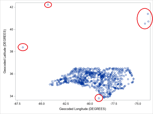
To programmatically get rid of the outliers that are not actually in NC, I decided to use Proc Ginside to determine which lat/long locations were 'inside' the boundary of the North Carolina map.
First I grabbed a copy of the NC county map and projected it. And then I projected the drone lat/long data using the same projection parameters. This adds projected X & Y variables to the datasets.
data my_map; set mapsgfk.us_counties (where=(statecode='NC') drop=x y);
run;
proc gproject data=my_map out=my_map latlong eastlong degrees dupok
parmout=projparm;
id state county;
run;
proc gproject data=my_data out=my_data latlong eastlong degrees dupok
parmin=projparm parmentry=my_map;
id;
run;
Then I ran Proc Ginside to determine which drone registration lat/long's were inside the map. Ginside adds the id variables to the data= dataset for each obsn what has x/y inside the polygons/areas of the map dataset. (Note that I run Ginside after running gproject, because Ginside requires x/y variables. I could have re-named the unprojected lat/long as y & x to run Ginside without gprojecting the data, but since I wanted to project the map anyway, I think this is a more efficient and intuitive way to go.)
proc ginside map=my_map data=my_data out=my_data dropmapvars;
id statecode county;
run;
data my_data; set my_data (where=(statecode='NC'));
run;
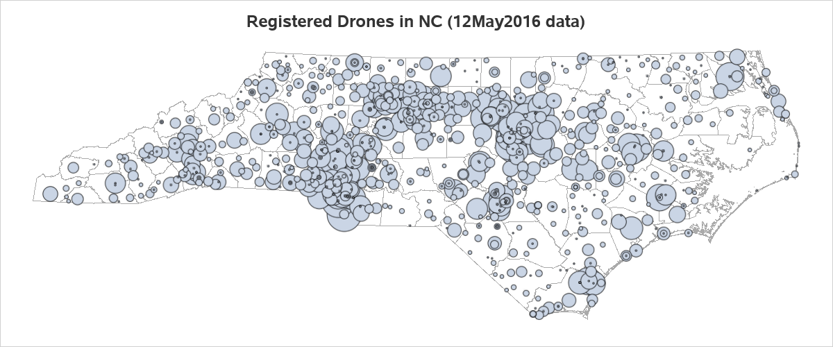
Plotting the data on a map
Now I can easily plot markers on a map at each drone registration zip code (which I have geocoded to find the lat/long, and projected to get a projected x/y), and size the markers based on the number of drone registrations at each zip code. Note that I drop the unprojected lat/long, otherwise Proc SGmap choro would use them by default, rather than the projected X & Y.
proc sgmap mapdata=my_map (drop = lat long) plotdata=my_data noautolegend;
choromap / mapid=id lineattrs=(color=grayaa);
bubble x=x y=y size=Number_of_Registrations / bradiusmin=1 bradiusmax=30;
run;
Alternatively, you can specify a couple of extra options to make the bubble markers transparent red. The advantage of this is that you can visually see where there are several markers stacked/overlapping in the same location.
proc sgmap mapdata=my_map (drop = lat long) plotdata=my_data noautolegend;
choromap / mapid=id lineattrs=(color=grayaa);
bubble x=x y=y size=Number_of_Registrations / bradiusmin=1 bradiusmax=30
fillattrs=(color=red) transparency=.8;
run;
![]()
Which technique do you like better - solid, or transparent bubbles? Do you see any trends in the NC drone registration map? Any surprises, or just about what you thought it would be? Feel free to discuss in the comments section!


4 Comments
Hello Robert,
Can you please post the link to the full SAS code if possible. Thanks.
The trends I see might just be population density. How about calculating drones / 1000 residents and plotting that? The picture of the drone rescue raises another possibility: a negative correlation with tree density. It could be related to income too. There are so many possibilities with enough data!
Ahh! - Those are some good observations!
Can you update this for 2022?