In these modern times, my utility bill has a bar chart so I can see how my current consumption compares to my historical usage. I decided to create my own version of this utility bill bar chart, and make a few improvements along the way. If you're into SGplot bar charts, you might learn a thing or two from this example!
But first, you need to guess what kind of utility data I'll be plotting. Is it water, sewer, power, or gas?!? Here's a hint, in the form of a picture my friend Annie took - very cool photo, eh?!?

And now, let's plot my power utility data! I grabbed one of my old power bills, and created a SAS dataset of the values shown in their graph. They don't give a specific date (just the month), but I went ahead and called it the first of the month in my dataset, to make it a valid 'date' value ...
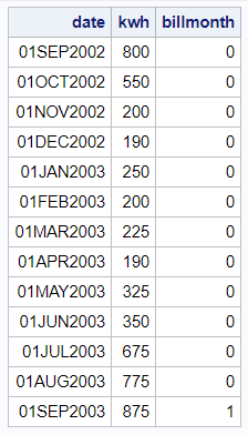
And with the code below, here's my first bar chart of the data. Notice that I use the monyy7. date format, so the dates just show the month and year (not the '01' day part). I also used group=billmonth, to make the current/billing month's bar a different color than the other months.
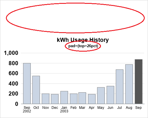
title1 h=13pt "kWh Usage History";
proc sgplot data=my_data noborder noautolegend;
format date monyy7.;
styleattrs datacolors=(cxcad5e4 gray55);
vbarparm category=date response=kwh / group=billmonth
outlineattrs=(color=gray77) tip=(date kwh);
yaxis display=(nolabel noline noticks) thresholdmax=1
valueattrs=(weight=bold size=13pt)
grid gridattrs=(color=graydd);
xaxis display=(nolabel noticks)
fitpolicy=rotate valuesrotate=vertical;
run;
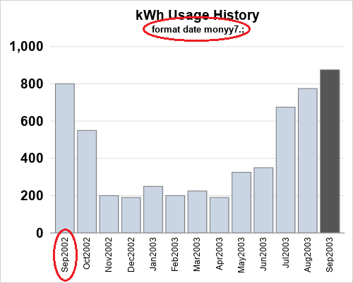
That's an ~OK plot, but I think the date values along the bottom are a bit difficult to read (since I had to rotate them to make them fit), and having the year repeated so many times seems a bit wasteful of space. So let's apply the monname3. format to make the date values print as the 3-character month abbreviation. Those values will be short enough to fit under the bars without rotating. It looked good at first, but then I noticed that since the plot covers a 13 month time span, the graph has 2 September's (from 2 years) ... and when you plot the bars by the 3-character month abbreviation, the 2 Sep's get stacked into the same bar!
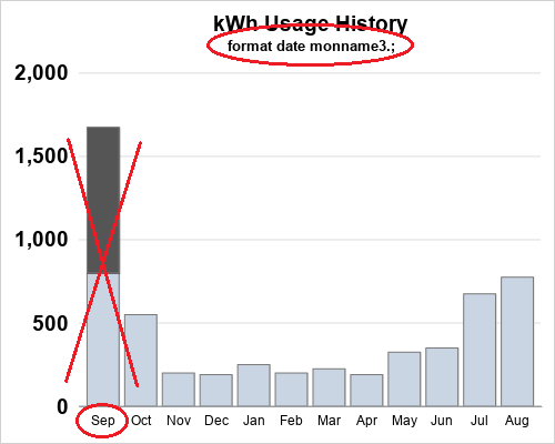
One advantage of the newer SGplot over the old SAS/Graph Gchart is that it has more "time smarts" built into it. Therefore I added the type=time option on the xaxis statement, to let it know to handle the values in a "time smart" way, and voilà - I got a chart with a very nicely formed time axis!
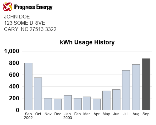
Now that we've got the graph looking great, let's create the rest of the power-bill look. They had a logo and address at the top of the bill - how can you add something like that to a SAS graph?!? ... By using annotate, of course! First, use the pad option to add some blank space above the graph:
I then used the following code to create the annotate dataset, and specified sganno=anno_all to include it in the SGplot bar chart.
data anno_logo;
length function $10 anchor $20 drawspace $20;
function='image';
drawspace='graphpercent';
anchor='bottomleft';
x1=2; y1=91;
widthunit='percent'; width=31.5;
heightunit='percent'; height=7;
layer='front';
image='../democd12/prog_ener.gif';
run;
data anno_address;
length label $100 x1space y1space $50;
layer="front";
function="text"; textcolor="gray33"; textsize=12;
width=100; widthunit='percent';
x1space='graphpercent';
y1space='graphpercent';
anchor='left';
x1=2;
y1=86.5; label="JOHN DOE"; output;
y1=y1-5; label="123 SOME DRIVE"; output;
y1=y1-5; label="CARY, NC 27513-3322"; output;
run;
data anno_all; set anno_logo anno_address;
run;
proc sgplot data=my_data noborder noautolegend pad=(top=26pct) sganno=anno_all;
Hopefully you've learned a few tricks you can use in your own graphs! ... If you'd like to play around with this graph, here's a link to the complete SAS code. And if you're interested in utilities & energy, and would like to see more blog posts on this topic, click here.


5 Comments
Thanks for the great demonstration - but I have a couple of questions.
1. Why is your energy use much greater in the summer compared with the winter?
2. Is there a "season" format that could be used to show this?
I use more electricity in the summer because I have an electric air conditioner (and less in the winter because I have gas heat).
I'm not sure if SAS has a 'season' date format, but in this case I would rather have the bars labeled by month. I could perhaps use colored bands behind the bars to represent season.
Thanks Robert, it really help me understand the basics. Kudos!
This is great....I have monthly data, can you explain how I would only show tickmark labels for every 2 months, yet continue to display all the data by month?
On the XAXIS statement, specify INTERVAL=MONTH and INTERVALMULT=2. This basically means you want 2-month intervals along the axis. Hope this helps!