In this 'Rosetta Graph' example, I demonstrate how to control bar chart colors in Gchart and SGplot.
But first, here's a little diversion... some artwork in my office here at SAS. There's a *lot* of artwork hanging around at SAS, but this particular painting wasn't created by the SAS artists - it was created by my friend Sara. She's a master of paint & color!

And speaking of mastering colors, let's get working on those SAS graphs!...
I'm not talking about simply hard-coding some colors in a one-off chart, so they happen to match up with the data you're currently plotting. I'm talking about those tricky coding techniques which allow you to write generalized code that will map the colors as desired, even if the data changes next time you run the graph.
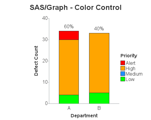
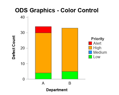
Specifically, the important feature of these examples is that they map specific colors to specific values (for example, 'Alert' defects are always red), and they order the stacked bar segments and legends such that the colors are in a meaningful order ('Low' is at the bottom, and 'Alert' is at the top), rather than being in alphabetical or data order.
Data Preparation
I'll be using the following data in both examples. This data represents the number of defects in each department, by priority. Note that there are no data lines with 'Medium' priority defects in this particular data, but it is a possible value, and I therefore want to show it in the legend.
data my_data;
length Department $1 Priority $10;
input Department Priority Defect_Count;
datalines;
A Low 4
A High 26
A Alert 4
B Low 5
B High 28
;
run;
SAS/Graph Gchart
data fake_data;
length Priority $10;
input Priority;
datalines;
Low
Medium
High
Alert
;
run;
data my_data_gchart; set my_data fake_data;
if priority='Low' then stack_order=1;
if priority='Medium' then stack_order=2;
if priority='High' then stack_order=3;
if priority='Alert' then stack_order=4;
run;
proc sql noprint;
create table control as
select unique stack_order as start, priority as label
from my_data_gchart;
quit; run;
data control; set control;
fmtname='stk_fmt';
type='N';
run;
proc format lib=work cntlin=control;
run;
legend1 label=(font='albany amt/bold' position=top 'Priority')
value=(justify=left) order=descending shape=bar(.15in,.15in)
across=1 position=(right middle) mode=share offset=(-5,0);
pattern1 v=s c=lime;
pattern2 v=s c=dodgerblue;
pattern3 v=s c=orange;
pattern4 v=s c=red;
axis1 label=(font='albany amt/bold' angle=90 'Defect Count')
order=(0 to 40 by 10) minor=none offset=(0,0);
axis2 label=(font='albany amt/bold') offset=(15,15);
title1 h=18pt ls=1.5 "SAS/Graph - Color Control";
proc gchart data=my_data_gchart;
format stack_order stk_fmt.;
vbar department / type=sum sumvar=defect_count
subgroup=stack_order
width=15pct space=8pct coutline=gray33
legend=legend1
raxis=axis1 maxis=axis2 noframe;
run;
ODS Graphics SGplot
data myattrs;
length value $10 fillcolor $12;
show='AttrMap';
id="some_id";
value='Alert'; fillcolor="red"; output;
value='High'; fillcolor="orange"; output;
value='Medium'; fillcolor="dodgerblue"; output;
value='Low'; fillcolor="lime"; output;
run;
title1 h=18pt ls=1.5 "ODS Graphics - Color Control";
proc sgplot data=my_data dattrmap=myattrs noborder
pad=(left=10pct right=10pct);
vbarparm category=department response=defect_count /
group=priority groupdisplay=stack attrid=some_id
barwidth=.6 outlineattrs=(color=gray33)
name='mybars';
yaxis label='Defect Count' labelattrs=(size=12pt weight=bold)
values=(0 to 40 by 10) valueattrs=(size=12pt);
xaxis label='Department' labelattrs=(size=12pt weight=bold)
display=(noticks) valueattrs=(size=12pt);
keylegend 'mybars' / position=right location=outside
title='Priority' titleattrs=(color=gray33 size=12pt weight=bold)
fillheight=11pt valueattrs=(color=gray33 size=12pt)
noborder opaque across=1;
run;
Code Explanation
Here's where I explain the important differences in the SAS/Graph (Gchart) code, and the ODS Graphics (SGplot) code. If you want to find these commands & keywords in the code above, I recommend using your browser's Ctrl+f (find) feature.
- In Gchart I specify the colors in pattern statements, and they are mapped to the values of the subgroup= variable. In SGplot I specify the colors using the fillcolor variable in the attribute dataset (which I specify as dattrmap=myattrs). I then specify attrid=some_id to tell sgplot which obsns of the attribute dataset to use (in this trivial case, all of the obsns have id='some_id'), and then the group=priority in the plot are colored by the matching value= in the attribute dataset (this might seem a bit confusing at first, but it's very flexible, and makes more sense the more you use it!)
- In Gchart the colors specified in the pattern statements are assigned to the data values in alpha/numeric order, therefore if I want all 4 possible color values assigned consistently (even when the data changes), I have to make sure the data contains all 4 possible values - I do this by creating a 'fake_data' dataset with all the 4 possible values (and missing/no defect count), and merge that into the data I'm plotting. In SGplot, I do not have to add fake/missing values to the data (I'll explain more in the final bullet).
- In Gchart, the stacking order of the bar segments is alpha/numeric order, therefore to get the defect priorities (Low, Medium, High, Alert) stacked in the desired order, I assign a numeric value to them (stack_order), and then specify subgroup=stack_order (instead of subgroup=priority). In Sgplot, the stacking order of the bars is controlled by the order of the values in the data= dataset (my_data), ie, "data order".
- Since I'm using numeric values to control the stacking order of the bar segments in Gchart, those numeric values would show up in the legend. To get the text priorities to show up in the legend instead of the numeric values, I create a user-defined-format (which I call stk_fmt). In Sgplot, since you didn't have to use numeric values, you don't have to worry about a user-defined-format.
- To control the order of the items in the GGhcart legend, such that 'Alert' is at the top and 'Low' is at the bottom (the same way the colored segments are stacked in the bars), you have to specify the order=descending option in the legend statement. In Sgplot, I specify show='AttrMap' in the attribute dataset so that all the possible values are shown in the legend, and the order of the legend items is controlled by the order of the values in the attribute dataset.
As you can see, SGplot provides a much easier and more direct way to map specific data values to specific colors. If you found this example useful, be sure to check out my other 'Rosetta Graphs' examples!

5 Comments
Pingback: Converting from Gchart to SGpie - simple pie chart - Graphically Speaking
Hi Robert,
Thanks for your Blog posts. Extremely Informative. I have a question. Will and Can SAS ODS Graphics eventually replace the need for SAS/GRAPH software in Future?
Hi Prashant - thanks for the feedback and question!
ODS Graphics is quickly gaining most/all the features that SAS/Graph has. In the current release (9.4 maintenance 6), sgmap is still lacking some of the key functionality that sas/graph gmap has ... but hopefully most of that functionality will be added in the next release. The only other area I've found it lacking in would be placing & overlaying multiple graphs on a page, with mouse-over text and drilldown capability on the individual bars & plot markers, like proc greplay allows (which is great for building custom dashboards). ODS Layout can provide some degree of placing multiple graphs on a page, but not with the level of functionality greplay provides.
Of course, I'm still just a 'beginner' in ODS Graphics, and after I learn all the tricks perhaps I will find that it can do everything I need! 🙂
Thanks Robert, especially for the last bullet point. The explanation here is much better than the manual. I have been struggling to understand the concept that attribute maps control the sorting of stacks. In these days when everything should be a dashboard it would be nice to see some of these features explained and possibility studies in VA. we are struggling to explain to Ad_hoc users why the VA graphs cannot just be as they think they should be. I feel that some blogs/articles of what is really possibly in VA and what is not with an explanation of why would be helpful.
You Rosetta stone theme for SGPLOT to VA would be really nice.
This is the kind of feedback that helps me know what users are interested in, and helps me pick the direction to go in future blog posts! Thanks for taking the time to leave this comment!