While we're on the topic of mortgage rates, let's explore another technique for plotting and comparing the rate data over several years. Last time, we plotted each year's data in a separate graph, and paneled them across the page. This time, let's overlay multiple years together in the same graph.
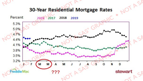
Here's the graph that inspired me to look into this technique. This is a graph April Orr periodically posts on her Twitter page (not sure whether she created it, or just re-posted it), with updated data. Her graph gets the job done ... but I'm suspicious there's a bug in the labeling along the bottom axis. How many months start with 'M'? - I only know of two (March and May), but she has 3 M's in her axis. I suspect it has two 'March' labels, and that probably means the other month tick marks are not quite spread out correctly.
My Preliminary Graphs
I decided to create my own version of this graph, and fix the x-axis (and maybe make a few other small improvements). First I located the data on the FreddieMac website, and downloaded the Excel spreadsheet. I imported it into SAS, and was soon able to get a preliminary plot of the data using the following code:
proc sgplot data=my_data (where=(year>=2016)) noautolegend;
format rate percent7.1;
series x=date y=rate / group=year;
yaxis display=(nolabel);
xaxis display=(nolabel);
run;
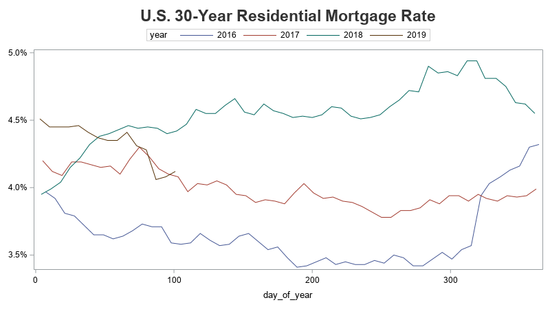
I used group=year which colors the line for each year differently, but how can I overlay the years in the same space? One technique might be to create 4 separate plots, and overlay/layer them on top of each other. But it can be difficult to get the axes and labels to line up exactly the same.
I decided to take a different route. Rather than plotting against the date, I created a new variable that represents the number of days into the year (1-365). I used the julday format to do that...
day_of_year=.; day_of_year=put(date,julday.);
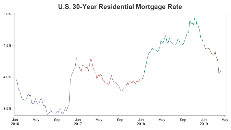
I then plotted against day_of_year rather than date, and got the following graph with all 4 years plotted in the same space.
But most people don't relate too well to "day of year" numbers (for example, what month is "day 100" in?) I want to show an actual date along the x-axis, to make the graph easier to understand. If I just apply a date format to the day_of_year number, you will see dates in 1960 (that's because 1960 is the default beginning year for date values in SAS, and therefore days in this numeric range (1-365) are considered to be in 1960. Here's what that graph would look like (incorrectly/naively applying the date format).
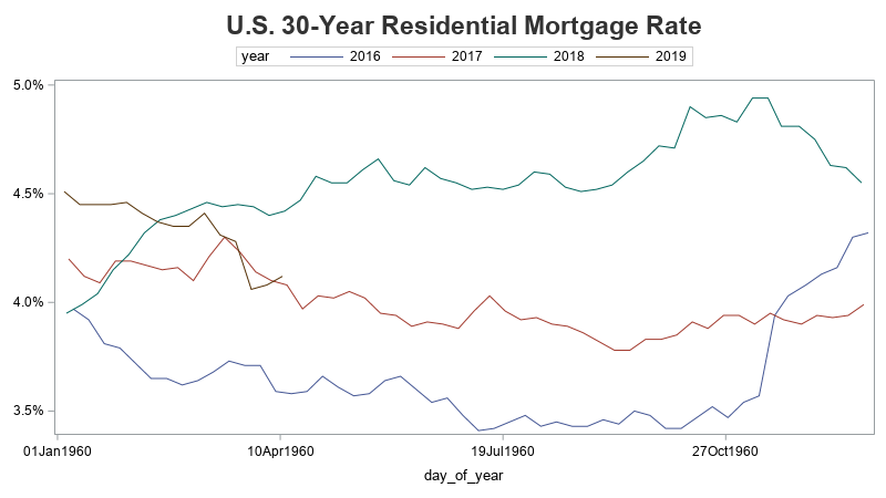
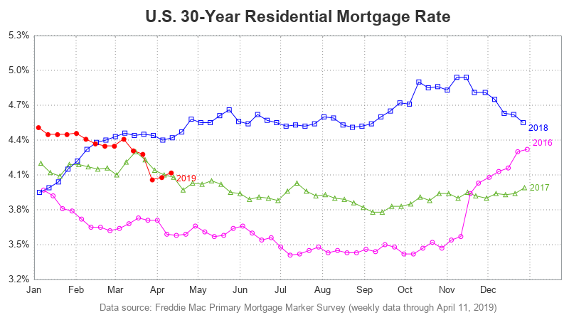
My Final Graph
We don't really want the '1960' part, and we don't really need the day-of-month - we just need the month part. I could use the monname3 format, to print 3-character abbreviations for the month, but in order to show all 12 months of data, my axis needs to go out to Jan 1 of the following year. I don't want to show Jan of the following year on the axis, therefore I jump through a couple of hoops to get things just the way I want them, and blank out that last tick mark:
xaxis values=('01jan1960'd to '01jan1961'd by month)
valuesdisplay=('Jan' 'Feb' 'Mar' 'Apr' 'May' 'Jun' 'Jul' 'Aug' 'Sep' 'Oct' 'Nov' 'Dec' ' ');
After that change, along with a few other tweaks and customizations, I came up with my final graph!
Other Improvements
Here are a few of the other improvements I used to create my final graph:
- I added year labels to the lines (using the curvelabel option), rather than using a legend.
- I used colors that are a little easier to discern, and more variety in markers (varied both shapes, and filled/empty). I specified these colors and marker shapes in a styleattrs statement.
- I use 3-character month abbreviations, rather than 1-character, so there's no question which month is which.
- I added light dotted reference lines (using the grid option in the xaxis statement), to make it easier to see if the rates were changing, or holding steady.
- Added a descriptive footnote indicating that Freddie Mac was the source of the data (whereas in the original graph, people might have thought the graph itself was from Freddie Mac).
- And, removed the 'Percent' label from the top of the y-axis (it was just unnecessary clutter).
Hopefully you've picked up a few graphing tips & tricks from this example. If you'd like to dig into more details, here's a link to my full code. If you have any other suggestions, feel free to discuss them in the comments section!
See also: Diving deeper into a mortgage rate graph


5 Comments
Pingback: Diving deeper into a mortgage rate graph - Graphically Speaking
I actually like your first graph MUCH more.
When you plot each year as an overlay from Jan to Dec, that's functionally saying that the pattern of seasonality is the primary interest. Maybe for people who know a lot about Residential Mortgage Rates that's true, but I'm ignorant on the topic, and not seeing it from the data.
The top chart shows the longer term trend, AND because of the way you've separated the years, also says "look at seasonality." (It also scores high on sparse elegance.)
But a nice catch on the "more Marches than normal" issue.
Nice observations!
I always encourage looking at the data in several different ways - and the first plot would be one of those ways! 🙂
I can't understand this graph. Will someone help me understand how the mortgage rates are being compared here? I think that you should have just done a written post, and not include any graphs in this post.
Pingback: These mortgage rates look shady to me! - Graphically Speaking