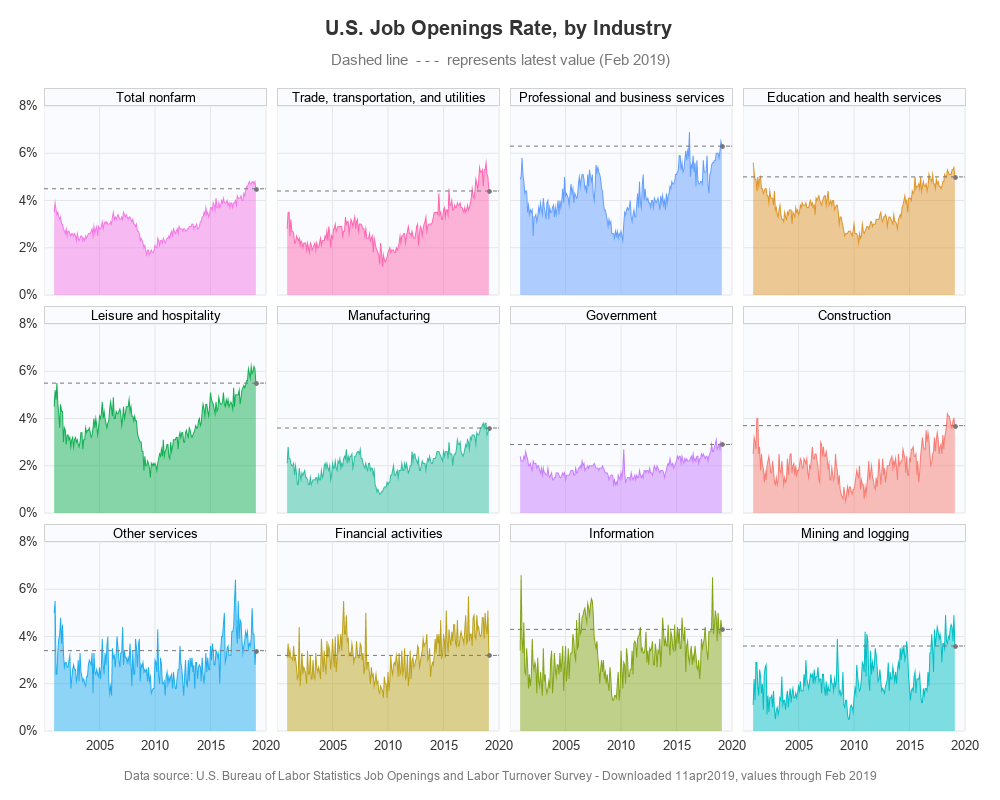
In the past, I created some graphs about our record low unemployment rate (US unemployment, and state-level unemployment), but does low unemployment also mean there are jobs available? Let's have a look at the data!...
Existing Graphs
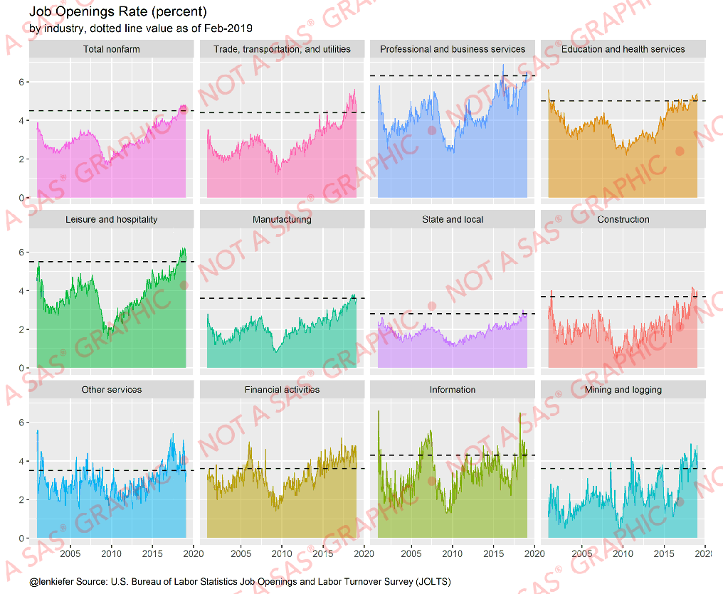
I knew I couldn't be the only one interested in this kind of data, and therefore I turned to the Internet to see what might already be out there. And I found this really cool graph that Leonard Kiefer had posted on twitter (he's the Deputy Chief Economist at Freddie Mac, and he's always posting interesting graphs - you should follow him too!)
Getting The Data
I liked Kiefer's graph, so I decided to try to create my own version, and make a few small improvements. First, I located the data on the BLS website, and downloaded it. Where available, I selected the "seasonally adjusted" data. I now had 12 Excel spreadsheets (one for each graph). They all had their data in the same cells, therefore I wrote a re-usable parameter-driven macro to import this spreadsheet layout:
%macro read_data(xlsname,dataname,survey);
proc import datafile="&xlsname" dbms=xlsx out=&dataname;
range='BLS Data Series$a12:m32';
getnames=yes;
run;
data &dataname; set &dataname;
length survey $100;
survey="&survey";
run;
%mend;
I then used the following code to run the macro 12 times to import the 12 spreadsheets, and combine the 12 datasets into one:
%read_data(SeriesReport-20190411072035_0b99d7.xlsx, nonfarm, Total nonfarm);
%read_data(SeriesReport-20190411084943_987910.xlsx, ttu, %bquote(Trade, transportation, and utilities));
%read_data(SeriesReport-20190411091327_530482.xlsx, profbus, Professional and business services);
%read_data(SeriesReport-20190411091852_3ae78c.xlsx, eduhea, Education and health services);
%read_data(SeriesReport-20190411092515_a7430e.xlsx, leishosp, Leisure and hospitality);
%read_data(SeriesReport-20190411092906_c269ba.xlsx, manuf, Manufacturing);
%read_data(SeriesReport-20190411093420_c2726b.xlsx, gov, Government);
%read_data(SeriesReport-20190411094247_8b3456.xlsx, const, Construction);
%read_data(SeriesReport-20190411094638_8479b9.xlsx, serv, Other services);
%read_data(SeriesReport-20190411095010_9fd34a.xlsx, fin, Financial activities);
%read_data(SeriesReport-20190411095445_7d57c5.xlsx, info, Information);
%read_data(SeriesReport-20190411095643_4052a1.xlsx, minlog, Mining and logging);
data my_data; set nonfarm ttu profbus eduhea leishosp manuf gov const serv fin info minlog;
run;
My Preliminary Graph(s)
I did a bit of data-wrangling (transposing columns into rows, and such), and soon had the data structured so that I could create a grid of graphs using Proc SGPanel. Here's a summarized version of the code, showing the important bits, and a glimpse at my preliminary graph ...
proc sgpanel data=my_data;
panelby survey / columns=4;
series x=date y=job_openings_rate;
run;
My preliminary graph (above) just had a line, but I also want the area under the line to be shaded, and slightly transparent so you can see the grid lines behind it. Therefore I added a 'band' graph from the value 0, to the line.
band x=date lower=0 upper=job_openings_rate / fill transparency=.50;
The default colors are ~OK, but I liked the colors that Kiefer had used, therefore I set up an attribute table to map certain colors to certain graphs. I specified group= to turn colors on in the plots, and the attrid and dattrmap told the graphs which colors to use.
data myattrs;
length value $100;
id="some_id";
value="Total nonfarm"; fillcolor="cxf377e4"; linecolor=fillcolor; output;
value="Trade, transportation, and utilities"; fillcolor="cxff66b1"; linecolor=fillcolor; output;
value="Professional and business services"; fillcolor="cx629eff"; linecolor=fillcolor; output;
value="Education and health services"; fillcolor="cxde952a"; linecolor=fillcolor; output;
value="Leisure and hospitality"; fillcolor="cx11ae52"; linecolor=fillcolor; output;
value="Manufacturing"; fillcolor="cx2dbc9e"; linecolor=fillcolor; output;
value="Government"; fillcolor="cxc77dff"; linecolor=fillcolor; output;
value="Construction"; fillcolor="cxf77c73"; linecolor=fillcolor; output;
value="Other services"; fillcolor="cx20adee"; linecolor=fillcolor; output;
value="Financial activities"; fillcolor="cxbba21a"; linecolor=fillcolor; output;
value="Information"; fillcolor="cx83a414"; linecolor=fillcolor; output;
value="Mining and logging"; fillcolor="cx02bfc4"; linecolor=fillcolor; output;
run;
proc sgpanel data=my_data dattrmap=myattrs;
panelby survey / columns=4;
band x=date lower=0 upper=job_openings_rate / group=survey attrid=some_id transparency=.50;
series x=date y=job_openings_rate / group=survey attrid=some_id;
run;
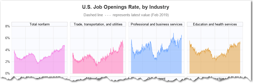
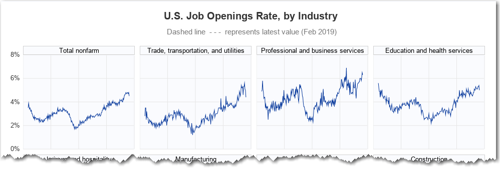
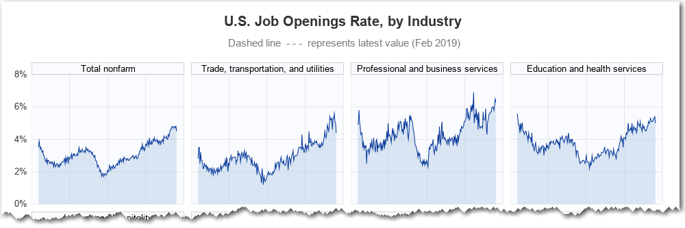
My Final Graph
And the final step was to add the dashed reference line at the latest value! I added a new variable to the dataset, and only populated it for the last value in each graph, and then I plotted a dashed 'refline' at that value. But it wasn't visually intuitive that the dashed refline represented the last value in each graph, therefore I added a black 'dot' marker at the last value, to make it stand out more. (Here's a link to the full code, if you'd like to see all the details of creating the final graph.)
data my_data; set my_data;
by survey notsorted;
if last.survey then latest=job_openings_rate;
run;
proc sgpanel data=my_data dattrmap=myattrs;
panelby survey / columns=4;
band x=date lower=0 upper=job_openings_rate / group=survey attrid=some_id transparency=.50;
series x=date y=job_openings_rate / group=survey attrid=some_id;
refline latest / axis=y lineattrs=(color=gray77 pattern=shortdash);
scatter x=date y=latest / markerattrs=(color=gray77 symbol=CircleFilled size=8px);
run;
My Improvements
The original graph was nice, but I always try to make a few improvements. Here are the ways I think (hope) I've improved the graph ...
- The original graph plotted plain numbers along the left axis, and explained in the title that the values represented "(percent)". In my graph, I add '%' to the values (such as '2%') and therefore they need no explanation in the title.
- I make the background of the graphs a much lighter gray, which makes the colored area graphs show up more.
- I put a little more info in the footnote, indicating exactly when the data snapshot was taken.
- Also, when you click the footnote, it takes you directly to the data download page.
- I added a 'dot' marker to the latest value, so it's more evident that's what the dashed refline represents.
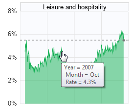
- And, I add HTML mouse-over text, so you can mouse over the lines, and see the exact monthly values. (Click the image of the graph above, to see the interactive version with mouse-over text). Below is a screen-capture example showing the mouse-over.
Now it's your turn - help me interpret these graphs! Do these numbers mean there are more jobs available now than in the past? Feel free to add your views/opinions/interpretations in the comments section.


6 Comments
Nicely done!
I honestly don't know how to interpret that information!
But, as a minor point, I kept getting confused on whether the label was for the graph above or below the text. Since the label is physically closer to the graph above it, I kept reading it that way until I noticed I had extra labels at the top. Just a thought.
Hmm... maybe I need to add more white-space between the graphs (I used 6 pixels). Or maybe I need to use a slightly darker background for the graphs (so the white-space between them has more contrast).
Very nice. I'd lean towards a slightly darker gray to help the graph areas from the surround spacing. I'd probably also put "2000 to 2019" in the titles, so viewers don't have to search for the axis values to set the context. (However, I'm pretty convinced 60% of people don't read the titles at all, but that's another issue.)
Sounds like you've got good insight into graphs - I might give those ideas a try!
At 2008, there was a financial storm .
The job openings rate of 2008 in the United States is the lowest in history.
We now don't have financial storm, so the job openings rate is not the lowest.
Hahaha, that maybe too strained.
I did the exact same when I first saw the example graph. I'd lean toward putting the label at the bottom.