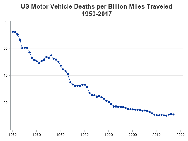
I recently saw an interesting graph that showed the number of motor vehicle crash deaths has been going down. The graph showed deaths per mile. That's a good statistic, but I wondered whether there were other ways to look at the data?
An Interesting Graph
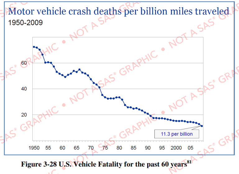
Here's the graph, from an NHTSA report (p. 3-194). I was hoping to find the data source, so I checked reference 81, which took me to an IIHS slide show. The graph was indeed there (on page 4), but they didn't list the data values, or the source of the data.
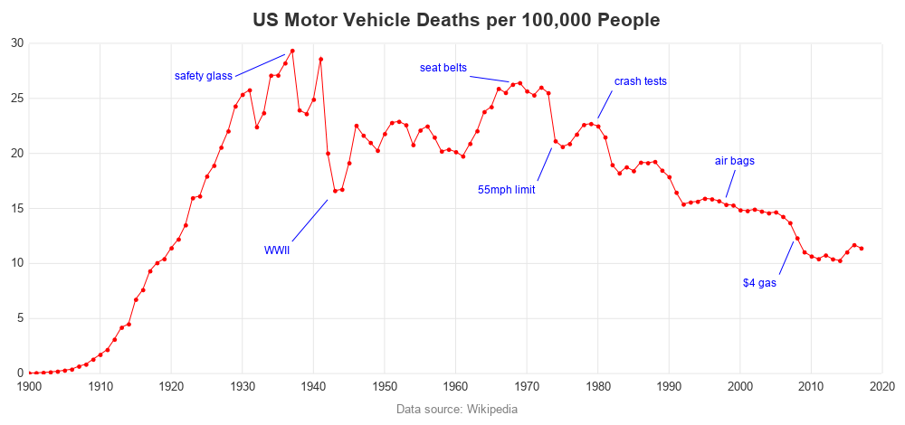
My Alternate Graph - Deaths per Person
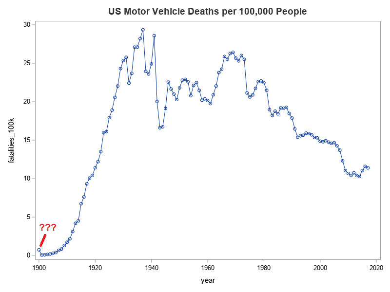
Not to be deterred, I did a bit of searching, and found similar data in a table on Wikipedia. I used one of Rick Langston's macros to read the HTML table into a SAS dataset, cleaned it up a bit, and was soon able to start creating my own graphs! Rather than deaths per mile, I thought it would be interesting to see deaths per capita. Below is the simple code, and the default graph it produces:
proc sgplot data=my_data;
series x=year y=fatalities_100k / markers;
run;
Let's Investigate a Side Issue
I wasn't sure what to expect, but I was curious why the first data point was so much higher than then next few years (in the graph above). Were the very first cars perhaps extremely dangerous? I decided to take a closer look at the data. I was plotting the fatalities per 100k population column that they (Wikipedia) had pre-calculated for me in the table, but the raw values for deaths and population were also available in the table.
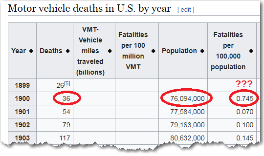
I plugged the suspect/bad 1900 values into my calculator, and 36/(76,094,000/100,000) = 0.047 ... not 0.745. Therefore it appears the calculated value for 1900 in the Wikipedia table was calculated incorrectly! (I love using my SAS software to find problems in Wikipedia data!) Perhaps someone calculated the value by hand, rather than programmatically, and made a mistake? Or perhaps they were entering the values into the table by hand and transposed some digits?
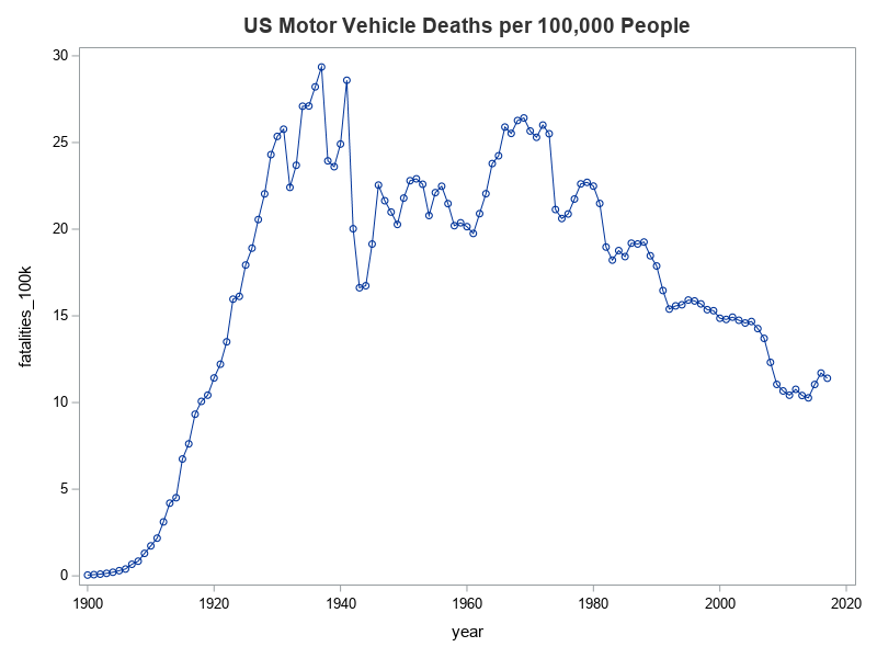
Rather than using the bad/suspect values from the pre-calculated column in the Wikipedia table, I decided to calculate my own column programmatically. Below is the simple code I used, and a graph of the new/fixed values. Much better, eh! - No strange outlier at year 1900 now!
data my_data; set my_data;
fatalities_100k=deaths/(population/100000);
run;
Cleaning Up My Graph
The default graph (above) is OK, but I always like to clean it up a bit, and try to make it a little more informative. First, I removed the axis labels and added grid lines. Then I annotated some text labels, with events that might possibly help explain why the trends might have changed. (Did I annotate the right events? What are some others that might be good to add?)
Re-Visiting Deaths per Mile Graph
Now, let's go full-circle and re-visit the original graph again. Here's my version of the original, but using the Wikipedia data (which goes to 2017, rather than just 2009).
But why only go back to 1950? ... Why not go back as far as we can. And let's add those annotated text labels again.
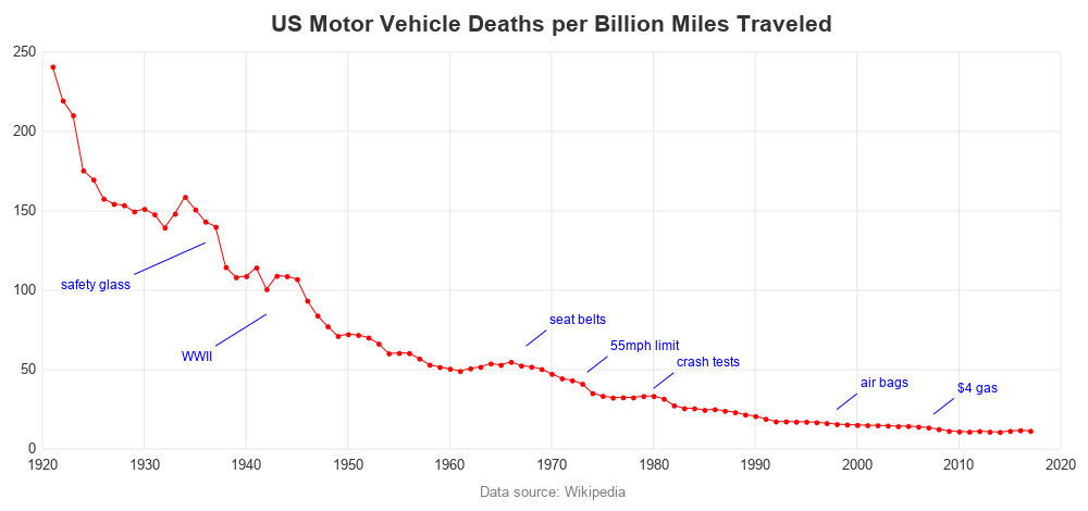
These graphs show some interesting trends, eh! What do you conclude from this data and these graphs? What other data & graphs might add even more insight? (Feel free to discuss in the comments section.)


6 Comments
Thanks for the informative graph Robert. Can you please include the link to your SAS Code if possible?
Here's the code I used to create the graph: https://blogs.sas.com/content/graphicallyspeaking/files/2019/04/us_traffic_fatalities.txt
I wonder how much of the later reduction comes from modern technologies like adaptive cruise control, blind spot warnings, collision mitigation, higher crash standards, and increased number of airbags?
Sounds plausible!
It would be interesting to distinguish fatalities inside vehicles from those outside. You might find a smaller reduction in the latter. Conclusions are difficult to draw here: if pedestrians and cyclists are frightened away they will not be "available" to be fatalities. Could you compare other countries? SAS is an international company, isn't it?
I guess all these depend on what data is available!