During the year 2020, many countries and areas will be conducting their decennial census, and making projections to estimate what their population will be in the future. Therefore I decided to dust off one of my old SAS/Graph samples based on the 2010 census, and rewrite it using more modern technology. That way, I will be ready to plot new data and forecasts based on the 2020 census, when that information becomes available. Follow along, and learn a few tips about plotting population projections!
United Nations Graph
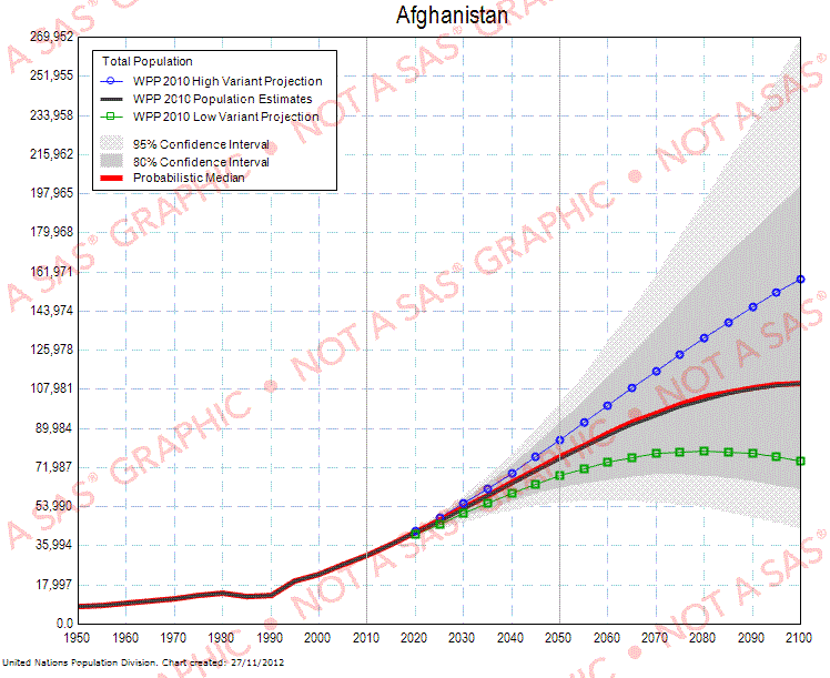
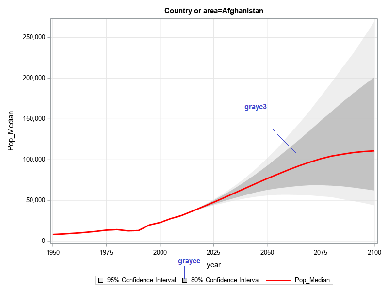
So let's get started! ... First some background. Back ~10 years ago, the UN had a web page where you could select a country, and see a graph of the population projection out to the year 2100. They had two shaded areas around the projection - one for the 80% confidence interval, and one for the 95%. It's an informative graph, but a little crowded/cluttered for my preferences. Their list of countries was alphabetical, and Afghanistan came up first in their list - here's the Afghanistan graph:
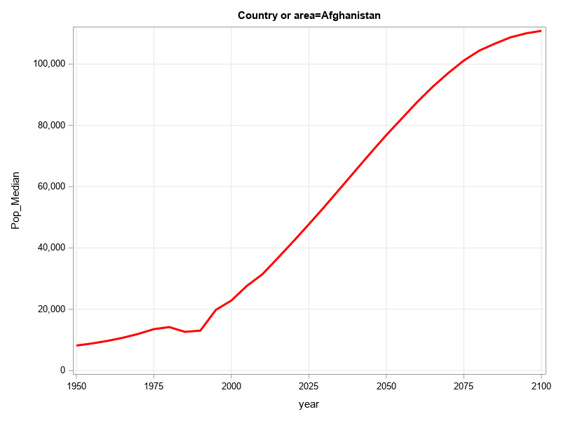
Basic Plot
I downloaded their spreadsheet, imported the data into SAS, and was able to produce a basic graph of the population projection with the following minimal code.
proc sgplot data=all_data;
by Country_or_area;
series x=year y=Pop_Median / lineattrs=(color=red thickness=3px);
yaxis grid min=0;
xaxis grid;
run;
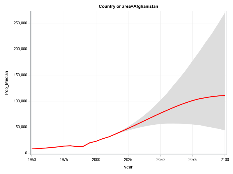
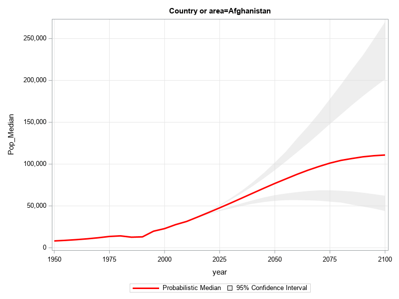
95% Confidence Band
Now, let's add the shaded area for the 95% confidence interval.
With the older SAS/Graph software, you could shade the area under a line (but not the area between two lines). And therefore to get the appearance of a shaded confidence interval, you had to play some tricks with your code. By comparison, with SAS's newer ODS Graphics software, this functionality is built-in. In SGplot, that's a simple matter of adding a band statement, and specifying which variable in the dataset represents the upper and lower edge of the band.
band x=year upper=Pop_Upper95 lower=Pop_Lower95 / fillattrs=(color=graydd);
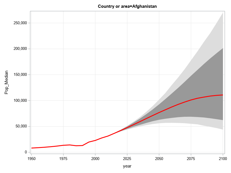
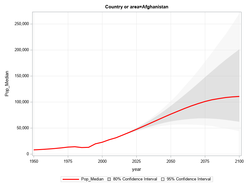
Overlay 80% Confidence Band
Next, let's add a darker gray area for the 80% confidence interval.
band x=year upper=Pop_Upper80 lower=Pop_Lower80 / fillattrs=(color=gray99);
Transparent Shading Can Be Deceptive!
For most people, the graph above would be fine, and you'd be finished (with some fairly simple code!)
But, being a Graph Guy, I wanted a little more from my graph. I wanted to be able to easily see exactly where the red line is, in relation to the grid lines. But the gray confidence bands obscure the grid lines. To get around that, let's (naively) try making the shaded confidence bands transparent, by adding transparency=.50 as an option on the band statements.
Now you can see the grid lines through the shaded bands, but if you look really closely, you'll notice that the colors/shades in the graph no longer match the colors in the legend. The reason for this is that the 80% band is layered on top of the 95% band, and the transparent colors 'combine'. This causes the color you see for the 80% band to appear darker in the graph (since it's actually a combination of two transparent bands). I used the Pixeur tool to sample the colors in the graph and the legend, and found the dark gray in the graph is grayc3, whereas the dark gray in the legend is graycc (see where I've marked in blue in the graph below).
Using Transparent Colors in a Non-Deceptive Way
Here's a trick to get around that problem of the overlapping transparent colors combining. Rather than using two color bands that overlap, break the bands into 4 pieces that don't overlap. Here's a graph with the two pieces that go from the outer edge of the 80% to the outer edge of the 95% area.
band x=year upper=Pop_Upper95 lower=Pop_Upper80 / fillattrs=(color=grayee) transparency=.50;
band x=year upper=Pop_Lower80 lower=Pop_Lower95 / fillattrs=(color=grayee) transparency=.50;
And now we can add darker gray bands for the two inner pieces, going from the median line to the outer edge of the 80% confidence area. Yay! ... Now we can see the grid lines through the confidence bands, and the colors you see in the bands match the colors you see in the legend! (Yes, you can have it all, sometimes!)
band x=year upper=Pop_Upper80 lower=Pop_Median / fillattrs=(color=grayc3) transparency=.50;
band x=year upper=Pop_Median lower=Pop_Lower80 / fillattrs=(color=grayc3) transparency=.50;
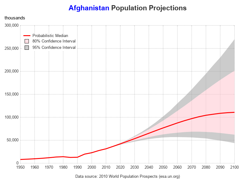
Finishing Touches
Now that we've got the basic plot worked out, let's add a few finishing touches! There's quite a bit of code below, but I wanted to show you the difference in the amount of effort required to produce a really nice plot (below), and a plot that's OK, but not great. In my opinion, it's worth the extra effort - especially when you can write the code once, and produce many different graphs!
options nobyline;
title1 h=15pt c=blue "#byval(Country_or_area) " c=gray33 "Population Projections";
footnote h=1pt ' ';
ods html anchor="#byval(Country_or_area)";
proc sgplot sganno=anno_footnote noborder data=all_data;
by Country_or_area;
band x=year upper=Pop_Upper95 lower=Pop_Upper80 /
fillattrs=(color=gray99) transparency=.50
name='band95' legendlabel='95% Confidence Interval';
band x=year upper=Pop_Upper80 lower=Pop_Median /
fillattrs=(color=pink) transparency=.50
name='band80' legendlabel='80% Confidence Interval';
band x=year upper=Pop_Median lower=Pop_Lower80 /
fillattrs=(color=pink) transparency=.50;
band x=year upper=Pop_Lower80 lower=Pop_Lower95 /
fillattrs=(color=gray99) transparency=.50;
series x=year y=Pop_Median / lineattrs=(color=red thickness=3px)
name='line' legendlabel='Probabilistic Median';
yaxis display=(noline noticks)
labelpos=top label="thousands" thresholdmax=.8
offsetmax=0 offsetmin=0 valueattrs=(color=gray33)
grid gridattrs=(color=gray55 pattern=dot) min=0;
xaxis display=(nolabel noline noticks)
values=(1950 to 2100 by 10)
offsetmax=0 offsetmin=0 valueattrs=(color=gray33)
grid gridattrs=(color=gray55 pattern=dot);
keylegend 'line' 'band80' 'band95' / position=topleft location=inside across=1
opaque noborder outerpad=(top=15px) linelength=20px fillheight=13px
valueattrs=(color=gray33);
run;
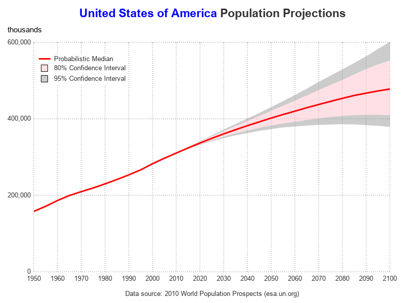
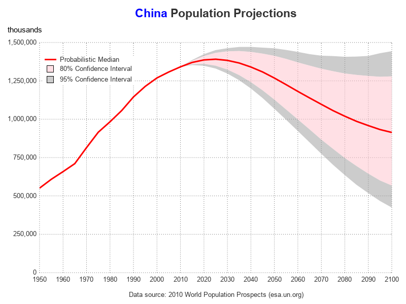
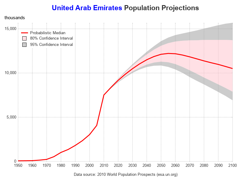
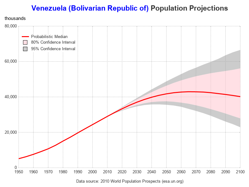
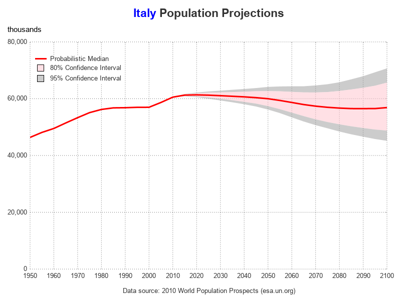
Other Countries
Here are the population projections for a few other countries, in case you're curious. Note that these projections were done about 10 years ago, using the data available in 2010. Do you think the projections using the upcoming 2020 census data will be different? What are some factors and developments in the past 10 years, that might change the population projections?
Here's a link to the complete SAS code, in case you want to see all the details.


5 Comments
Nice graphs. In addition to the techniques you've demonstrated, some analysts like to shade the portion of the graph that corresponds to the future. One of my posts shows how to use the BLOCK statement to highlight the future predictions. You can also use the GROUP= option on the SERIES statement to change the attributes of the median curve. For example, you can make it solid for the past but dashed for the future.
Thanks for the great tips!
That China graph is amazing. I would like to see your graphs for India and Japan.
I found the China population projection graph interesting also - I wonder if the "one child" rule made the projection go down, and I wonder if the relaxing of the one child rule will change the projection. (Also, I wonder how the trend of families having "unreported children" in the rural areas of China will affect their population projections?)
Anyway, here is the graph of India that you requested (I don't think I've graph Japan's data yet): http://robslink.com/SAS/ods3/un_population_projections.htm#India
I used a few of these for a graph in my schoolwork. Of course all of this is completely accredited to you. Mine is not professionally done (I was using this for reference and do not own SAS), to say the least, but here it is anyways. Thanks for the useful information. 🙂 https://docs.google.com/document/d/1sHmdipO5MfETx2pvRjC_gGnq9hJkwM-SHMOWb_Xpl3c/edit?usp=sharing