US farmers grow a lot of food ... but did you know some of them also grow fuel for our vehicles? Follow along and you'll learn how much fuel they grow, and also learn some tips about plotting this type of data!
These days most gasoline in the US has a bit of ethanol mixed in. A little bit of ethanol in every gallon of gasoline adds up, and some even has a lot of ethanol mixed in (such as E85, which is ~85% ethanol). Most of this ethanol comes from corn, that farmers grow specifically for this purpose.
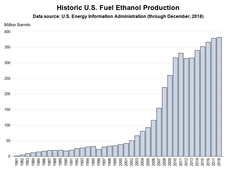
The Original Graph
How much fuel ethanol do US farmers produce? I found this fancy graph on the agronomy.org website, which answers that question!

I don't usually like fancy graphs, but the more I looked at this one, the more I kinda liked some of the fancy visual cues in it. Therefore I decided to try creating my own version, (hopefully) with a few improvements...
First I had to find the data! Fortunately the US Energy Information Administration provides easy access to data like this on their website. I downloaded their spreadsheet, and imported it into SAS.
Starting Simple
Now we can start on that bar chart! First, here's the basic code to create a somewhat standard version, with 1 bar per year. It's a fine bar chart for seeing what the data values are, and how production has increased over the years. If you just want to see the data, then you are done!
proc sgplot data=my_data_yearly noautolegend noborder;
vbarparm category=year response=million_barrels;
yaxis display=(noticks noline) labelpos=top label="Million Barrels"
values=(0 to 400 by 50) grid;
xaxis display=(noticks nolabel) valuesrotate=vertical fitpolicy=rotate;
run;
But sometimes the goal isn't just to see the data values in a clear/concise visualization. Sometimes you want to capture an audience's attention, or create a graph that's visually pleasing (in addition to be informative). So let's start adding some extra visual effects!
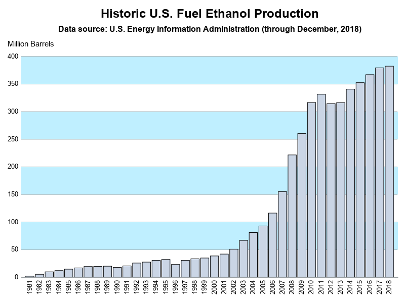
Color Bands Behind the Bars
If you look closely, you'll notice the light gray reference lines - these help you determine whether the bars are above or below the values along the response axis. But sometimes using a light color between the lines makes it even easier to follow. We can accomplish this by adding band statements - the following statements add a few light blue color bands.
band x=year lower=50 upper=100 / fill fillattrs=(color=cxBFEFFF);
band x=year lower=150 upper=200 / fill fillattrs=(color=cxBFEFFF);
band x=year lower=250 upper=300 / fill fillattrs=(color=cxBFEFFF);
band x=year lower=350 upper=400 / fill fillattrs=(color=cxBFEFFF);
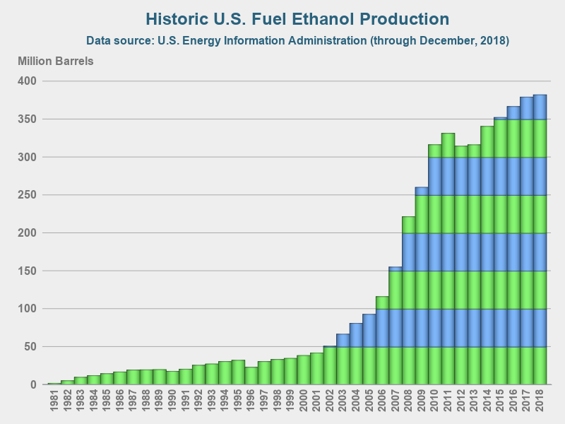
Color Bands *On* the Bars
But those bands look a little garish, eh? The color bars capture more of my attention than the bars. In the original plot, they used bands of color as part of the bars, rather than the background. How can we do that? Well, I had to get a little tricky! For each year (bar), I looped through, and chopped the value into several segments, with each segment representing 50 million barrels.
%let number=50;
data plot_data; set my_data_yearly;
length Details $300;
Details='a00d'x||'Year '||trim(left(year))||'0d'x||
trim(left(put(million_barrels,comma20.1)))||' million barrels';
segment=0;
do loop=0 to int(million_barrels/&number);
if loop gt 0 then do;
segment+1;
million_barrels2=&number;
output;
end;
if loop eq int(million_barrels/&number) then do;
segment+1;
million_barrels2=mod(million_barrels,&number);
output;
end;
end;
run;
And now, I can use group=segment to create a stacked bar chart of the segments. I specify alternating colors for the segments, by using the styleattrs. It takes a bit of jumping through hoops, but it produces the cool effect I was wanting - placing color bands on the bars, rather than in the background.
styleattrs datacolors=(&green &blue &green &blue &green &blue &green &blue)
backcolor=&back wallcolor=&back;
vbarparm category=year response=million_barrels2 /
group=segment barwidth=1 tip=(Details) dataskin=pressed;
Thinning Values on Year Axis
We've got a pretty nice looking plot now, but the years along the bottom axis are a little crowded. So I decided to thin them out a bit. I wanted to keep the label for every year that was a '05' or '10'. Since this was a one-off graph, I decided to specify the bar labels manually (sometimes I spend the extra time to do something like this in a data-driven/re-usable way ... and sometimes I decide to just use brute force and hard-code it like this).
xaxis display=(noticks nolabel)
valueattrs=(color=gray77 weight=bold size=10pt)
valuesrotate=vertical fitpolicy=rotate
values=(1981 to 2018 by 1)
valuesdisplay=('' '' '' ''
'1985' '' '' '' '' '1990' '' '' '' ''
'1995' '' '' '' '' '2000' '' '' '' ''
'2005' '' '' '' '' '2010' '' '' '' ''
'2015' '' '' '2018');
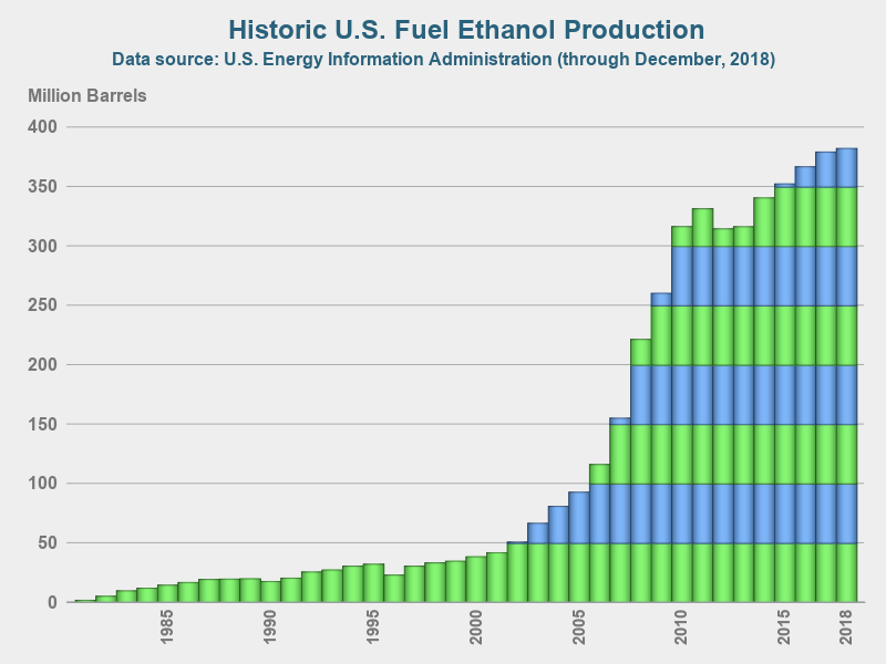
I think the final graph looks great - very visually pleasing, and easy to read!
Showing Exact Value for Each Bar
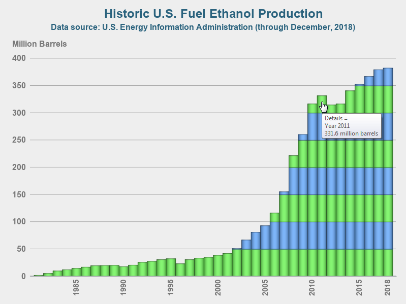
But if you're a discerning reader, you might be saying "Hey! - the original graph had the numeric value at the top of each bar - I can't tell what the exact yearly values are in your graph!" Don't fret - I did take that into account. I didn't want to add a label to the top of each bar, because that makes the graph very visually crowded. But I did add HTML mouse-over text to each bar, so you can hover your mouse over it and see the yearly values! (Click on the final graph image, to see the interactive version with the HTML mouse-over text.)
Here's a screen-capture showing an example of the mouse-over text:
What's your preference? The plain chart, or the fancy chart? Feel free to share your thoughts in the comments!


4 Comments
Very nice. I like bar charts. Never liked pies. Even on pi day.
Haha! - Someone managed to link my bar chart to Pi Day! 😉
Hey, it's really helpful.
I am wondering how did you add HTML mouse-over text to each bar.
Can you explain the method? Thanks!
On the vbarparm statement, use the tip= option to point to the variable(s) you want to display in the mouse-over text.