A few months ago, a user inquired about a chart that showed tumor response and treatment duration for each subject on 2 different planes of a 3D view. The data was really 2D, with one independent variable (the subject id) and two or more response values. I had provided an alternate (and in my view, better) visual to view this data in this article.
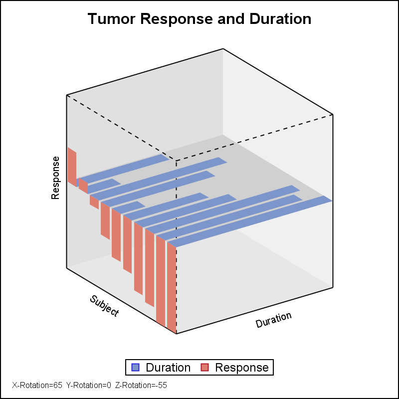
Recently there has been more interest shown by users in creating a 3D visual of the same data using SAS. Questions have come into Technical Support for creating a graph like the one shown below. So I thought it would be useful to see how this could be done using ODS Graphics. ODS Graphics (SGPLOT or GTL) does not have any way to create such a graph using layout containers or plot statements directly. It would be useful to note this visual is a non-standard usage of 3D. Normally, 2 dimensions on the "floor" are used for classification or a numeric grid, with the third (vertical) dimension as the response.
In this case, we have only one independent variable on the left horizontal axis. The left vertical plane is used to display the tumor response, and the horizontal plane to display the duration of treatment. To create this graph I used a technique similar to what I had described earlier in the A 3D Scatter Plot article from March 2015 to create this custom graph. I modified the 3D scatter macro to render the two responses as mentioned above. The macro handles all the 3D transformations and projections, and then uses SGPLOT to render the visual. Here is the macro output:
The macro call looks like this. The ATTRMAP option is currently not used.
%WaterFall_3D_Macro (Data=waterfall3D, WallData=wall_Axes, Pid=pid,
X=x, Y=y, Z=z, Lblx=Subject, Lbly=Duration, Lblz=Response,
Group=grp, Attrmap=attrmap, Tilt=65, Rotate=-55,
Title=Tumor Response and Duration);
Data is provided in a data set "Waterfall3D", where the "Response" and "Duration" are provided as values for 2 groups by subject id. The data could be easily restructured as two columns by the subject id. While I labeled the axes, I stopped here before continuing to add more details to get a feel whether this is really something the SAS user community is demanding. I can add more details (additional overlays, axis details, etc) based on your response. If you really want such a graph, please include the details you would like to see in the graph.
At the risk of being repetitive, I would still suggest that this data can be better visualized using a standard 2D graph as shown below. This can be easily done using SGPLOT statements. Additional data layers can be easily added. I will publish a GTL version with 2 rows where the yaxis information is on the left for both.
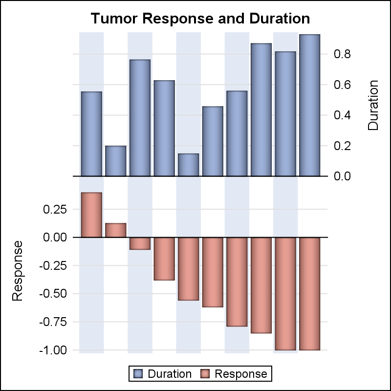
proc sgplot data=tumor2;
styleattrs axisextent=data;
vbarparm category=i response=duration / fillattrs=graphdata1 dataskin=pressed y2axis;
vbarparm category=i response=response / fillattrs=graphdata2 dataskin=pressed;
yaxis offsetmax=0.5 labelpos=datacenter grid display=(noline noticks);
y2axis offsetmin=0.55 labelpos=datacenter grid display=(noline noticks);
xaxis display=none colorbands=odd colorbandattrs=(transparency=0.3);
run;
I have not yet included the 3D Macro code in this article as it is incomplete. I will do that once all the details are in. I really hope this will stimulate a conversation among our clinical users on the need and desirability of such a graph to visualize this data. I look forward to your feedback.


8 Comments
This is impressive, but personally I'm not a big fan of 3-D charts. So don't have any requests in this area. Personally, instead of the 2-D bar chart to display these data, I think a simple scatterplot would convey the information.
Thanks Quentin, A bar chart or needle plot is the traditional visual. Scatter plot will likely work too. My effort is to gauge if the interest in such a 3D visual is fleeting, or an enduring trend. At the end of the day, I would rather provide the SAS user a way to get this if they really want it for reasons not clear to me. 🙂
3-D charts can also be misleading... I *never* use them! I think they are attractive more to people who do not understand statistics and thnk they look "cool" - similar to the problem when you get people using GIS and preparing maps that are so busy with things (like multiple bar charts displayed on top of an isoplath chart, really horrible and a favorite of new uses of GIS.
Thanks for your insight, Jean. I agree one should not use 3D charts merely for "looks". 3D chart would be acceptable where the data is really 3D, with multiple independent variables. Even here, 2D views of the 3D data can be useful.
Hi. I hope interest is "fleeting". Never have seen a waterfall chart used in a published paper (been looking at such things for 40+ years). If someone has an example, I'd really like to see it. Meantime,
I agree with "I think a simple scatterplot would convey the information."
Thanks for chiming in with your views, Mike. It is good to get multiple opinions so readers can make up their own minds.
Hi Sanjay, thanks for Your interesting thoughts. I partly agree that 3D is not the best way to show data like this. However there is the need of being able to show a 3d Version to management and others to spur interest. That might be the best way to get an agreement that this is not the best way. Even a rudimentary macro would be a help.
I do have a Challenge in the lack of a 3d scatter in GTL (Similar to scatter in Proc g3d). I have a need to overlay a surface plot With needles. The case is that I have rather few observations that is predicted into a large respons surface. Can't really show where the observed values are in the surface in a good manner.
On another note you talk of this as clinical graphs. We are using a lot of these graphs and survival analyses for Supply chain processes. So it might be wise to market these thoughts outside the clinical community.
Thanks for your comment, Paal. Sometimes, just presenting a alternate is not enough, as it is seen as an excuse. That is the main reason for presenting this macro that can do the 3D view. Then, the decision can be made purely on function. Thanks for reminding us that such graphs (including Survival) are used in other industries.