In the previous post, I discussed creating a 2D grid of spark lines by Year and Claim Type. This graph was presented in the SESUG conference held last week on SAS campus in the paper ""Methods for creating Sparklines using SAS" by Rick Andrews. This grid of sparklines was actually the second graph presented in the paper. I started with a way to create a functionally similar graph using the SGPANEL procedure because this one was easier as it is a simple grid. The SGPANEL procedure is well suited for such cases where a single graph is classified by one or more classifiers.
Now, let us approach the first graph. This is a one-dimensional table of Sparklines (on the right), with the addition of textual display of the same data. The graph is shown below.
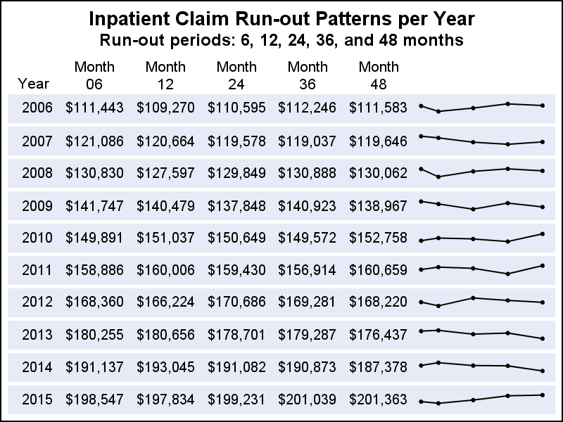
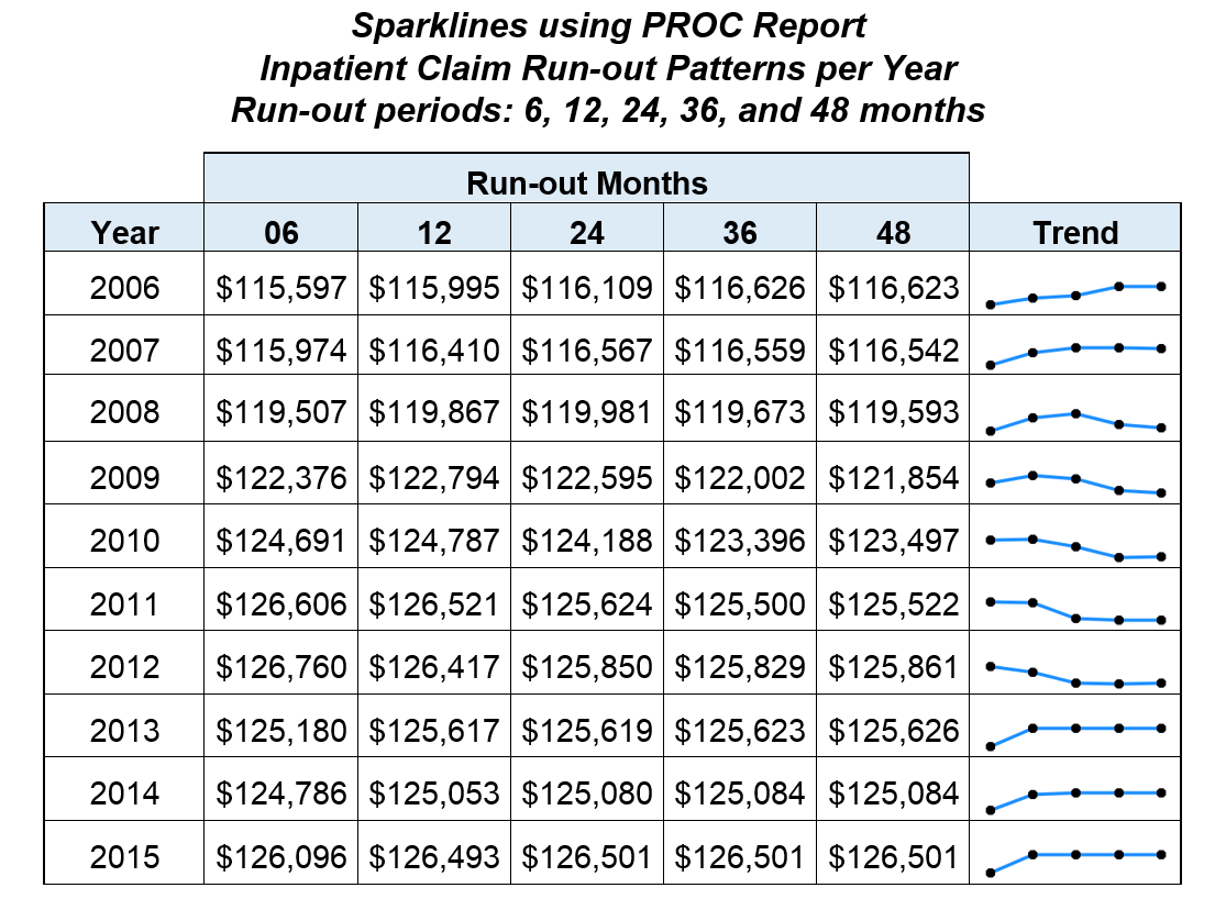 The graph above is classified by Year, with a row of data values for each "Run-out" period. This is followed by a "Sparkline" of the same data that can make it easier to see the trend over the 5 periods. So, this graph is a hybrid of a lightweight series plot on the right and textual display of each value in the corresponding cells on the left.
In the paper, the graph shown above was created in SAS using a "compositing" process with PROC REPORT. The Sparklines for all the year values are generated separately as image files using the SGPLOT procedure. Image files are creates as "Plot1.png", Plot2.png" and so on. Then a table of the Run-out data is created by Year using PROC REPORT, and the images are inserted in the column on the right as a computed column.
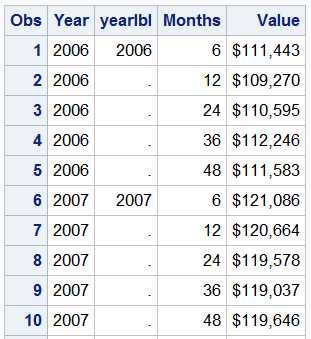 Let us see if we can build this using the SGPANEL procedure. First, I simulated the data using some random functions, as shown on the right. Note the additional column "YearLbl". The need for this will be clear below.
The SGPANEL procedure can easily create the column of Sparklines classified by Year. Note, each graph in the cell is a x-y plot, where the y-axis (not shown) is shared with other cells in a row. We can use a yAxisTable to display the Run-out values. But simple addition of the yAxisTable will position each value at its own y-axis value. The simple case is shown below with the resulting graph.
title 'Inpatient Claim Run-out Patterns per Year';
title2 'Run-out periods: 6, 12, 24, 36, and 48 months';
proc sgpanel data=spark;
format value dollar8.0;
panelby year / layout=rowlattice onepanel uniscale=column noheader noborder;
series x=months y=value / markers markerattrs=(symbol=circlefilled size=5);
rowaxistable yearlbl / y=value nomissingchar position=left separator nolabel pad=20;
rowaxistable value / y=value class=months nomissingchar position=left separator
labelpos=top pad=20;
rowaxis display=none;
colaxis display=none;
run;
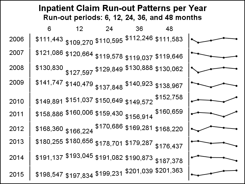
Note the use of y=value for each yAxisTable statements. Each of the Run-out values is vertically aligned with the same point in the Sparkline. Also, we used YearLbl to display the year instead of "year" since "year" would be displayed 5 times, spread over the cell height (one for each point in the Sparkline). YearLbl variable has a value only once for each level. But, note its position varies vertically.
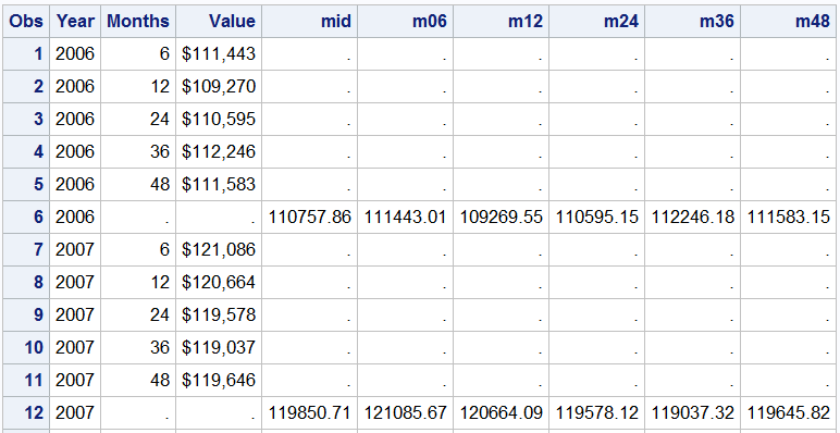
So far so good, but we need to find a way to display the Run-out textual values in the vertical center of the cell. We also want to control the padding so each column of values can be more distinct. I do that by computing the mean value of all the points in the Sparkline, which will be the middle of the cell. Then, I can use y=mid in the yAxisTable instead of the y=value.
This would fix the centering of the textual values. But, I also wanted to control the padding for each column. So, after computing the mid y-value, I output the data as multiple columns, one for each Run-out value, and merged this data with the original data "BY Year" to get the data set below. Now, I have the data for the series plot like before, but I also have the individual Run-out values with "Mid" which is the middle of the y-data range of the Sparkline, only once per year.
Now, I will display the textual values from the columns along with the classified table of Sparklines. Here is the modified program code and the graph Only one yAxisTable is needed.
title 'Inpatient Claim Run-out Patterns per Year';
title2 'Run-out periods: 6, 12, 24, 36, and 48 months';
proc sgpanel data=final;
format value m06 m12 m24 m36 m48 dollar8.0;
styleattrs wallcolor=cxe7ebf7;
panelby year / layout=rowlattice onepanel uniscale=column noheader noborder spacing=5;
series x=months y=value / markers markerattrs=(symbol=circlefilled size=5);
rowaxistable year m06 m12 m24 m36 m48 / y=mid nomissingchar valueattrs=(size=8)
position=left pad=10 labelpos=top;
rowaxis display=none;
colaxis display=none;
run;
The code for computing the mid value of y-range is set for the 5 Run-out values, but will scale for different number of year values. I am sure even that can be generalized by the expert SAS coders. The graph above is not "Identical" to the one in the paper, but it seems to be "functionally" similar. The full code including processing of the data is included in the link below.
SGPANEL code: Spark_Table_2


