The 25th annual SESUG conference was held at in the SAS campus this week. I had the opportunity to meet and chat with many users and attend many excellent presentations. I will write about those that stood out (graphically) in my view.
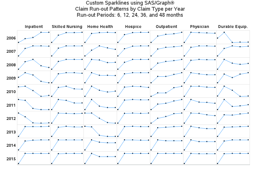
One excellent presentation was on "Methods for creating Sparklines using SAS" by Rick Andrews. Co-authored by Louise Hadden and our own Robert Allison. One of the examples Rick presented was a 2D grid of spark lines, by year and Claim Type. For context, the term "Sparkline" was introduced by Edward Tufte, where relevant information can be displayed using a very lightweight plot or chart. In this case, the trend of the data is plotted as a line without any axes or other decorations. A lot of information can be displayed in a small amount of space.
Rick used SAS/GRAPH GPLOT procedure to create the Sparklines grid shown below. As he described, the spark lines are really one large continuous plot that covers all 7 columns and 10 rows. The data is modified so the plot will lay out in this manner. The lines are broken at cell borders by using missing data. Then the table grid, headers and other details are added using annotate. Some work needs to be done to normalize the data. The key here is to visualize the rising or falling slope of the spark likes by Type and Year.
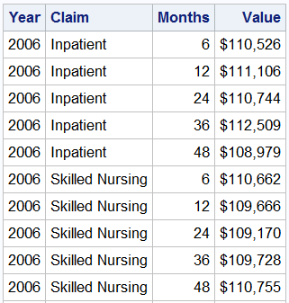 The SGPANEL procedure is well suited to create a graph that is functionally similar. Since I did not have access to the real world data available to Rick, my first step is to create some sample data. I created some random data over time (6, 12, 24, 36 & 48 months) by Year and Claim Type. A snippet of the data is shown on the right.
The code for the SGPANEL procedure is shown below.
title 'Claim Run-out Patterns by Claim Type per Year';
proc sgpanel data=sparkGrid;
styleattrs wallcolor=cxe7ebf7;
panelby claim year / layout=lattice onepanel uniscale=column novarname rowheaderpos=left
noborder spacing=3 noheaderborder headerattrs=(size=7 weight=bold) sort=data;
series x=months y=value / markers markerattrs=(symbol=circlefilled size=5);
rowaxis display=none;
colaxis display=none;
run;
The resulting graph is shown below.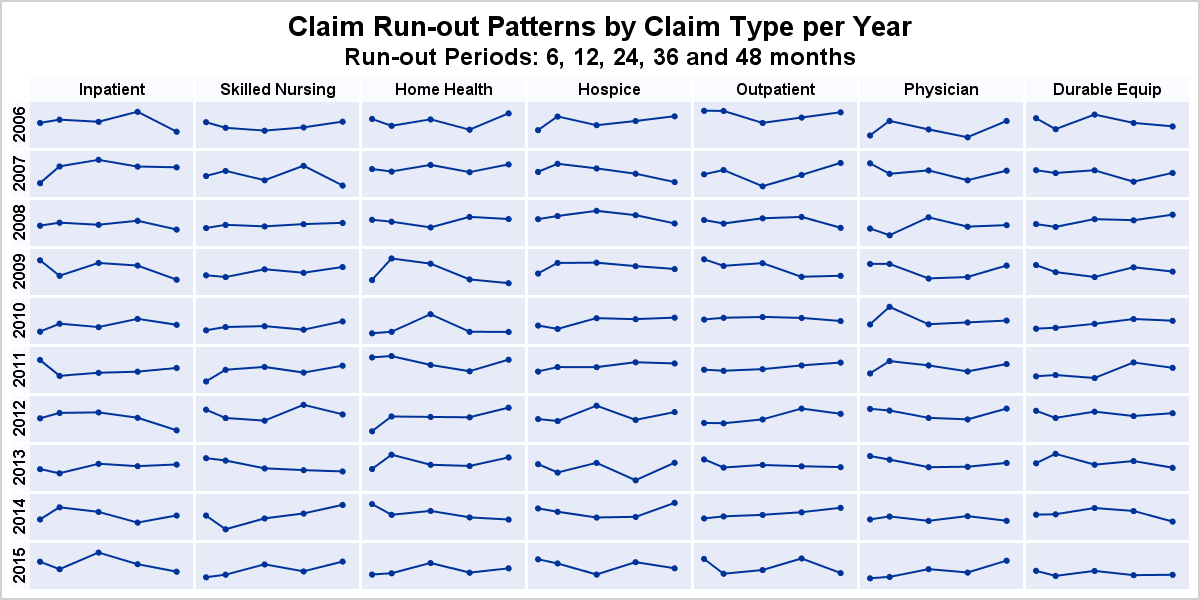
The data for this graph is simulated using random functions so it has no inherent trends. With real data, trends can be visually detected. This graph is "functionally" similar to the graph presented in the paper, with a few aesthetic differences. However, the code and process needed to create this graph using the SGPANEL procedure is very compact. No need for any processing of the data or any annotation. I would prefer to have the row headers oriented horizontally. While there is no simple option for that yet, it can be done.
Full SAS SGPANEL code: Spark_Grid

4 Comments
Wow Sanjay , your SGPANEL Code is really compact . How difficult would it be to answer your last question : ie get the row headers( Year values) horizontally aligned?
Thanks.
Once we add the option to orient the row labels horizontally, it will be a piece of cake. However, that requires a new SAS release. So in the meantime, we have to put in an INSET into the cell. Adding an inset into the first curve column would be easier, but not as clean. The best way would be to add another column which can show only the inset and no curve data. I will look into it.
Hi Sanjay
I love this sparkline plot, and I have been using the code, thanks. In reply to your comment about having the row labels horizontal, would it be easier to annotate the labels? I have been playing around with this, but I then need to turn off the rowheader by using noheader, which then turns off the column header as well (but I want to keep that). Is there a way I can turn off just the rowheader? Or would you suggest annotating both the row and column headers and turn off both headers?
Thanks
You are probably right, setting NOHEADER likely turns off both row and column headers. In that case, you would need to annotate both.