Plot statements included in the graph definition can contribute to the legend(s). This can happen automatically, or can be customized using the KEYLEGEND statement. For plot statements that are classified by a group variable, all of the unique group values are displayed in the legend, along with their graphical representation in the plot. For plot statements that are not classified by a group variable, the "LegendLabel" value is displayed in the legend.
Often we come across cases where we need to add some information to the graph legend that is not directly generated by the plots that are visible in the graph. Or, we may want to modify the contents of the legend. In situations like this, we needed to resort to some "tricks" or use annotation to achieve our results.
My preference is to use plot statement layers to achieve my results. So, I often use additional plot statements in the code that generate the desired entry into the legend, without displaying anything in the graph itself. For examples of such usage, see the Survival Plot. In this case, (see the last example), I use an extra scatter plot to include non-grouped items in the "Censored" legend. Also, in this example of the Swimmer Plot, I used three additional scatter plot statements to insert items into the legend. Sometimes, this needs some creative work to avoid the display of the item in the graph itself.
With SAS 9.40M5, this becomes a lot easier and logical using the LEGENDITEM statement now included with the SGPLOT procedure. This statement allows you to define a legend item, including the graphical representation and the textual information for inclusion into legend without the need of any "ghosty" plot statement. A sample syntax of this statement and its usage is as follows:
legenditem type=marker name='Item' / markerattrs=graphdata1 label='Description';
keylegend 'Item';
In this case, we are defining a "marker" type legend item named "Item", which will have a graphical representation of the marker for the GraphData1 style element and the defined label. The graphical representation is based on the item type, which can be "Fill", "Marker", "MarkerLine", "Line" and "Text". The graphical representation is defined using the appropriate attributes for the type. Then, the defined item can be inserted into a legend by including its name in the list of plot names for the keylegend statement, in the order you want.
In the case of the Survival Plot, I can use the following code to create the graph as shown.
title 'Product-Limit Survival Estimates';
title2 h=0.8 'With Number of AML Subjects at Risk';
proc sgplot data=data.SurvivalPlotData;
legenditem type=marker name='c' / markerattrs=(symbol=plus color=black) label='Censored';
step x=time y=survival / group=stratum lineattrs=(pattern=solid) name='s';
scatter x=time y=censored / markerattrs=(symbol=plus) GROUP=stratum;
xaxistable atrisk / x=tatrisk class=stratum location=outside colorgroup=stratum;
keylegend 'c' / location=inside position=topright;
keylegend 's';
yaxis min=0;
run;
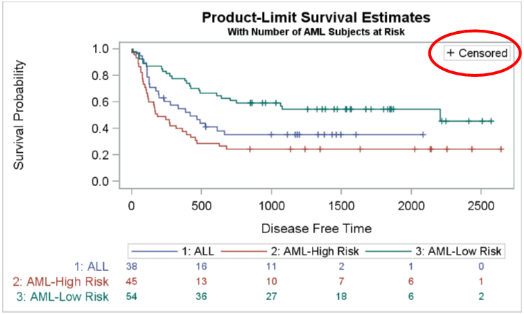
Now, the "+ Censored" in the inner legend at the top right (with callout) is generated by creating a legend item called "c", and then including it in the first keylegend statement. No extra "ghost" statements are required to make this happen. Also, the procedure code is more self documenting since no special "tricks" are used.
Similarly, we can define and use multiple legenditems for the example of the Swimmer Plot linked above. Here is the new code and the resulting graph. You can view the full code in the link at the bottom.
title 'Subject Response Stage by Month'; footnote J=l h=0.8 'Each bar represents one subject in the study.'; footnote2 J=l h=0.8 'A durable responder is a subject who has confirmed response for at least 183 days (6 months).'; proc sgplot data= swimmer dattrmap=attrmap nocycleattrs noborder; legenditem type=marker name='ResStart' / markerattrs=(symbol=trianglefilled color=darkgray size=9) label='Response start'; legenditem type=marker name='ResEnd' / markerattrs=(symbol=circlefilled color=darkgray size=9) label='Response end'; legenditem type=marker name='RightArrow' / markerattrs=(symbol=trianglerightfilled color=darkgray size=12) label='Continued response'; highlow y=item low=low high=high / highcap=highcap type=bar group=stage fill nooutline dataskin=gloss lineattrs=(color=black) name='stage' barwidth=1 nomissinggroup transparency=0.3 attrid=stage; highlow y=item low=startline high=endline / group=status lineattrs=(thickness=2 pattern=solid) name='status' nomissinggroup attrid=status; scatter y=item x=durable / markerattrs=(symbol=squarefilled size=6 color=black) name='Durable' legendlabel='Durable responder'; scatter y=item x=start / markerattrs=(symbol=trianglefilled size=8) group=status attrid=status; scatter y=item x=end / markerattrs=(symbol=circlefilled size=8) group=status attrid=status; xaxis display=(nolabel) values=(0 to 20 by 1) valueshint grid; yaxis reverse display=(noticks novalues noline) label='Subjects Received Study Drug' min=1; keylegend 'stage' / title='Disease Stage'; keylegend 'status' 'Durable' 'ResStart' 'ResEnd' 'RightArrow' / noborder location=inside position=bottomright across=1 linelength=20; run; |
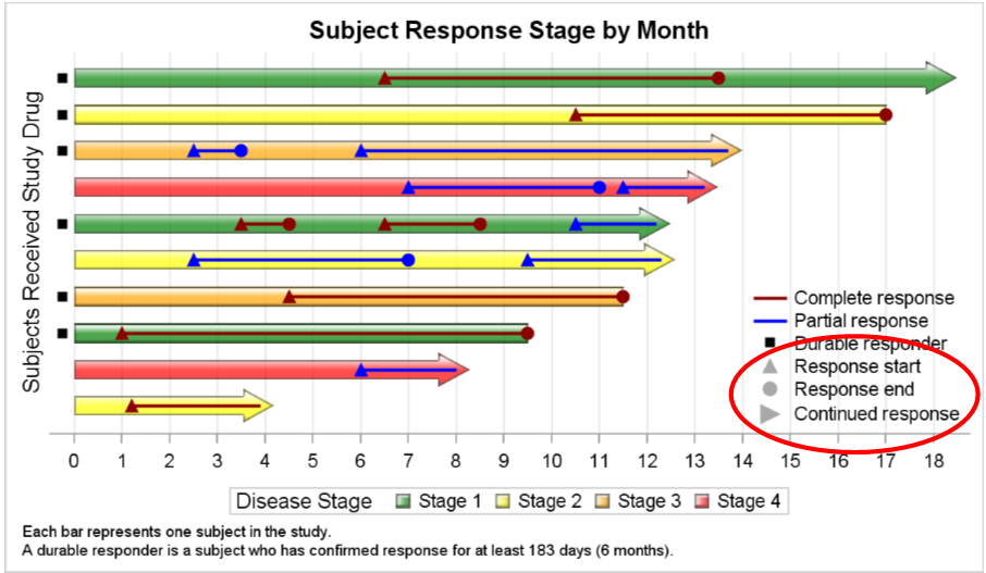 In the graph above, the grey filled triangle, circle and right triangle (with callout) are all included by defining and including legend items. So, the three "ghost" scatter plot statements can be dropped. Also, I have used a Discrete Attributes Map to assign the colors for increasing disease Stage and for the Response Status.
You can certainly define a SYMBOLCHAR or SYMBOLIMAGE marker, and then include that into the legend for special cases.
Full SAS 9.40M5 SGPLOT Code: Legend_Item


3 Comments
Very nice! I look forward to using this new statement.
Is there a way to control the size of the caps (with type=line) with HIGHLOW? I am using 9.4 TS1M2, and the arrows are bigger than I would like. I am currently using GTL and HIGHLOWPLOT. Any suggestions would be greatly appreciated. Thank you.
Unfortunately, no, there is not such option. We did add such an option for the arrowheads in the Series Plot. Maybe can use those for your purpose. Also, Vector plot arrow heads may have a better sizing.