Bar charts in SGPLOT procedure have some new features that everyone may not be familiar with. In this article we will create bar charts with color response on linear axes. Normally, the VBAR statement treats the x-axis as discrete, placing each unique value by itself, equally spaced on the x-axis. Each bar has a tick value on the x-axis, and when there are many bars, this can get busy as shown below.
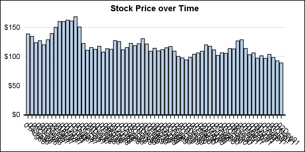
title 'Stock Price over Time'; proc sgplot data=ibm noborder; vbar date / response=close nostatlabel; xaxis display=(nolabel); yaxis display=(noline noticks nolabel) grid; run; |
When creating a graph of the stock closing price over time, I do not prefer the default discrete x-axis. We can change the behavior by setting the x-axis to LINEAR to get the graph below.
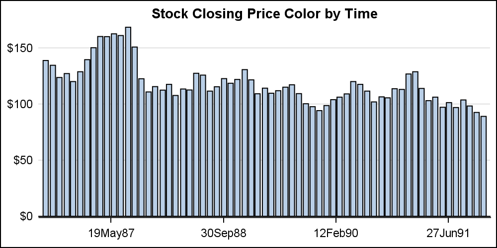
xaxis type=linear display=(nolabel); |
This creates a bar chart on a linear axis. Note, the bar chart will still summarize the values by the category value. Stacked or clustered groups will be displayed. However, in this case, we are staying with a non grouped bar chart.
Now, a TIME axis is preferred, and we can set XAXIS TYPE=TIME. This will display the time axis as shown below. In the graph below, we have also set the COLORRESPONSE=date. Now, the bars are colored left to right using a color model that has a gradient from green to yellow to red. Note, the bars are placed at the correct scaled location by date, thus having slight uneven gaps between the bars.
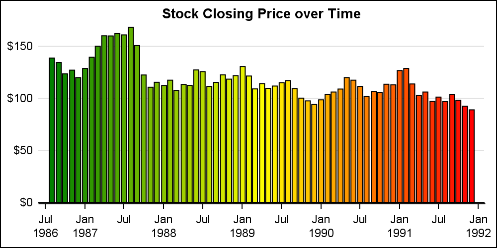
title 'Stock Closing Price over Time'; proc sgplot data=ibm noborder subpixel noautolegend; vbar date / response=close nostatlabel colorresponse=date colormodel=(green yellow red); xaxis type=time display=(nolabel); yaxis display=(noline noticks nolabel) grid; run; |
We could use a NEEDLE plot to display values over time. However, the NEEDLE plot does not support the COLORRESPONSE feature that I wanted to write about. The COLORRESPONSE role can be set to any variable in the data. We can have the bars colored by date as shown above, or by closing response value as shown below.
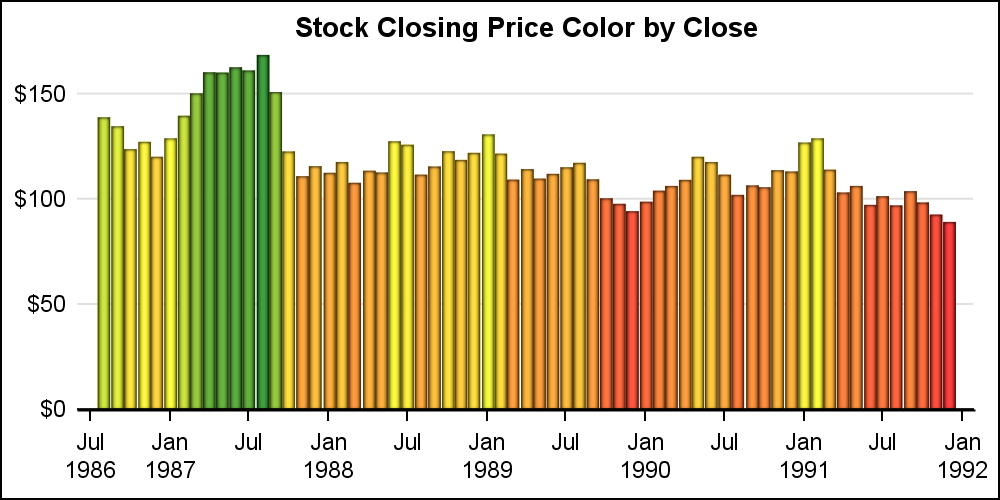
In this example, I have set COLORRESPONSE=CLOSE. Note, the VBAR statement also supports COLORSTAT. If any bar has multiple observations they will be summarized. For all the graphs above, I have set the NOAUTOLEGEND option. This is not needed as the bars were colored by the x or y axis variable.
In the graph below, I have set the COLORRESPONSE=vol2, which is the volume in millions and different from x or y axis variable. So, now we can visualize two responses in the same graph, thus requiring a color legend. I have also changed the color model to a simple 2 color gradient to indicate the trading volume.
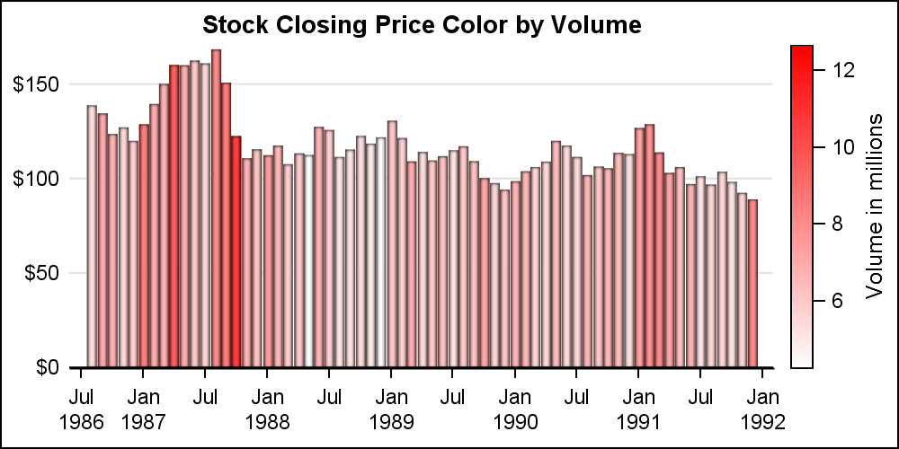
title 'Stock Closing Price Color by Volume'; proc sgplot data=ibm noborder subpixel; vbar date / response=close nostatlabel colorresponse=vol2 dataskin=pressed colormodel=( white red) barwidth=1 nooutline; xaxis type=time display=(nolabel); yaxis display=(noline noticks nolabel) grid; run; |
The color response feature is available with many plot statements, including the HIGHLOW plot as shown below. You can use these features to create graphs for many interesting use cases.
Full SAS 9.4M3 code: Color_Response


3 Comments
This was helpful and it gets me within 90% of what I'm trying to do! I have a very similar situation where I'm trying to create these same colors based on a "REFLINE" on the SGPLOT vbar Chart. For example, adding "refline 125,000 / axis=y lineattrs=(pattern=2 thickness=2px) label='Stock Closing Price Ref Line'; would create a reference line and then I would like to base the colors on that refline. Green if the bars are >= $125,000, Yellow if the bars are $124,000-$115,000 and Red if the bars are < $115,000. Can you provide a way of accomplishing this?
Yes, you can use RANGE ATTRIBUTE MAP with the color response variable to get what you want. The range attr map can be defined as a SAS data set, where you can set the value ranges with specified colors. Please see the SGPLOT procedure documentation.
Clarification...
..."refline 125 / axis=y lineattrs=(pattern=2 thickness=2px) label='Stock Closing Price Ref Line'
...Green if the bars are >= $125, Yellow if the bars are $124-$115 and Red if the bars are < $115.