One key aspect of graphs used in the statistical or clinical research domains is the need to display numerical or textual information aligned with the data in the plot. Examples of such graphs are the Survival Plot or the Forest Plot. These graphs use the AXISTABLE statements available with SAS 9.4 in both SG Procedures and GTL.
The AxisTable can be used to add statistical or textual data display in a graph that is aligned with the X or Y axis. In the example below, I have displayed the monthly high and low average temperatures using a HighLow plot. I have also included the textual display of the Low, High and Precipitation at the bottom of the graph using the xAxisTable. In this case, the textual values are displayed "inside" the plot area, above the x-axis.
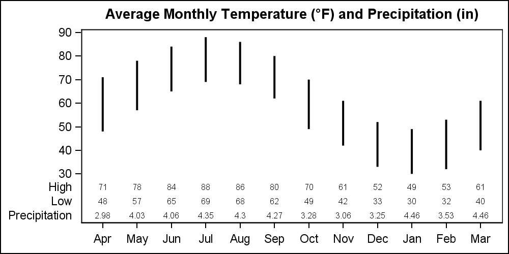
title "Average Monthly Temperature (~{Unicode '00b0'x}F) and Precipitation (in)"; proc sgplot data=weather; highlow x=month low=low high=high / lineattrs=(thickness=2); xaxistable high low precip / location=inside; xaxis display=(nolabel); yaxis display=(noline nolabel); run; |
When LOCATION=INSIDE, the xAxisTable values are displayed in a region inside the plot area called the "Inner Margin". This is a part of the plot area that is reserved for such purposes, and the main plots are not plotted in this area. Inner margins can be placed on all four sides of the plot.
The months on the x-axis go from April to March. So, in such a case, one may want to indicate the change in the year by displaying a reference line between "Dec" and "Jan". This can be done by placing a REFLINE "Dec", with a DISCRETEOFFSET=0.5. This will place the reference line half way between "Dec" and "Jan" as shown below. Note, we have also set some axis options to change the appearance of the graph.
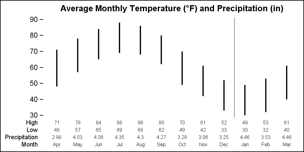
title "Average Monthly Temperature (~{Unicode '00b0'x}F) and Precipitation (in)"; proc sgplot data=weather noborder; highlow x=month low=low high=high / lineattrs=(thickness=2); refline 'Dec' / axis=x discreteoffset=0.5; xaxistable high low precip month / location=inside labelattrs=(size=8); xaxis display=none; yaxis display=(noline nolabel); run; |
In the graph above, the "Month" is also displayed by the xAxisTable, so the display of the x-axis is fully suppressed. Note, the reference line only displays in the plot region, and is not displayed in the margin. This is because the background behind the axis table is intentionally cleared to avoid clutter.
But, in this case, I intentionally offset the reference line to be placed in between the x-axis tick values. I want the reference line to go all the way to the bottom as a separator. How can we achieve this?
Here is the TRICK: The background for the innermargin is NOT drawn if COLORBANDS are displayed. So, to make the reference line show up in the inner margin, I have to add COLORBANDS to the x-axis. But to avoid actually showing these bands, I set their transparency=1.
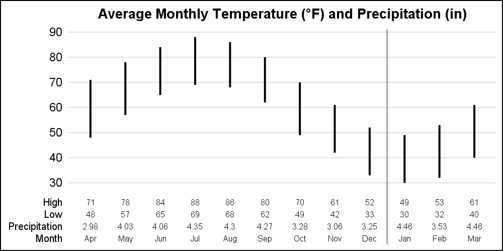
title "Average Monthly Temperature (~{Unicode '00b0'x}F) and Precipitation (in)"; proc sgplot data=weather noborder; highlow x=month low=low high=high / lineattrs=(thickness=2); refline 'Dec' / axis=x discreteoffset=0.5; xaxistable high low precip month / location=inside labelattrs=(size=8); xaxis display=(noline nolabel noticks novalues) colorbands=odd colorbandsattrs=(transparency=1); yaxis display=(noline nolabel noticks) grid offsetmin=0.05; run; |
Note the addition of COLORBANDS option to the x-axis, which allows the REFLINE to extend all the way to the x-axis in the inner margin. Also, note the setting of y-axis OFFSETMIN=0.05, providing a bit of a gap between the axis table and the "30" grid line.
This can also be useful when using the REFLINE to create the color bands. The COLORBANDS option always creates alternate color bands on a category axis. This can be useful for a wide graph to help the eye across the data. However, sometimes the bands need to cover groups that are not even. In such a case, we can use the REFLINE statement to create bands by drawing wide reference lines. The only issue here is that we have to take a guess at the thickness setting needed to cover the width of the categories.
In the example below, I want to highlight the "dry" months, with average precipitation < 4". I did this by first computing a variable "Ref" whose value is set to same as "Month" when precip < 4. Else the value is missing. Now, I can use a REFLINE with variable "Ref" to draw broad reference lines at these locations. One issue is how to set the thickness of the reference line (in pixels) to fill the region of one category spacing?
Sneak preview: With SAS 9.4M5, we will release a new option to set the width of a reference line on a category axis as a % of the midpoint spacing. Thus, setting DISCRETETHICKNESS=1 sets the reference line width to the full amount of the tick spacing automatically. No guesswork needed.
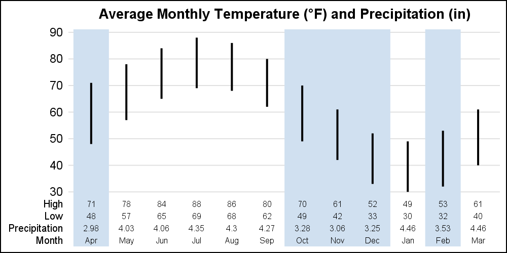
title "Average Monthly Temperature (~{Unicode '00b0'x}F) and Precipitation (in)"; proc sgplot data=weather2 noborder; refline ref / axis=x discretethickness=1 lineattrs=(color=cxd0e0f0); highlow x=month low=low high=high / lineattrs=(thickness=2); xaxistable high low precip month / location=inside labelattrs=(size=8); xaxis display=(noline nolabel noticks novalues) colorbands=odd colorbandsattrs=(transparency=1); yaxis display=(noline nolabel noticks) grid; run; |
Note the use of DISCRETETHICKNESS=1 option on the REFLINE statement, and again the usage of COLORBANDS to allow the thick reference lines to be displayed in the margin region.
SGPLOT code (Contains some SAS 9.4m5 features): Transparent_Margin

3 Comments
Sanjay, You showed me the COLORBANDS trick when I was working on this year's PharmaSUG paper. https://www.pharmasug.org/proceedings/2017/DV/PharmaSUG-2017-DV03.pdf In Figure 6, I wanted references lines to extend horizontally through both the graph and through a series of vertical axis tables. It wasn't until I saw today's blog that I understood why it all worked the way it does. Thanks for sharing this tip! As you know, I am a big fan of axis tables, and I am glad to have this new insight into how they work.
Yes, it is really an unintended side effect. In GTL, the way to control this is directly through the OPAQUE option on the INNERMARGIN statement. However, for SGPLOT, the placement of the AxisTable in the InnerMargin is a hidden behavior. So, there is no way to expose InnerMargin options in SG. Maybe we could add an option on the AxisTable for OPAQUE. Right now, only other item that can go in the inner margin is a BLOCKPLOT.
Pingback: Remaking a panel of dynamite plots - The DO Loop