When presenting information in form of a graph we show the data and let the reader draw the inferences. However, often one may want to draw the attention of the reader towards some aspect of the graph or data. For one such case, a user asked how to highlight one (or more) boxes in a box plot.
There are multiple ways of doing this, some of which are discussed in the article "Conditional Highlighting". Another simpler and effective way would be to draw an "underglow" effect for the bars that need highlighting. This can be easily done by drawing reference lines at specific category values behind the box or bar chart as shown below.
In the first case, I decide to highlight the "Coronary Heart Disease" category. The graph and the SGPLOT code is shown below.
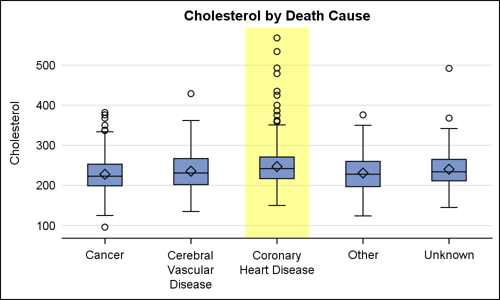
title 'Cholesterol by Death Cause'; proc sgplot data=sashelp.heart noborder; refline 'Coronary Heart Disease' / axis=x lineattrs=(thickness=70 color=yellow) transparency=0.6 ; vbox cholesterol / category=deathcause; yaxis offsetmin=0.05 offsetmax=0.05 display=(noline noticks) grid; xaxis offsetmin=0.1 offsetmax=0.1 display=(nolabel); run; |
In the graph and code above, I have drawn a REFLINE on the x-axis, with a specified value of "Coronary Heart Disease". The thickness of the reference line is set to 70px with a yellow color. The "70" is a guess that works well for this case. So, the above solution is very specific, with hard coded values. Note, I also have to set x and y axis offsets to prevent the thick reference line from skewing the offsets.
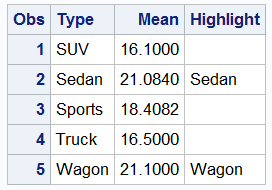
Alternatively, we may be able to determine the categories that need to be highlighted based on some criteria in data step code. Such a case is shown below. In this case, I have used the MEANS procedure to compute the mean mileage, and then decided to highlight all car types with mileage > 20. I do this by creating another column called "Highlight" and copy the type value into it when mileage > 20. Now, I can draw the reference line by column "Highlight" in the data itself. Data set, graph and code are shown below.
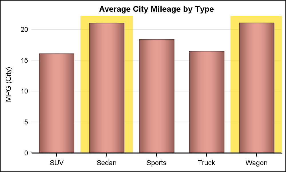
title 'Average City Mileage by Type'; proc sgplot data=cars noborder; <strong>refline highlight</strong> / axis=x lineattrs=(thickness=100 color=gold) transparency=0.4 ; vbar type / response=mean dataskin=pressed fillattrs=graphdata2 barwidth=0.7; yaxis offsetmin=0.0 offsetmax=0.05 display=(noline noticks) grid; xaxis offsetmin=0.1 offsetmax=0.1 display=(nolabel); run; |
In this case, the REFLINE uses the "Highlight" column, and thick reference lines are drawn where the Highlight column contains a category name. The thickness of the reference line is still hard coded.
Now, it is clear that it would be nice if we did not need to hard code the thickness of the reference line. The space between the category values varies with each graph so we need a way to set that by option. Also, this should not adversely impact the axis offsets.
Such a feature is planned for the V9.40M5 release of SAS SGPLOT procedure and GTL. You can use a new option "DISCRETETHICKNESS=fraction" to make the reference line a fraction of the midpoint spacing as shown below.
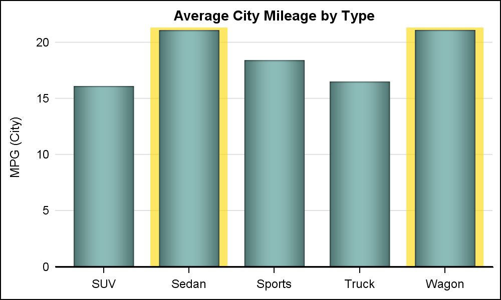
title 'Average City Mileage by Type';
proc sgplot data=cars noborder ;
  <strong>refline highlight / axis=x discretethickness=0.9</strong>
          lineattrs=(color=gold) transparency=0.4 ;
  vbar type / response=mean dataskin=pressed fillattrs=graphdata3 barwidth=0.7;
  yaxis offsetmin=0.0  display=(noline noticks) grid;
  xaxis  display=(nolabel);
run;
Here, the DISCRETETHICKNESS=0.9, so the reference line is 90% of the midpoint spacing, regardless of the pixel width of the spacing. Also, the offsets are not adversely impacted. So, this is a sneak preview into a new option coming with SAS 9.40M5 that will make such customization easier and scalable..
Full SAS 9.40M3 SGPLOT code: Highlight

4 Comments
Nicely done! Excellent examples.
What attributes do you have defined in fillattrs=graphdata2? Is that just color or some level of transparency?
Whenever you specify only the Style Element (like GraphData2), all attributes are utilized. So, for FillAttrs, this would be the fill color and transparency. Transparency is not set in the default value in the Style.
Thanks for the reply. I'm using this "highlighting" technique on an hourly chart of CPU Usage to show the Top 4 hours by processor type. I have 2 bars overlaying each other for each hour. Now to figure out why my data labels go away with the refline and the second vbar using labels. It works great with no data labels and with only one vbar using data labels...Thanks again, this got me started. I ended up using multiple reflines to colorcode processor type and cross-over...I set those refline (Highlight..) and data label (Label) values in a previous data step.
proc sgplot data=work.CPC1Top4 (where=(CPC='CPC1'))
description="CPC1 CPU Used";
refline Highlightc / axis=x name="refline1"
legendlabel='Top 4 CP'
lineattrs=(thickness=8.0 color=yellow) transparency=0.4;
refline Highlightz / axis=x name="refline2"
legendlabel='Top 4 zIIP'
lineattrs=(thickness=8.0 color=orange) transparency=0.4;
refline Highlightcz / axis=x name="refline3"
legendlabel='Top 4 CP/zIIP'
lineattrs=(thickness=8.0 color=lightred) transparency=0.4;
vbar hour / response=sumcptm stat=sum barwidth=0.7
dataskin=pressed legendlabel='CP' name="vbar1"
tip=(hour sumcptm) tiplabel=("Hour" "CP Used");
vbar hour / response=sumzIIPtm stat=sum name="vbar2"
dataskin=pressed legendlabel='zIIP' barwidth=0.5
tip=(hour sumzIIPtm) tiplabel=("Hour" "zIIP Used");
xaxis interval=hour offsetmin=0.0 offsetmax=0.0;
yaxis label="CPU Used" offsetmin=0.0 offsetmax=0.00 max=80
display=(noline noticks);
keylegend "vbar1" "vbar2" "refline1" "refline2" "refline3"
/border title='Processor Type ';
run;