Recently, while browsing health care data, I came across the graph shown below. The graph includes the healthy life expectancy at birth by countries in the EU, along with the associated per capita expenditure. The graph also shows estimate of potential gain in life expectancy by increasing expenditure efficiency.
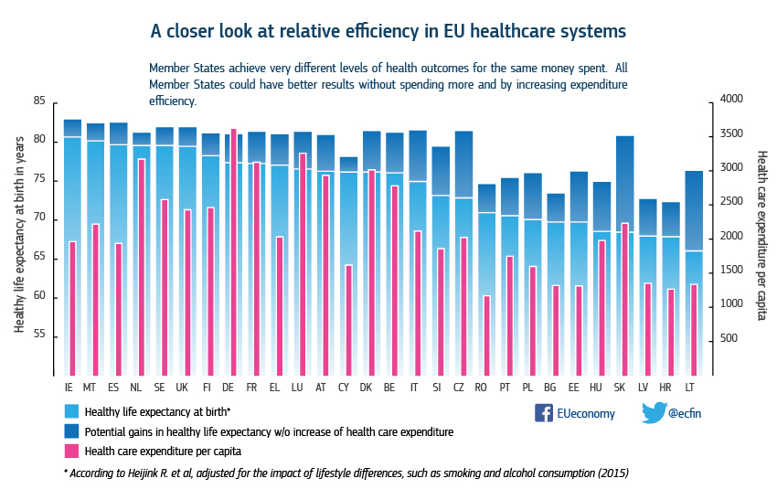
The graph has some interesting characteristics, so I thought it would be interesting to see how easy it is to make the same chart using SGPLOT procedure. The first task was to enter some of the data into a SAS data set, and I did that for about half of the countries, enough to proceed with the graph. Here is the graph and the code. See the linked program at bottom for full code.
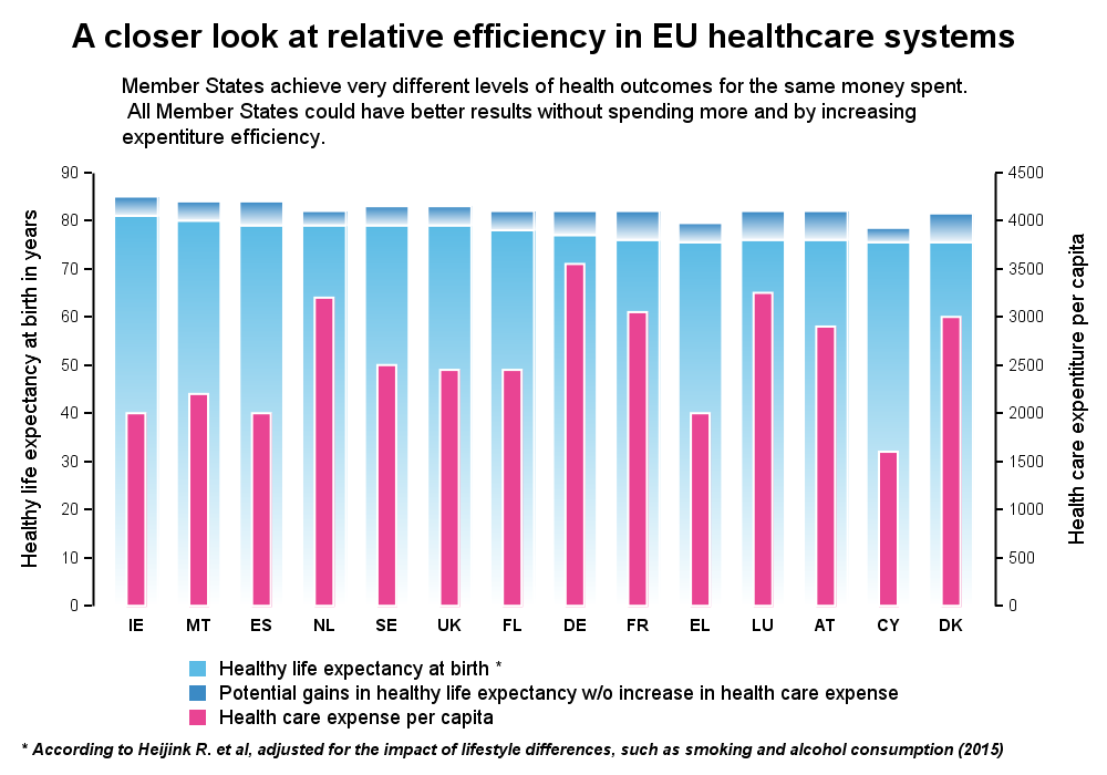
title 'A closer look at relative efficiency in EU healthcare systems'; footnote j=l h=7pt italic bold '* According to Heijink R. et al, adjusted for the impact of lifestyle differences,' ' such as smoking and alcohol consumption (2015)'; proc sgplot data=efficiency2 noborder; styleattrs datacolors=(%rgbhex(91,187,229) %rgbhex(59,138,197) %rgbhex(233,68,147)) axisextent=data; vbarparm category=country response=Value / group=cat groupdisplay=stack outlineattrs=(color=white) barwidth=0.7 baselineattrs=(thickness=0) filltype=gradient; vbarparm category=country response=expense / barwidth=0.3 y2axis outlineattrs=(color=white) baselineattrs=(thickness=0); yaxis label='Healthy life expectancy at birth in years' values=(0 to 90 by 10) offsetmax=0.2 labelposition=datacenter; y2axis label='Health care expentiture per capita' values=(0 to 4500 by 500) offsetmax=0.2 labelposition=datacenter; xaxis display=(noline noticks nolabel); keylegend / across=1 noborder; inset 'Member States achieve very different levels of health outcomes for the same money spent.' ' All Member States could have better results without spending more and by increasing ' 'expentiture efficiency.' / textattrs=(size=7pt) position=top; run; |
In this program, I used the macro %rgbhex() by Perry Watts to match the colors.
On first view, the "Gain in life expectancy" bar segments look smaller in my graph. Then, on closer examination, one can see that the original graph sets the y axis min=50, causing the bar segments to get longer. This could actually distort the perception of life expectancy vs gain and expense, as the y2 axis min=0. In my graph, both y axes are zero based.
Also, we should note that the relative lengths of the blue and red bars have no significance, as the axis values on Y and Y2 are very different, and different between the graphs.
The original graph data is sorted by descending "Healthy life expectancy at birth". I thought it may be useful to also view the same data sorted by per capita expense. So, I sorted the data and the new graph is shown below.
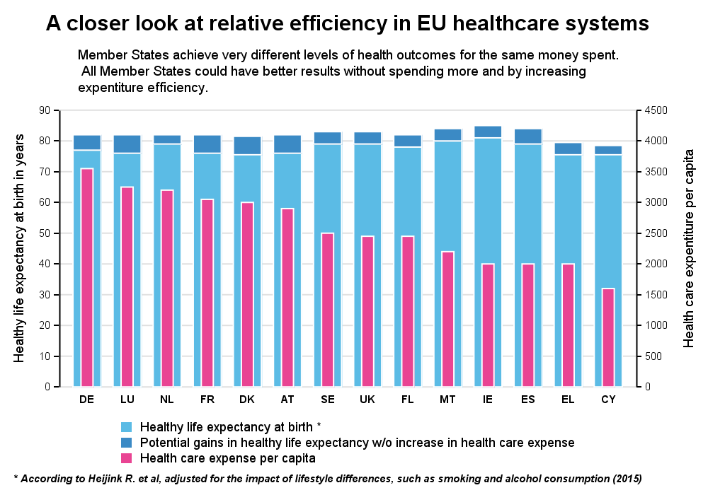
In this graph, we can really appreciate the difference in per capita expense between the countries. Also, the countries with lower expense still seem to enjoy a pretty good life expectancy. Actually, Ireland and Spain have relatively low expense, and the high life expectancy (amongst the EU contries in my graph)!
Full SGPLOT code: EU_Health_Efficiency

6 Comments
Certainly helps to interpret the graph to have the data sorted! I also prefer the sharper colors in your graph rather than the graduating colors. Nice enhancements and always great to see SGPLOT code and the use of the %rgbhex() macro!
A different way to view the same data. It seems to give a bit more insight. Glad you like it.
I have mixed feelings about this one. On the one hand... its good to see another way to graph information and I have found SGPLOT especially helpful (albeit not easy to learn)... but the context of the data in this example I would question. It may be a good example of what "not" to do... over emphasis on modeling with what appears to be weak assumptions (and those not discussed).
Saying in a footnote that something has been "adjusted for the impact of lifestyle differences, such as smoking and alcohol consumption" - well yes, if you were to do something like that it would be important to note that you did, but where to find the details would be better.
Not that it has anything to do with how to use SAS to provide a specific type of graphic... more a comment on what type of work makes for a good example. I would be highly suspicious of data of that type and if given the opportunity to comment on something that had been published or if I was being asked to review something submitted for publication... I probably would recommend not. Because data on smoking and alcohol consumption tends to be grossly under reported... which I know because of working in public health for over 20 years!
I appreciate your comments from the content and analysis perspective. We (in the graphics world) are often asked "Can SAS make this graph?". So, often I look at the situation from a graphics tools perspective. It is good to also have comments from other perspectives.
As for learning SGPLOT, some examples can seem complex due to nature of the graph. I suggest looking at the "Getting Started" topics at: http://blogs.sas.com/content/graphicallyspeaking/2016/12/05/getting-started-sgplot-index/
If make Y2AXIS has pink color, that would look better.
y2axis valueattrs=(size=6 color=%rgbhex(233,68,147)) labelattrs=(size=7 color=%rgbhex(233,68,147))
Good idea.