This is the 5th installment of the Getting Started series. The audience is the user who is new to the SG Procedures. Experienced users may also find some useful nuggets of information here.
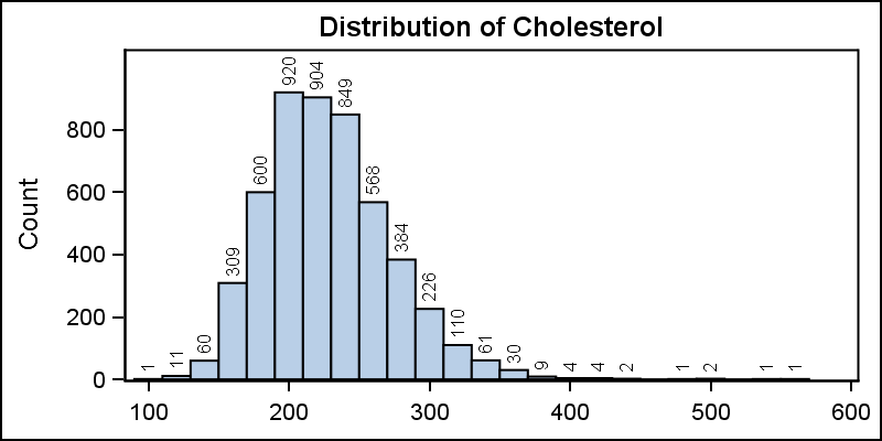
A histogram reveals features of the distribution of the analysis variable, such as its skewness and the peak which may not be evident by examining the tabular display of the data. Viewing the distribution of the data can provide valuable insight. The SGPLOT procedure makes it very easy to view the distribution of an analysis variable such as Cholesterol for all subjects in a study as shown below.
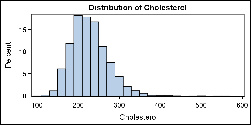
title 'Distribution of Cholesterol'; proc sgplot data=sashelp.heart; histogram cholesterol; run; |
A normal density curve can be added to the histogram for comparison of the distribution to the normal distribution. A second kernel density estimate curve can also be added as shown below.
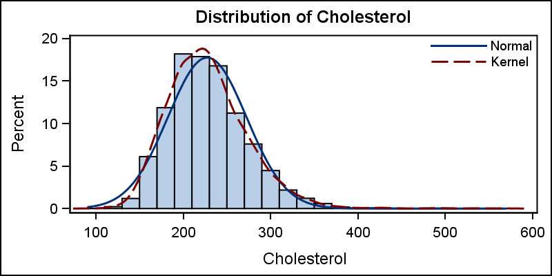
title 'Distribution of Cholesterol'; proc sgplot data=sashelp.heart noautolegend; histogram cholesterol; density cholesterol; density cholesterol / type=kernel; keylegend / location=inside position=topright across=1 noborder; run; |
Note that a small gap is introduced between the bottom of the histogram bins and the x-axis in the graph above. The "zero" tick and value on the y-axis are slightly above the x-axis line. This is done to allow for the thickness of the overlaid density plot line(s), so the lines do not clip at the bottom. A legend is created by default including the density curves, and we have used the KEYLEGEND statement to customize its position inside the data area.
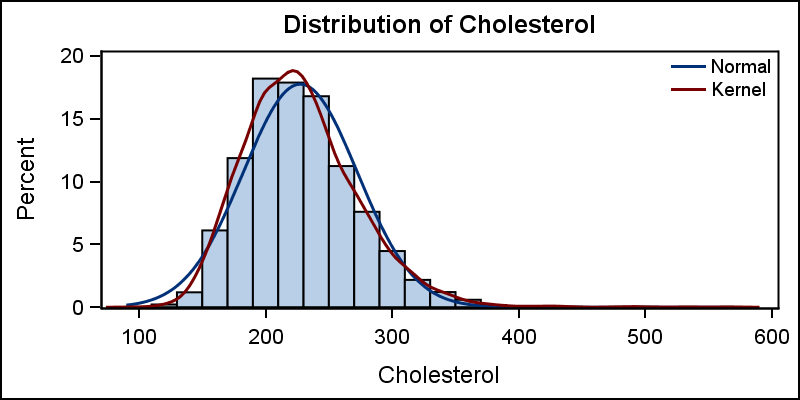
title 'Distribution of Cholesterol'; proc sgplot data=sashelp.heart noautolegend; histogram cholesterol; density cholesterol; density cholesterol / type=kernel lineattrs=(pattern=solid); keylegend / location=inside position=topright across=1 noborder linelength=20; yaxis offsetmin=0; run; |
In the code above, we have set the line pattern to solid for the Kernel density plot using the LINEATTRS option. The length of the lines in the legend can be reduced and we have also used the YAXIS statement to set the min offset to zero so the histogram bins now touch the x-axis line.
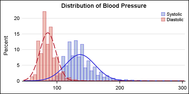
Where it makes sense, distribution of multiple analysis variables can be viewed in one graph as shown below. Here we have displayed the distribution of the Systolic and Diastolic blood pressure in the same graphs.

title 'Distribution of Blood Pressure'; proc sgplot data=sashelp.heart nocycleattrs; histogram systolic / fillattrs=graphdata1 name='s' binstart=50 binwidth=5 transparency=0.5; density systolic / lineattrs=graphdata1; histogram diastolic / fillattrs=graphdata2 name='d' binstart=50 binwidth=5 transparency=0.5; density diastolic / lineattrs=graphdata2; keylegend 's' 'd' / location=inside position=topright across=1 noborder; yaxis offsetmin=0; xaxis display=(nolabel); run; |
In this case, we have set the BINSTART nd BINWIDTH options to ensure the bins for the two variables have consistent values. We made the histograms 50% transparent to the overlap can be seen clearly. The x-axis label is now removed since two separate variables are plotted on the x-axis.
With SAS 9.4, the GROUP option is supported for the HISTOGRAM and DENSITY statements. This makes it much easier to compare the densities by a classifier. To use this feature, we can either use data that has measures by a classifier, such as Mileage by Type in the sashelp.cars data set. For our case, I have created a temporary "heart" data set from sashelp.heart, keeping the Systolic and Diastolic blood pressure values and restructuring the data from 2 measure columns to one classifier (Group) and one measure (bp). See linked code for data step.
Now, we can visualize the distribution of blood pressure by group using the GROUP role for Histogram and Density plot statements.
title 'Distribution of Blood Pressure'; proc sgplot data=heart noborder; histogram bp / group=group name='a' transparency=0.5; density bp / group=group; keylegend 'a' / location=inside position=topright across=1 noborder; yaxis offsetmin=0 display=(noline noticks) grid; xaxis display=(nolabel); run; |
Note, we do not need to set BINSTART or BINWIDTH in this GROUP case, as the system will automatically make the bins consistent. Here I have also changed the look of the graph a bit by suppressing the y-axis line and ticks.
Starting with SAS 9.40M1, bin labels can be displayed as shown below. I have changed the SCALE=count.
Full SGPLOT code: Getting_Started_5_Histogram

8 Comments
Pingback: Getting started with SGPLOT - Index - Graphically Speaking
Bonsoir,
Est-it possible de changer la coleur du contour des bars de l'histogramme?
Merci
If I understand the question (French?), yes. You can use the option FILLATTRS=(color=red) or some other color to set the fill color of the histogram.
Hi, I'd like to know how it is possible to change the name of the variable ( es in the Histogram 'Distribution of Cholesterol' changing 'Cholesterol' in Chol) in a histogram
thank you
That string comes from a TITLE statement (see the code example above). You can change it in the title string by changing the literal value or using a macro variable.
I am trying to use the binwidth option in an SGPLOT histogram but it seems like it does not work for SAS EG v 8.2.
Is there any way around it?
Is it possible to the change y axis label ? I am trying to change "count" in y axis to "number of xxx".
Thank you!
Add yaxis value statement can change the y axis label. For example: yaxis values= (0 to 300 by 50) label= "Number of xx";